Luxury Retail Color Psychology: The Science Behind High-End Shopping Environments
· Coloracci Team
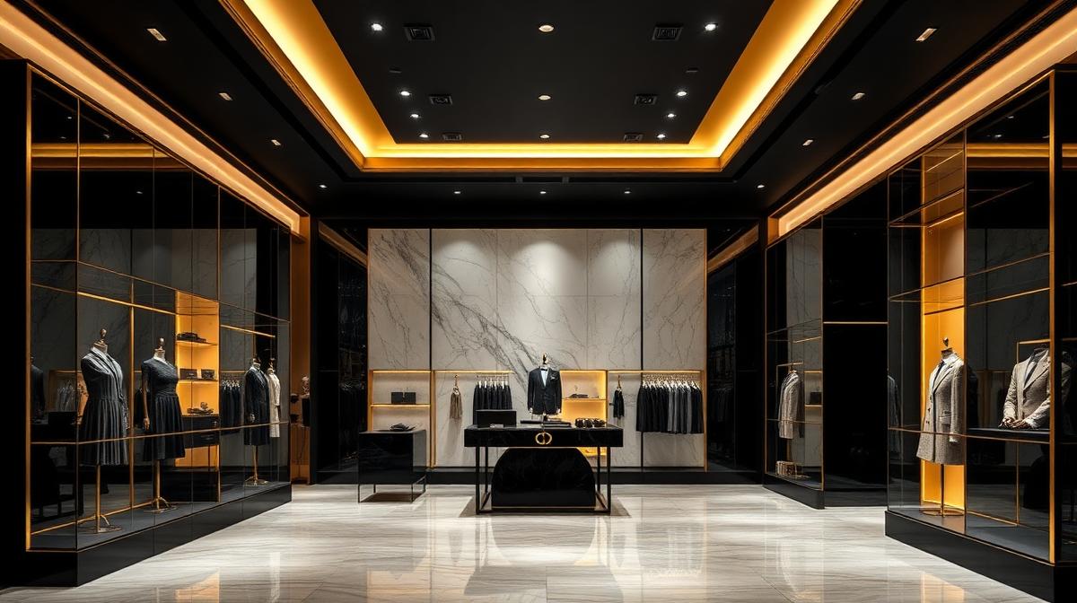
Luxury retail color operates under fundamentally different rules than mass-market retail. Where mainstream stores use bright colors to stimulate impulse purchases, luxury environments use restrained, sophisticated palettes to slow customers down, elevate their self-perception, and justify extraordinary price points. Understanding these color dynamics reveals why a $50 handbag shop feels completely different from a $5,000 one — even before you see a price tag.
The Architecture of Exclusivity
The Luxury Color Hierarchy
Luxury retail environments follow a strict chromatic hierarchy:
| Layer | Color Role | Typical Palette | Purpose |
|---|---|---|---|
| Architecture | Dominant neutral | White marble, travertine, dark wood | Timelessness, permanence |
| Fixtures | Secondary neutral | Brushed gold, polished chrome, black lacquer | Precision, quality signals |
| Product display | Product colors | Varies by brand | Star of the show |
| Accent | Brand signature | Hermès orange, Tiffany blue, Cartier red | Identity, recognition |
| Lighting | Warm ambient | 2700-3000K warm tones | Flattery, desire |
The "Less Is More" Principle
Luxury retail uses chromatic restraint strategically:
- Fewer colors = higher perceived value: Research shows that environments with limited palettes are perceived as more expensive
- Negative space: Empty wall space in neutral tones suggests abundance of resources
- Product isolation: Each item gets its own color "stage," reducing visual competition
- Controlled surprise: A single unexpected color element (a red wall, a blue vase) creates memorable impact
Signature Brand Colors in Retail Spaces
Hermès: The Orange Strategy
Hermès orange (#FF6600) is one of the most recognizable luxury colors:
- Origin: Reportedly adopted during WWII when only orange cardboard was available for boxes
- In-store application: Orange appears in packaging, some displays, and branded elements — never on walls
- Contrast principle: Orange against cream, brown, and natural leather creates warm sophistication
- Scarcity signal: Orange is used precisely, never abundantly, maintaining its specialness
Tiffany & Co.: The Blue Box Effect
Tiffany Blue (#0ABAB5) demonstrates color as intellectual property:
- Trademarked color: One of few successfully trademarked colors in retail
- Store presence: Blue appears in display cases, packaging, and subtle architectural details
- White pairing: Tiffany stores use white extensively, making blue appearances feel precious
- Emotional conditioning: The blue box triggers anticipatory joy before the product is seen
Louis Vuitton: The Brown Foundation
Louis Vuitton brown (#6B3A2A) anchors the brand:
- Heritage reference: Brown connects to the leather trunk heritage
- Warmth and trust: Brown communicates reliability and craftsmanship
- Gold complement: Brown paired with gold creates classic luxury without ostentation
- Store design: Warm wood, leather upholstery, and amber lighting extend the brown identity
Cartier: The Red Authority
Cartier red (#B22222) commands attention:
- Passion and power: Red communicates the emotional intensity of jewelry purchases
- Selective use: Red appears in boxes, bags, and select interior moments
- Against white/cream: Red on neutral backgrounds maximizes impact
- Evening association: Deep red suggests formal occasions where jewelry is worn
The Neutral Luxury Palette
Why Neutrals Dominate Luxury
Neutral environments serve luxury in ways color cannot:
- Product supremacy: Neutral backgrounds ensure merchandise is the visual focus
- Timelessness: Neutrals don't date — critical for brands investing in permanent retail spaces
- Cross-cultural safety: Neutrals avoid color associations that vary by culture
- Sophistication signaling: Restraint itself communicates confidence and taste
The Luxury Neutral Spectrum
| Neutral | Hex | Temperature | Luxury Association |
|---|---|---|---|
| Bright white | #FFFFFF | Cool | Gallery, contemporary, architectural |
| Warm white | #FAF9F6 | Warm | Classic, inviting, European luxury |
| Champagne | #F7E7CE | Warm | Celebration, femininity, jewelry |
| Taupe | #483C32 | Neutral | Understated, sophisticated, timeless |
| Charcoal | #36454F | Cool | Masculine luxury, technology, modern |
| Ebony | #1A1A1A | Neutral | Drama, nighttime, exclusive |
Material Color in Luxury Retail
Stone and Mineral Colors
Luxury stores use material colors that cannot be replicated cheaply:
- Calacatta marble (#F5F0E8 with gray veining): Each slab unique, signaling authentic investment
- Travertine (#E8D8C4): Warm, ancient, connected to Roman luxury traditions
- Onyx (#353839): Translucent depth when backlit, dramatic exclusivity
- Granite (#808080): Permanence, strength, geological time scale
Metal Colors in Luxury
- Polished brass (#B5A642): Warm luxury, traditional craftsmanship
- Brushed gold (#C9A96E): Modern luxury, subtle shimmer
- Rose gold (#B76E79): Contemporary femininity, jewelry reference
- Polished chrome (#C0C0C0): Clean modernity, technology luxury
- Blackened steel (#1A1A1A): Industrial luxury, avant-garde design
Lighting Color and Luxury Perception
The Flattering Light Principle
Luxury retail lighting serves one primary purpose: making products and customers look their best.
- Warm ambient (2700-3000K): Creates golden atmosphere, flatters skin tones
- Product spotlights (3000K, CRI 95+): Accurate color rendering for merchandise
- Jewelry lighting (4000K, high CRI): Slightly cooler to make diamonds sparkle while keeping gold warm
- Dressing room lighting (2700K, diffused): The most critical lighting — must be flattering or sales suffer
Light as Color
Some luxury stores use light itself as a color element:
- Backlit onyx walls: Translucent stone glowing from behind creates otherworldly color
- Cove lighting: Indirect colored light washing walls in subtle branded tones
- Seasonal light shifts: Warmer in winter, slightly cooler in summer
- Time-of-day adaptation: Morning light cooler and brighter, evening warmer and more intimate
Window Display Color Psychology
The Street-Level Color Decision
Window displays are the first color encounter:
- High contrast: Products must read from across the street
- Seasonal narrative: Color stories that change with fashion seasons
- Brand consistency: Every window must be instantly identifiable as that brand
- Night performance: Lit windows serve as advertising after hours — color must work under artificial light
Display Color Strategies
| Strategy | Description | Best For |
|---|---|---|
| Product-forward | Neutral backdrop, product is the color | Jewelry, accessories |
| Color story | Monochromatic themed display | Fashion, seasonal campaigns |
| Dramatic contrast | Dark background, spotlit product | Watches, premium electronics |
| Environmental | Lifestyle scene with curated color | Lifestyle brands, home luxury |
Digital-Physical Color Continuity
The Omnichannel Color Challenge
Luxury brands must maintain color consistency from digital to physical:
- Website colors: Must match in-store brand colors precisely
- Product photography: Accurate color representation prevents returns
- Social media: Filters and editing must stay within brand color guidelines
- Packaging unboxing: The at-home color experience must echo the in-store experience
The Future of Luxury Retail Color
Emerging Trends
- Sustainability colors: Earth tones and natural materials signaling environmental responsibility
- Digital integration: LED walls and screens adding dynamic color capabilities
- Experiential retail: Immersive colored environments for brand storytelling
- Personalization: Adjusting store color and lighting for individual client appointments
- Biophilic luxury: Living green walls and natural elements adding organic color variation
The color psychology of luxury retail ultimately serves a single purpose: creating an environment where extraordinary prices feel not just justified, but inevitable. When every color choice communicates quality, exclusivity, and timelessness, the customer's internal narrative shifts from "Why is this so expensive?" to "I deserve this."