Victorian Color Revival: 19th Century Palettes for Modern Design
· Coloracci Team
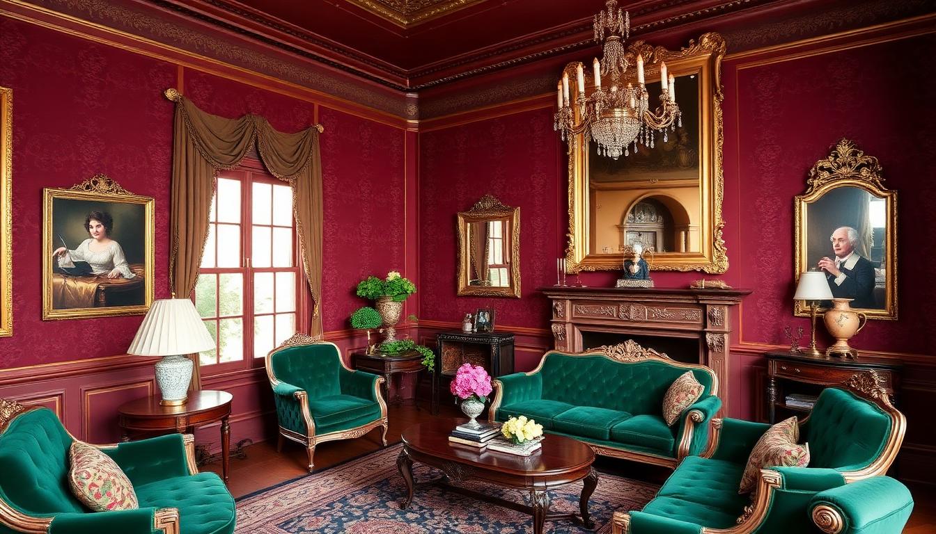
The Victorian era (1837-1901) produced some of the most complex and saturated color palettes in design history. Far from the stereotype of somber, dusty rooms, Victorian interiors embraced rich jewel tones, intricate patterns, and dramatic contrasts that created spaces of extraordinary visual intensity. Today, as contemporary design seeks alternatives to the minimalism that has dominated for decades, Victorian colors are experiencing a significant revival — adapted for modern sensibilities while retaining their characteristic depth and drama.
The Victorian Color Revolution
The Victorian era transformed Western color use through technological, economic, and cultural changes that made rich, saturated colors available to the middle class for the first time.
The Chemistry of Victorian Color
Scientific advances revolutionized Victorian color options:
- Synthetic dyes (1856+): William Perkin's mauveine opened the floodgates for affordable, vivid colors
- Aniline dyes: Bright, colorfast pigments in every hue
- Chrome pigments: Stable, intense yellows and greens
- Coal tar derivatives: Cheap base material for endless color innovation
For the first time, colors that had been rare and expensive became mass-market accessible. Victorian consumers responded with enthusiasm that contemporary observers found excessive.
The Four-Color Room
Victorian interior design theory, particularly from the 1860s onward, championed the "four-color room":
| Role | Typical Victorian Color | Modern Equivalent | Application |
|---|---|---|---|
| Primary (walls) | Deep red, green, or blue | Burgundy, forest, navy | Main wall surfaces |
| Secondary (furnishings) | Complementary contrast | Rust, gold, cream | Furniture, drapery |
| Tertiary (accents) | Lighter variant | Rose, sage, sky | Smaller elements |
| Quaternary (trims) | Gold or strong contrast | Brass, black, white | Moldings, details |
This systematic approach to color complexity was unprecedented in domestic design.
The Victorian Palette: Specific Colors
Victorian color preferences can be mapped to specific hues that remain distinctive today.
Deep Reds and Burgundies
Red dominated Victorian interiors as the color of luxury and respectability:
- Pugin red: A. W. N. Pugin's preferred deep crimson for Gothic Revival
- Wine burgundy: #722F37 — the quintessential Victorian parlor color
- Claret: #7F1734 — darker, browner red for masculine spaces
- Crimson lake: Natural dye red with blue undertone
These reds appeared on walls, in upholstery, in drapery, and as accents — often simultaneously in the same room.
Forest and Bottle Greens
Green represented nature, health, and the emerging environmental consciousness:
- Victorian forest: #228B22 — deep, saturated natural green
- Emerald green: #50C878 — jewel-toned, sophisticated
- Schweinfurt green: Arsenic-based, toxic, but brilliantly saturated
- Olive drab: #6B8E23 — quieter green for secondary spaces
The deadly "Paris green" and "emerald green" (copper acetoarsenite) killed untold numbers through wallpaper and fabric off-gassing — a cautionary tale about color obsession.
Navy and Midnight Blues
Blue conveyed respectability and stability:
- Midnight blue: #191970 — deep, almost black
- Prussian blue: #003153 — synthetic, affordable, widely used
- Royal navy: Traditional uniform color adapted for domestic use
- Wedgwood blue: #5B9EA0 — lighter, referencing ceramic traditions
Gold and Gilt Accents
Gold unified Victorian color complexity:
- Gold leaf: Real gold for picture frames, mirrors, architectural details
- Bronze powder: Cheaper metallic paint for mass-market "gilt"
- Brass: Hardware, lighting, furniture fittings
- Mustard yellow: #FFDB58 — painted alternative to metal gold
The Victorian Pattern Explosion
Victorian color complexity was amplified by pattern — multiple patterns, often in the same room, each with its own color scheme.
Wallpaper Madness
Victorian wallpaper achieved unprecedented visual intensity:
- Aesthetic Movement: Flat, stylized patterns in coordinated palettes
- William Morris: Nature-inspired patterns with specific color harmonies
- Oriental influences: Japanese and Chinese patterns with exotic color
- Gothic Revival: Medieval-inspired patterns in deep, saturated hues
Rooms often featured wallpaper on every wall plus the ceiling — total pattern immersion.
Textile Overload
Victorian soft furnishings added additional color layers:
- Upholstery: Velvet, brocade, and damask in rich jewel tones
- Drapery: Heavy curtains in contrasting or coordinating colors
- Carpets: Patterned rugs adding yet more color complexity
- Throw pillows and table covers: Every surface received color treatment
The Victorian parlor was a Gesamtkunstwerk of color and pattern.
Victorian Color Theory and Advice
Victorian design writers developed elaborate color theories that influenced millions of homeowners.
Christopher Dresser's Scientific Color
Christopher Dresser (1834-1904) applied scientific principles to design:
- Botanical color study: Japanese and exotic plant color as inspiration
- Functional color: Different colors for different room functions
- Simplicity advocacy: Surprisingly restrained compared to contemporaries
Dresser's work bridges Victorian excess and emerging modernist restraint.
The Ladies' Guides
Domestic advice books offered detailed color instruction:
- "Appropriate" colors: Gendered and function-specific palettes
- Harmony rules: What colors "go together" by Victorian standards
- Status signaling: Colors that conveyed wealth and taste
- Moral implications: Some colors considered "fast" or improper
These guides reveal Victorian color anxiety — with so many new options, how to choose correctly?
Arts and Crafts: The Victorian Color Alternative
The Arts and Crafts movement, while technically Victorian, offered different color values.
William Morris Color Philosophy
Morris (1834-1896) developed distinctive color approaches:
- Natural dyes: Return to pre-synthetic color traditions
- Plant-based palettes: Colors derived from madder, indigo, weld
- Subdued intensity: Rich but not garish, saturated but not harsh
- Nature as model: Colors observed in English gardens and countryside
Morris & Co. patterns remain in production, testament to their enduring color appeal.
The English Vernacular
Arts and Crafts architecture employed:
- White: Rejecting Victorian dark wall colors for lightness
- Natural wood: Oak, walnut, and chestnut as color elements
- Green: Connecting to gardens and landscape
- Rust and ochre: Earth colors from local materials
This palette influenced 20th-century design more than the darker Victorian mainstream.
Victorian Colors by Room Function
Victorian design assigned specific colors to room types based on function, time of day, and gender associations.
The Parlor (Drawing Room)
The formal reception space demanded:
- Red: Wealth, hospitality, stimulation
- Gold accents: Luxury and sophistication
- Green: Balance to red, nature reference
- Complex pattern: Wallpaper, carpet, textiles in coordinated schemes
The Dining Room
Victorian dining rooms used color to stimulate appetite:
- Red: Appetite stimulation, conviviality
- Green: Digestive aid, nature, freshness
- Warm lighting: Color temperature enhancing food appearance
- Dark wood: Mahogany and walnut as foundational color
The Bedroom
Bedroom color reflected rest and intimacy:
- Blue: Calm, cool, peaceful
- Green: Fresh, healthful, natural
- White: Clean, pure, hygienic (increasingly toward the end of the era)
- Pink: Feminine, soft, delicate (for women's rooms)
The Study/Library
Masculine spaces favored:
- Green: Eye rest, concentration, serious purpose
- Brown: Leather, wood, tobacco — masculine associations
- Dark red: Wine, club atmosphere
- Tobacco tones: Stained wood, leather bindings
The Victorian Gothic Revival
A.W.N. Pugin and the Gothic Revival created the most distinctive Victorian color environment.
Ecclesiastical Colors Domesticated
Gothic Revival brought church colors into homes:
- Pugin blue: Deep, rich azure for walls and ceilings
- Crimson: Blood, sacrifice, medieval ecclesiastical reference
- Gold: Divine light, church decoration
- Jewel tones: Ruby, sapphire, emerald — the colors of stained glass
The secular home became quasi-religious space through color.
The Great Exhibition and International Influence
The 1851 Crystal Exhibition exposed Victorians to global color:
- Indian: Rich textiles and carved wood colors
- Chinese: Porcelain blues and lacquer reds
- Japanese: Exotic woods and patinated metals
- Middle Eastern: Islamic geometric patterns and tile colors
Victorian interiors became museums of global color influence.
The Decline and Modernist Rejection
By the 1890s and into the Edwardian era, Victorian color faced reaction.
The White Reaction
The end of Victoria's reign saw:
- White walls: Rejection of dark, saturated room colors
- Simplified palette: Fewer colors, less pattern
- Natural light: Larger windows, lighter treatments
- Hygiene obsession: White as clean and healthy
This presaged 20th-century modernism's color restraint.
Modernist Condemnation
20th-century modernists explicitly rejected Victorian color:
- Adolf Loos: "Ornament is crime" included color pattern
- Le Corbusier: White architecture as moral imperative
- Bauhaus: Functional color, no decorative excess
- Mid-century minimalism: Neutral palettes as sophisticated
Victorian color became synonymous with bad taste, clutter, and psychological oppression.
The Victorian Revival: 21st Century
Contemporary design has rediscovered Victorian color values.
Why Victorian Now?
Several factors drive the Victorian color revival:
- Minimalism fatigue: Decades of white and gray create appetite for richness
- Digital anxiety: Screen-saturated lives crave tactile, complex physical environments
- Heritage appreciation: Historic preservation revealing Victorian color sophistication
- Sustainability: Victorian longevity values over disposable culture
- Individualism: Victorian personal expression versus mass-market sameness
Contemporary Victorian Color
Today's Victorian-influenced design adapts the palette:
- Saturated but not garish: Rich colors with contemporary sophistication
- Curated pattern: Multiple patterns with careful coordination
- Mixed metals: Brass, copper, and bronze as Victorian designers used
- Dark walls: Navy, forest, burgundy returning to interiors
- Ceiling color: The "fifth wall" receiving color attention
Applying Victorian Colors Today
Designers can use Victorian color principles without period recreation.
The Modern Victorian Palette
Contemporary adaptations of Victorian colors:
| Victorian Original | Modern Adaptation | Application |
|---|---|---|
| Deep burgundy | Rich wine | Accent walls, furniture |
| Forest green | Saturated emerald | Kitchens, studies |
| Navy blue | Midnight blue | Bedrooms, dining rooms |
| Gold | Brass and bronze | Hardware, lighting |
| Mustard | Ochre and turmeric | Accents, textiles |
| Cream | Warm white | Ceilings, trim |
Victorian Color Principles
- Embrace saturation: Don't fear rich, deep colors
- Layer patterns: Multiple patterns in coordination
- Use the ceiling: Fifth wall color adds sophistication
- Mixed metals: Don't match finishes perfectly
- Dark and light contrast: Create drama through value difference
- Warm artificial light: Color temperature matters for Victorian colors
Specific Victorian Color Combinations
Proven palettes from Victorian sources:
The Jewel Box
- Deep teal: #006D77
- Ruby red: #9B2335
- Gold: #D4AF37
- Cream: #F5F5DC
The Library
- Forest green: #228B22
- Tobacco brown: #6B4423
- Brass: #B5A642
- Ivory: #FFFFF0
The Drawing Room
- Burgundy: #722F37
- Rose: #BC8F8F
- Gold: #FFD700
- Charcoal: #36454F
Victorian Color Resources
Designers exploring Victorian palettes can reference:
- Historic paint collections: Farrow & Ball, Benjamin Moore historic lines
- Museum interiors: Period rooms at the Victoria & Albert, Metropolitan Museum
- William Morris & Co.: Continued production of authentic patterns and colors
- Victorian house museums: Preserved interiors showing original color schemes
- Period publications: Reproduction advice books and design journals
The Victorian color revival isn't mere nostalgia — it's recognition that human environments need richness, complexity, and saturation. After decades of minimalism, Victorian colors offer a path to visual satisfaction without sacrificing sophistication.