Art Deco Color Palettes: The Glamorous Legacy of 1920s Design
· Coloracci Team
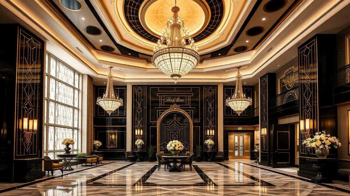
Art Deco emerged in the 1920s as a celebration of modernity, luxury, and geometric precision. Its color palette — bold, unapologetic, and dripping with glamour — remains one of the most recognizable and influential in design history. Understanding Art Deco's chromatic language reveals how color can simultaneously communicate wealth, progress, and artistic sophistication.
The Gold Standard: Metallics in Art Deco
Gold is the defining color of Art Deco. Not the warm, understated gold of traditional luxury, but a brilliant, almost theatrical gold that announced the arrival of a new era.
The Psychology of Art Deco Gold
Art Deco gold (#D4AF37) communicates specific values:
- Machine-age optimism: Gold reflected the excitement about industrial progress and mass production
- Democratic luxury: Unlike aristocratic gold, Art Deco gold was accessible — appearing in movie theaters, department stores, and public buildings
- Geometric precision: Gold in Art Deco was contained within sharp geometric forms, not flowing organic patterns
- Sunburst energy: The iconic Art Deco sunburst motif used gold to symbolize a radiating, confident future
Gold Application Framework
| Application | Hex Code | Art Deco Context |
|---|---|---|
| Primary gold | #D4AF37 | Architectural details, typography |
| Champagne gold | #F7E7CE | Background tones, fabric accents |
| Bronze gold | #CD7F32 | Metalwork, furniture details |
| Rose gold | #B76E79 | Feminine-coded luxury spaces |
| Antique gold | #C9B037 | Aged elegance, restoration projects |
Black and Gold: The Signature Combination
The black-and-gold pairing is Art Deco's most iconic color relationship. This combination creates maximum visual drama through extreme contrast.
Why Black and Gold Works
The psychological impact of this pairing:
- Maximum contrast: Black (#1A1A2E) against gold creates the highest possible visual tension
- Night and day: The combination evokes the glamour of nightlife — jazz clubs, speakeasies, and theatrical performances
- Masculine-feminine balance: Black provides structure while gold provides warmth
- Timeless luxury: This combination has maintained its luxury association for over a century
The Chrysler Building Effect
The Chrysler Building's crown demonstrates how Art Deco metallics work at architectural scale:
- Nirosta steel: The distinctive silver-toned stainless steel caught light differently at every angle
- Eagle gargoyles: Chrome automotive elements translated to architectural ornament
- Triangular windows: Geometric forms created patterns of light and shadow
- Sunburst crown: The tiered arches culminated in a spire that captured and reflected sunlight
Jewel Tones: The Art Deco Accent Palette
Beyond metallics, Art Deco embraced rich jewel tones that referenced precious gemstones.
Emerald Green: The Gatsby Color
Emerald green (#046307, #50C878) held special significance:
- Wealth association: Green explicitly references money, prosperity, and gemstones
- Egyptian influence: Art Deco drew heavily from Egyptian art following Tutankhamun's tomb discovery (1922)
- Nature abstracted: Green in Art Deco was never natural — always geometric, stylized, precise
- Contrast power: Green against gold and black created visually striking three-tone compositions
Sapphire Blue: The Depth Color
Deep blues (#0F52BA, #1B3A5C) provided:
- Nocturnal atmosphere: The deep blue of night skies enhanced the nightlife associations
- Water reference: Ocean liner culture and aquatic motifs used sapphire blue extensively
- Celestial drama: Stars and astronomical motifs against deep blue backgrounds
- Cooling effect: Blue balanced the warmth of gold and the intensity of red
Ruby Red: The Drama Color
Art Deco red (#9B111E, #8B0000) conveyed:
- Theatrical intensity: Red velvet, red lacquer, red lips — the color of performance
- Asian influence: Chinese lacquerware and Japanese red heavily influenced Art Deco
- Power signaling: Red in Art Deco was always bold, never subtle
- Cinematic association: Red became linked to Hollywood glamour during this era
The Geometric Color Framework
Art Deco's relationship with geometry fundamentally shaped how colors were applied.
Color Within Lines
Unlike Art Nouveau's flowing organic color, Art Deco constrained color within geometric boundaries:
- Stepped forms: Colors changed at geometric steps, creating zigzag and pyramid effects
- Chevron patterns: V-shaped color patterns became signatures of the movement
- Fan motifs: Radiating color from a central point, often using gradients within rigid forms
- Parallel lines: Color stripes of varying widths created rhythm and movement
The Ziggurat Color Strategy
The stepped pyramid form influenced color gradation:
- Base: Darkest values — black, deep navy, forest green
- Middle tiers: Rich jewel tones — emerald, sapphire, ruby
- Upper tiers: Lighter metallics — silver, bronze, copper
- Apex: Brightest — gold, white, or chrome
Art Deco in Interior Design
Art Deco interiors used color to create specific atmospheric effects that remain influential today.
The Hotel Lobby Strategy
Grand Art Deco hotel lobbies followed predictable color patterns:
| Element | Color Strategy | Purpose |
|---|---|---|
| Floors | Black/white marble (#1A1A1A / #F5F5F5) | Geometric drama, wayfinding |
| Walls | Warm neutrals (#E8DCC8) | Sophistication without overwhelm |
| Metalwork | Polished brass (#B5A642) | Luxury signaling, warmth |
| Upholstery | Jewel tones | Color accent, visual interest |
| Lighting | Warm amber (#FFBF00) | Atmospheric warmth, flattering light |
| Ceiling | Deep color or gold detail | Upward visual draw, grandeur |
The Miami Beach Revival
Miami's Art Deco Historic District introduced a pastel variation:
- Pastel pink (#FFB6C1): Tropical femininity, sunset associations
- Mint green (#98FF98): Tropical freshness, ocean reference
- Lavender (#E6E6FA): Softened luxury, evening sky
- Sky blue (#87CEEB): Ocean and sky continuity
- Coral (#FF7F50): Warm tropical energy
These pastels adapted Art Deco's geometric vocabulary to a subtropical climate, proving the style's color flexibility.
Art Deco Typography and Color
Art Deco typefaces used color in specific ways that reinforced the movement's visual language.
The Display Type Palette
- Gold on black: Maximum impact for headlines and signage
- White on deep blue: Nautical luxury, movie poster drama
- Chrome silver on dark gray: Industrial sophistication
- Red on cream: Theatrical announcements, invitation formality
Inline and Outline Effects
Art Deco typography often used:
- Inline gold: Thin gold lines within letter forms (#D4AF37 within #1A1A2E)
- Drop shadows: Colored shadows creating dimensional effects
- Gradient fills: Letters transitioning from one jewel tone to another
- Metallic effects: Simulated chrome or brass within letterforms
Art Deco in Modern Digital Design
Contemporary designers are rediscovering Art Deco's color principles for digital applications.
Website Design Applications
Art Deco principles translate to web design through:
- Dark mode elegance: Black backgrounds with gold accents (#D4AF37 on #0D0D0D)
- Geometric dividers: Colored chevrons and zigzags separating content sections
- Luxury landing pages: Jewel-tone hero sections for premium products
- Typography hierarchy: Gold headlines, silver subheadings, cream body text
Brand Identity Applications
Modern brands channeling Art Deco:
- Luxury hotels: The Peninsula, The Ritz — maintaining gold and black identity systems
- Premium spirits: Art Deco-inspired bottle design using metallic inks
- Fashion houses: Geometric patterns in gold, black, and jewel tones
- Event design: Gatsby-themed celebrations using the full Art Deco palette
Cultural Context: Why Art Deco Colors Endure
Art Deco's color palette survives because it addresses fundamental human desires:
The Optimism Factor
Art Deco emerged after World War I, during a period of cultural optimism:
- Forward-looking: Gold and chrome represented technological progress
- Celebratory: Rich colors expressed the joy of survival and new possibilities
- Confident: Bold geometric applications rejected the uncertainty of the war years
- Inclusive luxury: Art Deco democratized luxury aesthetics, making them accessible to the middle class
The Nostalgia Cycle
Art Deco colors experience revival cycles approximately every 20-30 years:
- 1960s: Mid-century designers rediscovered geometric precision
- 1980s: Postmodern architecture embraced Art Deco ornamentation
- 2010s: The Great Gatsby film (2013) triggered massive revival interest
- 2020s: Dark mode UI design aligns naturally with Art Deco's black-and-gold aesthetic
Designing with Art Deco Colors Today
The Modern Art Deco Palette
For contemporary applications, adapt the classic palette:
| Classic | Modern Adaptation | Hex | Usage |
|---|---|---|---|
| Bright gold | Muted gold | #C9A96E | Subtle luxury, warm accents |
| Pure black | Soft black | #1A1A2E | Deep backgrounds with warmth |
| Chrome silver | Brushed steel | #C0C0C0 | Modern industrial references |
| Emerald green | Muted emerald | #2E8B57 | Natural luxury, sustainability |
| Ruby red | Burgundy | #722F37 | Sophisticated depth |
Common Mistakes to Avoid
- Overgolding: Too much gold becomes gaudy rather than glamorous — use the 10-15% accent rule
- Flat metallics: Art Deco metallics always had dimension — use gradients, not flat colors
- Missing geometry: Art Deco colors without geometric structure lose their identity
- Ignoring contrast: The style depends on high contrast — muted palettes lose impact
- Period confusion: Mixing Art Deco with Art Nouveau creates visual incoherence
Art Deco's enduring appeal lies in its unapologetic boldness. In a design landscape that often defaults to safe, minimal palettes, Art Deco reminds us that color can be theatrical, geometric, and gloriously excessive — and still be sophisticated.