Pop Art Color Psychology: Bold Palettes That Changed Design Forever
· Coloracci Team
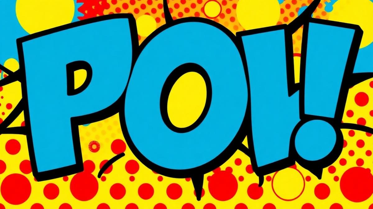
Pop Art Color Psychology: Bold Palettes That Changed Design Forever
Pop Art didn't just challenge the art establishment—it rewrote the rules of color in visual culture. When Andy Warhol silk-screened Marilyn Monroe in electric pink, cyan, and yellow, he wasn't merely creating art. He was building a color language that would dominate advertising, branding, and digital design for decades to come.
The Pop Art Color Revolution
Breaking from Abstract Expressionism
Before Pop Art, the dominant movement—Abstract Expressionism—favored muted, emotionally complex palettes. Artists like Mark Rothko used deep burgundies (#722F37) and somber blues (#2C3E6B) to evoke existential contemplation. Pop Art artists deliberately rejected this approach.
The Pop Art palette was built on three principles:
- Maximum saturation: Colors pushed to their most intense values
- Commercial origin: Colors borrowed from consumer packaging and advertising
- Flat application: No blending, no gradients—solid, unapologetic blocks of color
The Core Pop Art Palette
| Color | Hex Code | Pop Art Role | Modern Application |
|---|---|---|---|
| Hot Pink | #FF69B4 | Warhol's signature femininity | Social media branding |
| Electric Blue | #0047AB | Commercial product packaging | Tech startup logos |
| Cadmium Yellow | #FFF600 | Attention-grabbing headlines | CTA buttons |
| Vermillion Red | #E34234 | Consumer desire and urgency | Sale banners |
| Cyan | #00FFFF | Printing process reference | Digital interface accents |
| Black | #000000 | Bold outlines and contrast | Typography and borders |
Andy Warhol's Color Strategy
The Campbell's Soup Revelation
Warhol's Campbell's Soup Cans (1962) weren't just about consumer culture—they were a masterclass in color recognition psychology. The red-and-white label combination (#CC0000 over #FFFFFF) had already been optimized by Campbell's marketing team for maximum shelf visibility. Warhol recognized that commercial designers had solved problems fine artists hadn't even attempted.
The Marilyn Diptych Color System
Warhol's Marilyn Monroe prints demonstrate what modern designers call color variation branding:
- Hot Pink (#FF1493) + Gold (#FFD700): Glamour and excess
- Turquoise (#40E0D0) + Orange (#FF6600): Artificial beauty
- Lavender (#E6E6FA) + Green (#00FF00): Otherness and alienation
Each color combination told a different emotional story using the same image—a technique now standard in A/B testing for digital marketing campaigns.
Screen Printing and Color Limitation
Warhol's screen printing process imposed constraints that became creative advantages. Limited to flat, opaque inks, he developed what we now call the "Warhol Effect":
- High contrast base: Black outlines separate color regions
- Deliberate misregistration: Slight color offsets create dynamism
- Limited palette per print: 3-4 colors maximum for maximum impact
This approach directly influenced modern design systems that use limited color palettes for brand consistency.
Roy Lichtenstein and the Ben-Day Dot Revolution
Color Through Optical Mixing
Lichtenstein's comic-book style used Ben-Day dots—small, evenly-spaced dots of color that create the illusion of tones and gradients when viewed from a distance. This technique anticipated digital display technology by decades.
His primary palette was intentionally limited:
- Primary Red (#FF0000): Emotion and action
- Primary Blue (#0000FF): Stability and sky
- Primary Yellow (#FFFF00): Energy and light
- Black (#000000): Structure and definition
- White (#FFFFFF): Space and highlight
The Psychology of Comic Color
Lichtenstein understood that comic book colors carried specific emotional associations:
- Red backgrounds: Danger, passion, urgency
- Yellow speech bubbles: Communication, importance
- Blue tones: Contemplation, distance, coolness
These associations weren't random—they were refined over decades by comic book colorists working with the four-color printing process (CMYK).
Claes Oldenburg and Object Color
The "Wrong Color" Technique
Oldenburg's oversized sculptures of everyday objects—hamburgers, typewriters, clothespins—often used deliberately "wrong" colors. A blue hamburger or a pink typewriter forces the viewer to see the object's form rather than its familiar identity.
This technique is now used in:
- Product design: Dyson's colorful appliances
- Tech branding: Apple's iMac color revolution
- Fashion: Balenciaga's unconventional color choices
Pop Art's Influence on Modern Design
Digital Design and the Pop Art Legacy
The flat design movement that dominated UI/UX from 2013 onward owes a direct debt to Pop Art aesthetics:
| Pop Art Principle | Modern Application | Example |
|---|---|---|
| Flat color blocks | Material Design | Google's interface system |
| Bold outlines | Neo-brutalist web design | Figma's marketing site |
| Limited palette | Design systems | Stripe's 5-color system |
| Commercial aesthetic | Social media design | Instagram's gradient logo |
| Repetition | Grid-based layouts | Pinterest's card system |
Brand Identity and Pop Art Colors
Several major brands have explicitly adopted Pop Art color strategies:
Spotify uses the Pop Art principle of a single, bold color (#1DB954) against dark backgrounds—echoing Warhol's high-contrast approach.
Snapchat's yellow (#FFFC00) recalls the aggressive brightness of Pop Art's palette, deliberately standing out among more conservative tech brand colors.
Supreme's red-and-white box logo (#E21836 on #FFFFFF) directly references Barbara Kruger's Pop Art-influenced typographic work.
Social Media and the Neo-Pop Aesthetic
Instagram, TikTok, and Pinterest have created a new "Neo-Pop" aesthetic where:
- Saturated colors perform better in algorithmic feeds
- Bold, flat graphics are more shareable than subtle designs
- Color contrast is essential for small-screen visibility
Research shows that social media posts using Pop Art-inspired saturated colors receive 23% more engagement than those using muted palettes.
Designing with Pop Art Colors Today
The 60-30-10 Pop Art Rule
When applying Pop Art principles to modern design, adapt the classic 60-30-10 rule:
- 60% Neutral base: White or black for breathing room
- 30% Primary impact: One bold, saturated color for brand identity
- 10% Accent pop: A contrasting bright color for CTAs and highlights
Color Combinations That Work
The Warhol: Hot Pink (#FF69B4) + Electric Yellow (#FFF000) + Black (#000000)
- Best for: Fashion brands, entertainment, youth marketing
The Lichtenstein: Primary Red (#FF0000) + Primary Blue (#0000FF) + Yellow (#FFFF00)
- Best for: Comic-inspired branding, retro campaigns, game design
The Haring: Bright Green (#00FF00) + Orange (#FF6600) + Pink (#FF1493)
- Best for: Non-profit, activism, street culture brands
Accessibility Considerations
Pop Art colors present unique accessibility challenges:
- High saturation can cause eye fatigue: Use sparingly for UI elements
- Pure primaries often fail contrast ratios: Red (#FF0000) on white only achieves a 3.99:1 ratio—below WCAG AA standards
- Color combinations for colorblind users: Avoid red-green combinations; use blue-yellow instead
Always test your Pop Art-inspired palettes with a color contrast checker and colorblind simulator to ensure inclusivity.
Building Pop Art Palettes with AI
Creating authentic Pop Art color combinations requires understanding the movement's core principles. Modern AI tools like Coloracci's palette generator can analyze Pop Art masterworks and extract their color relationships, then adapt them for your specific design needs.
Whether you're designing a social media campaign, building a brand identity, or creating eye-catching CTAs, Pop Art's color legacy offers timeless principles: be bold, be deliberate, and never apologize for making an impact.
Want to explore more color movements? Read about Bauhaus Color Theory, Art Deco Colors, or Street Art & Graffiti Colors.