Bauhaus Color Theory: How a German Art School Shaped Modern Design Forever
· Coloracci Team
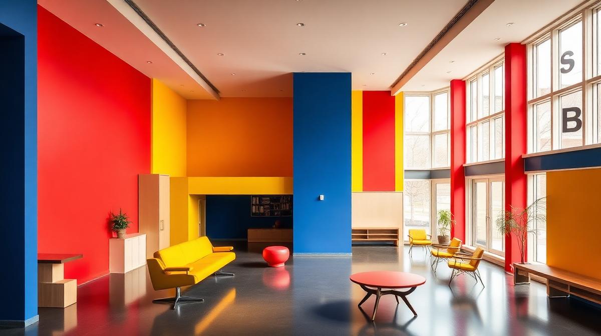
The Bauhaus school operated for only 14 years (1919-1933), yet its color theory fundamentally reshaped how the modern world understands and applies color. From the primary-color furniture of IKEA to the color systems of Google's Material Design, Bauhaus principles permeate contemporary design so deeply that most designers use them without realizing their origin.
The Three Bauhaus Color Masters
Johannes Itten: The Color Wheel Pioneer
Itten developed the most systematic color education program in history during his time at the Bauhaus (1919-1923).
Itten's Seven Color Contrasts
| Contrast | Description | Example |
|---|---|---|
| Hue | Pure color difference | Red vs. blue vs. yellow |
| Light-dark | Value difference | Light blue vs. dark blue |
| Cold-warm | Temperature difference | Orange (warm) vs. cyan (cool) |
| Complementary | Opposite colors | Red vs. green |
| Simultaneous | Perceived complement | Gray appears warm next to blue |
| Saturation | Intensity difference | Vivid red vs. muted red |
| Extension | Area proportion | Large blue vs. small orange |
The Color Sphere
Itten's 12-part color wheel organized color into:
- 3 Primary colors: Red (#FF0000), Yellow (#FFFF00), Blue (#0000FF)
- 3 Secondary colors: Orange, Green, Violet (mixed from primaries)
- 6 Tertiary colors: Red-orange, Yellow-orange, Yellow-green, Blue-green, Blue-violet, Red-violet
This systematic approach democratized color knowledge — anyone could learn to work with color confidently.
Wassily Kandinsky: Color and Emotion
Kandinsky taught at the Bauhaus from 1922-1933 and developed the most psychologically oriented color theory.
Form-Color Correspondence
Kandinsky's famous assertion linked geometric forms to specific colors:
- Triangle = Yellow: Sharp, aggressive, angular energy
- Square = Red: Stable, grounded, material weight
- Circle = Blue: Spiritual, infinite, transcendent calm
This correspondence influenced everything from children's toys to corporate logos.
Kandinsky's Color Psychology Framework
| Color | Psychological Quality | Movement | Sound Equivalent |
|---|---|---|---|
| Yellow | Eccentric, sharp | Radiating outward | Trumpet |
| Blue | Concentric, deep | Drawing inward | Cello |
| Red | Stable, powerful | Static, grounded | Drum |
| Orange | Warm, spreading | Expanding gently | Viola |
| Green | Balanced, calm | Motionless | Violin |
| Violet | Mournful, heavy | Withdrawing | English horn |
Paul Klee: Color as Music
Klee (1921-1931) approached color as a visual equivalent of musical composition:
- Color chords: Combinations that create harmonic or dissonant effects
- Color rhythm: Repeated color patterns creating temporal-visual sequences
- Color melody: Progressive color changes telling visual stories
- Color counterpoint: Multiple color "voices" interacting simultaneously
The Primary Color Revolution
Why Primary Colors Define Bauhaus
The Bauhaus commitment to primary colors (red, yellow, blue) was philosophical:
- Universal: Primary colors were seen as fundamental, accessible to all cultures
- Democratic: Unlike subtle mixed colors requiring expertise, primaries were direct and honest
- Industrial: Primary colors were easiest to reproduce in mass manufacturing
- Functional: Each primary served a specific psychological and visual function
- Reductivist: Simplifying to essentials reflected the broader Bauhaus philosophy
Primary Colors in Bauhaus Architecture
The Bauhaus building in Dessau used primary colors strategically:
- Yellow: Applied to areas of social gathering and communication
- Blue: Used in contemplative spaces and workshop entrances
- Red: Applied to shared spaces and transitional areas
- White: Dominant surfaces providing neutral backgrounds
- Gray: Functional surfaces — floors, equipment, utilitarian elements
The Grid and Color: Systematic Design
Bauhaus Grid Systems
The Bauhaus developed grid-based design systems that assigned colors systematically:
- Color zoning: Different areas of a composition received different color assignments
- Proportional color: The amount of each color was mathematically calculated
- Hierarchical color: More important elements received stronger colors
- Functional color: Color served communication purposes, not decoration
The Legacy in Digital Design
Modern design systems directly descend from Bauhaus color-grid thinking:
| Bauhaus Principle | Modern Application |
|---|---|
| Primary color system | Material Design's primary/secondary/accent |
| Color as function | UI semantic colors (success green, error red) |
| Grid-based color | CSS Grid with color-coded sections |
| Form-color correspondence | Icon design, data visualization |
| Contrast hierarchy | Accessible color contrast (WCAG) |
| Systematic color education | Design system documentation |
Bauhaus Color in Product Design
The Furniture Revolution
Marcel Breuer's Wassily Chair and other Bauhaus furniture used color as design language:
- Black leather and chrome: Industrial materials as aesthetic statement
- Primary-colored versions: Red, yellow, or blue as identity markers
- Material color honesty: Showing the true color of steel, leather, and wood
- No ornamental color: Every color served structural or functional purpose
The Toy Revolution
Bauhaus toys (particularly Alma Siedhoff-Buscher's building blocks) established:
- Primary color coding: Shape recognition through color association
- Educational color: Color as a tool for learning, not just pleasure
- Geometric simplification: Complex forms reduced to colored geometric shapes
- Universal play: Colors and forms that transcended language and cultural barriers
Bauhaus Typography and Color
The New Typography
Bauhaus typography used color with revolutionary purpose:
- Red as emphasis: Herbert Bayer and others used red for important information
- Black for body: Standard text in black for readability
- White space as color: The absence of color was a deliberate design element
- Colored backgrounds: Colored rectangles behind text for hierarchical organization
- Limited palette: Typically only one color plus black — clarity through restraint
Poster Design
Bauhaus posters demonstrated color as communication:
- Bold primary blocks: Large areas of primary color creating visual impact
- Diagonal composition: Color blocks arranged dynamically rather than symmetrically
- Photomontage integration: Black-and-white photography against colored geometric backgrounds
- Functional information hierarchy: Color guiding the reading order of information
The Bauhaus Color Legacy
Direct Descendants
Organizations and movements directly continuing Bauhaus color principles:
- Swiss Style (1950s-60s): Refined Bauhaus grid and color systems into "International Typographic Style"
- De Stijl: Mondrian's primary-color grids were contemporary with and influenced by Bauhaus
- Ulm School (1953-68): Direct continuation of Bauhaus pedagogy including color theory
- Apple Design: Jonathan Ive's emphasis on material color honesty descends from Bauhaus
Indirect Influence
Bauhaus color thinking permeates:
- LEGO: Primary-colored building blocks embodying Bauhaus educational color
- Google: The primary-color logo directly references Bauhaus universality
- IKEA: Democratic design with bold primary color accents on white
- Subway signage: Color-coded transit systems using systematic color assignment
Applying Bauhaus Color Principles Today
For Digital Designers
- Start with function: Assign colors based on what they need to communicate, not how they look
- Limit your palette: Bauhaus proved that fewer colors create stronger communication
- Use contrast systematically: Apply Itten's seven contrasts consciously
- Match form and color: Consider Kandinsky's form-color correspondence for icons and shapes
- Create rhythm: Use Klee's musical approach to create visual rhythm through color repetition
For Brand Designers
- Primary confidence: Don't be afraid of primary colors — they communicate universality and clarity
- Systematic application: Create clear rules for where each color appears
- Material honesty: Let natural material colors contribute to your palette
- Functional hierarchy: Use color to organize information, not just decorate
- Cross-cultural reach: Primary colors communicate across cultural boundaries
The Bauhaus demonstrated that color is not subjective decoration but an objective communication tool. A century later, this insight remains the foundation of professional design practice — whether you're designing a website, a building, or a brand.