Street Art and Graffiti Color Psychology: The Chromatic Language of Urban Expression
· Coloracci Team
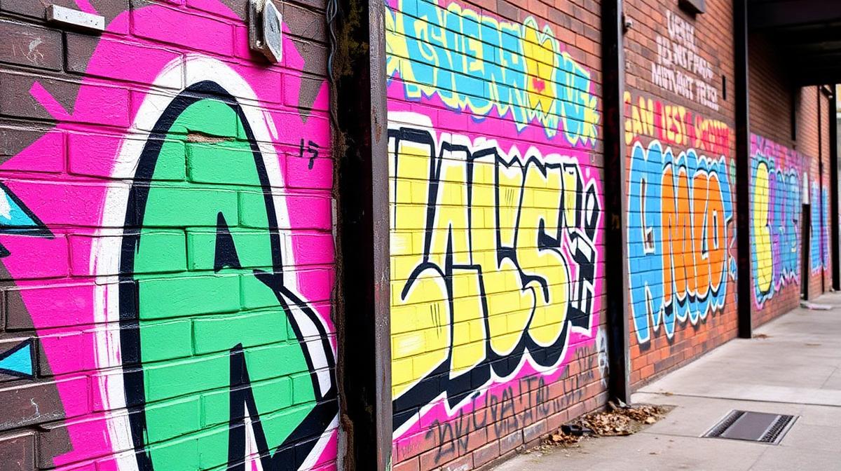
Street art and graffiti represent one of the most visceral applications of color psychology in human culture. Unlike gallery art, street color must compete with the entire visual chaos of the urban environment. It must be readable at speed, memorable from a single glance, and powerful enough to transform the psychological experience of a space. The color strategies developed on the street have profoundly influenced graphic design, fashion, and digital art.
The Physics of Spray Paint Color
Why Spray Paint Colors Are Different
Spray paint creates a unique color quality:
- High pigment density: Spray paint deposits more pigment per area than brush painting, creating intense saturation
- Overlap transparency: Layered spray creates unique color mixing at edges
- Fade patterns: UV exposure creates time-dependent color evolution
- Surface interaction: The same color reads differently on brick, concrete, metal, and glass
- Cap variation: Different spray caps create different color densities and gradients
The Spray Paint Palette
Professional street artists work with specific brand palettes:
| Brand | Color Range | Characteristic | Street Art Use |
|---|---|---|---|
| Montana Gold | 215 colors | Matte finish, low pressure | Detailed work, characters |
| Montana Black | 187 colors | High pressure, quick coverage | Backgrounds, fills |
| Molotow Premium | 251 colors | Nitro-acrylic, high opacity | Technical pieces, outlines |
| Ironlak | 72 colors | Smooth application | Throws, fills |
| Flame Blue | 100 colors | Low pressure, precise | Fine details, portraits |
Color as Territory: The Graffiti Color Code
Crew Colors
Graffiti crews often adopt signature color combinations:
- Color consistency: Using the same palette creates visual territory even without reading letters
- Competitive signaling: Overlapping another crew's colors with your own is a territorial challenge
- Brand recognition: Consistent color makes individual writers recognizable across a city
- Legacy marking: Historical crews maintain color palettes across decades
The Fill-Outline-Background System
Traditional graffiti pieces use a three-layer color system:
- Background: Often clouds or geometric shapes in contrasting colors
- Fill: The interior color of letterforms — bold, readable, signature
- Outline: Usually black (#000000) or dark color providing definition and readability
- Highlights: White (#FFFFFF) or bright accents creating dimension and catching light
- Force field/Glow: Halo effect around letters, often in bright or neon colors
High-Visibility Color Strategies
The Distance-Readability Formula
Street art must be readable at various distances:
- 50+ meters: Only the broadest color contrasts register — high contrast essential
- 20-50 meters: Overall color composition visible, shapes readable
- 5-20 meters: Detail becomes visible, secondary colors appear
- Under 5 meters: Full detail, texture, and subtle color visible
Maximum Contrast Combinations
The most visible street art color pairings:
| Combination | Visibility | Hex Pair | Common Use |
|---|---|---|---|
| Yellow on black | Highest | #FFD700 / #000000 | Warning-inspired, high impact |
| White on red | Very high | #FFFFFF / #FF0000 | Political messaging |
| Neon green on dark | High | #39FF14 / #1A1A1A | Night visibility, alien aesthetic |
| Blue on orange | High | #0066FF / #FF6600 | Complementary vibration |
| Pink on teal | Moderate | #FF69B4 / #008080 | Contemporary, fashion-influenced |
Neon and Fluorescent: Street Art's Secret Weapon
The Blacklight Effect
Fluorescent colors serve specific street art functions:
- Attention capture: Neon colors register peripherally, pulling attention from competing visuals
- Night performance: Fluorescent pigments glow under UV streetlighting
- Photographic impact: Neon colors pop in photographs, increasing social media shareability
- Youth association: Neon connects to rave culture, energy, and rebellion
Popular Fluorescent Applications
- Neon pink (#FF6EC7): Feminine power, fashion-street crossover
- Electric blue (#7DF9FF): Technology, futurism, alien themes
- Acid green (#B0FF00): Toxicity, warning, environmental commentary
- Fluorescent orange (#FF5F1F): Safety vest aesthetic, worker solidarity
- UV purple (#BF00FF): Psychedelic, spiritual, night-culture connection
Political and Social Color in Street Art
Color as Message
Street artists use color to communicate political positions:
- Red: Revolution, anger, blood, labor movements, urgency
- Black: Anarchism, mourning, resistance, power
- Green: Environmental activism, Islam, growth and hope
- Rainbow: LGBTQ+ pride, inclusivity, diversity
- Gold: Wealth critique, corruption commentary
- Gray/monochrome: Bleakness, depression commentary, institutional critique
The Banksy Approach: Minimal Color
Banksy's use of near-monochromatic stencils with selective color demonstrates sophisticated psychology:
- Black stencil on wall: Integrates with urban surface, reads as "belonging" to the space
- Single red element: A balloon, a heart — the color spot creates emotional focus
- Gray-scale realism: Photographic quality in gray creates documentary-feeling social commentary
- Selective saturation: Desaturating everything except one element directs emotional response
Street Art Color and Urban Renewal
The Mural Effect
Large-scale murals transform neighborhood color psychology:
- Property value impact: Colorful murals measurably increase surrounding property values
- Safety perception: Bright, maintained street art reduces perception of crime
- Community identity: Murals create visual landmarks and neighborhood pride
- Tourism attraction: Cities increasingly commission street art for cultural tourism
Color and Gentrification
Street art color carries complex social dynamics:
- Organic graffiti: Raw, unsanctioned color represents community voice
- Commissioned murals: Curated color can signal gentrification and displacement
- Buffing (removal): Gray-over-color erases community expression
- Preservation: Protecting significant street art acknowledges its cultural value
Digital Influence on Street Art Color
Screen-to-Street Translation
Digital art tools have expanded street art color:
- Procreate-to-wall: Artists plan complex color schemes digitally before executing
- Social media optimization: Colors chosen to perform well on Instagram
- Digital projection: Some artists project digital color onto architecture
- AR integration: Augmented reality adds digital color layers to physical street art
The Instagram Color Effect
Social media has shifted street art color toward:
- Pink walls: The "Instagram wall" phenomenon — pastel backgrounds for selfies
- Gradient smoothness: Smooth color transitions that read well on screens
- Saturated palettes: Colors that compete with digital filters and editing
- Hashtag-friendly aesthetics: Recognizable color schemes that encourage sharing
Material Considerations
Surface-Color Interaction
The substrate dramatically affects how color reads:
- Red brick: Warm tones harmonize; cool tones pop dramatically
- Gray concrete: All colors read cleanly; neutral background advantage
- Rusty metal: Orange-brown base requiring complementary color choices
- White-washed walls: Maximum color impact, closest to canvas conditions
- Glass/mirror: Transparency and reflection create unique color effects
Weathering and Color Evolution
Street art color is inherently temporal:
- UV fading: Red and yellow fade fastest; blue and black are most stable
- Rain washing: Gradual desaturation creates aging effects
- Graying: Dust and pollution mute saturation over time
- Seasonal variation: Same piece looks different in summer sun versus winter overcast
The color psychology of street art reveals that the most powerful chromatic experiences aren't in galleries or boutiques — they're on the walls we walk past every day. Street color is democratic, confrontational, and constantly evolving. It reminds us that color's deepest purpose isn't decoration; it's communication.