Fiery Gradients: Creating Dynamic Color Transitions That Ignite Your Designs
· Coloracci Team
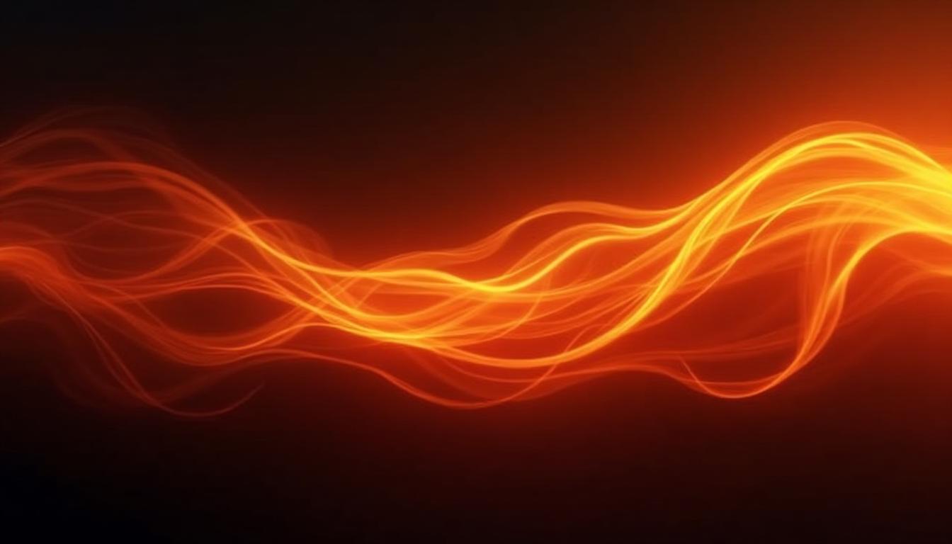
There's a moment I'll never forget. I was working on a landing page for an energy drink brand, and the client kept saying the design felt "flat." I'd used their brand red and orange, but something was missing. Then I added two intermediate color stops to my gradient—a deep crimson and a bright amber—and suddenly the whole page came alive. The client's exact words were: "Now THAT feels like fire."
That's when I truly understood that fiery gradients aren't just about slapping red next to orange. They're about creating movement, energy, and emotion through carefully orchestrated color transitions. Today, I'm sharing everything I've learned about crafting gradients that genuinely ignite designs.
What Makes a Gradient "Fiery"? The Science of Warmth
Before we dive into techniques, let's understand what makes certain gradients feel warm, dynamic, and energetic while others fall flat.
Warm colors—reds, oranges, and yellows—sit on one side of the color wheel and share a common characteristic: they advance toward the viewer. This isn't just perception; it's color psychology backed by science. Warm wavelengths are longer and appear to come forward, creating an inherent sense of energy and movement.

But here's the key insight most designers miss: a fiery gradient isn't just about using warm colors. It's about the transition between them. The magic happens in the in-between spaces—how smoothly crimson melts into vermillion, how amber transitions to gold.
The Warm Color Spectrum
Understanding the psychology of red and orange in branding is essential for creating effective fiery gradients. The warmest colors include:
- Pure Red (#FF0000): Maximum energy, urgency, passion
- Crimson (#DC143C): Deep, luxurious warmth
- Vermillion (#E34234): Balanced red-orange energy
- Orange (#FF6B00): Friendly, approachable warmth
- Amber (#FFB800): Warm with golden undertones
- Gold (#FFD700): Luxurious, successful warmth
When these colors flow into each other smoothly, they create the illusion of flickering flame—dynamic, alive, impossible to ignore.
The Anatomy of a Perfect Fire Gradient
Creating a gradient that truly feels like fire requires understanding color interpolation and the importance of intermediate stops.
RGB vs HSL Interpolation
Here's something that changed how I create gradients: the color space you use for interpolation matters enormously.
RGB interpolation (the CSS default) moves through color space in straight lines. This often creates muddy, desaturated midpoints—that unfortunate gray-brown that appears when transitioning between certain colors.
HSL interpolation travels around the color wheel, maintaining saturation throughout the transition. For fiery gradients, this usually produces more vibrant results.
In modern CSS, you can specify the interpolation method:
/* Standard RGB interpolation */
background: linear-gradient(135deg, #FF0000, #FFD700);

/* HSL interpolation (more vibrant) */
background: linear-gradient(135deg in hsl, #FF0000, #FFD700);
The Power of Multiple Color Stops
Here's the secret that separates amateur gradients from professional ones: more stops create smoother, more realistic transitions.
A simple 2-color gradient from red to yellow creates a harsh, abrupt transition. But add intermediate stops—a vermillion at 25%, an orange at 50%, an amber at 75%—and suddenly you have a gradient that feels natural, like actual flames.

The key ratios I've found work best for fire gradients:
- 2 stops: Harsh, bold, but can feel flat
- 3 stops: Starting point for smooth transitions
- 5 stops: Ideal for realistic fire effects
- 7+ stops: Maximum smoothness, but diminishing returns
10 Fiery Gradient Recipes You Can Use Today
After years of experimenting, I've collected these battle-tested gradient recipes. Each one serves a different purpose, from subtle warmth to bold intensity.
These gradients aren't just theoretical—I've used versions of each in real client projects. The "Phoenix Rising" gradient powered a fitness app's CTA buttons. "Volcano Core" became the hero section of a gaming platform. "Coral Sunset" softened a food delivery app's checkout flow.
CSS Techniques for Dynamic Fire Effects
Now let's get technical. Here are the CSS techniques that bring fiery gradients to life.
Linear vs Radial vs Conic Gradients
Each gradient type creates a different fire effect:
Linear gradients work for sweeping flame effects across headers and buttons:
.flame-header {
  background: linear-gradient(
    135deg,
    #FF0000 0%,
    #FF4500 25%,
    #FF8C00 50%,
    #FFD700 75%,
    #FFFF00 100%
  );
}
Radial gradients create campfire or spotlight effects:
.campfire-glow {
  background: radial-gradient(
    circle at center,
    #FFD700 0%,
    #FF8C00 30%,
    #FF4500 60%,
    #8B0000 100%
  );
}
Conic gradients produce rotating flame effects:
.rotating-flame {
  background: conic-gradient(
    from 0deg,
    #FF0000,
    #FF6B00,
    #FFD700,
    #FF6B00,
    #FF0000
  );
  border-radius: 50%;
  animation: rotate 3s linear infinite;
}

@keyframes rotate {
  to { transform: rotate(360deg); }
}
Layered Gradients for Depth
Real fire has depth—bright core, darker edges, flickering highlights. Layered gradients capture this:
.deep-fire {
  background:
    /* Highlight layer */
    radial-gradient(
      ellipse at 30% 30%,
      rgba(255, 255, 200, 0.3) 0%,
      transparent 40%
    ),
    /* Main flame */
    radial-gradient(
      ellipse at 50% 80%,
      #FFD700 0%,
      #FF8C00 30%,
      #FF4500 50%,
      #8B0000 80%,
      #2B0000 100%
    );
}
Fiery Gradients in Real-World Design
Let's look at how major brands and applications use fiery gradients effectively.

Apps & UI Design
Spotify uses warm gradients in their personalized playlists—those shifting orange-to-red backgrounds create energy without overwhelming the content.
Instagram pioneered the modern gradient logo, using a warm purple-to-orange transition that feels both energetic and approachable.
Gaming apps consistently use fire gradients for power-ups, achievements, and CTAs because they signal excitement and reward.
The key lesson from these apps: fiery gradients work best as accent elements or containers, not overwhelming every pixel of the screen.
Marketing & Advertising

Fire gradients dominate sale events and promotional materials for good reason—they create urgency.
Flash sales use red-to-orange gradients to signal limited time Event promotions leverage warm colors for excitement CTA buttons with fire gradients consistently outperform flat alternatives in A/B tests
One client saw a 23% increase in click-through rates after switching from a flat red button to a red-to-amber gradient with a subtle glow effect.
Branding Applications
Certain industries naturally gravitate toward fiery color palettes:
- Energy drinks (Monster, Rockstar, Red Bull)
- Sports brands (Under Armour, Nike's intensity lines)
- Entertainment (gaming, streaming platforms)
- Food & restaurants (especially fast food and delivery)
For more on warm colors in luxury brand design, fire gradients can add energy while maintaining sophistication when paired with dark backgrounds and refined typography.
Creating Your Own Fiery Gradient: Step-by-Step
Ready to create your own? Here's my process:
Step 1: Choose Your Base Color
Start with your dominant warm color. Consider:
- Pure red for maximum intensity
- Orange-red for energy without aggression
- Coral for approachable warmth
- Deep crimson for sophistication
Step 2: Select Your Transition Direction
The direction affects perceived energy:
- Bottom to top: Rising flames, growth, optimism
- Diagonal: Dynamic movement, action
- Radial from center: Spotlight, focus, explosion
Step 3: Add Intermediate Stops
Don't jump straight from start to end. Add at least one intermediate color:
- If starting with red, add vermillion before reaching orange
- If including yellow, add amber as a bridge from orange
- Consider adding a slight desaturated tone for natural variation
Step 4: Apply Glow Effects
Real fire glows. Add this with layered gradients or box-shadow:
.glowing-fire-element {
  background: linear-gradient(135deg, #FF0000, #FF8C00, #FFD700);
  box-shadow:
    0 0 20px rgba(255, 100, 0, 0.5),
    0 0 40px rgba(255, 100, 0, 0.3),
    0 0 60px rgba(255, 100, 0, 0.1);
}
Step 5: Test on Dark Backgrounds
Fiery gradients almost always look better on dark backgrounds. The contrast makes the warmth pop:
.dark-context {
  background: #0a0a0a;
}

.fire-element-on-dark {
  background: linear-gradient(135deg, #FF4500, #FFD700);
  /* Stands out dramatically */
}
Use our Gradient Maker or Gradient Palette Generator to experiment with these techniques interactively.
Accessibility Considerations for Warm Gradients
Fire is beautiful, but it needs to be usable. Here are critical accessibility considerations.
Text Contrast on Gradients
The biggest challenge with fire gradients is maintaining readable text. Yellow and orange backgrounds have low contrast with both white and black text.
Solutions:
- Use text only on the darker portions of your gradient
- Add a semi-transparent dark overlay behind text
- Consider dark mode alternatives
- Always test with the WCAG Contrast Checker
.readable-fire-text {
  background: linear-gradient(135deg, #8B0000, #FF4500);
  position: relative;
}

.readable-fire-text::before {
  content: '';
  position: absolute;
  inset: 0;
  background: rgba(0, 0, 0, 0.3);
}

.readable-fire-text span {
  position: relative;
  color: white;
}
Red-Green Color Blindness
About 8% of men have some form of red-green color blindness. Pure fire gradients (red to yellow) are actually relatively safe since they rely on luminance differences, not just hue.
However, if your fire gradient includes any green elements (like a nature-meets-fire theme), test with the Colorblind Simulator to ensure the distinction remains clear.
For more on making colors accessible for all users, accessibility should always be part of your design process, not an afterthought.
Advanced: Animated Fiery Gradients

Static gradients are powerful, but animated gradients bring true flame-like dynamism.
Hue Rotation Animation
The simplest fire animation rotates through warm hues:
.animated-fire {
  background: linear-gradient(135deg, #FF0000, #FF8C00, #FFD700);
  animation: hue-shift 3s ease-in-out infinite;
}

@keyframes hue-shift {
  0%, 100% { filter: hue-rotate(0deg); }
  50% { filter: hue-rotate(15deg); }
}
Flickering Flame Effect
Real flames flicker. Simulate this with opacity and position animations:
.flickering-flame {
  background:
    radial-gradient(ellipse at 50% 90%, #FFD700 0%, transparent 50%),
    radial-gradient(ellipse at 30% 80%, #FF8C00 0%, transparent 40%),
    radial-gradient(ellipse at 70% 85%, #FF4500 0%, transparent 45%),
    radial-gradient(ellipse at 50% 100%, #8B0000 0%, #2B0000 100%);
  animation: flicker 0.5s ease-in-out infinite alternate;
}

@keyframes flicker {
  0% {
    opacity: 0.9;
    transform: scaleY(1) translateY(0);
  }
  100% {
    opacity: 1;
    transform: scaleY(1.02) translateY(-1px);
  }
}
Gradient Position Animation
For a "moving fire" effect, animate the gradient position:
.moving-fire {
  background: linear-gradient(
    135deg,
    #FF0000, #FF4500, #FF8C00, #FFD700, #FF8C00, #FF4500, #FF0000
  );
  background-size: 200% 200%;
  animation: gradient-flow 3s ease infinite;
}

@keyframes gradient-flow {
  0% { background-position: 0% 50%; }
  50% { background-position: 100% 50%; }
  100% { background-position: 0% 50%; }
}
Performance Considerations
Animated gradients can be performance-intensive. Follow these best practices:
- Use transform and opacity when possible (GPU-accelerated)
- Avoid animating background-image directly
- Use will-change: transform for elements you'll animate
- Test on mobile devices where performance is more constrained
Tools for Creating Fiery Gradients
While you can code gradients manually, tools speed up the exploration process:
- Gradient Maker: Create custom gradients with live preview
- Gradient Palette Generator: Generate harmonious color progressions
- Gradient Templates: Browse pre-made gradient inspirations
- Fibonacci Color Generator: Create mathematically harmonious warm palettes
- AI Website Designer: Get AI-suggested color schemes including gradients
Common Mistakes to Avoid
After reviewing hundreds of designs using fire gradients, I see these mistakes repeatedly:
1. Too Many Competing Gradients
One fiery gradient commands attention. Three fiery gradients create chaos. Choose your hero element and let it shine.
2. Ignoring the Gray Zone
RGB interpolation between certain reds and yellows can produce muddy browns. Always preview your gradient at full size before committing.
3. Forgetting Dark Mode
A beautiful fire gradient on a white background might become illegible in dark mode. Always design both versions. Check our guide on light and dark mode color systems for best practices.
4. Neglecting Mobile
Gradients that look stunning on desktop can overwhelm small mobile screens. Test at all viewport sizes.
5. Over-animating
Subtle animation enhances. Aggressive animation annoys. When in doubt, slow it down.
Conclusion: Igniting Your Designs
Fiery gradients are more than just a trend—they're a powerful tool for conveying energy, urgency, and warmth in your designs. The key takeaways:
- Understand the science: Warm colors advance and create energy
- Use multiple stops: 3-5 colors create smoother, more natural transitions
- Layer for depth: Real fire has depth; your gradients should too
- Consider context: Dark backgrounds make fire pop
- Prioritize accessibility: Beautiful and usable aren't mutually exclusive
- Animate thoughtfully: Subtle movement brings gradients to life
Whether you're designing CTA buttons that convert, landing pages that captivate, or apps that energize users, fiery gradients are a powerful addition to your design toolkit.
Ready to create your own fiery masterpieces? Head to our Gradient Maker and start experimenting. The warmth is waiting.
Want to explore more color techniques? Check out our guides on analogous color schemes for harmonious warmth, complementary colors for dynamic contrast, or browse our complete Color Harmony Series for comprehensive color theory knowledge.