How Luxury Brands Use Passionate Colors to Create Desire: Ferrari, Louboutin, Cartier & More
· Lion Dada
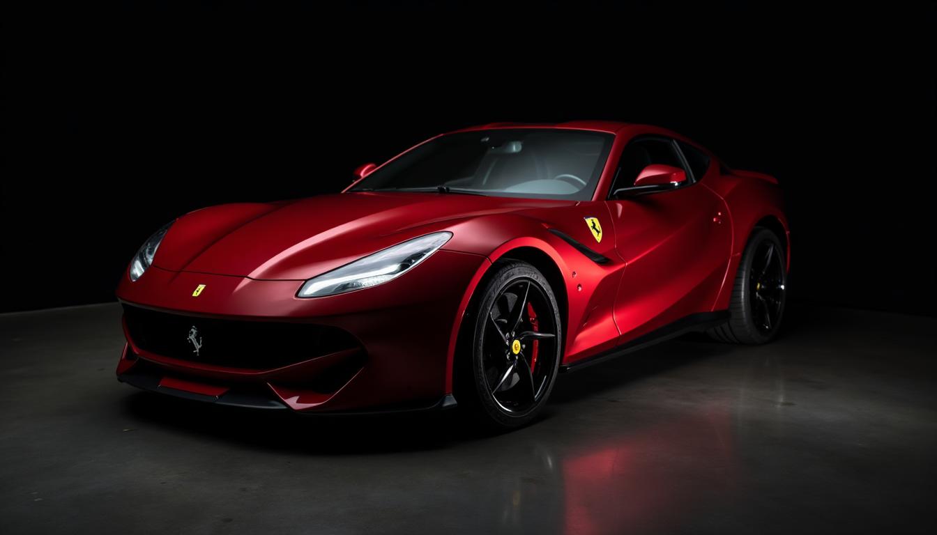
The $300 Billion Secret: Why Luxury Speaks in Red
I'll never forget standing in the Ferrari museum in Maranello, Italy. Surrounded by decades of automotive history, every single legendary car shared one thing: that unmistakable red. Not just any red—Rosso Corsa. Racing red.
A seven-year-old boy next to me tugged his father's sleeve and whispered, "Papa, why are they all red?" His father smiled and said, "Because red is the color of dreams, piccolo."
He was more right than he knew.
The world's most successful luxury brands didn't choose passionate colors by accident. Ferrari, Louboutin, Cartier, Hermès, Valentino, Porsche—billions of dollars in brand value are tied to specific shades of red and orange. These colors don't just represent their brands; they create desire at a neurological level.
In this deep dive, I'll show you exactly how these brands weaponized color psychology, and how you can apply their strategies—whether you're building a global empire or a local business.
The Neuroscience of Luxury Color: Why Red Creates Want
Before we explore individual brands, let's understand why passionate colors work so powerfully in luxury contexts.
The Brain on Red
When you see a rich, saturated red, your brain responds in measurable ways:
- Heart rate increases by 5-10%
- Adrenaline and cortisol spike slightly
- Attention becomes laser-focused
- Time perception distorts—moments feel longer, more significant
This is exactly what luxury brands want. They're not selling products; they're selling experiences. And red makes every experience feel more intense.
Research from the University of Rochester found that red increases attractiveness ratings and creates associations with passion, power, and status. Another study showed that items presented on red backgrounds are perceived as more valuable.
The Scarcity Signal
Red in nature often signals scarcity—ripe fruit, blood, danger. Our ancestors who paid attention to red survived. This primal programming still runs in our neural hardware.
Luxury brands exploit this brilliantly. That Cartier red box doesn't just hold jewelry; it signals rarity, importance, a moment that matters. Before you even see the diamond, the color has prepared your brain for something precious.

Case Study 1: Ferrari's Rosso Corsa (#CF0032)
The Accidental Icon
Here's a fact most people don't know: Ferrari wasn't always red by choice.
In the early days of international motor racing, colors were assigned by country. Italy got red. Germany got silver. Britain got racing green. France got blue.
Enzo Ferrari, racing for Alfa Romeo before founding his own company, drove Italian red out of regulatory requirement, not preference. But something magical happened: the color became inseparable from victory.
Between 1951 and 1958, Ferrari won more Formula One championships than anyone. The red car always won. Red became the color of triumph.
The Psychology at Play
Rosso Corsa (#CF0032) isn't just red—it's a specific, carefully calibrated red that:
- Commands attention without feeling aggressive
- Suggests speed even when stationary
- Evokes Italian passion and craftsmanship
- Photographs beautifully in any light
When you see a Ferrari, you don't think "that's a red car." You think "that's a Ferrari." The color has transcended its category entirely.
Today, while Ferrari offers other colors, approximately 40% of all Ferraris sold are still red. Customers actively choose to be part of the legend.
What You Can Learn
Ferrari teaches us that signature colors can emerge from constraints. Sometimes your most powerful brand element isn't what you planned—it's what circumstances forced upon you, embraced fully.
If you're building a brand, ask yourself: What unexpected element could become your signature? Use Coloracci's AI Website Designer to explore how passionate reds could define your visual identity.
Case Study 2: Christian Louboutin's Red Sole (#E60026)
The Nail Polish Moment
In 1992, Christian Louboutin was in his Paris atelier, frustrated. His new shoe prototype looked... fine. Just fine. Not magical.
His assistant was painting her nails. Louboutin grabbed the bottle of red polish and painted the prototype's sole.
"That red sole was like putting on lipstick," he later said. "It transformed the shoe."
That spontaneous act created the most recognizable trademark in fashion history.

The Genius of the Hidden Reveal
What makes Louboutin's red sole brilliant isn't just the color—it's the reveal mechanism.
When a woman walks, her sole flashes red momentarily. It's not always visible. It appears and disappears. This creates:
- Mystery and anticipation
- In-group recognition (those who know, know)
- A sense of secret luxury
- Movement-triggered attention
The red sole is only seen when walking away—making the exit as powerful as the entrance.
The Legal Battle That Proved the Power
When YSL released all-red shoes (including red soles), Louboutin sued. The case went to appeals court. Louboutin won—but with a fascinating ruling: the red sole is only protected when contrasted against a different-colored shoe.
Why does this matter? It proved that color contrast—not just color alone—creates trademark recognition. The red sole works because it surprises against black, nude, or colored uppers.
What You Can Learn
Louboutin teaches us about strategic contrast. Your signature color might not be your entire palette—it might be one unexpected element that creates recognition.
Consider: What's your "red sole"? What single color touch could make your brand instantly recognizable? Explore color combinations that create similar impact.
Case Study 3: Cartier's Red Box (#B22222)
Before the Diamond, There's the Box
Ask anyone who's received a Cartier engagement ring. Before they saw the diamond, before they said yes, there was a moment with that red box.
Cartier's packaging is so iconic that the box itself has become a status symbol. Empty Cartier boxes sell for hundreds of dollars on resale markets. People display them. Photograph them. Keep them forever.

The Anticipation Architecture
Cartier's red isn't just pretty—it's psychological architecture:
- The deep crimson signals something precious inside
- The tactile quality of the leather makes opening feel ceremonial
- The gold lettering against red creates complementary tension
- The specific shade triggers memories of every Cartier advertisement you've ever seen
Before you see the jewelry, your brain has already categorized this moment as "important." The red box does half the selling.
The Heritage Play
Since 1847, Cartier has maintained this red consistently. That's 178 years of the same color. Every advertisement, every store, every box—the same Cartier Red.
This consistency creates something powerful: transgenerational brand recognition. Your grandmother knew this red. Your mother knew it. You know it. Your children will know it.
Few brands can claim this kind of color continuity. It's a moat that takes decades to build and can never be replicated quickly.
What You Can Learn
Cartier teaches us about packaging as experience. The color of your packaging, your UI, your physical touchpoints—they're not afterthoughts. They're anticipation builders.
For digital products, this translates to onboarding flows, loading states, email designs. Every moment before the "reveal" is an opportunity to build desire through color. Check out how landing page color psychology applies these principles.
Case Study 4: Porsche Guards Red (#D90000)
Engineering Emotion
Germans are stereotyped as logical, methodical, unemotional. Porsche proves that stereotype wrong every time a Guards Red 911 screams past.
Guards Red (originally "Signal Red") became Porsche's signature not through racing mandates like Ferrari, but through engineering philosophy.
Dr. Ferry Porsche believed that a sports car should quicken your pulse before you even start the engine. Guards Red accomplishes this purely through perception.
The Data Behind the Passion
Porsche tracks their color statistics meticulously. Here's what the data shows:
- 25-30% of 911s are ordered in Guards Red
- Red Porsches have higher resale values than other colors
- Insurance claims suggest red Porsche owners drive more carefully (they know they're being watched)
- Guards Red consistently tests as "most desirable" in customer surveys
The color creates a feedback loop: people who choose red feel more special, treat the car more carefully, enjoy higher resale—and tell others to choose red.
German Precision Meets Italian Passion
Porsche's red strategy is fascinating because it borrows emotional coding from Italian rivals while maintaining German precision. Guards Red (#D90000) is slightly more orange than Ferrari's Rosso Corsa—warmer, more accessible, less aggressive.
This subtle difference says: "I want passion, but I also want reliability. I want excitement, but I also want to arrive safely."
It's color psychology at the molecular level.
What You Can Learn
Porsche teaches us that subtle shade differences communicate different values. When choosing your brand red, don't just pick "red." Pick the exact red that matches your positioning.
Use Coloracci's Image Color Extractor to analyze competitor colors and find your unique position in the red spectrum.
Case Study 5: Hermès Orange (#FF6600)
The Wartime Accident
Here's luxury branding's greatest origin story: Hermès Orange exists because of World War II.
Before the war, Hermès used cream-colored boxes. When France was occupied, the company couldn't source its usual materials. The only paper available in quantity was orange.
Rather than wait for better materials or compromise quality, Hermès embraced the constraint. Orange became not just acceptable but essential.

The Psychology of Orange in Luxury
Orange is unusual in luxury—most premium brands avoid it. It's seen as playful, energetic, even cheap. So how does Hermès make orange feel like the most exclusive color in the world?
The secret is context and consistency:
- Burnt orange, not bright orange—sophisticated, not juvenile
- Always paired with brown ribbon—grounding, earthy, saddlery heritage
- Cream-colored boxes underneath—softening the vibrancy
- Minimal branding—letting the color do the talking
Hermès took a liability and made it an asset. No one else could copy orange without looking like they're copying Hermès.
The Waiting List Phenomenon
Hermès is famous for its waiting lists. A Birkin bag can take years to acquire. The orange packaging becomes part of the anticipation ritual.
When you finally receive that orange box, you've been thinking about it for months or years. The color has appeared in your dreams. It represents not just a product but time itself—the time you waited, the patience you showed, the desire you cultivated.
That's color psychology operating at the deepest level: color as time marker.
What You Can Learn
Hermès teaches us that constraint can create differentiation. When everyone zigs toward expected luxury colors (black, gold, red), zagging to unexpected orange creates memorability.
What's your "orange"? What unexpected color could differentiate your brand while maintaining premium perception? Explore color psychology in branding to find your answer.
Case Study 6: Valentino's Rosso (#BE0029)
The Opera Obsession
In 1959, a young Valentino Garavani attended the opera in Barcelona. A woman in a red dress caught his eye and held it for the entire performance.
"I saw red and went mad," he later said.
He spent years perfecting his signature red—testing, adjusting, obsessing. The result, Rosso Valentino, became fashion's most celebrated red.

Red as Main Character
Unlike Louboutin (accent color) or Ferrari (exterior finish), Valentino uses red as the complete garment. Floor-length red gowns. Red suits. Red everything.
This requires a red that:
- Photographs well from every angle
- Flatters multiple skin tones
- Maintains vibrancy in different lighting
- Commands attention without overwhelming the wearer
Rosso Valentino (#BE0029) achieves all of this. It's warm enough for pale skin, deep enough for darker tones, and saturated enough to photograph rich without looking neon.
The Celebrity Amplification
Valentino understood that red gowns create red carpet moments. Every time a celebrity wears Valentino red, the brand receives millions in equivalent advertising.
This created a virtuous cycle:
- Valentino designs stunning red gowns
- Celebrities wear them to major events
- Photographs circulate globally
- "Valentino red" becomes cultural shorthand for glamour
- More celebrities want Valentino red gowns
- Repeat
The color became self-marketing.
What You Can Learn
Valentino teaches us about color as platform. When your color becomes associated with success, achievement, or celebration, others will seek to participate.
How can your brand color become the backdrop for others' important moments? Consider social media color strategies that create shareable moments.
The Formula: What All Luxury Passionate Colors Share
After analyzing these six iconic brands, patterns emerge. Here's the formula for using passionate colors in luxury contexts:
1. Specificity Over Generality
None of these brands use "red" or "orange." They use:
- Rosso Corsa
- Rouge Louboutin
- Cartier Red
- Guards Red
- Orange Hermès
- Rosso Valentino
Naming your color creates ownership. When you have a specific hex code, a specific name, a specific story—you own it. Generic red belongs to everyone; Rosso Corsa belongs to Ferrari.
2. Origin Stories That Resonate
Every color has a story:
- Ferrari: Italian racing heritage
- Louboutin: The nail polish moment
- Cartier: 178 years of tradition
- Porsche: German engineering precision
- Hermès: Wartime necessity
- Valentino: Barcelona opera obsession
Stories make colors memorable. What's the story behind your brand colors? If you don't have one, create one—authentically.
3. Consistency Across Decades
These brands don't follow trends. They set them. Their colors remain constant while competitors chase the palette of the moment.
Consistency builds recognition. Five years of the same color is worth more than fifty colors in five years.
4. Strategic Application
Each brand applies its signature color differently:
- Ferrari: Exterior dominance
- Louboutin: Hidden accent
- Cartier: Packaging exclusively
- Porsche: Customer choice emphasis
- Hermès: Full ecosystem
- Valentino: Garment focus
Where you apply color matters as much as what color you choose. Consider color hierarchy principles in your application.
5. Emotion Over Function
None of these colors were chosen for practical reasons. They were chosen to create feelings:
- Desire
- Anticipation
- Status
- Belonging
- Power
- Passion
Luxury color is always emotional first. Use color psychology principles to guide your choices.
Applying Luxury Color Strategy to Your Brand
You don't need a billion-dollar valuation to use these principles. Here's how to apply them at any scale:
Step 1: Find Your Signature Shade
Don't just pick a color—find THE color. Use Coloracci's Fibonacci Generator to explore harmonious palettes, then narrow down to your signature shade.
Consider:
- What emotion do you want to evoke?
- What differentiates you from competitors?
- What story can you tell about this color?
Step 2: Name It and Claim It
Give your color a name that reflects your brand. "Coloracci Purple" is more ownable than "purple." Document the exact hex code (#7241FF for us) and use it religiously.
Step 3: Create Your Origin Story
Every color needs a why. It doesn't have to be dramatic—just authentic. Perhaps it's the sunset you saw when you had your business idea. Perhaps it's your grandmother's favorite color. Perhaps it's the color of the city where you started.
Step 4: Apply Strategically
Decide where your color lives:
- Logo only? (Minimal, sophisticated)
- Primary UI color? (Bold, modern)
- Accent color? (Subtle, memorable)
- Packaging focus? (Premium, ceremonial)
Use color proportion tools to balance your signature shade with supporting colors.
Step 5: Commit to Consistency
The hardest part: resist the urge to change. Set your color and let it marinate in your customers' minds. Trust the process. Cartier didn't build 178 years of red recognition by switching to teal in 1987.
When Passionate Colors Don't Work for Luxury
Honest disclosure: red and orange aren't right for every luxury brand. Some contexts call for restraint:
Categories to Avoid
- Wellness and spa: Passionate colors feel too intense for relaxation
- Financial services: Trust requires calmer blues and greens
- Healthcare: Red signals alarm, not healing
- Sustainable luxury: Earth tones often resonate better
- Tech luxury: Minimalist metallics may fit better
The Alternative: Black, Gold, and Restraint
Many luxury brands use the opposite approach:
- Chanel: Black and white
- Rolex: Green and gold
- Louis Vuitton: Brown and gold
These brands signal luxury through absence of color rather than presence. They whisper while Ferrari shouts.
Both strategies work. The question is which fits your brand personality.
Accessibility and Passionate Colors
A note on responsibility: passionate colors, especially reds, pose accessibility challenges.
Key Considerations
Red-green colorblindness affects ~8% of men. Ensure your red has sufficient contrast without relying on hue alone.
Cultural meanings vary. In some Asian cultures, red means luck. In Western contexts, it can signal danger. Know your audience.
Digital fatigue: Large areas of saturated red on screens can cause eye strain. Use passionate colors as accents, not backgrounds.
Use Coloracci's Contrast Checker to ensure your luxury colors meet WCAG guidelines. Luxury should be accessible to all.
The Future: Will Red Remain Royal?
As I write this in 2025, some argue that traditional luxury codes are fading. Gen Z supposedly prefers authenticity over status symbols.
But I don't buy it.
Red has been the color of power for at least 30,000 years (the oldest cave paintings use red ochre). Roman emperors wore red. Chinese dynasties wrapped themselves in red. The Catholic church uses red for significance.
Trends come and go. Red endures.
The brands that understand this—Ferrari, Louboutin, Cartier—will outlast the brands chasing momentary palettes. They've invested in color equity that compounds over decades.
Your Passionate Color Journey Starts Here
The world's most valuable brands prove that color isn't superficial—it's strategic. The right shade of red or orange, applied consistently over time, can create billions in brand value.
Whether you're launching a luxury brand or simply want to inject more desire into your visual identity, the principles remain:
- Choose specifically
- Tell the story
- Apply strategically
- Commit completely
Ready to find your signature passionate color? Coloracci's AI Website Designer can help you explore palettes inspired by the world's most iconic luxury brands. Or start with our Mood Board Generator to visualize how passionate colors could transform your brand.
Because every great brand has a color story. What's yours?
Want to explore how specific shades affect perception? Read our deep dive on The Psychology of Passion Colors: Why Red and Orange Ignite Emotions or discover how red logos influence consumer behavior.