Orange Color in Branding: From Playful to Professional – The Most Misunderstood Color in Marketing
· Coloracci Team
I'll never forget the day a client walked into our studio and said, "I want orange, but not like Nickelodeon orange. More like... Hermès orange."
I nodded like I knew exactly what she meant. Inside, I was panicking. How can the same color be both a children's TV network splat logo AND a $10,000 handbag? That's when I realized: orange isn't one brand personality. It's twenty different personalities wearing the same name tag.
The Orange Paradox: How One Color Does Everything
Here's the thing that makes orange fascinating and terrifying: it's the chameleon of the color wheel. Red's got aggression locked down. Blue owns trust. Green? That's nature's territory. But orange? Orange can be literally anything you want it to be, depending on which shade you pick.
The secret isn't in the saturation or the brightness alone—it's in understanding that #FFDAB9 (peachy orange) lives in a completely different universe than #B7410E (rust orange). One sells baby products. The other sells motorcycles.

Want to understand the full psychology behind color choices in marketing? Orange is where theory meets chaos.
The Science (and Surprise) Behind Orange
Let me hit you with something wild: research consistently shows that about 29% of people say orange is their least favorite color. That's nearly one in three people actively disliking it.
And yet. AND YET.
Some of the world's most successful brands are built on orange. Hermès. Amazon. Home Depot. Mastercard. Penguin Books. How does that work?
The psychology is actually elegant: orange sits between red's energy and yellow's happiness. It's like the extroverted middle child who got the best traits from both parents. When you see orange, your brain registers:
- Optimism without naivety (unlike pure yellow)
- Energy without aggression (unlike pure red)
- Warmth that feels approachable, not pushy
- Creativity and unconventional thinking
- Affordability and value (which can work for OR against you)
But here's where it gets interesting: different shades of orange trigger completely different associations. Bright tangerine says "fun and cheap." Burnt orange whispers "authentic and expensive."

The Playful End: Brands That Own "Fun Orange"
Let's start where most people think orange lives: the playful, energetic, slightly chaotic end of the spectrum.

Nickelodeon (#FF6600) might be the most iconic playful orange on Earth. That bright, almost neon tangerine isn't trying to be sophisticated. It's screaming "SLIME! CARTOONS! CHILDHOOD!" And it works because the target audience (kids and nostalgic adults) doesn't want sophistication. They want fun.
Fanta (#FF8200) uses orange you can practically taste. It's citrus. It's sweet. It's sugar in liquid form. The orange IS the product, which makes the branding choice almost too obvious—but that's why it works.
Firefox went with orange (and red) for their logo because they wanted to stand out in a sea of blue tech logos. In 2004, when Chrome and Safari were going cold and corporate, Firefox said "we're the rebel browser." Orange reinforced that message perfectly.
These brands aren't using orange despite its "least favorite color" status. They're using it BECAUSE it's polarizing. They want to attract the 71% who don't hate it, and they're okay filtering out the rest.
Curious about another warm color that divides opinions? Check out the psychology of mustard yellow for similar dynamics.
The Professional End: Wait, Orange Can Be Fancy?
This is where it gets really interesting. Because orange isn't supposed to work for luxury brands, right? Wrong.
Hermès uses #FF6B35, and they've made it SO iconic that "Hermès orange" is literally a thing people say. Their orange boxes are instantly recognizable worldwide. But here's the trick: it's not bright orange. It's a slightly muted, sophisticated orange with red undertones. It feels warm and exclusive, not loud and cheap.
ING Bank (#FF6200) made one of the boldest moves in financial branding: using orange when every other bank went blue or green. In the ultra-conservative banking world, orange says "we're trustworthy but not boring." It worked. They became the most recognizable orange bank globally.
Penguin Books has used orange for their fiction paperbacks since 1935. That's nearly 90 years of orange branding. Their orange isn't flashy—it's that classic, slightly dusty orange that feels literary and timeless. When you see an orange Penguin spine on a bookshelf, you're not thinking "discount bin." You're thinking "classic literature."
Mastercard uses orange (paired with red) in possibly the most-seen logo on the planet. Those two overlapping circles? The orange one represents optimism and security. It's doing heavy lifting in that brand identity.

The Middle Ground: Orange That Works for Everyone
Then there's the sweet spot—orange that's neither childish nor ultra-premium. Orange that just... works.

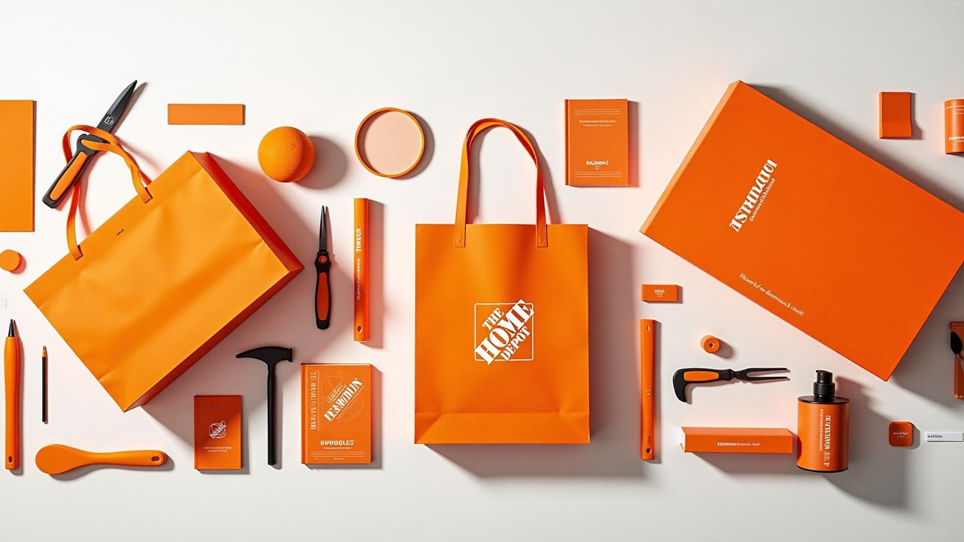
Home Depot (#F96302) absolutely nailed this. Their orange is energetic enough to feel approachable but professional enough that contractors take them seriously. It's construction-site orange that says "we're practical but enthusiastic about helping you build stuff."
Amazon doesn't use orange as their primary color, but that orange arrow/smile is genius. It's warm, friendly, and points from A to Z (get it?). The orange makes the logo feel less corporate and more helpful.
Harley-Davidson uses orange and black, and somehow it works for a premium motorcycle brand. Why? Because their orange has enough red in it to feel powerful and rebellious, not playful.
These brands prove that orange doesn't have to be extreme to work. Compare this to how green creates trust in branding—sometimes the "unexpected" color choice becomes your signature.
The Secret: Matching Orange Shade to Brand Message
Okay, here's the framework I actually use when clients ask for orange:
Peach/Apricot tones (#FFDAB9 - #FBCEB1): Use when you want softness, femininity, approachability. Think: beauty products, baby brands, wellness. This is orange for people who don't want to be TOO orange.
Bright/Neon Orange (#FF6600 - #FFA500): Use when you want maximum energy, youth appeal, and attention. Think: sports, entertainment, fast food. This is orange that doesn't apologize for being orange.
Burnt/Rust Orange (#CC5500 - #B7410E): Use when you want warmth with sophistication, earthiness, authenticity. Think: outdoor brands, craft products, autumn aesthetics. This is orange for adults.
Deep Terracotta (#E2725B - #A0522D): Use when you want premium feel, timelessness, artistic credibility. Think: luxury goods, artisan products, high-end design. This is orange that costs more.
The difference between these categories isn't subtle—it's the difference between Fanta and Hermès.

Orange Color Combinations That Actually Work
Orange is notoriously tricky to pair because it's so dominant. But these combos work consistently:

Orange + Navy Blue: This is the classic contrast. Think: complementary colors that balance each other. Orange provides energy, navy provides stability. Used by countless sports teams and corporate brands.
Orange + Black: High impact, high contrast. This combo screams confidence and doesn't mess around. Harley-Davidson proved it can work for premium brands if your orange shade is right.
Orange + Teal: These are literally complementary on the color wheel, which means they make each other pop. But use carefully—it can look very "designed" if you're not careful. Works great for tech and creative brands.
Orange + Cream/Ivory: This is the sophisticated move. Instead of white, use cream or ivory with your orange. It softens the intensity and creates that high-end, considered look. This is what Hermès does.
Orange + Copper/Bronze: Metallic accents with orange create depth and premium feel. Perfect for brands that want warmth but also luxury.
Want to explore how these combinations follow mathematical harmony? Try our Fibonacci color generator to create naturally balanced orange palettes.
Orange Accessibility: The Good News
Here's where orange actually shines (pun intended): it's one of the most accessible colors you can use.

Contrast ratios: Most orange shades provide excellent contrast on both white and black backgrounds. Even light orange (#FFA500) hits 3:1 contrast ratio on white, and darker oranges easily exceed 4.5:1.
Colorblind friendliness: Orange is relatively safe for red-green colorblindness (the most common type) because it has enough yellow component to remain visible. Unlike pure red, which can disappear for some viewers, orange usually stays distinct.
Visibility: Orange is highly visible in low-light conditions, which is why it's used for safety equipment and construction sites. Your orange CTA button will get noticed.
Test your orange choices properly:
- Use our color contrast checker for WCAG compliance
- Run it through our colorblind simulator to see how it appears
- Read our comprehensive WCAG accessibility guide
When NOT to Use Orange (Yes, There Are Rules)
Orange isn't universal. Here's when to avoid it:

Finance/Banking (Usually): ING is the exception that proves the rule. Most financial institutions should stick with blue or green because orange can feel too casual or "budget." Unless you're explicitly positioning as the friendly disruptor, skip it.
Healthcare/Medical: Orange is too energetic for most healthcare contexts. Patients want calm and clinical, not vibrant and exciting. Exception: Children's hospitals can pull it off.
Luxury Without Strategy: If you're not Hermès, using orange for luxury goods is risky. It can easily read as "trying too hard" or "discount." You need a VERY specific orange and a strong brand story to make it work.
B2B Enterprise Software: Orange often reads as too casual for serious enterprise tools. Your CFO doesn't want their accounting software to look like Nickelodeon. Unless you're positioning as the "fun, easy alternative," go with something more traditional.
Food Brands (Sometimes): While orange works great for citrus, beverages, and snacks, it can be tricky for other food categories. Orange can make food look artificial or overly processed if not handled carefully.
The Netflix Lesson: Why They Abandoned Orange
Want to know something wild? Netflix started with orange in their branding. Their original logo (2000s) used red-orange because they wanted to feel energetic and entertainment-focused.

Then they switched to pure red. Why?
As they grew from DVD-by-mail to streaming giant, they needed to feel more premium, more sophisticated, more "Hollywood." Orange was too playful for a company competing with HBO and Disney. Red had the energy they wanted but with more power and prestige.
It's a perfect case study in how color strategy should evolve with brand positioning.
Speaking of color psychology in tech, our article on the psychology of blue in design explains why most tech companies went the opposite direction.
Orange Is the Secret Weapon for Brave Brands
Here's what I've learned after years of working with orange: it's not for brands that want to play it safe. Orange makes a statement. It polarizes. And that's exactly why it works.

If you're willing to be bold, orange gives you:
- Instant recognition in markets drowded with blue and green
- Emotional warmth that other colors can't match
- Versatility from playful to professional (if you choose the right shade)
- Accessibility advantages for users with various vision abilities
The brands that succeed with orange aren't using it by accident. They're using it strategically, choosing the exact right shade for their message, and committing to it fully.
Want to explore orange in your brand? Start here:
- Generate complete orange-based designs with our AI Website Designer
- Create mood boards with orange as your hero color using Mood Board Generator
- Explore all our color tools to find the perfect shade
- See how orange works in triadic color schemes with green and purple
Remember: orange isn't the most popular color. But for the right brand, with the right shade, at the right moment? It's absolutely perfect.
And if anyone ever asks you why Hermès and Nickelodeon can both use orange successfully, now you know: they're not using the same orange at all. They're using the same name for two completely different colors that happen to live on the same part of the spectrum.
That's the magic—and the challenge—of orange.