Valentine's Day Color Palettes: Beyond Red and Pink (8 Romantic Palettes for 2025)
· Lion Dada
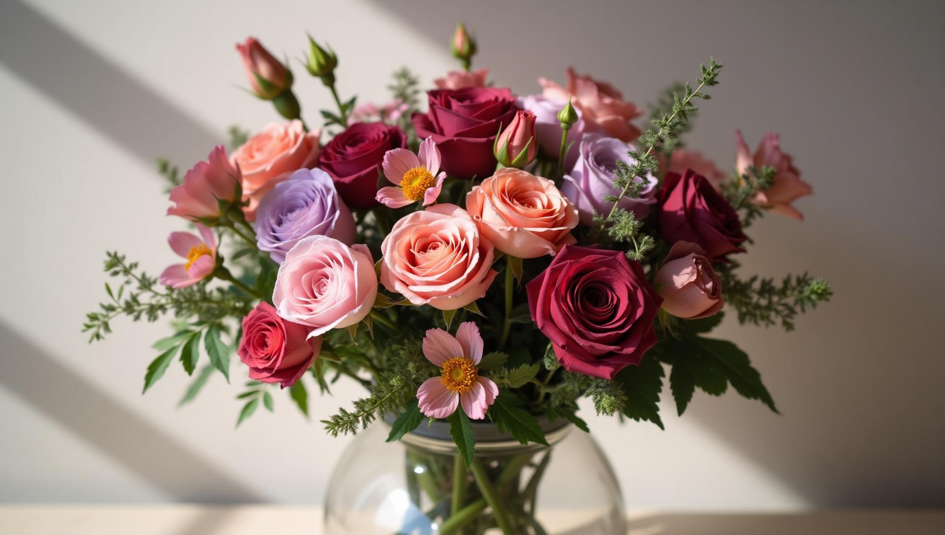
My Valentine's Day Color Wake-Up Call
I'll never forget the Valentine's Day campaign that made me rethink everything I knew about romantic colors.
A client came to me—a luxury jewelry brand—wanting Valentine's Day marketing that felt "elevated, not cliché." When I presented the first draft drowning in red hearts and baby pink, she looked at me with disappointment I can still feel. "This looks like a drugstore greeting card," she said. Ouch.
That feedback sent me down a rabbit hole of color psychology, historical research, and trend analysis. What I discovered changed how I approach seasonal design forever: Valentine's Day colors are so much richer than red and pink.

The Psychology Behind Valentine's Colors
Before we dive into the palettes, let's understand why certain colors feel romantic in the first place. It's not arbitrary—there's real psychology at play.
Why Red Means Love
Red is the color of passion and intensity. Our brains associate it with:
- Physical arousal (it literally raises heart rate)
- Excitement and energy
- Desire and urgency
But here's the thing: red is also aggressive. It's the color of stop signs, warning labels, and danger. That's why an all-red Valentine's palette can feel overwhelming rather than romantic.
The Softening Power of Pink
Pink's psychological effects are more nuanced:
- Nurturing and tender emotions
- Playful, youthful energy
- Calming and soothing
Pink literally calms aggression—there's a reason some sports teams paint visiting locker rooms pink. But too much pink can read as juvenile or overly sweet.
Beyond the Basics: Other Romantic Colors
What the color psychology research shows is that romance isn't limited to red and pink:
- Purple evokes luxury and mystery
- Deep burgundy suggests sophistication and depth
- Gold and metallics add premium, celebratory feelings
- Soft neutrals create intimacy and warmth
8 Valentine's Day Color Palettes for 2025
Now let's explore palettes that capture different facets of love—from passionate to playful, moody to minimalist.
1. Classic Romance: The Elevated Traditional
Sometimes tradition works—when done right. This palette takes the expected red-pink-white and elevates it with deeper, more sophisticated tones.
Best for: Wedding invitations, luxury chocolate packaging, traditional romantic brands
Key colors:
- Passionate Red #C41E3A (not fire-engine bright, but a deeper cardinal)
- Dark Pink #E75480 (sophisticated, not bubblegum)
- Light Pink #FFB6C1 (soft accent)
- Pure White #FFFFFF (crisp contrast)
- Deep Rose #8B0000 (grounding anchor)
The secret? Avoiding true primary red and instead using wines and cardinals that feel grown-up.
2. Dusty Rose: Modern Sophistication
This is the palette that saved that jewelry campaign. Dusty, muted tones feel contemporary, elegant, and—crucially—not cheesy.
Best for: High-end brands, millennial audiences, Instagram-worthy aesthetics
Key colors:
- Dusty Rose #DCAE96
- Wine #722F37
- Cream Blush #F5E6E0
- Mauve #C9A9A6
- Espresso #4A3728
The beauty of dusty rose palettes is their versatility. They photograph beautifully, work across seasons, and appeal to sophisticated audiences who might roll their eyes at traditional Valentine's colors.

3. Moody Romance: Dark and Dramatic
Not all love is light and sweet. This palette captures the intensity, mystery, and depth of passion—think candlelit dinners and velvet textures.
Best for: Luxury experiences, dramatic photography, evening events, perfume and wine brands
Key colors:
- Burgundy #4A0E2B
- Deep Purple #2E1A47
- Gold #D4AF37
- Merlot #722F37
- Midnight #1A1A2E
This palette works beautifully with the 60-30-10 rule: 60% dark tones, 30% merlot/burgundy, and 10% gold accents for drama.
4. Galentine's Day: Celebrating Friendship
February 13th has become its own celebration—Galentine's Day, honoring female friendships. This palette is cheerful, warm, and energetic rather than romantic.
Best for: Friend-focused campaigns, brunch events, self-love messaging, younger audiences
Key colors:
- Coral #FF6B6B
- Sunshine #FFE66D
- Peach #FF8E72
- Blush #F7B2B7
- Hot Pink #FF4757

The warm, analogous color relationship here (coral, peach, pink) creates visual harmony while the yellow pops with joyful energy.
5. Minimalist Love: Less Is More
For brands that want to acknowledge Valentine's without overwhelming their aesthetic, this stark palette makes a statement through restraint.
Best for: Minimalist brands, architectural spaces, high-fashion, tech-forward companies
Key colors:
- Black #000000
- White #FFFFFF
- Statement Red #E63946
- Off White #F1FAEE
- Dark Navy #1D3557

One red heart against clean black and white? That single pop of color becomes incredibly powerful. This is complementary color theory at its most elegant.
6. Tropical Valentine: Summer Romance
Who says Valentine's has to feel wintery? This palette brings vacation vibes and playful energy—perfect for resort wear, summer weddings, or brands with a fun personality.
Best for: Travel brands, beachwear, tropical destinations, playful brands
Key colors:
- Fuchsia #FF1493
- Coral Reef #FF6B6B
- Turquoise #00CED1
- Hot Pink #FF69B4
- Golden Sun #FFD93D
The split-complementary relationship between pink/coral and turquoise creates exciting visual tension while staying cohesive.
7. Earthy Romance: Natural Love
For brands connected to nature, sustainability, or bohemian aesthetics, this warm, organic palette feels authentic rather than commercial.
Best for: Eco-friendly brands, rustic weddings, natural beauty products, home decor
Key colors:
- Terracotta #C67C4E
- Saddle Brown #8B4513
- Burlap #DEB887
- Rosy Brown #BC8F8F
- Olive #556B2F
This connects beautifully to earth tone palettes while adding romantic warmth through the rosy brown.
8. Lavender Dreams: Soft and Ethereal
Lavender has become a major trend color, and it works beautifully for romantic contexts—soft, dreamy, and slightly mystical.
Best for: Wellness brands, dreamy photography, Gen Z audiences, whimsical aesthetics
Key colors:
- Lavender #E6E6FA
- Plum #DDA0DD
- Medium Purple #9370DB
- Silver #C0C0C0
- Ghost White #F8F8FF
This monochromatic approach using purple tones creates a cohesive, soothing atmosphere that feels like a romantic daydream.
Valentine's Colors Around the World
One fascinating aspect of researching this article was discovering how differently cultures approach Valentine's colors—and romantic colors in general.
Japan: White Day and Chocolate Culture
In Japan, Valentine's Day (February 14) is when women give chocolate to men. One month later, on "White Day" (March 14), men return the gesture. The color white therefore carries romantic significance—purity, reciprocity, fresh beginnings.
Japanese Valentine's marketing often features:
- White chocolate packaging
- Pale pink and white combinations
- Gold accents for premium gifts
China: Red Is Lucky, Not Just Romantic
While red absolutely dominates Chinese Valentine's Day (Qixi Festival), the meaning differs from Western associations. Red in Chinese culture represents:
- Good fortune and prosperity
- Joy and celebration
- Protection from evil
Valentine's gifts often feature red and gold together—a combination that signals both love AND good wishes for the couple's future.
Brazil: June Valentine's (Dia dos Namorados)
Brazil celebrates lovers on June 12, right before the feast of Saint Anthony (the marriage saint). Being winter in the Southern Hemisphere, the color palette naturally shifts warmer:
- Deep reds and oranges
- Warm neutrals
- Rich purples

Using Valentine's Colors in Your Designs
Now that you have the palettes, here's how to apply them effectively across different design contexts.
Social Media Graphics
Do:
- Use your palette's accent color for text overlays
- Create gradient backgrounds from your palette
- Let one color dominate (60-30-10 rule)
Don't:
- Use all five colors at equal weight
- Add extra colors "just because it's Valentine's"
- Forget about accessibility and contrast
Email Marketing
Valentine's emails perform best when they feel premium, not cheesy. Apply your palette to:
- Hero image backgrounds
- CTA button colors (test red vs. other accent colors!)
- Border and divider accents
Learn more about email marketing color psychology.
Product Photography
Your palette should inform:
- Props and backgrounds
- Color correction and filters
- Packaging elements in frame
Website Landing Pages
Create a dedicated Valentine's landing page using your palette for:
- Background gradients
- Button and CTA colors
- Section dividers and accents
- Featured product highlights
Common Valentine's Color Mistakes
After years of seeing Valentine's designs, here are the mistakes I see repeatedly:
1. Going Full Red
Red is powerful—but overwhelming. Always balance it with softer tones or neutrals.
2. Forgetting Dark Mode Users
Those light pinks might look great on white backgrounds, but have you tested them on dark mode?
3. Ignoring Your Brand
Just because it's Valentine's doesn't mean you abandon your brand colors. Find the overlap—maybe your blue brand can add a touch of purple for the season.
4. Same as Last Year
Audiences notice when you recycle. Keep your approach fresh by choosing a different palette each year.
5. Pink = Feminine Only
Modern Valentine's marketing should be inclusive. Consider palettes that don't lean heavily gendered—earthy, minimalist, or moody options work for everyone.
Create Your Perfect Valentine's Palette
Ready to build your own romantic color scheme? Here are some tools that can help:
- Fibonacci Generator — Create mathematically balanced palettes starting from any romantic base color
- AI Website Designer — Generate complete color schemes for Valentine's landing pages
- Mood Board Generator — Collect inspiration and extract palettes from romantic imagery
- Color Contrast Checker — Ensure your Valentine's palette is accessible
Beyond February 14
Here's a secret about Valentine's colors: they work year-round for certain contexts.
Dusty rose and burgundy → Autumn weddings, wine marketing, luxury anything
Coral and warm tones → Summer campaigns, lifestyle brands, hospitality
Lavender and soft purples → Wellness, sleep products, Gen Z marketing
Black/white with red accent → Year-round sophistication for any bold brand
The best Valentine's palettes aren't just for February—they're romantic color systems that can elevate your brand in any season.
Final Thoughts: Love Beyond Cliché
That jewelry client who rejected my first draft? The dusty rose campaign we created together became one of their most successful Valentine's promotions ever. The muted, sophisticated palette attracted their target demographic in a way that screaming red hearts never could.
The lesson: romance isn't one color, one shade, or one style. It's the emotion behind the colors—intimacy, passion, tenderness, celebration, friendship.
Choose the palette that matches the story you're telling. Whether that's dramatic moody purples or cheerful Galentine's corals, make it intentional.
Love comes in many colors. Your Valentine's palette should too.
Need help creating your perfect Valentine's palette? Try our AI-powered color tools to generate custom romantic color schemes in seconds.