Toy Store Color Psychology: Playful Palettes That Drive Sales
· Coloracci Team
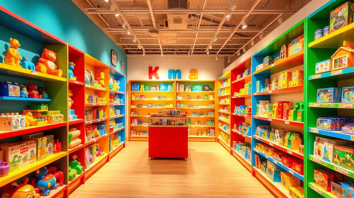
Toy Store Color Psychology: Playful Palettes That Drive Sales
Toy stores face a unique design challenge: they must simultaneously appeal to children (the desire generators) and parents (the purchasers). The most successful toy retailers use color as a sophisticated dual-audience strategy—creating wonder and excitement for kids while maintaining an environment where parents feel comfortable spending money. Every color decision in a toy store is engineered to extend dwell time, reduce purchase resistance, and create memories that drive return visits.
The Dual-Audience Color Challenge
Child vs. Parent Color Preferences
| Factor | Children (2-8) | Tweens (9-12) | Parents |
|---|---|---|---|
| Preferred colors | Primary: Red, Yellow, Blue | Teal, Purple, Neon | Neutral with color accents |
| Color saturation | High saturation | Medium-high | Medium-low |
| Color quantity | More is better | Curated cool | Less is more |
| Emotional trigger | Excitement, wonder | Aspiration, identity | Trust, value, quality |
| Decision driver | "I want THAT one!" | "That's cool" | "This is worth the price" |
The Two-Level Design Strategy
Successful toy stores design for two viewing heights:
- Child level (0-4 feet): Intense, saturated colors on lower shelves and displays
- Parent level (4-7 feet): Calmer tones, brand signage, price information in readable, professional colors
- Ceiling/upper: Softer colors that create an overall pleasant atmosphere without overwhelm
Age-Based Color Zoning
Infant/Toddler Zone (0-2 years)
Colors that parents trust for their youngest:
- Soft pastels: Baby blue (#89CFF0), pale pink (#FFD1DC), mint (#98FF98), lavender (#E6E6FA)
- Warm neutrals: Cream (#FFFDD0), soft gray (#D3D3D3), natural wood (#DEB887)
- Avoid: Harsh reds, blacks, neon colors—these signal "danger" to parents of infants
- Wall color: Warm white (#FFF8F0) or the softest yellow (#FFFDE7)
Preschool Zone (3-5 years)
Peak color sensitivity—children at this age respond most strongly to color:
- Primary palette: True red (#FF0000), bright blue (#0000FF), sunshine yellow (#FFD700), Kelly green (#4CBB17)
- Accent colors: Orange (#FF8C00), purple (#800080)
- Floor: Colorful but safe—rubber in primary colors or bright patterns
- Displays: Maximum color variety—this age group is attracted to rainbow arrangements
School-Age Zone (6-8 years)
More sophisticated but still vibrant:
- Evolved palette: Royal blue (#4169E1), emerald (#50C878), hot pink (#FF69B4), bright orange (#FF6600)
- Category coding: STEM toys in blue/green, creative toys in purple/pink, action toys in red/orange
- Interactive displays: Screens and demos with high-contrast, attention-grabbing UI colors
Tween Zone (9-12 years)
Aspirational and "grown-up" feeling:
- Cool palette: Teal (#008080), electric purple (#BF00FF), neon green (#39FF14), charcoal (#333333)
- Brand-driven: Licensed product colors dominate—gaming brands, movie tie-ins
- Design language: More like a tech store or fashion retail than traditional toy store
- Lighting: Slightly dimmer, more "cool"—LED accents in blue and purple
Store Layout Color Strategy
The Entrance: Color as a Welcome
The first 15 feet determine whether families enter or walk past:
- Exterior signage: Bright primary colors—red + yellow + blue is the classic toy store formula
- Window displays: Maximum color saturation to catch children's eyes from a distance
- Entry floor: Often a bold color (red or yellow) that creates a clear "threshold" moment
- Temperature: Warm lighting (3000-3500K) to feel inviting and magical
The "Wow Wall"
Every successful toy store has a color-rich focal point visible from the entrance:
- Rainbow arrangement: Products arranged by color in a gradient create an irresistible visual magnet
- Height: Floor to ceiling for maximum impact
- Lighting: Bright, even illumination to make colors pop
- Purpose: Draws families deeper into the store (retail industry calls this the "decompression zone breaker")
Checkout Zone
Where purchases are confirmed—color strategy shifts:
- Impulse items: In bright red (#FF0000) and yellow (#FFD700) packaging—small, affordable, irresistible
- Counter color: Neutral—white or light wood—to not compete with impulse merchandise
- Signage: Clear, professional—parents are now in "purchase mode" and need to feel rational
- Queue entertainment: Colorful displays at child eye level keep kids happy during wait
Brand Case Studies
Toy Store Color Languages
| Brand | Primary Color | Hex | Secondary | Strategy |
|---|---|---|---|---|
| LEGO Store | Bright red | #DA291C | Yellow #FFD700 | Bold, creative, confident |
| FAO Schwarz | Red + black | #CC0000 + #000000 | Gold #FFD700 | Premium, magical, timeless |
| Hamleys | Rainbow | Multiple | White #FFFFFF | Joyful, every-child, inclusive |
| Build-A-Bear | Brown + rainbow | #8B4513 | Multiple | Warm, personal, creative |
| Disney Store | Blue + white | #006CB7 + #FFFFFF | Gold #FFD700 | Magical, premium, storytelling |
Digital Toy Retail Design
E-commerce Color Strategy
Online toy stores use color differently:
- Hero banners: Bright, saturated colors matching current seasonal toys
- Navigation: Clean, neutral—parents need to find things efficiently
- Age filters: Color-coded age ranges for quick identification
- CTA buttons: Orange (#FF8C00) or red (#FF0000)—high urgency, playful energy
- Background: White or very light gray—let product photography shine
Toy Packaging Color Psychology
Colors that sell toys off the shelf:
| Toy Category | Dominant Package Color | Hex | Why It Works |
|---|---|---|---|
| Action figures | Red + black | #CC0000 + #000000 | Excitement, power |
| Dolls/fashion | Pink + purple | #FF69B4 + #800080 | Fantasy, imagination |
| Building/STEM | Blue + green | #0066CC + #228B22 | Intelligence, creativity |
| Board games | Orange + yellow | #FF8C00 + #FFD700 | Fun, social, energy |
| Educational | Green + white | #4CAF50 + #FFFFFF | Growth, trust, learning |
| Outdoor/sports | Green + orange | #228B22 + #FF6600 | Adventure, energy |
Seasonal Color Strategies
Holiday Season (November-December)
The most critical sales period:
- Christmas overlay: Red (#CC0000) + green (#228B22) + gold (#FFD700)
- Gift wrap stations: Festive but efficient—red counters, green accents
- Santa zone: Deep red (#8B0000) + white (#FFFFFF) + gold trim
- Urgency signage: Red backgrounds with white text for "limited stock" messaging
Summer Season
Back-to-outdoor-play emphasis:
- Bright, sunny palette: Yellow (#FFD700), sky blue (#87CEEB), grass green (#4CBB17)
- Water toy displays: Blue (#0066CC) dominant with splash effects
- Outdoor signage: High contrast for visibility in bright sunlight
Use Coloracci's palette generator to create age-appropriate, psychologically-optimized color schemes for retail and children's spaces.
Explore more retail color psychology: Ice Cream Shop Colors, Pet Store Colors, Florist Shop Colors, or Luxury Retail Colors.