Florist Shop Color Psychology: Botanical Palettes That Sell Emotions
· Coloracci Team
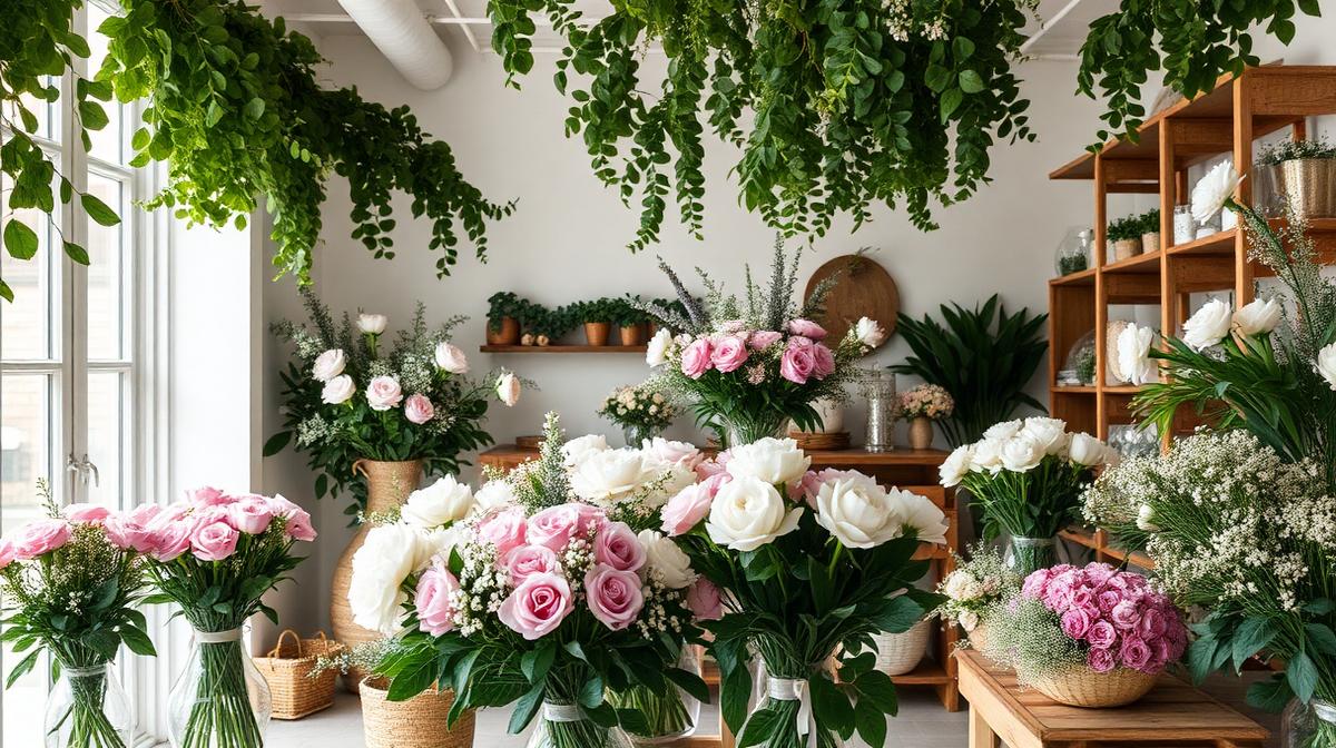
Florist Shop Color Psychology: Botanical Palettes That Sell Emotions
Florists sell emotions disguised as flowers. A bouquet of red roses is really an "I love you." White lilies say "I'm sorry for your loss." Sunflowers declare "You make me happy." The interior design of a florist shop must support these emotional transactions by creating an environment where color tells the story before a single stem is selected.
The Florist's Color Challenge
Product IS the Palette
Unlike most retail environments, a florist's primary visual element—the flowers—changes daily, seasonally, and by availability. This creates a unique design challenge:
The backdrop principle: Shop colors must serve as a neutral-to-complementary backdrop that makes every flower arrangement look its best, regardless of the day's inventory.
The enhancement rule: Interior colors should enhance, never compete with, the flowers on display.
The emotion bridge: Shop colors must create the emotional context—romantic, celebratory, or consoling—that customers need to feel when selecting arrangements.
The Florist Shop Color System
The Optimal Base Palette
The most successful florist shops use a carefully controlled base palette:
| Element | Color | Hex Code | Purpose |
|---|---|---|---|
| Walls | Warm white | #FAF9F6 | Neutral backdrop for any flower color |
| Display surfaces | Natural wood | #C4A882 | Warmth, organic connection |
| Floor | Warm gray or terracotta | #A0937D | Practical, grounding |
| Ceiling | Bright white | #FFFFFF | Maximize reflected light |
| Fixtures | Matte black or aged brass | #2C2C2C / #B5A642 | Structural contrast |
| Accent wall | Sage green | #9CAF88 | Nature connection, botanical context |
Why Green Walls Work
Sage green (#9CAF88) or olive (#6B7D4E) accent walls are the most popular choice among award-winning florists because:
- Natural association: Green connects the shop to nature without competing with flowers
- Complementary function: Green is complementary to red and pink—the most common flower colors—making them appear more vivid
- Calming effect: Green reduces shopping anxiety, encouraging longer browsing times
- Photography backdrop: Green creates beautiful, Instagram-worthy backgrounds for product photography
Seasonal Color Strategies
Spring (March-May)
Emphasis colors: Soft pink (#FFB6C1), lavender (#E6E6FA), butter yellow (#FFFACD) Shop adjustments: Lighten displays, add pastel ribbons, showcase tulips and daffodils prominently
Summer (June-August)
Emphasis colors: Coral (#FF7F7F), sunflower yellow (#FFD700), grass green (#7CFC00) Shop adjustments: Brighten the exterior, add outdoor displays, feature tropical arrangements
Autumn (September-November)
Emphasis colors: Burnt orange (#CC5500), burgundy (#722F37), golden (#B8860B) Shop adjustments: Add warm lighting, introduce dried flower displays, use kraft paper wrapping
Winter (December-February)
Emphasis colors: Deep red (#8B0000), forest green (#006400), white (#FFFFFF), gold (#FFD700) Shop adjustments: Holiday displays, warm intimate lighting, luxury packaging emphasis
Display Psychology: Color Arrangement
The Color Wheel Display Method
Arrange flowers using color theory principles:
Analogous grouping: Place flowers in color-family groups (reds-oranges-yellows, blues-purples-pinks). This creates a harmonious, curated look that reduces decision fatigue.
Complementary pairing: Display contrasting colors together (orange + blue, purple + yellow) for maximum visual impact at window displays and entrance focal points.
Monochromatic graduation: Arrange one color from light to dark (pale pink → deep rose → burgundy) to showcase variety within a theme.
The Focal Point System
Primary focal point (entrance/window): The most dramatic, colorful arrangement—changes weekly Secondary focal points (mid-shop): Themed displays for occasions (wedding, sympathy, birthday) Tertiary elements (throughout): Small, affordable impulse-buy arrangements in bright colors near the counter
Packaging and Wrapping Colors
Wrapping Paper Psychology
The wrapping is the customer's first "gift moment" and carries significant color weight:
- Kraft paper (#C19A6B): Rustic, eco-friendly, artisan—appeals to sustainability-conscious customers
- White tissue (#FFFFFF): Clean, elegant, versatile—works for any occasion
- Black paper (#1A1A1A): Luxury, dramatic—premium bouquets and corporate gifts
- Colored tissue: Should complement, not match, the flowers—pink tissue for white flowers, sage for warm-toned arrangements
Ribbon Color Meanings
Ribbon color carries specific cultural associations:
- Red ribbon: Love, passion, romance
- White ribbon: Sympathy, purity, weddings
- Pink ribbon: Appreciation, gratitude, friendship
- Gold ribbon: Celebration, achievement, luxury
- Green ribbon: Nature, new beginnings, eco-consciousness
Lighting: The Color Multiplier
Natural Light Strategy
Natural light is a florist's most important design element:
- North-facing windows: Consistent, cool light that shows true flower colors
- South-facing windows: Warm light that enhances reds and yellows but can wash out cool tones
- Skylight installations: Ideal for even illumination across displays
Artificial Lighting
When natural light isn't sufficient:
- 3500-4000K: Warm white that flatters flowers without distorting colors
- Avoid below 3000K: Too warm, makes whites look yellow
- Avoid above 5000K: Too cool, makes flowers look clinical
- Spot lighting: Highlight feature arrangements with directional warm light
Digital Presence and Branding
Website Color Strategy
Florist websites should:
- Use white or light backgrounds: Let product photography dominate
- Feature high-quality imagery: Flowers sell themselves when photographed well
- Use muted brand colors: Sage green, soft pink, or warm neutrals as UI elements
- High-contrast CTAs: "Order Now" buttons should be the most visible color on the page
Social Media Visual Identity
Maintain consistent color in your feed:
- Background consistency: Photograph all arrangements against the same backdrop
- Filter consistency: Use the same photo editing style across all posts
- Color story: Periodically feature monochromatic arrangements for visual impact
Use Coloracci's AI palette generator to extract consistent color themes from your best floral photography, then apply them across all branding touchpoints.
Explore more retail design: Beauty Salon & Spa Colors, Wedding Venue Colors, Luxury Retail Colors, or Tropical Resort Colors.