Pet Store Color Psychology: Playful Palettes That Pet Owners Trust
· Coloracci Team
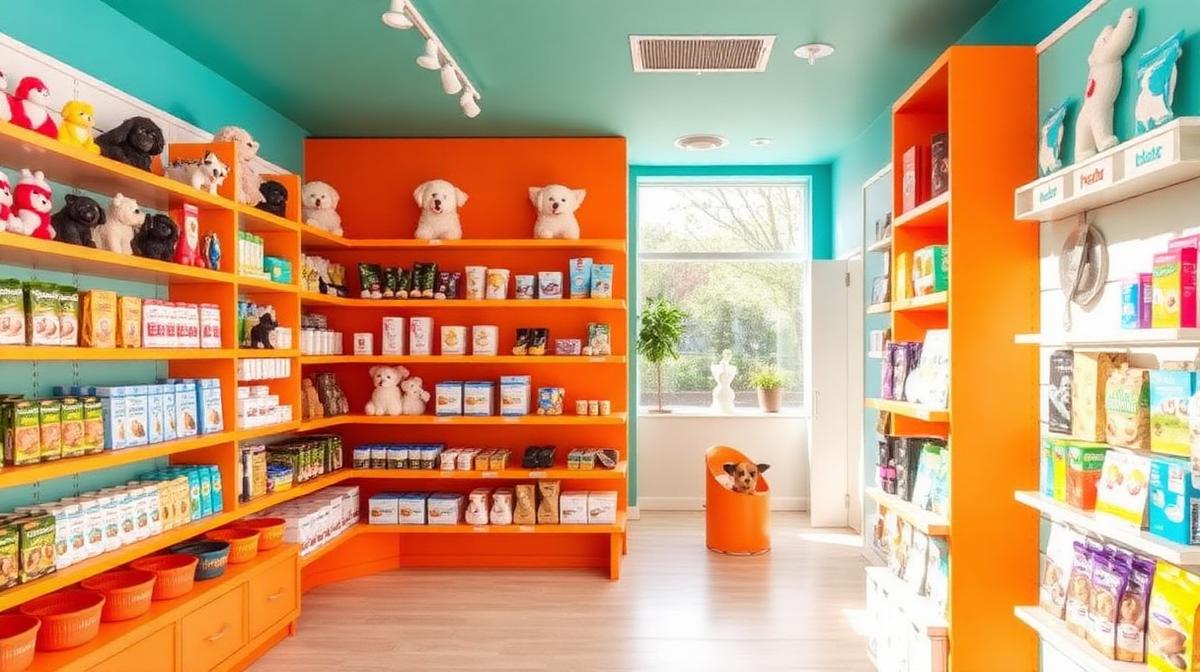
Pet Store Color Psychology: Playful Palettes That Pet Owners Trust
Pet store design must accomplish something few other retail environments face: it must simultaneously appeal to human shoppers and accommodate animal occupants. The colors that attract pet owners through the door, build trust in product quality, and create a comfortable environment for animals require a nuanced understanding of both human psychology and animal vision science.
How Animals See Color
Understanding Pet Vision
Before choosing pet store colors, understanding how animals perceive color is essential:
Dogs: See primarily in blues (#0000FF) and yellows (#FFFF00). Dogs are dichromatic—they cannot distinguish red from green. What humans see as red appears as dark brownish-yellow to dogs.
Cats: Similar to dogs but with slightly better blue-violet perception. Cats see the world in muted blues, yellows, and grays.
Birds: Tetrachromatic vision—they see the full human spectrum PLUS ultraviolet. Birds perceive colors we literally cannot imagine.
Fish: Most freshwater fish see colors similar to humans. Saltwater fish often have excellent color vision.
Reptiles: Many can see UV light and have excellent color discrimination.
Design Implications
| Animal Section | Recommended Colors | Avoid | Reason |
|---|---|---|---|
| Dog area | Blues, yellows | Red-green contrast | Dogs can't distinguish |
| Cat area | Blues, soft purples | Bright reds | Cats see blues best |
| Bird area | Full spectrum | None | Birds see everything |
| Fish/Aquatic | Blues, greens | None | Enhances water aesthetic |
| Small animal | Soft, warm neutrals | Harsh brights | Reduces stress |
The Five Pet Store Archetypes
1. The Premium Pet Boutique
Palette: Navy (#1B2838) + Copper (#B87333) + Cream (#FFFDD0) + Forest green (#2D5F3F)
Targeting affluent pet "parents":
- Navy walls: Sophistication, trust, and quality
- Copper/rose gold accents: Premium positioning without pretension
- Natural materials: Wood, stone, and leather signal quality
- Forest green: Nature connection, organic/natural product emphasis
Pricing psychology: Dark, warm environments increase willingness to pay by 20-30%. Premium pet brands like Wild One and Fable use this palette.
2. The Neighborhood Pet Shop
Palette: Teal (#008080) + Orange (#FF6B35) + White (#FFFFFF) + Warm gray (#9E9E9E)
Friendly, approachable, community-focused:
- Teal: Trustworthy and approachable without being clinical
- Orange: Playful, energetic, pet-like enthusiasm
- White base: Clean, hygienic impression
- Warm gray accents: Professional but not cold
3. The Natural/Organic Pet Store
Palette: Sage green (#8BC48A) + Warm wood (#C4A882) + Cream (#FAF0E6) + Earth brown (#6B4423)
Health-conscious pet owners:
- Green dominance: Nature, health, organic ingredients
- Wood elements: Natural, sustainable material associations
- Earth tones: Connection to the natural world
- Minimal plastic aesthetic: Avoids synthetic-looking materials and colors
4. The Big Box Pet Retailer
Palette: Brand primary + White (#FFFFFF) + Light gray (#E5E5E5) + Warm accent
Scale-focused, warehouse aesthetic:
- Bright brand color: Recognizable from distance (Petco blue, PetSmart red)
- White/gray base: Clean, organized, easy to navigate
- Clear wayfinding colors: Department-specific color coding
- Warm accent: Prevents clinical feeling in large spaces
5. The Adoption-Focused Rescue Shop
Palette: Soft blue (#A3C4E8) + Warm yellow (#FFE082) + White (#FFFFFF) + Blush (#F8C4C4)
Emotional, welcoming, hope-focused:
- Soft blue: Calm, trustworthy, reduces animal and human anxiety
- Warm yellow: Happiness, optimism, new beginnings
- White: Cleanliness, fresh starts
- Blush accents: Warmth, love, emotional connection
Functional Color Zones
The Adoption Area
Colors here serve a specific emotional function—they must help nervous animals appear calm and appealing:
- Wall color: Soft blue (#B3D4E8) or warm gray (#C8C0B8)—reduces animal anxiety
- Kennel/cage color: White or light gray—makes animals visible and spaces appear clean
- Lighting: 3500-4000K warm white—flatters animal appearances
- Floor color: Medium tone—hides mess while keeping space bright
The Product Floor
Product areas need to balance brand visibility with navigation:
- Aisle-by-species color coding: Blue for dogs, purple for cats, green for small animals, orange for fish
- Endcap highlighting: Warm spot lighting draws attention to featured products
- Price tag colors: Red (#CC0000) for sales, brand color for everyday pricing
The Grooming Area
The grooming space must communicate both fun and professionalism:
- Calming blues (#A3C4E8): Reduces anxiety for nervous pets
- Clean whites (#FFFFFF): Hygiene assurance for owners
- Playful accent: One energetic color (teal, coral) prevents clinical feeling
- Avoid: Bright red, which can increase anxiety in animals
Animal Stress and Color
Colors That Calm Animals
Research on shelter environments shows:
- Soft blue (#A3C4E8): Reduces barking in dogs by up to 15%
- Lavender (#E6E6FA): Calming effect on cats in shelter settings
- Sage green (#B2BEB5): Neutral, non-threatening to most species
- Warm neutrals (#C8B99A): Earth tones are generally non-stressful
Colors That Stress Animals
- Bright red (#FF0000): Increases arousal and anxiety in many species
- Harsh white (#FFFFFF) under fluorescent lighting: Creates a clinical, stressful environment
- High-contrast patterns: Can be overstimulating for nervous animals
- Neon/electric colors: Unnatural, potentially stressful for most pets
Branding and Digital Presence
Pet Brand Color Trends
The pet industry's most successful brands use:
- Blue + Orange: 35% of top pet brands—trust meets playfulness
- Green + Brown: 25%—natural and organic positioning
- Red + White: 20%—energy and clean branding
- Purple + Yellow: 15%—premium and joyful
E-commerce Color Strategy
Online pet stores should:
- Use white/light backgrounds: Makes product photography accurate
- Species-specific color coding: Help shoppers navigate quickly
- Warm CTAs: Orange (#FF6B35) or teal (#008080) "Add to Cart" buttons
- Pet photography: Feature happy animals with warm, natural lighting
Use Coloracci's palette tools to build cohesive pet brand palettes that appeal to owners while respecting animal comfort.
Explore more retail design: Veterinary Clinic Colors, Florist Shop Colors, Ice Cream Shop Colors, or Retail Store Color Psychology.