Ice Cream Shop Color Psychology: Pastel Palettes That Drive Sweet Sales
· Coloracci Team
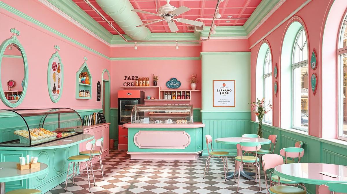
Ice Cream Shop Color Psychology: Pastel Palettes That Drive Sweet Sales
Ice cream is an emotional purchase—customers buy feelings, not just frozen dessert. The most successful ice cream and gelato shops understand that color creates craving before a single scoop is scooped. From cotton-candy pink walls to mint-green counters, every color choice influences what and how much customers buy.
The Psychology of Sweet Colors
Why Pastels Dominate Ice Cream Design
Pastel colors dominate ice cream shop design for scientifically-supported reasons:
- Sweetness association: Research shows that lighter, warmer colors (pink, peach, cream) are universally associated with sweet taste—even before consumption
- Childhood nostalgia: Pastels trigger memories of birthday parties, summer, and childhood treats
- Approachability: Soft colors reduce decision anxiety in a high-choice environment
- Temperature perception: Cool pastels (mint, baby blue) reinforce the "cold treat" expectation
The Core Ice Cream Palette
| Color | Hex Code | Psychological Effect | Best Use |
|---|---|---|---|
| Cotton Candy Pink | #FFB3D9 | Sweetness, playfulness | Walls, branding |
| Mint Green | #98FF98 | Freshness, coolness | Counters, accents |
| Vanilla Cream | #FFF8E7 | Comfort, richness | Base color, ceiling |
| Berry Purple | #C8A2C8 | Indulgence, luxury | Premium product displays |
| Sky Blue | #87CEEB | Refreshment, summer | Exterior, signage |
| Peach | #FFCBA4 | Warmth, happiness | Feature walls |
| Lemon Yellow | #FFF44F | Energy, joy | CTAs, price displays |
The Five Ice Cream Shop Archetypes
1. The Retro Parlor
Palette: Pink (#FFB6C1) + Mint (#AEEBD0) + White (#FFFFFF) + Chrome (#C0C0C0)
The 1950s-inspired aesthetic that never goes out of style:
- Checkerboard floors: Black and white create visual structure
- Pastel walls: Pink or mint for nostalgic warmth
- Chrome stools and fixtures: Retro-futuristic shine
- Neon signage: "Open" signs in warm pink or red
This archetype succeeds because it creates a time-capsule experience—customers feel like they're stepping into a simpler, happier era.
2. The Artisan Gelateria
Palette: Cream (#F5E6CC) + Sage (#B2BEB5) + Dark wood (#5C3A21) + White marble (#F0EDE8)
Italian-inspired sophistication:
- Natural materials: Stone, wood, and glass communicate quality ingredients
- Muted palette: Lets the gelato colors become the visual focus
- Earth tones: Signal natural, artisan production
- Minimal signage: Quality speaks for itself
3. The Instagram-Ready Pop-Up
Palette: Hot pink (#FF1493) + Electric blue (#00BFFF) + Yellow (#FFE135) + White (#FFFFFF)
Designed for social media sharing:
- Bold, saturated colors: Maximum contrast for phone cameras
- Statement walls: Murals, neon signs, and photo-op backdrops
- Branded packaging: Every cup and cone is content-ready
- Color-blocked zones: Each area offers a different photo opportunity
4. The Health-Conscious Frozen Treat Bar
Palette: White (#FAFAFA) + Sage green (#8BC48A) + Blush (#F4C2C2) + Natural wood (#C4A882)
For frozen yogurt, açaí, and "better for you" brands:
- Clean, bright interiors: Communicate health and freshness
- Green accents: Natural, organic associations
- Soft pink: Warmth without artificial sweetness
- Wood elements: Connection to nature and wholesome ingredients
5. The Late-Night Dessert Destination
Palette: Black (#1A1A1A) + Neon pink (#FF6EC7) + Gold (#FFD700) + Dark teal (#005757)
After-hours indulgence atmosphere:
- Dark base: Creates intimacy and indulgence
- Neon accents: Night-life energy
- Gold details: Premium positioning
- Dramatic lighting: Transforms ice cream into an experience
Flavor Display Color Psychology
The Gelato Case as Color Canvas
The display case is the most important sales tool. Color strategies include:
Color arrangement: Place complementary-colored flavors next to each other (strawberry pink next to pistachio green) for maximum visual appeal
The "anchor" technique: Place the most visually striking flavor (usually chocolate or a vivid fruit) at eye level to draw attention, then surround it with contrasting colors
White space: Leave visible steel or white surfaces between gelato pans—crowding reduces perceived quality
Flavor-Color Expectations
Customers have strong expectations about flavor-color connections:
- Vanilla: Customers expect warm cream (#FFF8DC), not white
- Strawberry: Expect pink (#FFB6C1), not red—too red suggests artificial
- Chocolate: Rich brown (#3C1414) signals quality; light brown suggests dilution
- Pistachio: Must be pale green (#93C572), not bright green—brightness suggests artificial coloring
- Mango: Deep golden (#FFB300) communicates ripeness and authenticity
Breaking these expectations (blue ice cream, black vanilla) can work for novelty but should be used strategically, not as the norm.
Packaging and Takeaway Colors
Cup and Cone Color Impact
Packaging color affects taste perception:
- White cups: Vanilla ice cream tastes "more creamy" in white cups
- Pink cups: Strawberry ice cream tastes "more fruity"
- Brown/kraft cups: Any flavor tastes "more natural and artisan"
- Black cups: Ice cream is perceived as "more premium and indulgent"
Spoon Color Psychology
Even the humble ice cream spoon carries color weight:
- Wooden: Natural, eco-conscious, artisan
- Pink: Playful, targeted toward younger customers
- Black: Premium, modern
- Transparent: Clean, minimal, no color interference
Seasonal Color Adaptation
Smart ice cream shops adjust their color emphasis seasonally:
Summer: Emphasize cool colors—mint, sky blue, lemon yellow. Lighter, fresher feeling. Winter: Shift to warm tones—hot chocolate brown, cinnamon, caramel gold. Comfort and indulgence. Holiday: Add festive accents—red and green for Christmas, pastels for Easter.
Digital and Branding Strategy
Website and App Colors
Ice cream brand digital presence should:
- Use the pastel palette: Maintain the sweet, approachable tone
- Feature product photography: Let ice cream colors dominate
- High-contrast CTAs: Use saturated versions of brand pastels for ordering buttons
- Mobile-first: Most ice cream searches happen on phones while walking
Social Media Palette Consistency
Maintain a consistent color filter across all posts:
- Bright and airy: For artisan and health-focused brands
- Warm and golden: For nostalgic and comfort brands
- Bold and saturated: For trendy and youth-focused brands
Use Coloracci's AI palette tools to extract and standardize your brand colors from your best product photography, ensuring consistency across all touchpoints.
Explore more food & beverage design: Coffee Shop Color Psychology, Restaurant Color Psychology, Brewery & Winery Colors, or Romantic Restaurant Colors.