Poker Room Design: Colors That Keep Players Seated for Hours
· Coloracci Team
Poker Room Design: Colors That Keep Players Seated for Hours
I once sat at a poker table in Las Vegas for eight straight hours. I didn't notice the time passing. I didn't feel tired. I didn't even feel hungry until I finally stood up and my legs reminded me they existed. That's not an accident—it's the result of deliberate color psychology that's been refined over decades of casino design.
Unlike the chaotic, dopamine-triggering colors of the slot machine floor, poker rooms are designed for a completely different psychology: sustained focus. While slot players cycle through machines in minutes, poker players need to remain mentally sharp for hours. The colors that achieve this are as scientifically calculated as any other aspect of casino design.

Why Poker Rooms Are Different from the Casino Floor
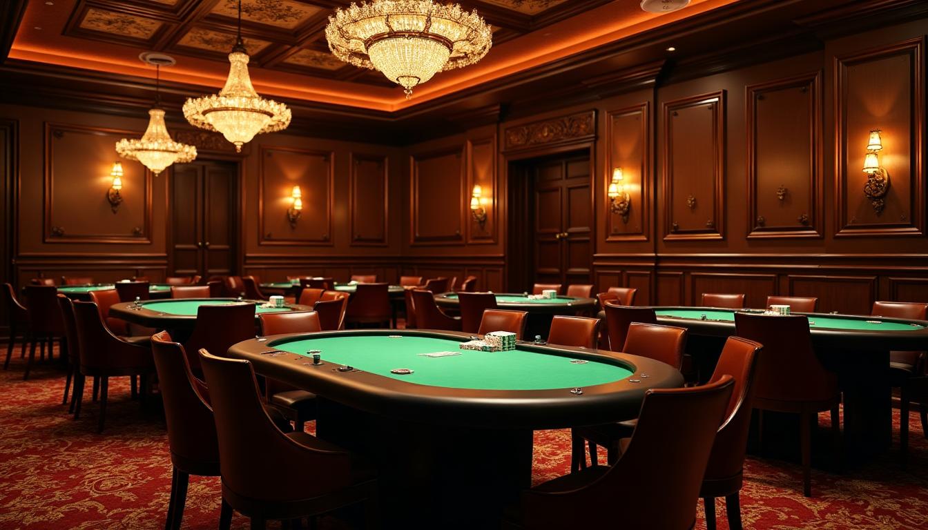
Walk from a casino's main floor into a dedicated poker room, and you'll immediately sense the difference. The sensory assault subsides. The lighting softens. The color palette shifts from aggressive reds and golds to calming greens and earth tones.
This isn't about poker being a "classier" game—it's about player retention economics. The psychology differs fundamentally:
Casino floor design goals:
- Trigger impulse decisions
- Create excitement and urgency
- Maximize quick turnover
- Stimulate dopamine spikes
Poker room design goals:
- Encourage long sessions
- Reduce eye strain
- Create comfortable focus
- Signal sophistication
The rake (casino's cut) in poker accumulates over time, not through quick bets. A player who stays for 8 hours is worth exponentially more than one who leaves after 30 minutes. Every color choice supports this economic reality.
The Sacred Green: Why Felt Color Matters
The iconic green felt of poker tables isn't tradition for tradition's sake—it's one of the most carefully researched color choices in gaming design.

The Psychology of Poker Green
The standard poker felt color (#0D5E3A to #1A5C3C) was chosen for several scientifically-validated reasons:
Eye Strain Reduction Green sits at the center of the visible light spectrum. Unlike red or blue wavelengths that require your eyes to work harder to focus, green wavelengths hit the retina at an optimal focal point. For players staring at cards for hours, this matters enormously.
Psychological Calming Green is associated with balance and harmony. It reduces anxiety without inducing sleepiness—the perfect state for strategic thinking. Unlike blue (which can feel cold and distant) or red (which creates urgency), green creates a sense of stability.
Contrast Optimization Standard playing cards feature red and black suits on white backgrounds. Against green felt:
- Red hearts and diamonds pop with high visibility
- Black spades and clubs maintain clear definition
- White card stock doesn't create glare
- Face cards remain easily readable
Modern Felt Variations
While traditional green remains dominant, modern poker rooms experiment with alternatives:
| Felt Color | Hex Code | Psychology | Best For |
|---|---|---|---|
| Classic Green | #0D5E3A | Focus, tradition | Cash games |
| Speed Felt Blue | #1E3A5F | Modern, clean | Tournaments |
| Burgundy | #800020 | Premium, exclusive | VIP rooms |
| Black | #1A1A1A | High stakes, dramatic | Final tables |
| Navy | #1B365D | Sophisticated | Private clubs |
The choice of felt color often signals the room's positioning. Blue felt says "modern, tournament-focused." Burgundy says "this is where serious money plays."
Tournament Poker Design: The Arena Effect
Professional poker tournaments have evolved into televised spectacles, and their design reflects this transformation. The World Series of Poker, European Poker Tour, and PokerStars events all employ specific color strategies.

The Final Table Color Psychology
When millions of dollars are on the line, every visual element is calculated:
Background Colors Tournament final tables typically use deep blue (#1E3A5F) or black backgrounds. This:
- Creates dramatic contrast for TV cameras
- Makes players and chips the visual focus
- Reduces ambient light distractions
- Signals "this is serious"
Branding Colors Major tournaments choose distinctive color palettes:
- WSOP: Red and gold (#DC143C, #FFD700) - power and prestige
- EPT: Red and black - European elegance
- WPT: Blue and silver - modern sophistication
Spotlight Psychology Notice how final tables are lit with focused spots while the audience sits in near-darkness. This:
- Creates a "theater" effect
- Increases player intensity
- Makes the table feel intimate despite large venues
- Signals "all eyes are on you"
Tournament Room vs. Cash Game Room
The same casino often differentiates tournament and cash game areas through color:
| Element | Tournament Area | Cash Game Area |
|---|---|---|
| Wall color | Dark blue/black | Warm browns |
| Lighting | Dramatic spots | Even ambient |
| Felt color | Blue or black | Traditional green |
| Ceiling | High, dark | Lower, warmer |
| Mood | Intense, competitive | Relaxed, social |
VIP Private Poker Suites
The highest-stakes poker often happens in private rooms away from the main floor. These VIP suites represent the pinnacle of poker room design—where color psychology meets luxury signaling.

The Psychology of Exclusivity
VIP poker rooms use color to communicate one message: "You belong to an elite group." This is achieved through:
Darker Color Palettes VIP rooms are almost universally darker than public rooms. Colors like deep burgundy (#800020), navy (#1B365D), and black create:
- A sense of privacy
- Separation from the "common" areas
- Increased focus (fewer visual distractions)
- Perception of exclusivity
Precious Metal Accents Gold (#D4AF37, #C9B037) appears throughout VIP rooms—in fixtures, trim, and decorative elements. Unlike the brass-plated gold of the main floor, VIP rooms often use actual gold leaf or high-quality finishes. The psychology:
- Associates the space with wealth
- Creates warm contrast against dark backgrounds
- Signals "winners play here"
Premium Material Colors VIP rooms pair color with texture:
- Deep leather browns and blacks
- Polished wood tones (#5D4037, #8B4513)
- Crystal and glass elements
- Plush carpet in burgundy or navy
Macau VIP Design: Red and Gold Dominance
Asian high-roller rooms, particularly in Macau, employ a different palette rooted in cultural color symbolism:
Red Everywhere While Western poker rooms use red sparingly, Macau VIP rooms embrace it:
- Red walls and ceiling details
- Red-accented lighting
- Red elements in carpet patterns
- Red and gold table rails
Lucky Gold Gold doesn't just accent—it dominates:
- Gilded wall panels
- Golden light fixtures
- Gold-threaded textiles
- Golden chip racks
This isn't just aesthetics—it's cultural psychology. Chinese high-rollers associate these colors with fortune and prosperity. A room that doesn't "feel lucky" won't attract the world's biggest gamblers.
Chip Color Psychology: The Currency Hierarchy
Poker chips aren't just currency—they're psychological tools that influence player behavior. The standardized color system creates a visual language that affects how players perceive and spend money.

The Standard Chip Color Hierarchy
Most casinos follow a similar color progression:
| Chip Value | Primary Color | Psychology |
|---|---|---|
| $1 | White/Blue | Disposable, training wheels |
| $5 | Red (#DC143C) | Action, betting standard |
| $25 | Green (#0D5E3A) | Serious money, felt blend |
| $100 | Black (#000000) | Power, high stakes |
| $500 | Purple (#800080) | Premium, rare |
| $1,000 | Orange/Yellow | Maximum visibility |
| $5,000+ | Pink/Chocolate | Ultra-high stakes |
Why These Colors?
Red for $5: Red creates urgency and action. It's the most commonly bet chip and encourages active play.
Green for $25: Green blends with the felt, making large stacks feel less "visible" to opponents. Players are more comfortable betting greens than reds of equivalent total value.
Black for $100: Black signifies power and seriousness. The transition from green to black represents a psychological step up in stakes.
Purple for $500+: Purple historically represents royalty and rarity. Its relative uncommonness reinforces its high value.
The Perception Manipulation
Casinos understand that players mentally process chips differently than cash:
Color Desensitization After hours of play, chip colors become normalized. A $500 purple chip stops feeling like $500—it's just "a purple." This is intentional.
Stack Psychology A stack of red chips ($5 × 20 = $100) looks smaller than a single black chip. Yet players often feel more comfortable betting "a black" than "twenty reds." The color simplifies the decision.
High-Value Visibility Orange and yellow chips for $1,000+ ensure high-value bets are visible—both to opponents (creating intimidation) and to surveillance cameras.
The Psychology of Keeping Players Seated
Every color choice in a poker room contributes to one goal: keeping players comfortable enough to stay for hours without realizing how much time has passed.
Color Temperature Strategy
Poker rooms use warm color temperatures (2700K-3200K) for several reasons:
Reduced Fatigue Cool blue light (5000K+) increases alertness short-term but causes eye strain long-term. Warm light mimics sunset conditions, signaling relaxation while maintaining focus.
Time Distortion Warm amber light feels perpetually like "early evening"—a comfortable time psychologically associated with leisure. Players don't sense time progressing.
Comfort Association Warm tones remind us of home environments, fireplaces, and intimate restaurants. This creates subconscious comfort.
Wall and Ceiling Colors
Poker room walls typically avoid white entirely:
- Earth tones (#8B7355, #5D4037) create warmth without distraction
- Deep burgundy (#800020) signals premium spaces
- Dark gray (#2C2C2C) for modern rooms
- Navy (#1B365D) for classic elegance
White walls would:
- Reflect light unevenly
- Create visual distractions
- Make the space feel clinical
- Reduce the "timeless" atmosphere
Carpet Psychology
Casino carpets are famously ugly for good reason—they're designed to keep eyes on the tables. Poker room carpets are more subtle:
- Dark patterns hide stains and chips
- Low contrast reduces distraction
- Warm colors complement table greens
- Sound-absorbing textures reduce noise
Online Poker vs. Live: Color Translation
How do you translate a physical poker room's psychology to a screen?

Digital Felt Colors
Online poker sites have experimented extensively with table colors:
| Platform | Primary Table Color | Psychology |
|---|---|---|
| PokerStars | Red (#8B0000) | Action, brand identity |
| GG Poker | Dark green (#0D5E3A) | Traditional feel |
| 888 Poker | Navy blue (#1B365D) | Premium perception |
| PartyPoker | Multi-color themes | Customization |
Screen Optimization
Online tables face unique challenges:
- Blue light emission: Most tables avoid bright blues that cause eye strain
- Contrast requirements: Cards must remain readable on small screens
- Brand differentiation: Colors must be distinctive for marketing
Dark Mode Considerations
Modern poker apps offer dark mode, which creates entirely different psychology:
- Reduced eye strain for long sessions
- Focus on cards and chips (everything else recedes)
- Feeling of privacy and focus
- Extended play session capability
Home Game Design: Bringing Casino Colors Home
Creating an effective home poker game environment doesn't require a huge budget—just understanding color psychology.
Essential Color Choices
Table Selection If buying a poker table:
- Green felt for traditional experience
- Blue felt for modern tournament feel
- Burgundy for a premium home setup
- Avoid: Black (hides cards), white (glare), bright colors (distraction)
Lighting
- Warm pendant lights (2700K) over the table
- Avoid overhead fluorescents
- Use dimmable options for ambiance control
- Direct light on table, softer ambient elsewhere
Room Colors
- Earth tones on walls (#8B7355, #A0522D)
- Dark ceiling (absorbs light, reduces reflection)
- Neutral carpet or rug
- Avoid white or bright walls
Creating the Right Atmosphere
Use color to signal "this is a serious game":
- Dedicated space with consistent colors
- Quality felt that matches professional rooms
- Proper chip colors following casino standards
- Ambient elements (art, shelving) in complementary tones
Designing Your Own Poker Brand
Whether creating a home game, poker league, or online platform, strategic color choices define your brand.
Color Selection for Poker Brands
Tournament Series
- Use two primary colors: one dark (authority), one bright (energy)
- Examples: Red/gold (WSOP), red/black (EPT)
Cash Game Rooms
- Earth tones signal "serious, professional"
- Green accent ties to poker tradition
Online Platforms
- Need high recognition in small icons
- Must work in both light and dark modes
- Consider color accessibility
Tools for Poker Design
Create your poker brand palette with:
- AI Website Designer - Generate complete poker room brand identities
- Color Hierarchy Tool - Plan your primary/secondary/accent balance
- Gradient Maker - Create premium gradient backgrounds
Ethical Considerations
Like all casino design psychology, poker room colors walk an ethical line:
Positive Applications
- Reducing player fatigue (healthier sessions)
- Creating comfortable environments
- Reducing eye strain
- Enabling focus and strategic thinking
Questionable Applications
- Time distortion (no windows or clocks)
- Obscuring real money through chip colors
- Creating addiction-friendly environments
- Targeting vulnerable players
Responsible poker room design can prioritize player comfort without manipulating play duration. The same psychology that keeps players seated can be applied to create genuinely enjoyable experiences.
Key Takeaways for Designers
The psychology of poker room color applies beyond casinos:
- Green reduces eye strain for any sustained focus environment (offices, study spaces)
- Warm lighting extends comfortable attention spans
- Dark backgrounds increase focus on primary elements
- Color hierarchy (like chip values) creates intuitive systems
- Material-color pairing (leather browns, velvet burgundy) signals quality
- Cultural color awareness matters for international audiences
Whether designing a home game, online platform, or understanding why you played poker until 4am without realizing it—the colors are doing exactly what they're designed to do.
Related Articles
- Casino Floor Color Psychology: Vegas, Monte Carlo & Macau Design Secrets
- Lucky Colors Across Gambling Cultures
- Slot Machine Color Psychology: Win Animations & Near-Miss Effects
- The Science of Green in Branding
- What Does the Color Black Mean?
- Luxury Brand Color Psychology
- Dark Mode Design: Creating Beautiful Dark Interfaces
- Color Accessibility WCAG Guide