Pixel Art & Retro Gaming Colors: 8-Bit Palettes That Defined a Generation
· Coloracci Team
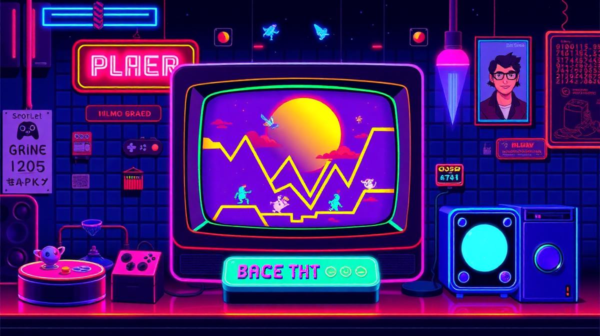
Pixel Art & Retro Gaming Colors: 8-Bit Palettes That Defined a Generation
The color palettes of early video games weren't artistic choices—they were engineering compromises that became aesthetic revolutions. Limited by hardware that could display only a handful of colors, game designers developed visual languages so distinctive that they've become permanent cultural touchstones, influencing everything from indie games to fashion and graphic design.
The Hardware Color Limitations
Console Color Capabilities
Each gaming generation's hardware imposed specific color constraints:
| System | Year | Total Colors | On-Screen | Notable Limitation |
|---|---|---|---|---|
| Atari 2600 | 1977 | 128 | 4 per line | Extreme limitation |
| NES | 1985 | 54 | 25 | 4 palettes of 4 colors |
| Game Boy | 1989 | 4 shades | 4 | Green-tinted monochrome |
| Sega Genesis | 1988 | 512 | 64 | Rich but constrained |
| SNES | 1990 | 32,768 | 256 | Near-photographic for its era |
| Game Boy Color | 1998 | 32,768 | 56 | Portable color revolution |
The NES Palette: 54 Colors That Changed Everything
The Nintendo Entertainment System's 54-color palette became the foundation of pixel art culture:
The "Nintendo colors" most associated with the era:
- Mario Red (#B53120): The most recognizable color in gaming
- Sky Blue (#6888FC): NES sky background, used in hundreds of games
- Brick Brown (#A45030): Ground tiles in Super Mario Bros.
- Pipe Green (#00A844): Mario's iconic green pipes
- Coin Gold (#FCE030): Collectible items and rewards
- Black (#000000): Outlines and deep shadows
The Game Boy Green Phenomenon
The original Game Boy's green-tinted display created an entire aesthetic:
- Lightest green (#9BBC0F): Background, highlights
- Light green (#8BAC0F): Light mid-tones
- Dark green (#306230): Dark mid-tones
- Darkest green (#0F380F): Shadows, outlines
This 4-shade palette forced designers to communicate everything through value contrast alone—a masterclass in monochromatic design that pixel artists still study.
Iconic Game Color Palettes
Super Mario Bros. (1985)
The game that defined color in gaming used the NES palette to create instantly readable environments:
- Sky blue (#6888FC): Safety, openness, above-ground levels
- Black (#000000): Danger, underground levels, night
- Red (#B53120): Mario himself—warm, approachable, active
- Green (#00A844): Luigi, pipes, nature elements
- Brown (#A45030): Ground, bricks, earth—stability
Design principle: Color defined game mechanics. Underground (black background) = danger. Above ground (blue background) = relative safety. This color-as-information approach remains fundamental in game design.
The Legend of Zelda (1986)
Zelda used color to create an open world within extreme limitations:
- Green (#00A844): Link's tunic—nature, exploration, heroism
- Tan/sand (#FCE0A8): Desert and overworld terrain
- Blue (#0058F8): Water, ice, and magical elements
- Dark gray (#585858): Dungeons and caves
Pac-Man (1980)
The simplest palette with the strongest recognition:
- Yellow (#FFFF00): Pac-Man—optimism, hunger, the player
- Blue (#0000FF): Vulnerable ghosts—edible, temporary safety
- Red (#FF0000): Blinky ghost—aggression, pursuit
- Pink (#FFB8FF): Pinky ghost—indirect threat
- Cyan (#00FFFF): Inky ghost—unpredictable
- Orange (#FFB852): Clyde ghost—random, less threatening
Color Techniques in Pixel Art
Dithering: Creating Colors That Don't Exist
Dithering—alternating two colored pixels in a pattern—creates the illusion of a third color that the hardware cannot produce:
- Blue + white dithering: Creates the appearance of light blue
- Red + yellow dithering: Creates the illusion of orange
- Black + any color dithering: Creates darker shades
This technique anticipates modern gradient algorithms and demonstrates that perceived color and actual color can differ.
Selective Outlining
Rather than uniform black outlines, pixel artists use colored outlines to suggest lighting:
- Warm side: Outline shifts toward warm darks (#4A2810)
- Cool side: Outline shifts toward cool darks (#1A2040)
- This creates dimensionality without additional colors
Anti-Aliasing by Hand
Pixel artists manually place intermediate-colored pixels at curved edges to create smooth-looking curves within the grid. This hand-crafted approach to anti-aliasing produces distinctive aesthetic results that are now deliberately emulated in modern pixel art tools.
The Indie Game Pixel Art Renaissance
Modern Pixel Art Color Approaches
Contemporary pixel art games use limited palettes by choice, not necessity:
Celeste (2018): Uses rich, emotionally-driven color palettes that shift with narrative mood—warm pinks during hopeful moments, cool blues during difficult passages
Stardew Valley (2016): Warm, saturated palette inspired by SNES-era games—pastoral greens, warm browns, and cheerful accent colors
Shovel Knight (2014): Deliberately constrains itself to NES-era limitations while using them masterfully
Hyper Light Drifter (2016): Uses pixel art with a more contemporary, neon-infused palette—magenta, cyan, and electric purple
Popular Pixel Art Palettes
Modern pixel artists often use pre-made palettes for consistency:
Pico-8 palette (16 colors): The most popular restrictive palette for modern pixel art:
- Dark blue (#1D2B53), dark purple (#7E2553), dark green (#008751)
- Brown (#AB5236), dark gray (#5F574F), light gray (#C2C3C7)
- White (#FFF1E8), red (#FF004D), orange (#FFA300)
- Yellow (#FFEC27), green (#00E436), blue (#29ADFF)
- Indigo (#83769C), pink (#FF77A8), peach (#FFCCAA), black (#000000)
Endesga 32: A 32-color palette designed for rich pixel art:
- Warm and cool variants of each hue
- Carefully selected for readable combinations
Pixel Art Color Principles for Modern Design
What Pixel Art Teaches Designers
- Constraint breeds creativity: Fewer colors force more thoughtful choices
- Every pixel matters: In limited palettes, each color placement has outsized impact
- Color communicates function: Color should tell the user what things DO, not just what they look like
- Readability over beauty: If elements aren't instantly distinguishable, the palette fails
- Consistency builds world: Maintaining palette discipline creates cohesive visual worlds
Applying Pixel Art Principles to UI Design
- Limited UI palettes: Most effective interfaces use 5-7 colors—like a well-chosen pixel art palette
- Color for meaning: Red for errors, green for success, blue for information—game-inspired functional color
- High contrast: Pixel art's forced contrast ensures readability—apply to text and CTAs
- Palette consistency: Stay within your defined palette, even when tempted to add "just one more color"
Creating Retro-Inspired Palettes
Use Coloracci's AI tools to generate pixel art-inspired palettes for modern design projects. Whether you're building a retro gaming interface, designing nostalgic branding, or creating indie game art, the principles of constrained color selection remain timeless.
Explore more digital design color topics: Gaming Color Psychology, Dark Mode Design Colors, Neobrutalism Design Colors, or Pop Art Colors.