Neobrutalism Design Colors: The Bold Color Trends Redefining Web Design in 2026
· Lion Dada
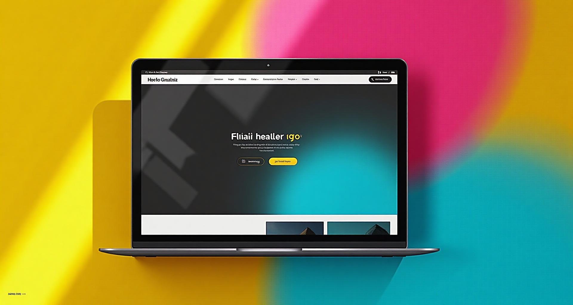
I was scrolling through Dribbble at 2 AM—the dangerous design hours when inspiration and chaos blur together—when I first saw it. A website that looked like it had been assembled by a rebellious teenager who'd just discovered Microsoft Paint and really, really liked it.
Thick black borders. Harsh shadows that didn't fade. Yellow so bright it felt like a warning. And somehow, impossibly, it was beautiful.
That was my introduction to neobrutalism. And if you're wondering why every other startup website suddenly looks like it's screaming at you in the most charming way possible, you're in the right place.
What Is Neobrutalism in Web Design?
Neobrutalism is the internet's rebellious answer to the sleek, polished minimalism that dominated the 2010s. Think of it as minimalism's punk cousin who went to art school and came back with opinions.
The style takes its name from Brutalist architecture—those raw concrete buildings from the 1950s-70s that prioritized function over form. But neobrutalism isn't about being ugly. It's about being intentionally bold in a world that's gotten too safe.
Key Visual Characteristics
Thick Black Borders: The signature element. Every button, card, and component is outlined with bold, unapologetic strokes—typically 2-4px thick.
Solid Drop Shadows: No soft gaussian blur here. Shadows are offset (usually 4-8px down and right) and completely solid. They look like elements were cut from paper and pasted onto the screen.
High-Saturation Colors: Forget your carefully calculated 60-30-10 ratio of muted tones. Neobrutalism embraces colors that punch you in the face—electric yellows, hot pinks, pure blues.
Flat Surfaces: No gradients, no glossy effects. Every color is flat and confident.
Intentional "Rawness": Exposed grid lines, visible borders, asymmetry that feels deliberate rather than broken.
The Neobrutalism Color DNA
If minimalism whispers, neobrutalism shouts. The color philosophy is fundamentally different from traditional web design.
Why Neobrutalism Rejects "Safe" Palettes
Most web design advice tells you to use muted, harmonious colors. Neobrutalism says: "Where's the fun in that?"
The movement emerged partly as a reaction against corporate sameness. When every SaaS company started using the same soft blue and gentle purple gradients, designers got bored. Neobrutalism is the collective scream of "We can do something different."
The Black Border Foundation
Here's the secret to neobrutalism that many designers miss: black is the most important color in the palette.
Every neobrutalist design uses black (#000000 or near-black #1A1A1A) as the structural element. It's the border, the shadow, the anchor that holds the chaos together. Without it, those clashing colors would just look broken.
Common Neobrutalist Color Patterns
- High Saturation + White Space: Bright colors pop even more against clean white backgrounds
- Complementary Clashes: Using complementary colors that would normally fight, but contained within black borders
- Neon Against Dark: Lime greens, hot pinks, and cyans against near-black backgrounds
- Primary Pure: Unapologetic use of pure primary colors (#FF0000, #00FF00, #0000FF)
6 Signature Neobrutalism Color Palettes
Ready to embrace the chaos? Here are six palettes that define the movement:
Palette Deep Dive
Classic Brutalist is where it all started. The combination of black, white, yellow, and blue feels like a warning sign in the best way. Use this for tech startups that want to appear bold but approachable.
Punk Pop is for brands that aren't afraid to alienate traditionalists. The hot pink #FF006E paired with electric blue #3A86FF is jarring—and memorable. Gen Z loves this.
Retro Digital borrows from 90s design trends but with modern restraint. The orange-purple-mint combination feels nostalgic yet fresh.
Bold Minimal proves neobrutalism doesn't have to be loud. With cream #FFFCF2 as the dominant color and red as the accent, it's sophisticated brutalism.
Neon Clash is the extreme end of the spectrum. Lime, magenta, and cyan together shouldn't work, but against black, they become almost elegant. Perfect for web3, NFT platforms, and nightlife brands.
Earthy Bold shows that neobrutalism can embrace natural tones. Burnt orange and forest green bring warmth while maintaining that characteristic boldness.
The Psychology Behind "Ugly" Colors
Why does neobrutalism work when it breaks every traditional design rule?
Authenticity Over Perfection
Gen Z grew up in a world of overproduced content. Every Instagram feed looked the same. Every brand had the same "authentic" voice that felt anything but.
Neobrutalism reads as honest. It doesn't pretend to be smooth or polished. In a world of corporate polish, that rawness signals "we're real."
The Von Restorff Effect Amplified
In color psychology, we know that elements that stand out are remembered. Neobrutalism takes this to the extreme—everything is designed to stand out.
When every website looks like a soft-focused wellness brand, the one screaming in yellow demands attention.
Playfulness as Trust Signal
For certain audiences—creative professionals, tech-forward startups, entertainment brands—playfulness signals competence. It says "we're confident enough to have fun."
Real Brands Using Neobrutalism
Let's analyze how major brands have adopted this aesthetic:
Figma's Marketing Pages
Figma's marketing site is a masterclass in controlled neobrutalism. They use:
- Bold yellow #FFD93D as their primary brand color
- Thick black outlines on UI elements
- Solid offset shadows
- High-contrast text
But they keep it usable by limiting the bold elements to specific sections while maintaining clean white space.
Gumroad's Redesign
Gumroad embraced neobrutalism fully with their rebrand. The pink-and-black combination, thick borders, and deliberately "anti-corporate" aesthetic perfectly matches their creator-first positioning.
Linear's Anti-Corporate Vibe
Linear proves neobrutalism can be subtle. Their use of stark black backgrounds with bright accents and crisp borders has neobrutalist DNA without the full chaos.
What These Brands Have in Common
- Target audience clarity: They know exactly who they're speaking to
- Strategic restraint: Bold elements are used deliberately, not everywhere
- Accessibility maintained: Despite bold colors, contrast ratios remain WCAG compliant
- Consistent application: The style appears across all touchpoints
Neobrutalism Color Rules (The Paradox)
Here's the irony: neobrutalism has rules, even if it pretends not to.
Rule #1: Black Borders Are Non-Negotiable
The thick black border is what separates neobrutalism from just "ugly design." Without it, you're not doing neobrutalism—you're just making a mess.
Recommended border weights:
- Buttons: 2-3px
- Cards: 3-4px
- Containers: 4-6px
- Hero elements: 6-8px
Rule #2: Shadows Must Be Solid and Offset
Forget box-shadow: 0 4px 6px rgba(0,0,0,0.1). Neobrutalism demands:
box-shadow: 4px 4px 0 #000000;
No blur. No soft edges. Just a solid block of shadow that looks like the element is floating above the page.
Rule #3: Maximum 4-5 Colors Per Page
This might surprise you. With all that boldness, neobrutalism actually requires color restraint. Use too many colors and you lose the impact.
A typical neobrutalist palette includes:
- Black (borders, shadows, text)
- White or cream (background)
- One dominant bold color
- One to two accent colors
Rule #4: High Contrast Is Mandatory
The color contrast checker should be your best friend. Because neobrutalism uses such bold colors, getting contrast right is both easier and more critical.
Aim for contrast ratios of:
- 7:1+ for body text (AAA)
- 4.5:1+ for UI components (AA)
- 3:1+ for large text and icons
Rule #5: Flat Is the New Deep
No gradients. No skeuomorphism. Every color should be solid and flat. The depth comes from shadows and borders, not from color transitions.
How to Apply Neobrutalism Colors
Web Design Application
| Element | Neobrutalist Treatment |
|---|---|
| Buttons | Solid background, 3px black border, 4px offset shadow |
| Cards | White background, 4px border, 6px shadow |
| Forms | Thick input borders, solid focus states |
| Navigation | Black or primary color background, high-contrast text |
| CTAs | Brightest accent color, largest shadow |
For Light/Dark Mode
Light Mode Neobrutalism:
- White or cream background (60%)
- Black borders and text (30%)
- Bold accent colors (10%)
Dark Mode Neobrutalism:
- Near-black background #0D0D0D
- Light borders (white or cream)
- Neon accents that glow against dark
UI Component Styling
Build your own neobrutalist button with our interactive generator—customize colors, shadows, borders, and export the code:
Common Neobrutalism Mistakes (When Bold Goes Wrong)
Mistake #1: Too Many Clashing Colors
Problem: Using every bright color available because "it's neobrutalism" Result: Visual chaos that feels random, not intentional Fix: Limit to 3-4 colors. Make black your friend.
Mistake #2: Forgetting Accessibility
Problem: Assuming bold = exempt from accessibility Result: Unreadable text, inaccessible UI Fix: Use our colorblind simulator to check your palette
Mistake #3: No Visual Hierarchy
Problem: Every element is equally bold Result: Users don't know where to look Fix: Reserve your brightest accent for primary CTAs only
Mistake #4: Overusing Shadows
Problem: Every element has the same 8px shadow Result: Elements appear to float at the same level Fix: Vary shadow depth: 4px for subtle, 6px for cards, 8px for modal overlays
Mistake #5: Inconsistent Border Weights
Problem: Random border thicknesses throughout the design Result: Looks broken, not intentional Fix: Create a system: 2px for small, 3px for medium, 4px for large elements
Tools for Creating Neobrutalist Palettes
Ready to create your own bold palette? Here's your toolkit:
Color Hierarchy Tool
Our Color Hierarchy Tool helps you maintain the right proportions even when working with bold colors. Set up your black, white, and accent colors, then use the visualizer to ensure proper distribution.
AI Website Designer
Use the AI Website Designer with bold style presets to generate neobrutalist layouts instantly. It automatically applies proper border weights and shadow depths.
Gradient Maker for Hard Stops
While neobrutalism avoids soft gradients, you can use our Gradient Maker to create hard-stop gradients—where colors transition instantly rather than blending.
Contrast Checker
The Color Contrast Checker is essential. Test your yellow-on-white, pink-on-black, and every other bold combination before shipping.
Neobrutalism in 2026: Where It's Heading
The trend isn't dying—it's evolving.
Softer Brutalism Emerging
We're seeing a "neo-neobrutalism" where the principles remain but the execution softens slightly. Shadows might be 2px instead of 4px. Colors might be 90% saturated instead of 100%.
Corporate Adoption
As larger companies see the success of Figma and Gumroad, expect neobrutalism to appear in unexpected places. Banks trying to appeal to younger users. Enterprise software attempting to feel approachable.
Integration with Other Trends
Neobrutalism is merging with:
- Dark mode design (neon brutalism)
- 3D elements (brutalist depth)
- Motion design (bold animations)
- Variable fonts (aggressive typography)
Making Neobrutalism Work for Your Brand
Neobrutalism isn't for everyone. Ask yourself:
Use Neobrutalism If:
- Your audience is under 35
- You want to stand out from corporate competitors
- Your brand values include creativity, rebellion, or playfulness
- You're in tech, entertainment, creative services, or youth-focused industries
Avoid Neobrutalism If:
- Trust and stability are your primary brand values
- Your audience expects formal, traditional aesthetics
- You're in healthcare, finance (for older audiences), or legal services
- You need to appeal to the broadest possible audience
The Hybrid Approach
Not ready to go full brutalist? Try these:
- Brutalist accents: Keep your main design conventional but use neobrutalist elements for CTAs and feature highlights
- Section brutalism: One bold section on an otherwise clean page
- Brutalist marketing, conventional product: Loud marketing pages, usable product UI
Connecting to Color Theory
Neobrutalism doesn't ignore color theory—it exploits it:
- Complementary colors: The tension between opposites creates energy
- Triadic schemes: Three bold colors at equal intervals (like cyan, magenta, yellow)
- Color psychology: Bold colors trigger strong emotional responses
The difference is in the application. Where traditional design softens these relationships, neobrutalism amplifies them.
Your Turn: Build Something Bold
Neobrutalism is more than a trend—it's a reminder that design doesn't have to be safe to be good. That memorable is sometimes more valuable than comfortable.
Ready to create your own neobrutalist palette?
- Start with our Color Hierarchy Tool to set up your proportions
- Test contrast with our Contrast Checker
- Generate full page designs with AI Website Designer
- See how colors work in context with the Mood Board Generator
The world has enough beige. Go make something that screams.