Photography Studio Color Psychology: Neutral Spaces for Creative Control
· Coloracci Team
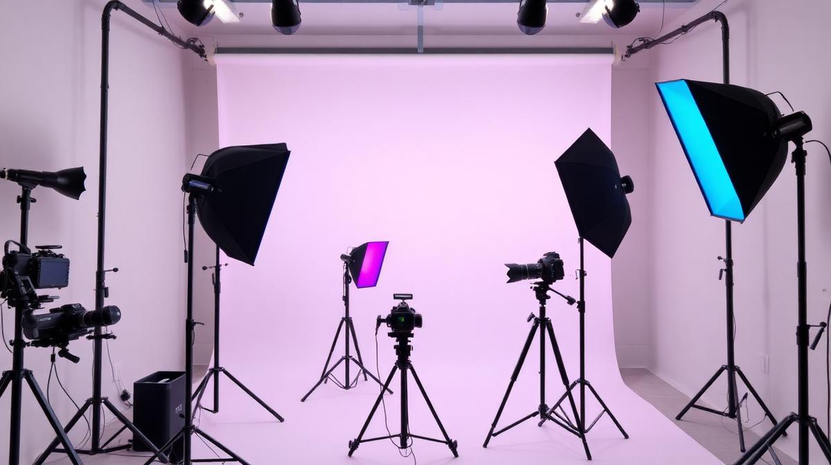
Photography Studio Color Psychology: Neutral Spaces for Creative Control
Photography studios present a fascinating color paradox: the space itself must be as colorless as possible so that the photographer has total control over color in the final image. Yet the client experience areas—lobby, consultation room, gallery—must create emotional impact through carefully chosen hues. Mastering this duality is the key to studio design.
The Science of Studio Neutrality
Why Gray Rules the Studio
Professional photography studios are painted in specific shades of gray for scientific reasons:
18% Gray (#808080): Also known as "middle gray" or "photographic gray," this specific tone:
- Reflects exactly the amount of light that camera meters are calibrated to measure
- Creates zero color cast on subjects—no warm or cool reflection
- Provides a neutral reference for white balance calibration
- Allows the photographer to add color intentionally through lighting, not accidentally through environment
The Studio Gray Scale
Different areas of a shooting space benefit from different gray values:
| Surface | Gray Value | Hex Code | Purpose |
|---|---|---|---|
| Shooting walls | 18% (middle gray) | #808080 | Neutral bounce light |
| Ceiling | 20-25% lighter | #A0A0A0 | Controlled fill light from above |
| Floor | 15-20% darker | #606060 | Reduced upward bounce |
| Equipment storage | Any neutral | #4A4A4A | Non-reflective backdrop |
The Enemy: Color Contamination
Color contamination occurs when environmental colors reflect onto the subject. Common sources:
- Colored walls: A red wall can add pink tones to skin
- Colored furniture: A blue couch reflects blue onto nearby subjects
- Colored floors: Green carpet creates green undercasts
- Clothing of assistants: Bright clothes can reflect onto subjects in close proximity
Even a small amount of contamination can require extensive post-processing correction. Studio gray eliminates this problem entirely.
Backdrop Color Science
The Essential Backdrop Colors
Professional studios maintain a library of backdrop colors, each serving specific purposes:
Seamless Paper Standards:
- Pure White (#FFFFFF): Product photography, high-key portraits, catalog work
- 18% Gray (#808080): Most versatile—can be lit to appear white or dark
- Black (#0D0D0D): Low-key portraits, dramatic product shots, fine art
- Chroma Green (#00B140): Video compositing, green screen effects
- Chroma Blue (#0033AA): Alternative compositing (when subjects wear green)
Fashion/Portrait Colors:
- Dove Gray (#6C6C6C): Classic portrait backdrop, flattering to all skin tones
- Warm Taupe (#A69279): Adds warmth to portraits without color contamination
- Navy (#1B2838): Corporate headshots, authority
- Dusty Rose (#C9A1A1): Soft, feminine portraits
- Forest Green (#2D5F3F): Natural, editorial look
Backdrop Color and Skin Tone Interaction
Different backdrop colors interact with skin tones differently:
- Cool grays: Complement warm skin tones, creating pleasant contrast
- Warm grays: Complement cool skin tones, adding warmth
- Blue backdrops: Make warm skin tones appear more vibrant
- Red/orange backdrops: Can make skin appear flushed—use cautiously
Creative Lighting Color
Gel Color Theory for Photographers
While the studio environment stays neutral, photographers add color through lighting gels:
Primary gel colors and their effects:
- CTO (Color Temperature Orange) (#FF8C00): Warms light, simulates golden hour
- CTB (Color Temperature Blue) (#4169E1): Cools light, simulates shade/moonlight
- Magenta (#FF00FF): Fashion editorial, creative portraits
- Cyan (#00FFFF): Sci-fi aesthetic, product photography
- Red (#FF0000): Drama, intensity, danger themes
- Green (#00FF00): Alien, unusual, experimental looks
The Two-Color Lighting Framework
The most popular creative lighting technique uses two contrasting gel colors:
- Key light: One color (e.g., warm orange #FF8C00)
- Rim/accent light: Complementary color (e.g., cool blue #4169E1)
- Background: Third color or the blend of both
This creates cinematic depth and visual interest while maintaining the subject's readability.
Client Experience Areas
The Lobby/Reception
Unlike the shooting space, client areas should create emotional impact:
For portrait studios: Warm, welcoming tones—cream (#FFFDD0), warm gray (#B0A99F), sage (#9CAF88) For commercial studios: Clean and professional—white (#FAFAFA), charcoal (#333333), brand accent color For creative/fashion studios: Bold and artistic—dark walls (#1A1A1A) with gallery lighting showcasing printed work
The Consultation/Viewing Room
Where clients review and select images—color accuracy is critical here too:
- Wall color: 18% gray or neutral warm gray (#9E9E9E)—prevents color cast on calibrated monitors
- Lighting: 5000K-5500K daylight balanced—matches industry color viewing standards
- Ambient darkness: Ability to dim ambient light for accurate screen viewing
- Print viewing: Dedicated area with D50 (5000K) viewing light for print evaluation
The Print Gallery
If the studio displays printed work:
- Gallery white (#F5F5F0): Clean, classic, lets the work speak
- Deep charcoal (#2C2C2C): Dramatic, editorial, makes colors pop
- Spot lighting: 3000K warm white for emotional warmth, or 4000K for accuracy
- Spacing: Generous negative space between prints—avoid visual crowding
Digital Studio Branding
Website Portfolio Color Strategy
Photographer websites should:
- Use dark backgrounds (#121212 or #1A1A1A): Makes images pop, creates gallery feel
- Minimal UI color: One brand accent color maximum—the work IS the color
- Large image display: Full-bleed imagery with minimal frame
- Consistent image editing: Color-grade portfolio images consistently
Social Media Color Consistency
Build recognition through consistent color treatment:
- Signature editing style: Your color grade is your visual brand
- Grid planning: Consider how images look together in the Instagram grid
- Story templates: Use brand colors (sparingly) for text overlays and graphics
Business Collateral
Print materials should reflect the studio's aesthetic:
- Business cards: Dark background + single image + minimal text
- Pricing guides: Neutral palette with one accent color
- Gift certificates: Premium feel with metallic accents
Use Coloracci's AI tools to establish a consistent brand palette that works across digital and print applications, and test color accuracy with our color contrast checker.
Explore more creative space design: Tattoo Studio Colors, Coworking Space Colors, Art Deco Colors, or Museum & Gallery Colors.