Tattoo Studio Color Psychology: Dark Palettes, Neon Signs & Trust Design
· Coloracci Team
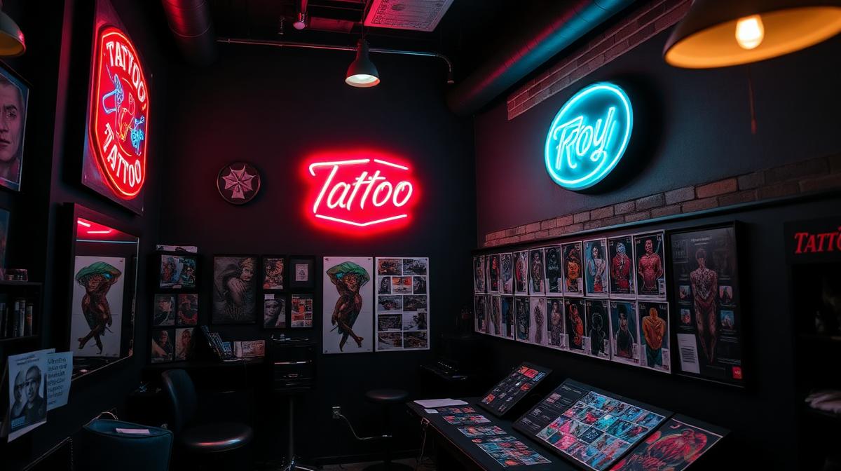
Tattoo Studio Color Psychology: Dark Palettes, Neon Signs & Trust Design
A tattoo studio faces a unique design challenge: it must simultaneously communicate artistic creativity, professional hygiene, and emotional comfort for clients making a permanent decision about their bodies. Color plays a critical role in achieving this delicate balance.
The Tattoo Studio Color Paradox
Art Gallery Meets Medical Facility
Unlike most commercial spaces, tattoo studios must bridge two opposing color philosophies:
Art gallery approach: Dark walls, dramatic lighting, curated displays—colors that showcase the artist's portfolio and create an immersive creative atmosphere.
Medical facility requirements: Clean workstations, visible sterilization, proper lighting for precision work—colors that communicate safety and hygiene.
The most successful studios resolve this tension through zoned color design: different areas of the studio serve different functions and use different palettes.
The Five Studio Archetypes
1. The Traditional/Old School Studio
Palette: Black (#0D0D0D) + Red (#CC0000) + Gold (#DAA520) + Cream (#FFFDD0)
Drawing from Sailor Jerry and classic American tattoo traditions:
- Black walls: Create gallery-like focus on flash art displays
- Red accents: Energy, passion, and traditional tattoo culture
- Gold/brass details: Nautical heritage and craftsmanship
- Cream/white workstations: Contrast for hygiene visibility
2. The Fine Art/Boutique Studio
Palette: Charcoal (#333333) + White (#FAFAFA) + Warm gray (#9E9E9E) + Accent color
Positioning tattoo artistry as fine art:
- Neutral gallery walls: Let portfolio work dominate
- Gallery-quality lighting: 5000K daylight balanced
- Minimal color: Sophistication and artistic seriousness
- Single accent: One brand color used sparingly
3. The Neo-Traditional/Neon Studio
Palette: Black (#0A0A0A) + Neon pink (#FF1493) + Neon blue (#00BFFF) + Purple (#8B00FF)
The Instagram-optimized aesthetic:
- Blackout walls: Maximum neon contrast and photogenic backdrop
- Neon signage: The defining visual element—creates shareability
- Color-changing LED strips: Dynamic atmosphere control
- Dark floors: Practical and atmospheric
4. The Japanese-Inspired Studio
Palette: Black (#1A1A1A) + Red (#B71C1C) + Gold (#B8860B) + Wood (#6B4423)
Honoring irezumi (traditional Japanese tattoo) heritage:
- Natural wood elements: Connection to Japanese aesthetics
- Red accent walls: The sacred color in Japanese tradition
- Gold details: Premium craftsmanship
- Minimal decoration: Wabi-sabi restraint
5. The Clean/Clinical Modern
Palette: White (#F5F5F5) + Sage (#8FBC8F) + Light wood (#D4A76A) + Black (#1C1C1C)
Breaking stereotypes with a wellness-adjacent approach:
- Bright, clean surfaces: Maximum hygiene communication
- Calming greens: Reduce client anxiety
- Natural materials: Warmth without darkness
- Minimal dark elements: Contrast without intimidation
Color Psychology for Client Comfort
The Anxiety Gradient
Getting tattooed triggers anxiety in most clients. Studio colors can amplify or reduce this:
Colors that increase anxiety in tattoo studios:
- Bright white (#FFFFFF): Too clinical, reminds of medical procedures
- Bright red (#FF0000): Association with blood and pain
- Harsh fluorescent: Institutional, uncomfortable
Colors that reduce anxiety:
- Deep teal (#005757): Calming without being cold
- Warm charcoal (#3D3D3D): Protective, womb-like comfort
- Muted sage (#7D9B76): Natural calm, healing association
- Soft amber lighting (#FFB347): Warmth and relaxation
The Trust-Building Palette
Research shows clients evaluate studio trustworthiness within 7 seconds of entering. Key color signals:
| Signal | Color Solution | Psychological Effect |
|---|---|---|
| Cleanliness | White workstations | Visible hygiene |
| Expertise | Dark + award displays | Authority and experience |
| Creativity | Art-covered walls | Artistic capability |
| Comfort | Warm lighting | Emotional safety |
| Professionalism | Consistent branding | Business reliability |
Functional Color Requirements
The Workstation Color Science
Tattoo workstation color directly impacts work quality:
Skin tone visibility: Neutral gray (#808080) surroundings provide the most accurate skin color perception. Colored walls can create color casts that affect ink selection decisions.
Ink color accuracy: 5000K-5500K lighting on neutral surfaces ensures tattoo artists can accurately judge ink colors against skin.
Blood visibility: Lighter-colored surfaces near workstations allow artists to monitor bleeding—a critical safety factor.
Lighting Color Temperature Zones
Different studio areas require different color temperatures:
- Portfolio/gallery area: 3000-3500K (warm, dramatic)
- Consultation space: 4000K (natural, comfortable)
- Tattoo station: 5000-5500K (daylight accurate)
- Sterilization area: 5500-6500K (bright, clinical)
The Neon Sign Phenomenon
Why Neon Defines Modern Studios
Neon signs have become the defining visual element of contemporary tattoo studios because:
- Instagram aesthetic: Neon creates instantly shareable photography
- Counter-cultural signal: Neon says "this isn't your parents' tattoo shop"
- Wayfinding: Visible from the street, neon serves as both art and signage
- Mood lighting: Contributes to the overall atmospheric color
Most popular neon colors for studios:
- Red (#FF0000): 40% of studios—traditional, powerful
- Pink (#FF69B4): 25%—modern, inclusive
- Blue (#00BFFF): 20%—cool, professional
- Purple (#8B00FF): 10%—artistic, mystical
- Multi-color: 5%—eclectic, maximalist
Branding and Digital Presence
Social Media Color Strategy
Tattoo artists are visual brands. Consistent color in their digital presence builds recognition:
Portfolio photography: Shoot against consistent neutral backgrounds (#2C2C2C or #F0F0F0)—let the tattoo art be the color
Instagram grid planning: Use a consistent color grade across all posts—darker, moodier edits outperform bright ones by 34% in tattoo content engagement
Website design: Dark mode (#121212) with portfolio focus. Use Coloracci's palette tools to extract your brand colors from your best work.
Logo and Brand Identity
Successful tattoo brand logos favor:
- Black + one accent color: 70% of top studios
- Script/calligraphy in black: Artistic, personal
- Minimal color use: Let the artwork tell the color story
Designing Your Studio's Color System
The key to tattoo studio design is resolving the art-vs-hygiene tension through thoughtful color zoning. Use Coloracci's AI tools to build a cohesive palette, and ensure your digital presence matches your physical space with consistent color grading.
Explore more creative space design: Barbershop Colors, Nightclub & Bar Colors, Photography Studio Colors, or Street Art & Graffiti Colors.