Coworking Space Color Psychology: Balancing Productivity, Creativity, and Community
· Coloracci Team
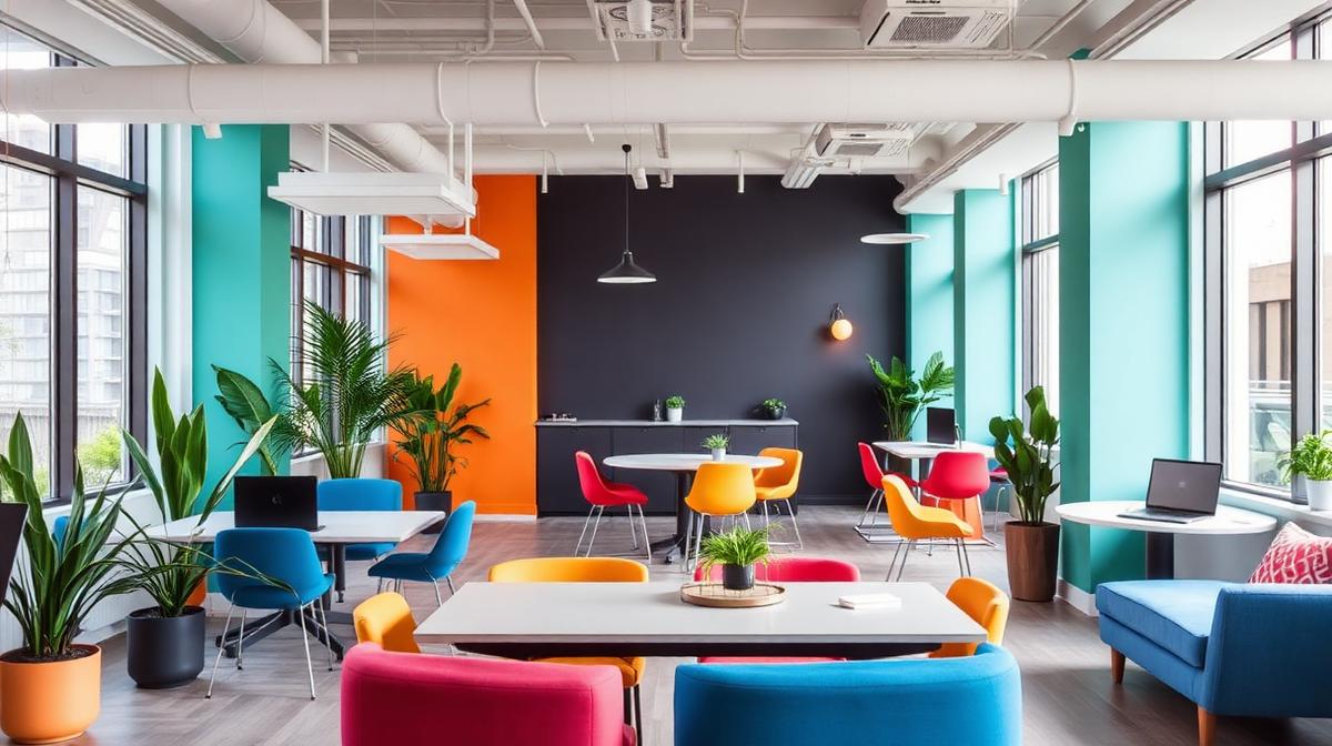
Coworking spaces face a color challenge unique in design: they must simultaneously serve individual focus, collaborative creativity, social connection, and brand identity — all within a single environment. Traditional office color psychology doesn't fully apply because coworking members choose where to work based on how the space makes them feel. Color becomes a competitive differentiator.
The Zone Color Strategy
Successful coworking spaces use color to define functional zones without physical walls.
The Four-Zone Framework
| Zone | Function | Color Strategy | Example Hex |
|---|---|---|---|
| Focus Zone | Deep work, concentration | Cool, muted tones | #E8EEF2, #D1D5DB |
| Collaboration Zone | Meetings, brainstorms | Warm, energizing | #F59E0B, #EF4444 |
| Social Zone | Networking, casual conversation | Vibrant, welcoming | #10B981, #8B5CF6 |
| Restoration Zone | Rest, phone calls, decompression | Calm, natural | #D1FAE5, #E0E7FF |
How Color Zoning Works Psychologically
Color zoning operates through environmental cueing:
- Automatic behavior shift: Members unconsciously adjust behavior based on surrounding color
- Permission signaling: Warm, bright colors "permit" conversation; cool, muted colors encourage quiet
- Spatial wayfinding: Color creates navigation without signage
- Emotional preparation: Transitioning between color zones prepares the mind for different work modes
Focus Zones: The Deep Work Palette
Cool Blues for Concentration
Research consistently links blue environments to sustained attention:
- Muted blue (#B0C4DE): Calming without inducing drowsiness
- Steel blue (#4682B4): Professional, focused, serious work mode
- Ice blue (#E0F0FF): Light enough to feel open, cool enough to maintain focus
- Navy accents (#1E3A5F): Depth markers for anchor walls or furniture
The Minimal Distraction Principle
Focus zones should minimize chromatic complexity:
- Maximum 2-3 colors: Reduce visual processing demand
- Low saturation: Muted tones that don't compete for attention
- Consistent temperature: Avoid mixing warm and cool in the same zone
- Natural material colors: Wood, stone, and plant colors provide subtle variation without distraction
Collaboration Zones: The Creative Energy Palette
Warm Colors for Group Energy
Collaborative areas benefit from warmth and energy:
- Amber orange (#F59E0B): Enthusiastic, creative, approachable
- Coral (#FF6B6B): Energetic without aggressive, modern warmth
- Golden yellow (#FFD700): Optimistic, idea-stimulating, attention-grabbing
- Terracotta (#E2725B): Warm grounding that supports extended collaboration
The Whiteboard Wall Strategy
Writable surfaces create dynamic color through use:
- White writable walls: Clean canvas that fills with colorful ideas
- Colorful marker sets: Providing high-saturation tools for visual thinking
- Post-it color coding: Warm-toned sticky notes on cool-toned backgrounds
Social Zones: The Community Palette
Colors That Encourage Connection
Social areas — lounges, kitchens, event spaces — need warmth and vibrancy:
- Sage green (#9CAF88): Relaxing, natural, conversation-supporting
- Dusty rose (#DCAE96): Warm, inclusive, comfortable
- Warm wood (#DEB887): Natural material warmth
- Accent color pops: Brand colors in furniture, artwork, or accessories
The Kitchen/Café Color Strategy
Coworking kitchen areas often serve as social hubs:
- Appetite-safe colors: Warm neutrals with green or yellow accents
- Cleanliness communication: White and light surfaces for hygiene perception
- Energy maintenance: Mid-range warm tones preventing afternoon energy dips
- Community signaling: Colorful communal elements (mugs, plants, art) creating shared identity
Brand Identity Through Color
How Major Coworking Brands Use Color
| Brand | Primary Color | Hex | Psychological Strategy |
|---|---|---|---|
| WeWork | Black + Yellow | #1A1A1A + #FFD100 | Professional energy, startup edge |
| Industrious | Navy + Gold | #1B2A4A + #C9A96E | Premium positioning, corporate comfort |
| Spaces | Orange + Gray | #FF6600 + #666666 | Creative energy, modern professionalism |
| The Wing | Millennial pink | #F4C2C2 | Feminine empowerment, community |
| Impact Hub | Green | #2E8B57 | Social impact, sustainability |
Developing Your Coworking Color Brand
Effective coworking brand colors should:
- Reflect community values: Tech-focused spaces favor blues and neons; creative spaces favor warm, diverse palettes
- Scale across touchpoints: Work on walls, apps, business cards, and social media
- Differentiate locally: Stand out from competitors in your specific market
- Allow member personalization: Brand color should frame, not dominate, member experience
The Acoustic-Color Connection
Sound management and color work together in coworking environments:
Felt Acoustic Panels as Color Elements
Modern acoustic solutions double as color design:
- Colored felt panels: Available in virtually any color, serving both acoustic and aesthetic functions
- Geometric arrangements: Panels arranged in patterns that create visual interest while managing sound
- Zone differentiation: Different colored panels in different zones reinforcing the color strategy
- Brand integration: Custom-colored panels incorporating brand identity
Lighting and Color in Coworking
Circadian-Responsive Lighting
Forward-thinking coworking spaces adjust lighting color throughout the day:
- Morning (8-10am): Cool, bright light (5000K) supporting alertness and energy
- Midday (10am-2pm): Neutral light (4000K) for sustained productivity
- Afternoon (2-5pm): Slightly warmer (3500K) preventing energy crash
- Evening (5-9pm): Warm light (3000K) for those working late, preventing sleep disruption
Biophilic Color Integration
Natural elements bring their own colors and psychological benefits:
- Living walls: Vertical gardens providing constant green variation
- Natural wood: Desks and shelving in warm wood tones
- Stone and mineral accents: Grounding gray and earth tones
- Water features: The color and movement of water adding calm
Member-Centric Color Decisions
The Preference Paradox
Coworking color must navigate competing preferences:
- Introverts: Prefer muted, cool, less stimulating environments
- Extroverts: Prefer bright, warm, socially activating environments
- Creative workers: Benefit from moderate stimulation and color variety
- Analytical workers: Perform best in consistent, low-distraction color environments
- Solution: Provide variety through zoning, letting members self-select
Cultural Color Sensitivity
Global coworking brands must consider:
- Color meaning variations: Red means luck in China but warning in Western contexts
- Gender associations: Pink-heavy designs may alienate some demographics
- Cultural neutrality: Earth tones and blues tend to work cross-culturally
- Local adaptation: Allow regional color variation within brand guidelines
Measuring Color Impact in Coworking
Key Performance Indicators
- Zone utilization: Do members use color-differentiated zones as intended?
- Productivity self-reports: Do members report effective work in focus zones?
- Community engagement: Does the social zone color encourage interaction?
- Member retention: Does the overall environment support long-term membership?
- Tour conversion: Do prospective members respond positively to the color environment?
- NPS scores: Do satisfaction ratings correlate with recent color changes?
A/B Testing Color in Coworking
Some spaces conduct natural experiments:
- Seasonal color updates: Changing accent colors and measuring member response
- Zone color rotation: Shifting zone palettes and tracking utilization patterns
- Furniture color tests: Introducing different colored furniture and measuring preference
The most successful coworking spaces treat color not as decoration but as infrastructure — as fundamental to function as WiFi, desk height, or coffee quality. When color supports the diverse work modes of a community, it becomes invisible. And that's when it's working perfectly.