Music Studio & Record Store Color Psychology: Sonic Palettes for Creative Spaces
· Coloracci Team
Music Studio & Record Store Color Psychology: Sonic Palettes for Creative Spaces
Music and color share a deep neurological connection. Both are processed as wavelength information—sound waves and light waves—and the crossmodal associations between them are remarkably consistent across cultures. A music space's color palette directly influences creative output, listening perception, and the emotional experience of discovering new music.
The Synesthesia Connection
Color-Sound Associations
Research in synesthesia and crossmodal perception reveals consistent color-music connections:
| Musical Quality | Associated Color | Hex Code | Psychological Basis |
|---|---|---|---|
| Bass/Low frequencies | Deep purple/indigo | #2D1B69 | Depth, weight, power |
| Mid-range/Warmth | Amber/orange | #FF8C00 | Warmth, presence, body |
| Treble/Brightness | Yellow/white | #FFD700 | Brightness, clarity, air |
| Minor keys | Blue/teal | #005F73 | Melancholy, introspection |
| Major keys | Orange/yellow | #FF9800 | Joy, openness, energy |
| Distortion/Edge | Red/crimson | #CC0000 | Aggression, intensity |
| Ambient/Space | Pale blue/gray | #A3B8CC | Vastness, ethereal calm |
Genre-Color Mapping
Different music genres have established strong color associations:
- Jazz: Deep blue (#003366), smoky gray (#6E6E6E), warm amber (#FFB347)
- Rock/Metal: Black (#0D0D0D), red (#CC0000), chrome (#C0C0C0)
- Hip-Hop: Gold (#FFD700), black (#000000), purple (#8B00FF)
- Electronic/EDM: Neon cyan (#00FFFF), magenta (#FF00FF), electric blue (#0080FF)
- Classical: Burgundy (#722F37), gold (#DAA520), ivory (#FFFFF0)
- Indie/Folk: Earthy brown (#8B6914), sage green (#9CAF88), warm cream (#FFF8E7)
Recording Studio Color Design
The Control Room
The control room is where critical listening and mixing decisions happen. Color directly affects perception:
Optimal palette: Dark, warm neutrals
- Walls: Charcoal (#333333) or dark warm gray (#3D3937)
- Ceiling: Medium-dark (#4A4A4A) to prevent distracting bright reflections
- Console area: Black (#1A1A1A) equipment on dark surfaces
- Accent lighting: Warm amber (#FFB347) at low levels
Why dark colors work:
- Reduced visual distraction: Dark environments sharpen auditory focus
- Monitor accuracy: Dark surroundings prevent light contamination on reference monitors
- Psychological intimacy: Dark spaces create a "womb-like" creative safety
- Fatigue reduction: Soft, dark environments reduce eye strain during long sessions
The Live Room
Where musicians perform and record:
- Warmer tones allowed: Slight warmth (#4A3D35) helps musicians feel comfortable
- Avoid stark white: Too clinical, creates performance anxiety
- Natural wood tones: Acoustic treatment panels in natural wood (#C4A882) serve dual aesthetic and acoustic purposes
- Low, warm lighting: 2700-3000K creates intimate performance atmosphere
The Lounge/Green Room
Where musicians relax between takes:
- Warmer, more saturated colors: Deep teal (#005757), burgundy (#722F37), or forest green (#2D5F3F)
- Comfortable lighting: Dimmable, warm, non-fluorescent
- Textured materials: Velvet, leather, and wood in rich colors
Record Store Design
The Vinyl Experience
Physical record stores are experiencing a renaissance, and color design is crucial to the experience:
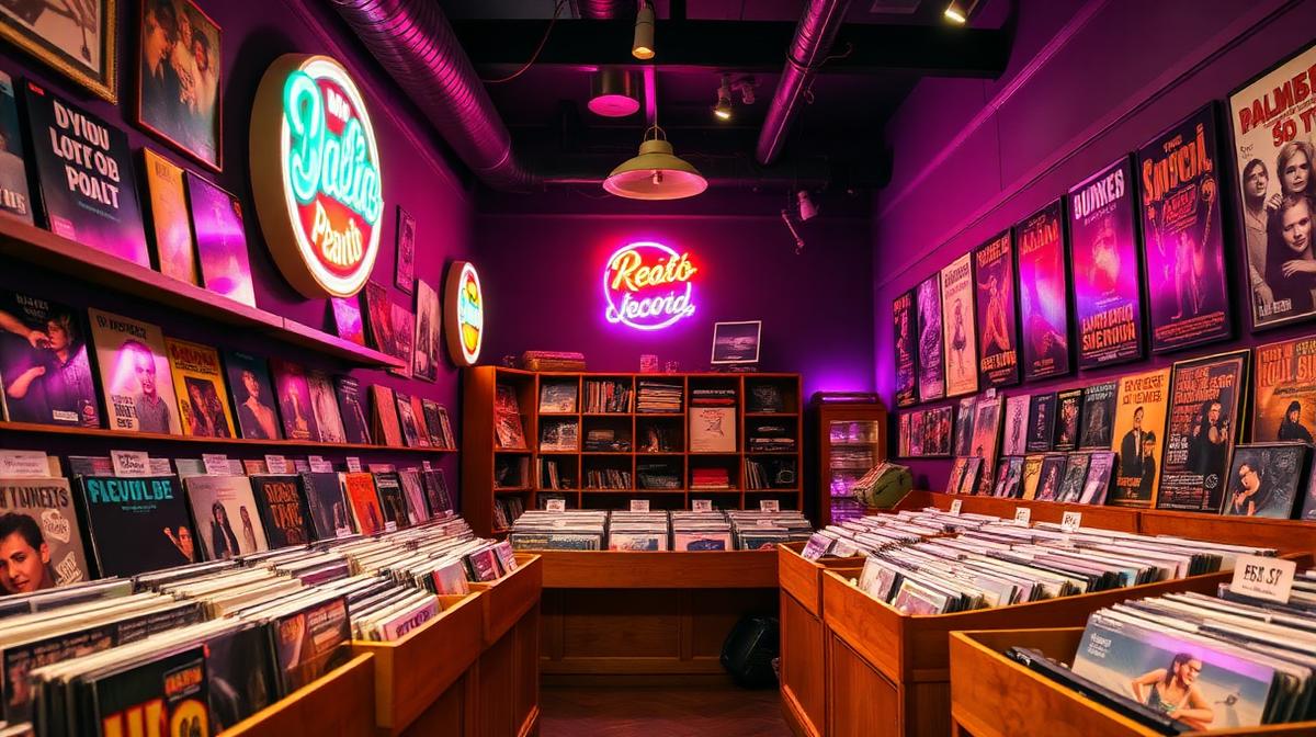
The Classic Record Store palette:
- Dark walls (#1A1A1A or #2C2C2C): Album art becomes the color—walls recede
- Warm wood (#6B4226): Record bins and shelving in natural wood
- Neon signage (#FF1493 or #00BFFF): Wayfinding and atmosphere
- Warm spot lighting: Individual spots on featured records create reverence
The Modern Vinyl Boutique palette:
- White walls (#FAFAFA): Gallery-like treatment of records as art
- Light wood (#D4B896): Scandinavian-influenced minimalism
- Single accent color: Brand identity in one strong hue
- Natural light: Large windows create an inviting browsing atmosphere
Genre Section Color Coding
Smart record stores use color to organize genre sections:
- Blue (#003366): Jazz and Blues
- Black (#0D0D0D): Metal and Punk
- Green (#228B22): Reggae and World Music
- Purple (#6A0DAD): Electronic and Dance
- Brown (#6B4423): Folk, Country, and Americana
- Red (#CC0000): Rock and Classic Rock
- Gold (#DAA520): Classical and Opera
- Pink (#FF69B4): Pop and K-Pop
The Listening Station
Dedicated listening areas require special color attention:
- Acoustic absorption panels: Dark fabric-wrapped panels (#2C2C2C) serve both function and aesthetic
- Warm lighting: Individual warm spots or Edison bulbs
- Comfortable seating: Deep-colored upholstery (navy #1B2838 or burgundy #4A0E2B)
- Visual isolation: Slightly separated from the main floor through color differentiation
Album Art as Color Influence
The Power of Cover Art
Album cover colors become permanently associated with the music inside:
- Pink Floyd "Dark Side of the Moon": The rainbow prism on black created one of music's most iconic color moments
- The Beatles "Abbey Road": The pedestrian crossing's neutral tones against London gray
- Fleetwood Mac "Rumours": White background suggesting intimacy and honesty
- Kendrick Lamar "DAMN.": Red (#FF0000) with white text—urgency and power
Building Music Brand Palettes
Modern music brands use distinctive color systems:
- Spotify: Green (#1DB954) on dark backgrounds—the dominant music brand color
- Apple Music: Gradient of warm reds and oranges—passion and creativity
- SoundCloud: Orange (#FF5500)—energy and independence
- Tidal: Blue (#0000FF) and black—premium quality and depth
- Bandcamp: Teal (#1DA0C3)—independence and artistic integrity
Designing Music Spaces
The Mood Lighting System
Professional music spaces use programmable lighting to shift color atmosphere:
- Writing/composing: Warm amber (#FFB347), low intensity
- Recording: Dim warm (#3D2B1F), minimal distraction
- Mixing: Very dark, monitor-focused
- Mastering: Neutral, accurate (5000K if needed for visual reference)
- Client playback: Slightly brighter warm tones, celebratory
Building a Music-Inspired Palette
Use Coloracci's AI tools to extract color palettes from album art, concert photography, or genre-specific imagery. The resulting palettes can inform everything from studio interior design to music brand identity and promotional materials.
Explore more creative space design: Nightclub & Bar Colors, Photography Studio Colors, Tattoo Studio Colors, or Coworking Space Colors.