Jewelry Store Color Psychology: Luxury Display Design That Sells
· Coloracci Team
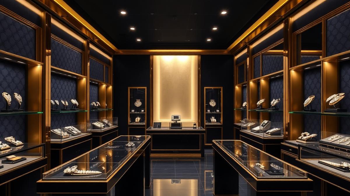
Jewelry Store Color Psychology: Luxury Display Design That Sells
Jewelry retail operates at the intersection of art, emotion, and extreme value perception. A diamond ring that costs $10,000 needs an environment that makes that price feel not just reasonable but inevitable. The color environment of a jewelry store is perhaps the most carefully engineered in all of retail—every hue, shade, and light source is calibrated to make precious materials radiate maximum beauty while creating an emotional atmosphere that transforms browsers into buyers.
The Dark Background Principle
Why Jewelry Stores Are Dark
The fundamental principle of jewelry display is contrast through darkness:
| Principle | Explanation | Impact |
|---|---|---|
| Theater effect | Dark environments focus attention on lit objects | Products become the "stars" |
| Perceived value | Objects in dark settings are valued 30-40% higher | Price resistance decreases |
| Intimacy | Dark spaces feel exclusive and private | Customers feel special |
| Color accuracy | Dark walls reduce color bounce on gemstones | Gems appear more vivid |
| Gallery association | Dark backgrounds mirror luxury art galleries | Products feel like art |
The Optimal Jewelry Store Color Palette
| Element | Color | Hex Code | Purpose |
|---|---|---|---|
| Walls | Charcoal/Dark navy | #1C1C1C / #1B2838 | Maximum contrast backdrop |
| Ceiling | Matte black | #0A0A0A | Invisible ceiling, focus on displays |
| Floor | Dark polished stone | #2C2C2C | Reflective luxury surface |
| Display cases | Dark velvet lining | #1A1A2E | Gemstone color enhancement |
| Accent lighting | Warm white | 3000-3500K | Flattering light on gold and diamonds |
| Metal fixtures | Gold or silver | #B8860B / #C0C0C0 | Matches jewelry metals |
| Brand accents | Signature color | Brand-specific | Identity differentiation |
Display Color Science
Velvet Lining Psychology
The color of display case lining is critical for different jewelry types:
| Jewelry Type | Best Lining | Hex | Why |
|---|---|---|---|
| Diamonds | Dark navy velvet | #1B2838 | Maximizes brilliance and fire |
| White gold/Platinum | Charcoal gray | #36454F | Enhances silvery sheen |
| Yellow gold | Dark burgundy | #4A0000 | Warm complement enhances gold glow |
| Rose gold | Deep forest green | #0B3D0B | Complementary contrast |
| Colored gemstones | Black velvet | #0A0A0A | Pure neutral lets gem colors dominate |
| Pearls | Cream or champagne | #F5E6CC | Harmonious warmth without competition |
Lighting Color Temperature by Jewelry Type
| Jewelry Category | Color Temperature | Effect |
|---|---|---|
| Diamonds | 5000-5500K (cool white) | Maximizes brilliance and sparkle |
| Gold jewelry | 2700-3000K (warm white) | Enhances yellow/rose gold warmth |
| Silver/Platinum | 4000-4500K (neutral) | Clean, accurate metal rendering |
| Colored gemstones | 3500-4000K (neutral-warm) | Accurate color rendering |
| Pearls | 3000-3500K (warm) | Flattering, lustrous appearance |
Brand-Tier Color Strategies
Ultra-Luxury (Tiffany, Cartier, Harry Winston)
| Brand | Signature Color | Hex | Store Palette |
|---|---|---|---|
| Tiffany & Co. | Robin's egg blue | #81D8D0 | Blue + white + silver |
| Cartier | Deep red | #9E1B32 | Red + gold + cream |
| Harry Winston | Dark gray | #2C2C2C | Gray + platinum + crystal |
| Bulgari | Gold/Black | #B8860B / #000000 | Gold + black + marble |
| Van Cleef & Arpels | Sage green | #8F9779 | Green + gold + cream |
Design principles:
- Minimal product display (fewer items = higher perceived value)
- Private consultation rooms with warmer, more intimate lighting
- Art gallery-style spacing between display cases
- Museum-quality lighting with no visible fixtures
Premium (David Yurman, Pandora, Swarovski)
Color strategy: More accessible but still sophisticated:
- Brighter environments than ultra-luxury
- White or light gray (#F5F5F5) walls with dark accent features
- More open display cases allowing customer interaction
- Brand color used more prominently as a differentiator
Fashion/Accessible (Kay Jewelers, Zales, Swarovski)
Color strategy: Approachable and trust-building:
- Warmer, brighter overall environment
- Rich wood tones (#6B4423) creating warmth
- Blue (#003DA5) used for trust and reliability
- Well-lit entrances to reduce intimidation
- Clear pricing signage in professional, readable colors
The Consultation Experience
Private Room Color Design
Where significant purchases happen:
- Wall color: Warm neutral (#F5E6D3) or soft champagne (#F7E7CE)—not dark like the showroom
- Lighting: 3000K warm, adjustable intensity
- Table surface: Dark velvet viewing pad (#1A1A2E) surrounded by warm wood
- Seating: Rich leather in dark brown (#3E2723) or brand accent color
- Purpose: Transition from "theater" (showroom) to "home" (consultation)—making the customer feel the jewelry belongs in their personal life
The Mirror Strategy
Strategic mirror placement affects color perception:
- Warm-tinted mirrors: Make skin tones flattering, making jewelry look better on the customer
- Lighting direction: Front and slightly above—eliminates shadows under chin and neck
- Background in mirror: Ensure the customer sees themselves against a flattering, neutral background—not cluttered shelving
Digital Jewelry Retail
E-commerce Color Design
Online jewelry stores face the challenge of replicating the luxury experience:
| Element | Color Choice | Hex | Reason |
|---|---|---|---|
| Background | Off-white or soft gray | #FAFAFA / #F5F5F5 | Clean, undistracted |
| Product images | Isolated on white/dark | #FFFFFF / #1A1A1A | Maximum product focus |
| CTA buttons | Brand accent or gold | Brand-specific | Premium feel, clear action |
| Typography | Dark, elegant serif | #1A1A1A | Luxury typography tradition |
| Trust badges | Muted navy or green | #003DA5 / #2E7D32 | Credibility without flashiness |
| Sale/promo | Restrained—gold accent | #B8860B | Luxury brands don't scream "SALE" |
Photography for Maximum Color Impact
Jewelry photography color settings:
- White background: Clean, modern, works for all metals (#FFFFFF)
- Dark background: Dramatic, emphasizes sparkle (#0A0A0A)
- Lifestyle photography: Warm skin tones, neutral backgrounds, natural light feel
- Close-up macro: Neutral gray background (#808080) for technical/detail shots
Seasonal Window Display Colors
| Season | Color Palette | Hex Codes | Theme |
|---|---|---|---|
| Valentine's | Red + pink + gold | #CC0000 + #FF69B4 + #FFD700 | Romance, desire |
| Mother's Day | Soft pink + pearl + silver | #FFB6C1 + #F5E6CC + #C0C0C0 | Elegance, tenderness |
| Holiday | Deep red + gold + forest green | #8B0000 + #FFD700 + #0B3D0B | Festive luxury |
| Bridal season | White + blush + platinum | #FFFFFF + #FFE4E1 + #E5E4E2 | Purity, commitment |
| Summer | Ocean blue + coral + gold | #006994 + #FF7F50 + #FFD700 | Vacation, joy |
Use Coloracci's AI color tools to create refined, luxury-appropriate color palettes for jewelry retail environments and branding.
Explore more luxury retail: Luxury Retail Colors, Car Showroom Colors, Beauty Salon & Spa Colors, or Wedding Venue Colors.