Wedding Venue Color Psychology: Creating Unforgettable Celebration Spaces
· Coloracci Team
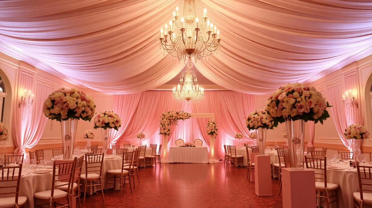
Wedding venue color is among the most emotionally significant color decisions in design. These spaces must photograph flawlessly, flatter diverse skin tones, accommodate varied décor themes, and create the emotional backdrop for one of life's most important moments. The color psychology of wedding spaces operates on multiple levels — personal symbolism, cultural tradition, photographic practicality, and atmospheric emotion.
The White Foundation: Why It Dominates
The Psychology of Wedding White
White (#FFFFFF, #FFFAF0, #FFF8F0) dominates wedding venues for layered reasons:
- Purity symbolism: Cultural association with new beginnings across many traditions
- Décor flexibility: White spaces accept any color theme without clashing
- Photographic advantage: White reflects light, creating luminous photography
- Skin tone flattery: Warm whites flatter diverse complexions under warm lighting
- Emotional amplification: White spaces feel more emotional — tears, laughter, and joy feel more intense in bright environments
Choosing the Right White
Not all whites work equally for weddings:
| White Variant | Hex | Warmth | Best For |
|---|---|---|---|
| Pure white | #FFFFFF | Neutral | Modern, minimalist venues |
| Ivory | #FFFFF0 | Warm | Traditional, romantic settings |
| Linen | #FAF0E6 | Warm | Rustic, natural venues |
| Pearl | #EAE0C8 | Warm golden | Luxury, evening events |
| Chalk white | #F5F5F5 | Cool | Contemporary, gallery-style spaces |
| Cream | #FFFDD0 | Very warm | Vintage, garden-inspired venues |
The Romance Palette: Pink and Blush
Blush Pink's Dominance
Blush pink (#FFB6C1, #FADADD, #F4C2C2) has become wedding's second most popular color:
- Romance signaling: Pink directly activates romantic emotional associations
- Softness: Creates gentle, tender atmosphere appropriate for vows and intimate moments
- Photography gold: Blush tones in ambient light produce universally flattering photographs
- Modern tradition: Blush strikes the balance between traditional and contemporary
- Gender-inclusive warmth: Modern blush avoids the overtly feminine associations of hot pink
The Pink Spectrum for Weddings
- Barely blush (#FFF0F3): Almost white, subtle warmth
- Rose quartz (#F7CAC9): The Pantone that launched a wedding revolution
- Dusty rose (#DCAE96): Sophisticated, slightly muted, vintage appeal
- Mauve (#E0B0FF): Pink-purple blend for evening elegance
- Deep rose (#C21E56): Dramatic accent for bold couples
Seasonal Color Strategies
Spring Weddings
Spring venues emphasize:
- Soft pastels: Lavender (#E6E6FA), mint (#98FB98), buttercup (#F9E547)
- Garden inspiration: Colors referencing blooming flowers and fresh foliage
- Light and air: Bright, open palettes reflecting longer days
- Fresh green accents: Connecting to the renewal of the natural world
Summer Weddings
Summer calls for:
- Vibrant saturation: Coral (#FF7F50), turquoise (#40E0D0), sunflower (#FFDA03)
- Beach influences: Sandy neutrals, ocean blues, sunset oranges
- High energy: Brighter colors supporting celebratory outdoor events
- Evening cool-down: Deeper tones for summer evening receptions
Autumn Weddings
Autumn venues embrace:
- Warm earth tones: Burnt orange (#CC5500), burgundy (#800020), mustard (#FFDB58)
- Rich depth: Deeper saturation reflecting the season's intensity
- Metallic warmth: Gold and copper accents complementing harvest tones
- Textural color: Velvet burgundy, matte terracotta, brushed gold
Winter Weddings
Winter demands:
- Deep jewel tones: Emerald (#046307), navy (#000080), ruby (#E0115F)
- Silver and white: Ice-inspired palettes creating winter wonderland atmosphere
- Candlelight warmth: Warm amber tones countering cold season associations
- Dramatic contrast: Dark backgrounds with bright floral and lighting accents
Cultural Wedding Color Traditions
Chinese Wedding Colors
- Red dominance (#C8102E): Luck, prosperity, happiness
- Gold accents (#FFD700): Wealth and imperial blessing
- Avoided: White and black — associated with mourning and death
Indian Wedding Colors
- Red sari (#FF0000): Fertility, prosperity, the bride's power
- Turmeric yellow (#E3A857): Purification, auspiciousness
- Green (#00A86B): Fertility, new beginnings
- Each ceremony has specific color requirements: Mehndi (green/yellow), Sangeet (vibrant mix), ceremony (red/gold)
Western Contemporary
Modern Western weddings increasingly break traditional rules:
- All-black weddings: Dramatic, avant-garde, nighttime glamour
- Rainbow weddings: LGBTQ+ celebrations using full spectrum
- Monochromatic: Single-color depth exploration (all-green, all-blue)
- Metallic-dominant: Gold, silver, or rose gold as primary rather than accent
Lighting Color for Wedding Venues
The Uplighting Revolution
LED uplighting transforms venue color instantly:
- Warm amber (#FFD700): Creates golden, romantic warmth
- Blush pink wash (#FFB6C1): Adds subtle romance to white spaces
- Deep purple (#4B0082): Evening drama, dance floor energy
- Color transitions: Shifting from ceremony (warm white) to reception (colorful) to dancing (dynamic)
Photography-Friendly Lighting
Wedding photographers need specific color conditions:
- CRI 90+ lighting: Accurate color rendering for skin tones
- Avoid mixed color temperatures: Don't combine warm and cool in the same space
- Uplighting that complements, not overwhelms: Subtle color is more photogenic than saturated
- Golden hour simulation: 2700K lighting replicating the most flattering natural light
Table Setting and Color Psychology
The Place Setting Color Framework
| Element | Recommended Color | Purpose |
|---|---|---|
| Table linen | White or ivory | Clean canvas, food presentation |
| Napkins | Accent color | Color theme reinforcement |
| Charger plates | Gold or silver | Luxury frame, light reflection |
| Centerpieces | Primary wedding colors | Visual anchor, conversation starter |
| Candles | Ivory or white | Warm light, romantic ambiance |
| Menu cards | Brand colors | Cohesive design detail |
Food Color Consideration
The color of served food interacts with venue and table colors:
- Avoid clashing: Red-sauced dishes on red-clothed tables lose visual appeal
- Contrast plates: Food should contrast with plate color for appetizing presentation
- Dessert display: Wedding cake color becomes a focal point requiring careful integration
- Cocktail color: Signature drinks in wedding colors create Instagram moments
The Floral Color Bridge
Flowers serve as the primary color delivery system in most weddings:
Flower Color Psychology
- White roses: Classic purity, elegant simplicity
- Red roses: Passionate love, bold romance
- Pink peonies: Prosperity, romance, bashfulness
- Lavender: Enchantment, love at first sight
- Sunflowers: Adoration, loyalty, longevity
- Greenery-only: Modern, sustainable, architectural
Floral-to-Venue Color Ratios
The 60-30-10 rule adapted for weddings:
- 60%: Base venue color (white, ivory, or neutral)
- 30%: Primary wedding color (in flowers, linens, bridesmaids)
- 10%: Accent color (metallic details, specific flower variety, invitation color)
Common Wedding Venue Color Mistakes
- Over-saturation: Too much bold color overwhelms — white space provides necessary breathing room
- Ignoring skin tones: Colors that clash with the wedding party's complexions ruin photographs
- Mixed metals: Gold and silver together creates visual confusion unless intentionally curated
- Neglecting transitions: The color journey from ceremony to cocktail hour to reception should flow naturally
- Fighting the space: Working against a venue's inherent color (stone, wood, garden) instead of complementing it
The best wedding venue color feels inevitable — as if the space was always meant to hold this specific celebration. That effortless feeling is the result of careful, intentional color psychology applied with emotional intelligence and aesthetic precision.