Beauty Salon and Spa Color Psychology: Creating Sanctuaries of Transformation
· Coloracci Team
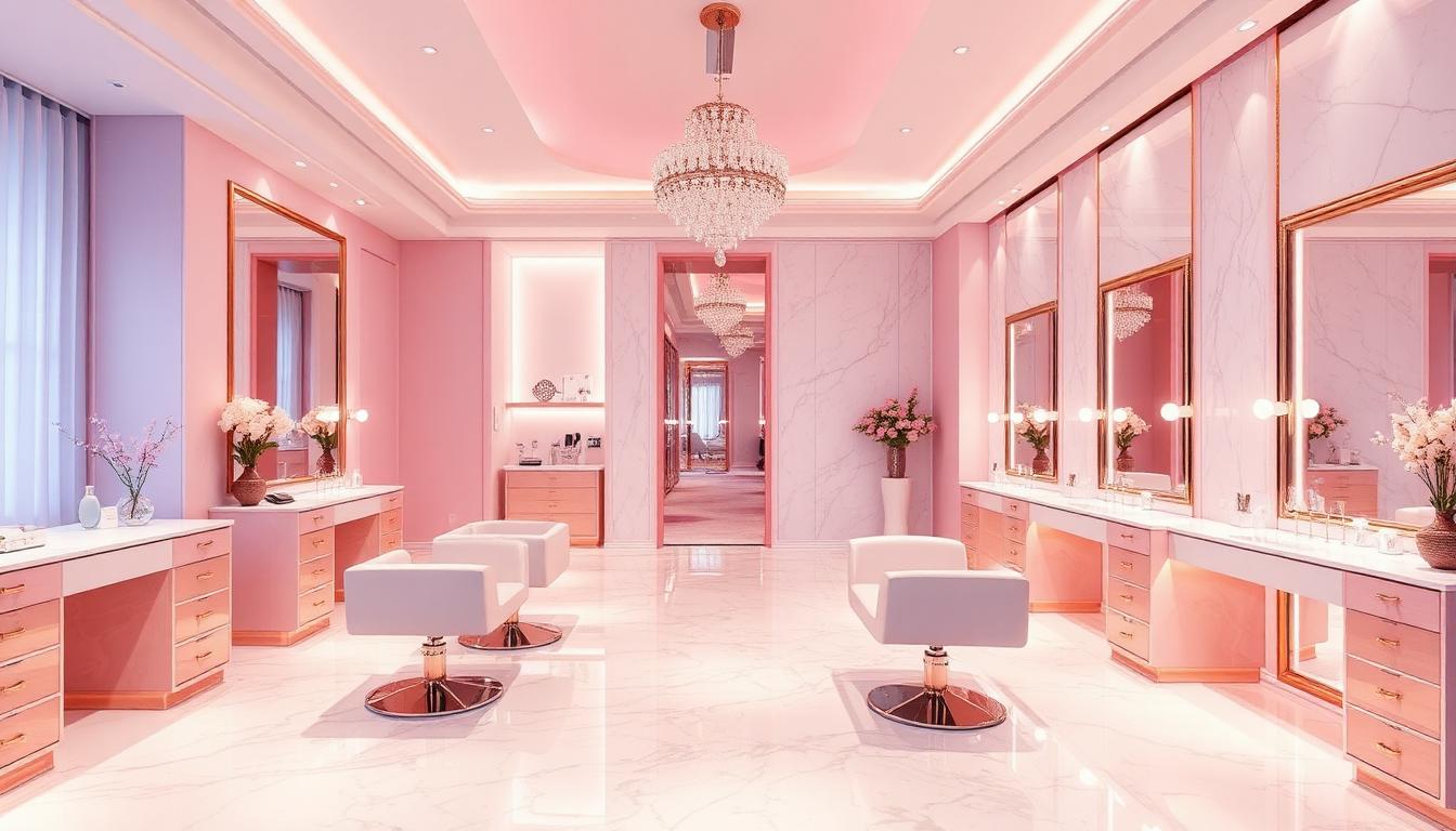
Beauty salons and spas occupy a unique psychological space where color choices must balance transformation with tranquility, luxury with accessibility, and clinical precision with emotional comfort. The most successful beauty businesses understand that their color palette is performing psychological work before any treatment begins — setting expectations, reducing anxiety, and creating the emotional foundation for the transformation their clients seek.
The Feminine Foundation: Pink and Its Evolutions
Pink's association with beauty services isn't accidental — it reflects deep cultural conditioning around femininity, care, and nurturing. However, contemporary salon design has evolved far beyond stereotypical bubblegum palettes.
The Millennial Pink Revolution
The "millennial pink" phenomenon (#F7CAC9 through #FFB6C1) transformed beauty industry color psychology:
- Instagram optimization: The shade photographs exceptionally well, driving organic social media marketing
- Gender expansion: Softer than traditional "girl" pink, appealing to broader audiences
- Sophistication signaling: Dusty, muted quality reads as design-conscious rather than childish
- Calming properties: Reduces heart rate and creates sense of safety
Brands like Glossier built entire empires on variations of this pink, demonstrating its commercial power.
Blush and Beyond: Sophisticated Pinks
Contemporary salons deploy pink in increasingly sophisticated variations:
| Shade | Hex Code | Application | Psychological Effect |
|---|---|---|---|
| Dusty Rose | #DCAE96 | Feature walls | Mature, romantic, timeless |
| Mauve | #E0B0FF | Upholstery, textiles | Luxurious, regal associations |
| Blush | #DE5D83 | Accents, branding | Soft, approachable, gentle |
| Terracotta Pink | #E2725B | Reception areas | Earthy, grounding, warm |
Breaking Pink Stereotypes
Forward-thinking salons are expanding beyond pink while maintaining feminine appeal:
- Sage and soft green: Nature-connected, wellness-oriented
- Warm cream and ivory: Clean, sophisticated, universally flattering
- Dusty blue: Calm, professional, unexpected in beauty contexts
- Lavender: Spiritual, transformative, luxurious
The Luxury Signal: Gold, Champagne, and Metallic Accents
Nothing communicates premium positioning in beauty environments like strategic metallic accents. The psychology of gold and champagne tones in spa and salon design is remarkably effective.
Gold's Psychological Weight
Gold in beauty spaces creates multiple psychological effects:
- Value perception: Immediately signals "expensive" and "exclusive"
- Warmth and radiance: Mimics healthy, glowing skin
- Achievement and reward: Associates the space with special occasion and self-care
- Light reflection: Brightens spaces and flatters clients in mirrors
However, gold requires careful deployment:
- Too much: Tacky, nouveau riche, overwhelming
- Too little: Misses the luxury signal entirely
- Wrong tone: Yellow gold can clash with cool-toned skin; rose gold offers more universal appeal
The Champagne Palette
Champagne and rose gold tones (#F7E7CE through #B76E79) have become the dominant luxury accent in contemporary salon design:
- Universal flattery: Complements all skin tones in mirrors and lighting
- Modern heritage: References Art Deco glamour without feeling dated
- Photogenic quality: Creates the aspirational aesthetic that drives social sharing
- Gender expansion: Less traditionally "feminine" than pure pink, appealing to broader clientele
Metallic Accents as Light Manipulation
Metallic surfaces in salons serve practical color psychological functions:
- Mirror frames: Gold or chrome framing focuses attention and flatters reflection
- Tool presentation: Metallic trays and stations signal precision and quality
- Lighting integration: Metallic surfaces amplify and warm lighting effects
- Focal points: Strategic metallic elements draw attention to retail or feature areas
The Wellness Connection: Green and Natural Tones
As spas and salons increasingly position themselves within wellness ecosystems, green has emerged as a crucial color for communicating holistic health benefits.
Sage: The Modern Spa Standard
Sage green (#9CAF88 through #8FBC8F) dominates contemporary spa design for specific reasons:
- Nature connection: Evokes botanical treatments, natural ingredients, organic positioning
- Calming without cold: Warmer than blue-based greens, more welcoming than forest tones
- Skin-tone harmony: Complements rather than competes with client complexions
- Clean association: Signals freshness and hygiene without clinical sterility
High-end hotel spas, wellness resorts, and organic beauty brands consistently deploy sage as their foundational color.
The Biophilic Integration
Beyond green paint, living plants integrated into salon design:
- Air quality association: Plants signal healthy, breathable environments
- Living color variation: Prevents static aesthetic, creates natural interest
- Treatment ingredient connection: Succulents, herbs, and botanicals reference natural skincare
- Stress reduction: Research confirms that plant presence measurably reduces cortisol
White and Clean: The Clinical-Luxury Balance
White dominates medical spa and high-tech beauty treatment spaces, but its deployment requires sophisticated calibration to avoid institutional associations.
White as Hygiene Signal
In beauty contexts, white primarily communicates:
- Cleanliness and sterility: Essential for services involving skin penetration
- Fresh start: The "blank canvas" concept that precedes transformation
- Professional credibility: Associates the space with medical and scientific rigor
- Light maximization: Brightens spaces and supports detailed work
Avoiding the Clinic
Successful beauty spaces prevent white from feeling cold or clinical:
- Warm white (#FFFAF0, #FDF5E6): Cream undertones prevent sterility
- Texture variation: White marble, tile, fabric create interest without color
- Natural light: Windows and skylights warm white with daylight variation
- Strategic color accents: Even predominantly white spaces need warm elements
The Transformation Promise: Purple and Lavender
Purple occupies a unique position in beauty color psychology — associated with royalty, spirituality, and transformation, it signals that the services offered go beyond superficial change.
Purple's Luxury Heritage
Historically, purple dye was extraordinarily expensive, creating lasting associations with:
- Royalty and exclusivity: Only the wealthy could access purple garments
- Spirituality and mystery: Purple's rarity connected it to the divine
- Creativity and imagination: Associated with the crown chakra in Eastern traditions
In beauty contexts, these associations translate to premium positioning and transformational promises.
Lavender: The Calm Transformation
Lavender (#E6E6FA through #D8BFD8) specifically serves spa and wellness contexts:
- Relaxation support: Research confirms lavender scent and color reduce anxiety
- Sleep association: Prepares clients for the rest and recovery that follows treatment
- Feminine without pink: Alternative to stereotypical beauty colors
- Sophisticated softness: Mature, design-conscious, elegant
Gender Expansion and Inclusive Palettes
The beauty industry is increasingly serving male and non-binary clientele, requiring color strategies that signal inclusivity.
Beyond the Pink/Blue Binary
Contemporary inclusive beauty spaces use:
- Earth tones: Terracotta, sage, sand — gender-neutral and universally appealing
- Monochromatic schemes: Black, white, gray with single accent color
- Natural materials: Wood, stone, plants transcend gendered color associations
- Bold, unexpected choices: Teal, mustard, coral — creative rather than stereotyped
Barbershop Aesthetics Influence
The resurgence of traditional barbershops has influenced salon color psychology:
- Dark wood and leather: Masculine sophistication
- Black and chrome: Clean, sharp, precise
- Strategic color: Single bold accent rather than pastel palettes
- Heritage references: Vintage signage, traditional color schemes
Lighting: The Color Multiplier
Beauty and spa color psychology cannot be separated from lighting design — the same wall color creates dramatically different client experiences under different light conditions.
Flattering Light Temperature
The ideal lighting for beauty services is remarkably specific:
- Makeup application: 5000K daylight-balanced for color accuracy
- Skincare analysis: 4000K neutral for condition visibility without harshness
- Relaxation treatments: 2700K warm for comfort and sleep preparation
- Retail browsing: 3500K for attractiveness and purchase encouragement
The Mirror Challenge
Mirrors present unique color lighting challenges:
- Backlighting: Warm light behind mirrors flatters skin and creates atmosphere
- Front lighting: Cool, accurate light for service performance
- Color rendering index (CRI): 90+ required for accurate color perception
Service-Specific Color Strategies
Different beauty and spa services benefit from tailored color environments:
Hair Salons
Hair color services require:
- Neutral walls: White or gray to accurately assess hair color
- Good natural light: Windows for true color evaluation
- Warm accents: To prevent the clinical feeling of purely neutral spaces
Nail Salons
Nail services benefit from:
- Bright, clean environments: White and light colors emphasize hygiene
- Colorful inspiration: Displays of polish options as design elements
- Instagram-ready settings: Photogenic backgrounds for client sharing
Spa Treatments
Body treatments and massage require:
- Deeply calming colors: Soft greens, blues, lavenders
- Minimal visual stimulation: Restful environments free from distraction
- Nature references: Botanical elements, natural textures, organic colors
Medical Spas
Clinically-oriented beauty services need:
- Clean white dominance: Medical credibility and sterility signaling
- Strategic warmth: Preventing cold, intimidating atmosphere
- Professional accent colors: Navy, charcoal, sage — mature and credible
Retail Integration: Color Psychology for Product Sales
Beauty salons increasingly depend on retail sales, requiring color strategies that encourage browsing and purchase.
The Color of Commerce
Research on retail color psychology applied to beauty:
- Orange: Encourages impulse purchases and action
- Soft lighting: Creates relaxed shopping without pressure
- Brand color repetition: Reinforces product recognition and loyalty
- Clean display backgrounds: White or light colors make products pop
The Sampling Station
Product testing areas benefit from:
- Mirror placement: Essential for makeup and skincare evaluation
- Good lighting: Accurate color rendering for product assessment
- Clean surfaces: Easy-to-maintain materials in forgiving colors
- Accessible organization: Color-coded systems for intuitive browsing
Brand Identity Through Color
Major beauty and spa brands have built recognizable color identities:
Sephora: The Black and White Authority
Sephora's iconic black-and-white stripe (#000000 and #FFFFFF) creates:
- Authority and expertise: Serious about beauty, not frivolous
- Product focus: Neutral background for any brand's colors to shine
- Accessible luxury: Premium positioning that remains approachable
- Photographic recognition: Instantly identifiable visual identity
Aesop: The Brown and Amber Heritage
Aesop's distinctive pharmacy-inspired aesthetic uses:
- Amber glass and brown: Apothecary heritage, natural ingredients
- White labels: Clean, clinical, ingredient-focused
- Minimal color: The products themselves provide visual interest
The palette communicates: "We are skincare as science and tradition, not fashion and trend."
Drybar: The Yellow Optimism
Drybar built a brand on bright yellow (#FFD700):
- Happiness and confidence: The emotional result of great hair
- Energy and speed: Fast service without the salon time commitment
- Distinctiveness: Immediately identifiable in a crowded market
- Social media optimization: Photogenic and shareable
Measuring Beauty Color Success
The effectiveness of salon and spa color choices can be evaluated through:
- Client relaxation: Do clients visibly unwind upon entering?
- Treatment satisfaction: Do colors support the transformational promise?
- Retail engagement: Do colors encourage product browsing and purchase?
- Return bookings: Does the environment create emotional attachment?
- Social sharing: Do clients photograph and share their experience?
- Staff satisfaction: Do service providers enjoy working in the environment?
The ultimate test: do clients leave feeling transformed, and do they want to return to that specific environment for future treatments?