Impressionist Color Theory: How Monet & Renoir Revolutionized Light
· Coloracci Team
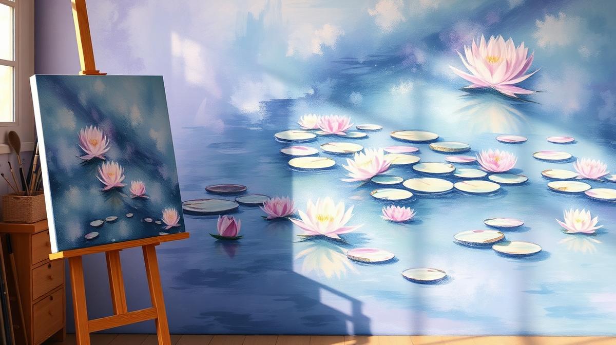
Impressionist Color Theory: How Monet & Renoir Revolutionized Light
The Impressionist movement (1860s–1880s) didn't just change painting—it fundamentally transformed how humans understand color and light. Before Impressionism, artists mixed colors on the palette to create smooth, blended surfaces. The Impressionists shattered this approach, placing pure colors side by side and letting the viewer's eye do the mixing. This technique, called "optical mixing" or "broken color," created unprecedented vibrancy and luminosity that still influences design today.
The Science Behind Impressionist Color
Chevreul's Color Theory
The Impressionists were deeply influenced by Michel Eugène Chevreul's 1839 treatise On the Law of Simultaneous Contrast of Colors. Chevreul discovered that:
- Adjacent colors influence each other: A gray next to blue appears slightly orange
- Complementary colors intensify each other: Red next to green makes both appear more vivid
- Shadows contain color: Shadows aren't simply darker versions of objects—they contain complementary hues
This scientific framework gave Impressionists permission to paint purple shadows on yellow haystacks and orange reflections in blue water.
The Impressionist Palette
| Pigment | Hex Code | Artist Association | Usage |
|---|---|---|---|
| Cobalt Blue | #0047AB | Monet, Sisley | Skies, water, shadows |
| Cadmium Yellow | #FFF600 | Monet, Pissarro | Sunlight, fields |
| Vermillion | #E34234 | Renoir, Cézanne | Warm accents, flesh tones |
| Viridian Green | #40826D | Monet, Pissarro | Foliage, landscapes |
| Lead White | #F5F5F0 | All Impressionists | Light mixing, highlights |
| Rose Madder | #E32636 | Renoir, Morisot | Skin tones, flowers |
| Chrome Orange | #FFA700 | Renoir, Sisley | Warm light, sunsets |
| Ultramarine Blue | #4166F5 | Monet, Cézanne | Deep shadows, sky depth |
| Naples Yellow | #FADA5E | Morisot, Cassatt | Gentle light, interiors |
What the Impressionists Banned
Equally important was what they removed from their palette:
- Black (#000000): Considered "dead" and absent from nature—replaced with deep blues and purples
- Bitumen/Asphaltum: The dark brown used by Old Masters—too opaque and deadening
- Earth tones (reduced): Raw umber and burnt sienna were minimized in favor of pure spectrum colors
Monet famously declared: "Color is my day-long obsession, joy, and torment."
Master Colorists: Technique Breakdowns
Claude Monet: The Cathedral of Light
Monet's approach to color was systematic and almost scientific:
The Haystacks Series (1890-91):
- Same subject painted at different times of day
- Morning: Cool lavender (#9B89B3) + pale gold (#F0E68C)
- Midday: Warm orange (#FF8C00) + bright white (#FFFFF0)
- Sunset: Deep crimson (#DC143C) + violet (#7B68EE)
- Snow: Blue shadows (#6495ED) + pink highlights (#FFB6C1)
Water Lilies (1897-1926):
| Element | Colors Used | Hex Range |
|---|---|---|
| Water surface | Blue-violet + green | #4169E1 to #228B22 |
| Lily pads | Viridian + yellow-green | #40826D to #9ACD32 |
| Flowers | Rose + white + yellow | #FF69B4 to #FFFACD |
| Reflections | Sky complementaries | Inverted sky colors |
| Shadows | Purple + deep blue | #663399 to #191970 |
Pierre-Auguste Renoir: The Flesh Tone Master
Renoir's revolutionary flesh tone palette:
| Skin Area | Color Mix | Approximate Hex |
|---|---|---|
| Highlights | White + Naples yellow + touch of vermillion | #FFE4C4 |
| Mid-tones | Rose madder + white + viridian | #F4C2C2 |
| Shadows | Cobalt blue + rose madder + viridian | #C08081 |
| Warm areas | Cadmium orange + white | #FFDAB9 |
| Cool areas | Cerulean blue + white + rose | #E6D8E8 |
Renoir's key insight: skin is never one color. A single face contains:
- Warm yellows on the forehead (light-catching)
- Cool blues on the temples (shadow)
- Rose pinks on the cheeks (blood flow)
- Green undertones on the jaw (reflected environment)
Berthe Morisot: The Master of Suggestion
Morisot used the least amount of paint to suggest the most:
- Broken brushstrokes: Leaving canvas visible between strokes created luminosity
- White ground showing through: The canvas itself became a light source
- Pastel palette: Softer versions of Impressionist colors—lavender (#E6E6FA), soft pink (#FFB6C1), pale blue (#B0C4DE)
The Broken Color Technique in Practice
How Optical Mixing Works
Instead of mixing blue + yellow on the palette to get green, Impressionists placed tiny strokes of blue and yellow side by side:
| Palette Mixing | Optical Mixing |
|---|---|
| Duller result | More vibrant result |
| Colors lose intensity | Colors retain purity |
| Smooth, flat appearance | Shimmering, alive appearance |
| Works at any distance | Requires viewing distance |
The 60-30-10 Rule in Impressionism
Impressionists intuitively followed what designers now call the 60-30-10 rule:
- 60% Dominant atmosphere: Sky/water/ground in cool or warm tones
- 30% Secondary elements: Foliage, buildings, clothing in complementary tones
- 10% Accent highlights: Pure, intense touches of vermillion, cadmium yellow, or cobalt blue
Impressionism's Legacy in Modern Design
Digital Color Applications
Impressionist principles directly influence modern design:
| Impressionist Principle | Modern Design Application |
|---|---|
| Optical mixing | Gradient transitions, dithering |
| Complementary shadows | UI shadow colors with complementary tints |
| Broken color | Texture overlays, grain effects |
| Serial painting (same subject, different light) | Dark mode / light mode design |
| Plein air (outdoor painting) | Photography-first web design |
Web Design Inspired by Impressionism
Applying Impressionist color theory to digital design:
- Gradient backgrounds: Instead of flat colors, use subtle gradient transitions that mimic optical mixing
- Colored shadows: Drop shadows with complementary color tints (not just gray)
- Warm/cool contrast: Pair warm foreground elements with cool background tones
- Texture and grain: Add subtle noise to flat colors to create visual vibration
The Impressionist UI Palette
A modern UI palette inspired by Impressionist principles:
| Role | Color | Hex | Impressionist Source |
|---|---|---|---|
| Primary | Cobalt blue | #0047AB | Monet's skies |
| Secondary | Rose madder | #E32636 | Renoir's accents |
| Accent | Cadmium yellow | #FFF600 | Sunlight highlights |
| Background | Warm white | #FFFFF0 | Canvas ground |
| Text | Deep ultramarine | #1B1464 | Shadow depth |
| Muted | Viridian tint | #40826D | Foliage undertone |
Impressionist Color Psychology
Why Impressionist Colors Feel Good
The Impressionist palette triggers specific psychological responses:
- Luminosity: High-key colors with white mixed in create feelings of openness and optimism
- Warmth: The predominance of warm tones (yellows, oranges, roses) creates comfort and pleasure
- Movement: Broken brushstrokes create visual energy and vitality
- Nature connection: The outdoor palette connects viewers to natural environments
- Nostalgia: The soft, diffused quality creates a sense of remembered beauty
Color Temperature Mapping
Impressionists masterfully used color temperature to create depth:
| Depth Layer | Temperature | Colors | Effect |
|---|---|---|---|
| Foreground | Warm | Oranges, yellows, warm greens | Advances toward viewer |
| Middle ground | Neutral | Mixed warm and cool | Creates spatial transition |
| Background | Cool | Blues, violets, cool greens | Recedes from viewer |
| Atmosphere | Very cool | Pale blue, lavender | Creates aerial perspective |
Collecting & Applying Impressionist Palettes
Building Your Own Impressionist Palette
Use Coloracci's AI palette generator to extract color palettes from Impressionist masterworks and apply them to modern design projects.
Steps for designers:
- Start with a warm white base (#FFFFF0 to #FFF8DC)
- Choose a dominant atmospheric color (blue sky, green landscape, or golden interior)
- Add the complementary color in smaller amounts
- Reserve pure, intense colors for focal point accents only
- Never use pure black—substitute with deep blue (#1B1464) or dark violet (#2E0854)
The Modern Impressionist Gradient
Create gradients that capture Impressionist light:
- Dawn: #FFE4E1 → #FF69B4 → #DA70D6 → #6A5ACD
- Midday: #87CEEB → #FFFFF0 → #FFD700 → #FF8C00
- Dusk: #FFB347 → #FF6B6B → #9B59B6 → #2C3E50
- Twilight: #4169E1 → #8A2BE2 → #FF1493 → #FF4500
Explore more art movement colors: Bauhaus Color Theory, Pop Art Colors, Renaissance Art Colors, or Art Deco Colors.