Iconic Painting Hex Codes: Vermeer, Hockney, Van Gogh, Picasso & Monet Decoded
· Coloracci Team
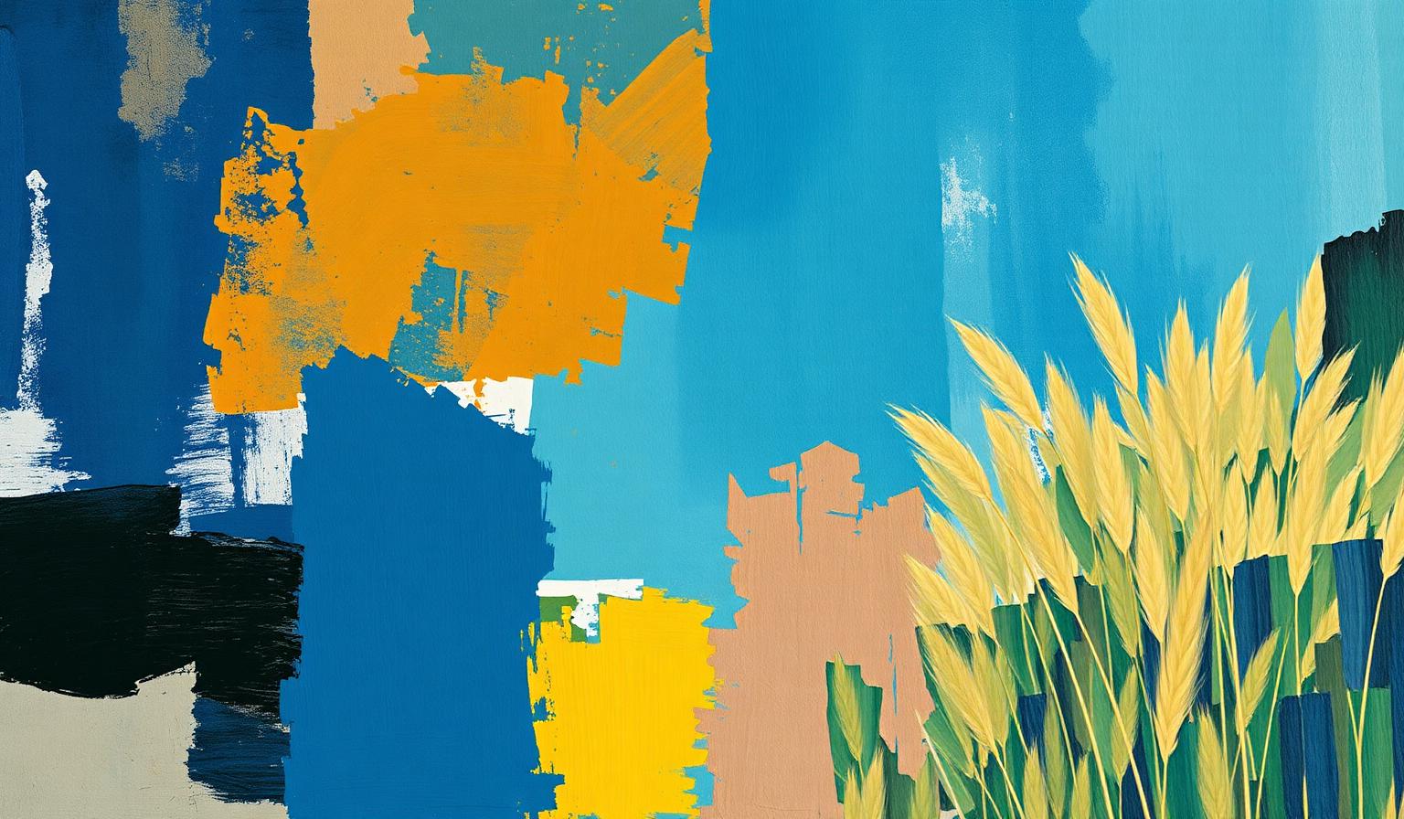
Iconic Painting Hex Codes: Vermeer, Hockney, Van Gogh, Picasso & Monet Decoded
The most enduring famous paintings color palettes are not lucky accidents of pigment. Vermeer's quiet ultramarine, Hockney's chlorine-blue Californian afternoon, Van Gogh's vibrating yellow-and-blue terrace, Picasso's fractured mirror, Monet's gilded wheat fields — each is a deliberate, restricted system of color engineered to deliver one emotional payload in under three seconds. That is exactly the brief modern product designers, brand strategists, and UI engineers work against every day.
This guide pulls the exact hex codes from five of art history's most analyzed canvases, decodes the color psychology behind them, and translates each into a working framework you can ship in brand systems, marketing sites, and interface design. It is a companion to our broader breakdown of famous paintings color palettes — focused this time on five specific compositions rather than artists' careers.
Why These Five Paintings Belong in Every Designer's Reference Library
Designers reach for trend reports and Pinterest boards, but the painters in this article solved the same compositional problems — figure-ground, hierarchy, mood, focal point — with paint, on a static surface, with no analytics. Their solutions still work because human perception has not changed. A 17th-century Dutch interior, a 1967 Los Angeles backyard, a 1920s French café, a 1932 Cubist portrait, and a 1891 French wheat field all encode the same lessons:
- Restriction beats variety. None of these palettes uses more than six dominant hues.
- Complementary tension creates energy. Yellow against blue is doing real perceptual work, not decorative work.
- Unsaturated colors carry saturated ones. Earthy, muted neutrals are what make a single accent sing.
- Color leads the eye. The reddest pixel in the painting is almost always the focal point.
The rest of this article is the receipts — exact colors, exact ratios, and the design implications.
The Complete Hex Breakdown: Five Iconic Paintings
Below are the dominant pigments of five canonical works. Hex values are sampled from high-resolution museum scans; color names are descriptive rather than pigment-historical.
Johannes Vermeer — Girl with a Pearl Earring (c. 1665)
Vermeer's masterpiece is a study in minimum-viable color — almost the entire canvas is built from five hues, with a single saturated red acting as a focal anchor.
| Color | Hex | Role |
|---|---|---|
| Inky Background Blue | #040310 |
Negative space, infinite depth |
| Warm Skin Pink | #DEBDA6 |
Face, hand — human warmth |
| Headscarf Blue | #657B9D |
Cool complement, calm |
| Lip Red | #9F463B |
Focal point — the eye lands here |
| Cream Headwrap | #E5C68E |
Mid-tone bridge between skin and blue |
The structural lesson: Vermeer surrounds a single saturated red (#9F463B) with desaturated earth tones and a near-black backdrop. The red is not loud in isolation — it is loud because everything around it is quiet. This is the accent principle every accessible CTA design relies on three centuries later.
David Hockney — A Bigger Splash (1967)
Hockney's poolside icon is the most "designed" painting on this list — flat, graphic, almost a poster. The palette behaves like a UI mood board for Californian modernism.
| Color | Hex | Role |
|---|---|---|
| Pool Blue | #6598B0 |
Dominant 40% field, calm |
| Ground Cream | #C6AFA6 |
Neutral warm grounding |
| Splash Off-White | #E2E2E0 |
The event, the punctuation |
| Palm Green | #4F745F |
Vertical accent, depth cue |
| Board Olive | #C8BF96 |
Connects warm ground to cool pool |
The genius is the temperature balance: a cool blue dominant offset by a warm cream secondary, with a single near-white "event" (the splash) carrying all the kinetic energy. Strip this painting to wireframes and you have the template for half of modern SaaS hero sections.
Vincent van Gogh — Café Terrace at Night (1888)
Van Gogh's terrace is the textbook example of complementary tension. The painting is essentially two colors — yellow and blue — fighting and resolving across the canvas.
| Color | Hex | Role |
|---|---|---|
| Sky Cobalt | #314F94 |
Dominant cool, ~45% of canvas |
| Terrace Yellow | #EAC655 |
Dominant warm, ~30% of canvas |
| Building Slate | #0C1418 |
Anchor darks, framing |
| Floor Burnt Sienna | #BC734A |
Warm mid, ties yellow to night |
| Street Off-White | #EFE8DF |
Highlight, draws perspective |
This is the 60/30/10 rule in 1888: ~60% blue, ~30% yellow, ~10% accent neutrals. Designers who follow this ratio inherit Van Gogh's compositional stability for free.
Pablo Picasso — Girl Before a Mirror (1932)
Picasso's mirror is the most chromatically ambitious painting in this group — five competing saturated hues held together by careful tonal balance.
| Color | Hex | Role |
|---|---|---|
| Body Mauve | #BEB3C2 |
Soft dominant, dream-state |
| Limb Sage Green | #7BA081 |
Body parts, biological cue |
| Face/Background Yellow | #CBBE6F |
Warm structure |
| Body Red Ochre | #9F533E |
Tension, blood, vitality |
| Mirror Slate Blue | #677894 |
The reflection — colder, melancholic |
The lesson is how Picasso prevents chaos: every saturated hue is partnered with a desaturated tint (mauve carries red, sage carries green, slate carries blue). It is a perfect demonstration of why pure palettes feel garish and tinted palettes feel resolved.
Claude Monet — Wheatstacks (End of Summer) (1891)
Monet's haystack is a monochromatic warm palette — almost entirely yellows, oranges, and browns, with a single complementary green to keep the eye moving.
| Color | Hex | Role |
|---|---|---|
| Sky Pale Green | #DBE0A6 |
High-key warm-leaning neutral |
| Hill Mid Olive | #887D09 |
Mid-tone structure |
| Haystack Dark Brown | #513800 |
Anchor, the visual weight |
| Ground Amber | #B19B38 |
Sun, surface, dominant field |
| Haystack Red Highlight | #A23B00 |
Accent — late-summer warmth |
Critically, Monet uses no pure black and no pure white to communicate light and shadow. Darks are deep browns; lights are pale yellow-greens. This is the master class in "color as light" — and the technique behind every modern dark-mode UI that avoids #000000 in favor of tinted near-blacks.
Patterns & Analysis: What These Palettes Reveal
Looking across all five canvases, four structural patterns emerge.
1. The 5-Color Ceiling
Not one painting uses more than six dominant hues. Vermeer and Hockney use five. Van Gogh and Monet hover near five. This maps directly onto modern brand systems: when your palette exceeds 5–6 dominant colors, the brand loses recognizability. The masters knew the cognitive limit centuries before color theory research confirmed it.
2. The 60/30/10 Distribution Predates Design Schools
Van Gogh's cobalt-and-yellow terrace, Hockney's pool-and-cream backyard, and Klimt-era warm-dominant compositions all approximate the same ~60% / ~30% / ~10% split. It is now codified as the 60/30/10 rule — but Vermeer, Monet, and Picasso were applying it instinctively.
3. Saturated Hues Need Desaturated Neighbors
Picasso's Girl Before a Mirror is the clearest proof. The painting could be visually exhausting — five saturated colors at once — but every hot color is tempered by a tinted version. This is the same reason modern UI guidance recommends pairing brand accents with neutral grays and tinted off-whites.
4. The Focal Point Is Almost Always the Reddest Pixel
Vermeer's lip. Picasso's body red ochre. Monet's haystack highlight. Even Hockney's "splash" — though near-white — sits at the warmest end of the cool palette. Color leads the eye. When you design a hero section, ask: what is the reddest, warmest, or most saturated pixel on the page, and is it the thing I want users to act on?
Color Psychology: What These Five Palettes Communicate
Color is a language. Here is what each painting is saying — and what your designs can borrow.
Vermeer's Ultramarine: Trust Encoded as Stillness
The headscarf blue (#657B9D) is muted, slightly grayed, and surrounded by warm skin tones. This is the psychological recipe for calm authority — the same reason banking, healthcare, and enterprise SaaS lean on muted blues rather than saturated ones. See our psychology of blue in design for the full pairing rules.
Hockney's Pool Blue: California as a Color
Hockney's #6598B0 is brighter, more chlorinated, more advertising-friendly. It carries leisure, optimism, and disposable income. Travel brands, hospitality, and DTC lifestyle products live in this exact zone of blue.
Van Gogh's Yellow: Joy with a Pulse of Anxiety
Chrome yellow (#EAC655) is luminous and life-affirming — but Van Gogh's biographers note he used yellow obsessively during his most psychologically intense periods. The takeaway for designers: yellow demands attention, but prolonged exposure feels urgent, not pleasant. Use it for CTAs, warning states, and accent moments — not large fields. Compare with the psychology of mustard yellow for desaturated alternatives.
Picasso's Slate Blue Mirror: Melancholy as a Mirror
The mirror in Girl Before a Mirror is the only cool tone in a warm-dominant painting — and that is the entire emotional point. Cool tones placed inside warm compositions read as introspection, loss, or self-reflection. Editorial brands and storytelling-first products use this technique to give a "hero moment" emotional weight.
Monet's Amber: Warmth Without Heat
Monet's wheat field amber (#B19B38) is warm but desaturated — it communicates late summer, memory, nostalgia. This is the exact tonal zone that hospitality, artisan food, and heritage brands occupy. See our earth tone color palette guide for the modern brand mapping.
Vermeer's Lip Red: The 3% That Holds the Composition
The lip red (#9F463B) occupies less than 3% of the canvas, yet the eye returns to it constantly. The smallest color does the heaviest lifting. Every successful CTA button design exploits the same math.
Designer Takeaways: Shipping These Palettes This Quarter
Here is how to translate the five paintings into work you can deploy.
1. Use a Vermeer Palette for Premium, Quiet Brand Systems
Anchor on a near-black background (#040310), cool muted blue support (#657B9D), warm earth midtones, and one saturated accent at <5% surface coverage. This is the recipe for luxury without volume — think editorial publishing, fine watches, private banking. Pairs beautifully with serif typography and generous whitespace.
2. Use a Hockney Palette for Lifestyle and DTC
Dominant cool blue (#6598B0), warm cream neutral (#C6AFA6), one event-color highlight, and a single vertical green accent. Flat, graphic, no gradients. This is the visual template behind most of the breakout DTC brands of the last decade — boxed water, premium swimwear, modern hospitality.
3. Use a Van Gogh Café Terrace Palette for Hero Sections That Must Stop the Scroll
Pair a saturated cool (#314F94) with a saturated warm (#EAC655) at roughly 60/30, with neutral darks framing. The complementary tension creates immediate visual gravity. Perfect for product launches, conference landing pages, and editorial features. Don't overuse — this palette demands attention, so reserve it for moments that deserve it.
4. Use a Picasso Palette for Creative-Industry and Maker Brands
Five saturated hues, each paired with a desaturated tint. This is the palette for design tools, creative platforms, art-school brands, and anything that needs to feel chromatically ambitious without becoming garish. Test the palette in our color contrast checker before committing — multi-hue palettes need careful luminance balancing.
5. Use a Monet Wheatstacks Palette for Heritage, Hospitality, and Wellness
Warm-monochromatic dominant (ambers, ochres, soft browns), with a single complementary green-leaning neutral to prevent fatigue. Avoid pure black and pure white — use tinted darks (#513800) and warm whites (#DBE0A6) instead. This is the palette for boutique hotels, artisan food, slow lifestyle brands, and meditation products.
Master Painting Color Reference Table
| Painting | Primary Color | Hex Code | Color Name | Psychological Meaning |
|---|---|---|---|---|
| Vermeer — Girl with a Pearl Earring | Inky Background Blue | #040310 |
Vermeer Black-Blue | Infinite quiet, premium gravity |
| Vermeer — Girl with a Pearl Earring | Warm Skin Pink | #DEBDA6 |
Dutch Skin | Human warmth, intimacy |
| Vermeer — Girl with a Pearl Earring | Headscarf Blue | #657B9D |
Delft Blue | Calm authority, trust |
| Vermeer — Girl with a Pearl Earring | Lip Red | #9F463B |
Vermilion Earth | Focal point, vitality |
| Vermeer — Girl with a Pearl Earring | Cream Headwrap | #E5C68E |
Linen Cream | Bridging neutral, warmth |
| Hockney — A Bigger Splash | Pool Blue | #6598B0 |
Hockney Pool | Leisure, optimism, California |
| Hockney — A Bigger Splash | Ground Cream | #C6AFA6 |
Sun-Bleached Cream | Grounding warmth |
| Hockney — A Bigger Splash | Splash Off-White | #E2E2E0 |
Splash White | Kinetic event, punctuation |
| Hockney — A Bigger Splash | Palm Green | #4F745F |
Palm Shadow | Vertical depth, stability |
| Hockney — A Bigger Splash | Board Olive | #C8BF96 |
Diving Olive | Warm-cool bridge |
| Van Gogh — Café Terrace at Night | Sky Cobalt | #314F94 |
Arles Cobalt | Tranquility with charge |
| Van Gogh — Café Terrace at Night | Terrace Yellow | #EAC655 |
Chrome Yellow | Luminous warmth, vitality |
| Van Gogh — Café Terrace at Night | Building Slate | #0C1418 |
Night Slate | Framing dark, gravity |
| Van Gogh — Café Terrace at Night | Floor Burnt Sienna | #BC734A |
Café Sienna | Warm-bridge midtone |
| Van Gogh — Café Terrace at Night | Street Off-White | #EFE8DF |
Lamplit Cream | Highlight, perspective |
| Picasso — Girl Before a Mirror | Body Mauve | #BEB3C2 |
Cubist Mauve | Dream state, softness |
| Picasso — Girl Before a Mirror | Limb Sage | #7BA081 |
Body Sage | Organic cue, calm |
| Picasso — Girl Before a Mirror | Face Yellow | #CBBE6F |
Picasso Ochre | Warm structure |
| Picasso — Girl Before a Mirror | Body Red | #9F533E |
Body Red Ochre | Vitality, tension |
| Picasso — Girl Before a Mirror | Mirror Slate Blue | #677894 |
Reflection Blue | Melancholy, self-regard |
| Monet — Wheatstacks (End of Summer) | Sky Pale Green | #DBE0A6 |
Summer Sky | High-key warmth |
| Monet — Wheatstacks (End of Summer) | Hill Mid Olive | #887D09 |
Field Olive | Structural midtone |
| Monet — Wheatstacks (End of Summer) | Haystack Brown | #513800 |
Haystack Umber | Anchor, visual weight |
| Monet — Wheatstacks (End of Summer) | Ground Amber | #B19B38 |
Late Summer Amber | Sun, nostalgia, dominant field |
| Monet — Wheatstacks (End of Summer) | Haystack Red | #A23B00 |
Sunset Sienna | Focal accent, late-summer warmth |
Conclusion: The Painters Were the First Color Strategists
Every painting in this guide is, in modern terms, a single-surface experience designed to deliver one emotional payload in under three seconds. That is the brief most product and brand designers work against today. The difference is that Vermeer, Hockney, Van Gogh, Picasso, and Monet had to solve it with pigment, ratio, and contrast alone — no motion, no copy, no A/B test.
When you choose a brand palette, a hero color, or a CTA accent, you are participating in a centuries-old conversation about how color makes humans feel. Borrow from the best.
Ready to extract a museum-grade palette from your own reference images? Try the Coloracci AI palette generator — upload any painting, photograph, or moodboard reference and get a production-ready palette with hex codes, contrast checks, and harmony analysis in seconds. Or deepen your fundamentals with our color psychology guide and the broader famous paintings color palettes pillar.
Further reading: Impressionist Color Theory, Renaissance Art Colors, Bauhaus Color Theory, How to Create Harmonious Color Palettes.