Famous Paintings Color Palettes: Decoding Monet, Van Gogh & Picasso
· Coloracci Team
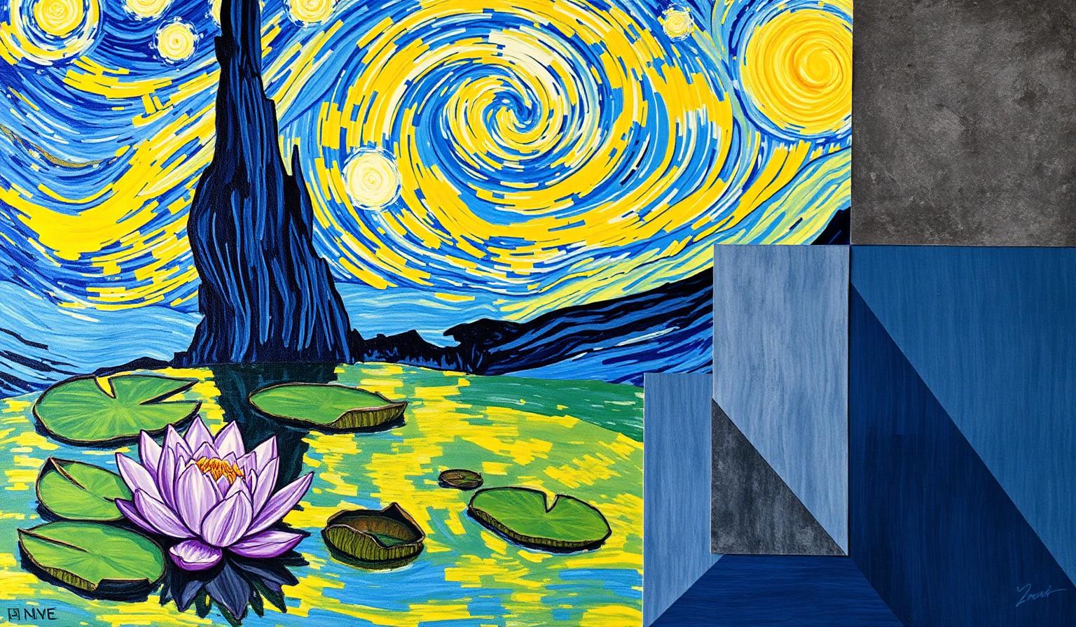
Famous Paintings Color Palettes: Decoding Monet, Van Gogh & Picasso
The most enduring famous paintings color palettes are not accidents of pigment — they are precision instruments. When Van Gogh layered cobalt against chrome yellow, when Picasso drained color into a single melancholy blue, when Monet dissolved a pond into pale violets and greens, they were doing what every modern designer tries to do: make a viewer feel something specific, fast. Centuries later, those same palettes still teach us how color carries emotion, hierarchy, and narrative.
This guide breaks down the exact hex codes behind four of art history's most influential colorists — Claude Monet, Vincent van Gogh, Pablo Picasso, and Gustav Klimt — and translates their choices into a working framework you can apply to brand systems, UI, and editorial design today.
Watch: The Famous Paintings Color Palettes Song
Why Master Painters' Palettes Still Matter to Designers
Designers reach for color psychology guides and trend forecasts, but the masters solved the same problems first — with paint, on canvas, without a screen to mediate the message. Their work is a free, time-tested lab:
- Monet proved that low-contrast palettes can hold attention through subtlety alone.
- Van Gogh showed that complementary tension (blue/yellow, red/green) can carry emotional weight no neutral ever will.
- Picasso demonstrated that desaturation and monochrome are not a lack of color — they are a deliberate emotional channel.
- Klimt proved that one dominant metallic can elevate an entire composition into the territory of the sacred.
These are the same levers behind every successful brand palette today. The rest of this article maps the exact colors, the psychology behind them, and the takeaways you can ship.
The Complete Breakdown: Exact Colors of the Masters
Below are the signature famous paintings color palettes drawn directly from the most analyzed works in Western art history.
Vincent van Gogh — Emotional Saturation
Van Gogh's palettes are built on high-chroma complements that vibrate against each other. He rarely used a "neutral" — even his backgrounds carry a charged hue.
| Color | Hex | Painting | Role |
|---|---|---|---|
| Deep Cobalt Blue | #003366 |
The Starry Night | Night sky, emotional turbulence |
| Vibrant Yellow | #FFD700 |
The Starry Night | Stars, moon, luminous hope |
| Bold Red | #FF0000 |
The Bedroom | Blanket, passion, comfort of home |
| Chrome Orange | #FFA700 |
Sunflowers | Petal warmth, vitality |
The genius of Starry Night is the blue–yellow complementary pair (#003366 against #FFD700). Complementary colors sit opposite on the color wheel, so they amplify each other's intensity. The sky doesn't contain turbulence — the color contrast itself is the turbulence.
Pablo Picasso — Color as Mood Switch
Picasso's career is the clearest proof that palette choice is a deliberate emotional decision, not a decorative one. He famously shifted entire palettes to match psychological states.
| Color | Hex | Period / Painting | Role |
|---|---|---|---|
| Pure Blue | #0000FF |
Blue Period | Melancholy, isolation |
| Dark Navy | #00008B |
Blue Period | Spiritual depth, introspection |
| Black | #000000 |
Guernica | Horror, void |
| White | #FFFFFF |
Guernica | Exposure, stark truth |
| Mid Gray | #808080 |
Guernica | Abstraction, ash, dehumanization |
Picasso's Blue Period (1901–1904) is a masterclass in monochromatic palettes. By restricting himself to blues, he forced viewers to feel a single, sustained emotion. Guernica (1937) does the opposite with absence: by stripping color out entirely, he turned the canvas into something resembling newsprint photography of an atrocity — the absence of hue is the message.
Claude Monet — The Quiet Power of Analogous Color
Where Van Gogh shouted, Monet whispered. His palettes are dominated by analogous colors — hues that sit next to each other on the wheel — producing harmony rather than tension.
| Color | Hex | Painting | Role |
|---|---|---|---|
| Soft Lavender | #CC99CC |
Water Lilies | Floating reflection, dawn light |
| Deep Forest Green | #006400 |
Water Lilies | Lily pads, depth, calm |
| Gentle Sage Green | #669966 |
Water Lilies | Mid-tone foliage |
| Subtle Pink | #FFC0CB |
Water Lilies | Petals, soft warmth |
Monet's Water Lilies series achieves what most digital interfaces fail at: sustained calm. The palette has no hard edges and no high-saturation accents. This is the design equivalent of a harmonious color palette — restful, immersive, and deeply on-brand for a meditative experience.
Gustav Klimt — The Single Dominant Metallic
Klimt's The Kiss (1907–1908) shows what happens when one color is given overwhelming dominance in a palette. Roughly 60–70% of the canvas is gold leaf.
| Color | Hex | Painting | Role |
|---|---|---|---|
| Bright Gold | #FFD700 |
The Kiss | Luxury, divinity, eternal love |
| Goldenrod | #DAA520 |
The Kiss | Shadow, depth, warmth of intimacy |
The takeaway is structural: when you commit to one color at this percentage, everything else in the palette becomes a supporting accent. This is why luxury brands so often anchor on a single warm metallic — the math of dominance is centuries old.
Patterns & Analysis: What Master Palettes Reveal
Looking across these famous paintings color palettes, three patterns emerge that map directly onto modern design problems.
1. Restriction Beats Variety
None of these masters used a 12-color palette. Van Gogh leaned on 4–6 dominant pigments. Picasso's Blue Period used essentially two values of one hue. Klimt anchored on gold. Modern brand systems that try to "cover all use cases" with sprawling palettes lose this clarity. Pick fewer colors. Use them harder.
2. Contrast Type Drives Emotion
- Complementary contrast (Van Gogh's blue/yellow) = energy, tension, urgency.
- Analogous harmony (Monet's greens/purples) = calm, immersion, contemplation.
- Achromatic contrast (Picasso's Guernica) = severity, journalism, gravity.
- Tonal monochromatic (Picasso's Blue Period) = single sustained mood.
Choose your contrast type first, then pick the colors. This is the inverse of how most designers work — and it's why master paintings hold together so well.
3. The 60-30-10 Rule Predates the Internet
Klimt's gold dominance, Monet's water surface, Van Gogh's night sky — each painting has a clear ~60% dominant field, a ~30% secondary field, and a ~10% accent. Modern UI systems that follow the same ratio inherit the same compositional stability.
Color Psychology: What These Palettes Communicate
Color is a language, and these masters were fluent. Here's the emotional dictionary their palettes encoded — and what it means for your work.
Blue: From Tranquility to Mourning
Blue is the most semantically flexible color in the master palette. Van Gogh's deep cobalt (#003366) carries night-sky tranquility shaded with anxiety. Picasso's pure blue (#0000FF) and dark navy (#00008B) carry isolation and grief. The variable that flips the meaning is saturation and warmth of neighbors: blue surrounded by yellow reads as awe; blue alone reads as sorrow.
Designer note: Tech brands use blue as a "trust" signal, but the same hex can read as cold or depressive without warm accent support. See our color harmony guide for pairing rules.
Yellow: Energy with a Warning Built In
Van Gogh's chrome yellow (#FFD700) is luminous and life-affirming. The same hex appears in Klimt's gold leaf as divinity. Yellow is the color of attention demanded — which is why CTA buttons, warning labels, and taxis all share it.
Red: Compressed Intensity
Van Gogh's bold red (#FF0000) in The Bedroom is jarring on first read because the rest of the room is muted. This is the accent principle: red works hardest when it occupies the smallest percentage of the composition.
Green: The Trust Color of Nature
Monet's greens (#006400, #669966) operate as the ground state of his palette — the color the viewer rests on between glances at the lilies. In digital design, deep greens carry the same role: stability, growth, the place where the eye recovers.
Gold: Wealth Encoded as Light
Klimt's gold isn't a color — it's a material. Reflective metallics behave differently than flat hues because they change with viewing angle. Modern design simulates this with gradients (#FFD700 → #DAA520) and subtle highlights.
Black, White, and Gray: The Silence Palette
Picasso's Guernica palette (#000000, #FFFFFF, #808080) shows that the absence of color is itself a strong color choice. Editorial design, journalism, and serious institutional brands lean on this palette because it communicates "this is not decorative — this is true."
Designer Takeaways: Using Master Palettes in Real Projects
Here's how to translate these famous paintings color palettes into work you ship this quarter.
1. Use a Van Gogh Palette for Hero Sections That Need to Stop the Scroll
Pair a deep cool (#003366) with a luminous warm (#FFD700) at roughly 70/15 with neutral support. The complementary tension creates immediate visual gravity — perfect for product launches and landing-page heroes.
2. Use a Monet Palette for Wellness, Editorial, and Long-Read UX
Restrict to 4 analogous hues across one temperature band (e.g., #CC99CC, #FFC0CB, #669966, #006400). Keep saturation low. Use this when dwell time matters more than click rate.
3. Use a Picasso Blue Period Palette for Empathy-First Brands
Mental health platforms, hospice services, and grief support products often misuse "cheerful" palettes. A monochromatic blue palette (#00008B, #0000FF, plus tints toward white) communicates respect for the user's emotional state without performative warmth.
4. Use a Klimt Palette for Single-Hero-Color Brand Systems
Choose one rich anchor (gold, deep emerald, oxblood) and let it occupy 60%+ of every key surface. Build the rest of the palette as supporting darks and one paper-toned neutral. This is the structural model behind most luxury brand identity.
5. Use a Guernica Palette When Truth Matters More Than Delight
Investigative journalism, security dashboards, compliance interfaces. Pure black, pure white, one mid-gray. No accent color. The lack of decoration is the credibility signal.
Master Painting Color Reference Table
| Painting / Period | Primary Color | Hex Code | Color Name | Psychological Meaning |
|---|---|---|---|---|
| Van Gogh — Starry Night | Deep Cobalt Blue | #003366 |
Cobalt Night | Tranquility & emotional turbulence |
| Van Gogh — Starry Night | Vibrant Yellow | #FFD700 |
Chrome Gold | Luminous hope, vitality |
| Van Gogh — The Bedroom | Bold Red | #FF0000 |
Cadmium Red | Passion, energy, comfort of home |
| Picasso — Blue Period | Pure Blue | #0000FF |
Ultramarine | Melancholy, desolation |
| Picasso — Blue Period | Dark Navy | #00008B |
Midnight Navy | Spiritual depth, introspection |
| Picasso — Guernica | Black | #000000 |
Pure Black | Horror, chaos, void |
| Picasso — Guernica | White | #FFFFFF |
Pure White | Exposure, stark truth |
| Picasso — Guernica | Mid Gray | #808080 |
Ash Gray | Abstraction, dehumanization |
| Monet — Water Lilies | Soft Lavender | #CC99CC |
Lily Lavender | Calm, shimmering light |
| Monet — Water Lilies | Deep Green | #006400 |
Forest Green | Nature, reflection, tranquility |
| Monet — Water Lilies | Sage Green | #669966 |
Sage Mid | Restful mid-tone harmony |
| Monet — Water Lilies | Subtle Pink | #FFC0CB |
Petal Pink | Soft warmth, intimacy |
| Klimt — The Kiss | Bright Gold | #FFD700 |
Klimt Gold | Wealth, divinity, eternal love |
| Klimt — The Kiss | Goldenrod | #DAA520 |
Aged Gold | Warmth, intimacy, depth |
Conclusion: The Masters Were the First UX Designers
Every painting in this guide is, in modern terms, a single-screen experience designed to deliver one emotional payload in under three seconds. That's the same brief most product designers work against today. The difference is that Monet, Van Gogh, Picasso, and Klimt had to solve the problem with pigment, composition, and contrast alone — no motion, no copy, no analytics.
When you choose a brand palette, a UI accent, or a hero color, you are participating in a 150-year-old conversation about how color makes humans feel. Steal from the best.
Ready to build your own masterpiece-grade palette? Try the Coloracci AI palette generator to extract museum-quality color systems from any image, painting, or reference — or deepen your fundamentals with our color psychology guide and color harmony playbook.
Further reading: Impressionist Color Theory: Monet & Renoir, Renaissance Art Colors, Bauhaus Color Theory.