A Designer's Guide: How to Identify Paint Color Undertones
· Coloracci Team
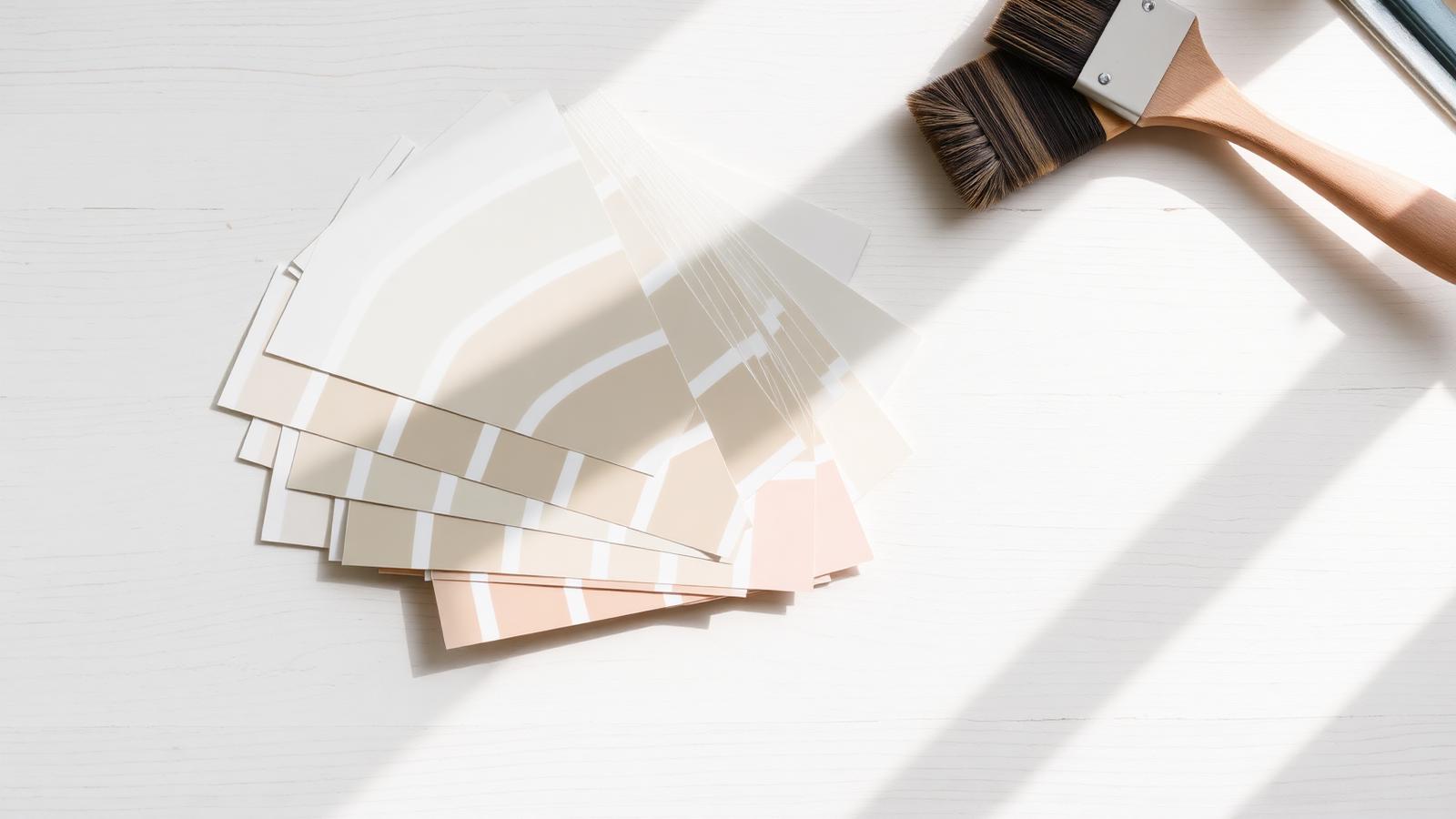
The Direct Answer: How to Identify Paint Color Undertones
If you want to know how to identify paint color undertones, here is the professional method in three moves: compare the paint against a pure, unmixed version of the same color family; read the darkest chip at the bottom of the paint strip, because it exposes the undertone of every lighter shade above it; then test a large sample on the actual wall in the room's real light, morning and evening. An undertone is the secondary color a paint reveals under certain lighting conditions — the trace of blue, green, violet, pink, or yellow that was mixed in to create the final shade. It is invisible in isolation and unmistakable in comparison.
This is why two "beiges" can look identical on a chip and fight each other in a finished room. A greige wall with a green undertone next to a sofa with a pink undertone will never feel resolved; the room reads muddy, and most homeowners cannot say why. Learning to see undertones is the single highest-leverage color skill in interior design, and it takes about twenty minutes to learn and a lifetime to stop noticing.
Below: the science of how undertones form, four reliable identification techniques, exact HEX values for the industry's most-used neutrals, three coordinated palettes, the psychology behind each undertone family, and a reference data table you can work from directly.
What an Undertone Actually Is
Every paint that is not a pure spectral hue is a mixture. When two or more colorants are combined, the exact proportion of each pigment determines both the visible surface color (the mass tone) and the secondary color that surfaces under specific light (the undertone). Gray, for example, is never just black plus white in commercial paint — it is tinted with blue, green, violet, or umber to give it character. Those tints are the undertone.
Three properties govern what you see:
- Mass tone — the color you perceive at a glance, from across the room.
- Undertone — the secondary color that emerges in comparison or in shifting light.
- Light temperature — north light (cool, ~7000K) amplifies blue and green undertones; south and west light (warm, ~2700–4000K) amplifies yellow, pink, and orange undertones.
This is why the same gallon can look sage in a north-facing bedroom and warm putty in a west-facing living room. Nothing about the paint changed; the light changed which pigment your eye picks out. If you want the deeper mechanics of warm versus cool perception, our guide to warm and cool color theory explains why the human eye advances warm hues and recedes cool ones.
Method 1: Compare Against a Pure Version of the Color
The most reliable technique — and the one professional color consultants use first — is comparison against a pure reference. Undertones are relational. In isolation, your visual system normalizes the color and you see "beige." Place that beige next to a pure, untinted beige and the difference leaps out.
Practically: hold your candidate chip against a pure white card (#FFFFFF), a pure warm beige such as #E8D9C0, and a neutral true gray such as #808080. Whatever direction your sample drifts is the undertone. Against pure beige, a greige with green undertones will look distinctly olive-cast; against pure gray, the same sample will look warm and slightly yellow.
Use white card stock behind every chip. A paint chip resting on a wood floor, a granite counter, or a colored table is already contaminated by reflected light and simultaneous contrast — your eye will read the wrong undertone with total confidence.
Reference anchors worth keeping in your kit:
- Pure White
#FFFFFF— exposes any yellow, pink, or blue cast in "whites" - True Neutral Gray
#808080— exposes warmth or coolness in grays and greiges - Pure Beige
#E8D9C0— exposes green, pink, or gray in beiges - Pure Black
#000000— exposes brown, blue, or green in "blacks" and charcoals
Method 2: Read the Darkest Chip on the Paint Strip
The second method — and the fastest one to learn — is to ignore the shade you like and study the darkest color at the bottom of the same paint strip. Manufacturers build a strip from a single colorant formula at increasing saturation. The darkest chip concentrates the tint most heavily, so it displays the undertone with the least ambiguity.
If the bottom of a beige strip is a deep brown with a visible green cast, every lighter beige on that strip carries the same green undertone — including the one that looks like innocent cream at the top. If the bottom chip is a chocolate that leans plum, your pale beige has a pink-violet undertone and will clash with olive furnishings.
This trick works because your eye detects hue far more accurately at mid-to-high saturation than in near-white tints. You are not guessing at a whisper; you are reading a shout and applying it upward.
Method 3: Sample Large and Live With It
Paint two coats onto a 2 × 2 ft sheet of white poster board rather than painting directly on the wall — the existing wall color contaminates your read. Move the board around: interior wall, exterior wall, next to the trim, next to the flooring, beside the sofa fabric. Photograph it at 9 a.m., 2 p.m., and after dark under artificial light.
Check it against the fixed elements you cannot change: flooring, stone, tile, cabinetry, and the largest upholstery pieces. Those fixed undertones win every argument. Our walkthrough on how to match colors like a professional designer covers the sequencing — always resolve the immovable materials first, then choose paint to serve them.
Method 4: Test the Undertone With Its Complement
Advanced but decisive: place the sample beside the complement of the suspected undertone. Complementary pairs maximize perceived saturation, so a faint green undertone becomes obvious next to a soft red-pink, and a violet undertone announces itself beside a muted yellow. If nothing intensifies, your suspicion was wrong. Our complementary colors guide explains the mechanism behind this simultaneous-contrast effect.
Case Study: Two Famous Neutrals, Two Different Undertones
Benjamin Moore Revere Pewter (HC-172) — #CBCCC6
Revere Pewter is the archetypal greige, and its undertone is green. Set it against a pure gray and the drift toward olive is immediate. That green is why Revere Pewter reads warm and organic beside oak, jute, and living plants — and why it turns faintly swampy beside a cool blue-gray sofa or under heavy north light. Pair it with warm whites such as White Dove #F0EFE4, and with woods that carry honey or amber tones. For complete coordinating palettes, see our guide to what colors go with Benjamin Moore Revere Pewter.
Sherwin-Williams Agreeable Gray (SW 7029) — #D1CABE
Agreeable Gray is the best-selling neutral in North America and its undertone is beige/taupe — a warm, slightly yellow-brown cast with far less green than Revere Pewter. Against a pure beige it looks grayer; against a pure gray it looks unmistakably warm. This is precisely why the two paints, both described as "greige," should never be used in adjacent rooms without an intentional transition: side by side, Revere Pewter reads green and Agreeable Gray reads dirty-yellow, and both look worse than they do alone. For the full set of coordinating palettes, see our guide to what colors go with Sherwin Williams Agreeable Gray.
More Reference Neutrals and Their Undertones
- Alabaster SW 7008
#EDEAE0— soft yellow-cream undertone, warm white - Sea Salt SW 6204
#CDD5CB— green-blue undertone, shifts with light - Pale Oak BM OC-20
#E4DED2— pink-taupe undertone - Naval SW 6244
#2F3E4E— cool blue with a faint violet undertone - Chantilly Lace BM OC-65
#F4F5F0— near-neutral white, barely cool - Accessible Beige SW 7036
#D3C7B4— yellow-gold undertone
Three Coordinated Palettes Built on Undertone Logic
Palette 1: Green-Undertone Greige (Organic Modern)
Anchored by Revere Pewter #CBCCC6. Support it with Sage Whisper #B8C0AE, Warm Linen #EDE6D8, Aged Bronze #6E6A5A, and Deep Forest #3A4A3C. Every member of this palette carries a green-to-yellow bias, so the room feels internally consistent and quietly grounded.
Palette 2: Beige-Undertone Greige (Warm Contemporary)
Anchored by Agreeable Gray #D1CABE. Pair with Alabaster #EDEAE0, Toasted Almond #C4AF97, Espresso Brown #4A3B31, and a controlled cool accent of Naval #2F3E4E. The single blue accent works precisely because it is deliberate contrast, not accidental undertone conflict.
Palette 3: Cool-Undertone Gray (Editorial Calm)
Anchored by Storm Gray #9BA3A9 with a blue undertone. Support with Chantilly Lace #F4F5F0, Slate Blue #5C6E7C, Graphite #3B3F44, and warm brass hardware #B08D57 as the sole warm relief. Note that no beige appears here — cool grays and warm beiges rarely coexist without a mediating material.
The Psychology of Undertones
Undertones carry emotional weight disproportionate to their visibility. A green-undertone neutral registers as natural, stable, restorative — a documented effect linked to the biophilic response. A pink or peach undertone reads flattering and hospitable, which is why designers favor pink-cast neutrals in bedrooms and dressing rooms; they warm skin tones in reflected light. Yellow undertones read cheerful and traditional but can tip toward dated when saturation rises. Blue and violet undertones read modern, clean, and clinical — powerful in offices and bathrooms, chilling in a north-facing living room.
The consistency of these responses matters commercially: hospitality and healthcare specifiers select undertones deliberately because guests report a room as "welcoming" or "cold" long before they can name a color.
Reference Table: Undertones at a Glance
| Item | Color | Hex | Color Name | Psychological Meaning |
|---|---|---|---|---|
| Greige wall (green undertone) | Soft warm gray | #CBCCC6 |
Revere Pewter HC-172 | Grounded, natural, restorative |
| Greige wall (beige undertone) | Warm taupe-gray | #D1CABE |
Agreeable Gray SW 7029 | Welcoming, safe, universally agreeable |
| Warm white trim | Creamy white | #EDEAE0 |
Alabaster SW 7008 | Clean, gentle, timeless |
| Cool white trim | Crisp white | #F4F5F0 |
Chantilly Lace OC-65 | Precise, modern, airy |
| Green-cast neutral | Muted sage | #CDD5CB |
Sea Salt SW 6204 | Calm, spa-like, healing |
| Pink-cast neutral | Soft blush-taupe | #E4DED2 |
Pale Oak OC-20 | Flattering, intimate, soft |
| Yellow-cast neutral | Golden beige | #D3C7B4 |
Accessible Beige SW 7036 | Cheerful, traditional, cozy |
| Blue undertone accent | Deep navy | #2F3E4E |
Naval SW 6244 | Authoritative, composed, trustworthy |
| Violet undertone gray | Cool mid-gray | #9BA3A9 |
Storm Gray | Contemporary, detached, elegant |
| Depth anchor | Rich brown | #4A3B31 |
Espresso Brown | Stable, secure, enveloping |
| Warm metal accent | Antique brass | #B08D57 |
Aged Brass | Luxurious, crafted, warm |
| Cool contrast anchor | Charcoal | #3B3F44 |
Graphite | Sophisticated, definitive, grounding |
Practical Takeaways for Designers and Homeowners
- Never judge an undertone alone. Always compare against a pure reference; isolation defeats your visual system.
- Read the bottom of the strip first. The darkest chip tells you the truth about every shade above it.
- Fixed materials rule. Flooring, stone, and tile undertones are non-negotiable — choose paint to serve them.
- One undertone family per open plan. Mixing green-cast and pink-cast neutrals in a sightline is the most common cause of a room that feels "off."
- Test in real light, over a full day. North light cools, west light warms; a paint that works at noon can fail at 6 p.m.
- Whites have undertones too. "White" trim beside a warm wall will read blue if the white is cool — a mismatch most people feel but cannot name.
- Use a controlled contrast accent. One deliberate opposing undertone adds life; three accidental ones create chaos.
Conclusion
Identifying paint color undertones is not an intuitive gift — it is a repeatable process. Compare against pure references, read the darkest chip on the strip, sample large in real light, and confirm with a complementary test. Do those four things and you will stop buying paint that looks perfect in the store and wrong on the wall. More importantly, you will start building rooms whose colors agree with one another, which is the entire difference between a decorated space and a designed one.
Ready to build a palette where every undertone is deliberate? Use the Coloracci palette generator to extract exact HEX values from your existing materials, generate coordinated schemes around them, and check how each combination behaves before you open a single can of paint.