What Colors Go With Sherwin Williams Agreeable Gray? A Designer's Guide
· Coloracci Team
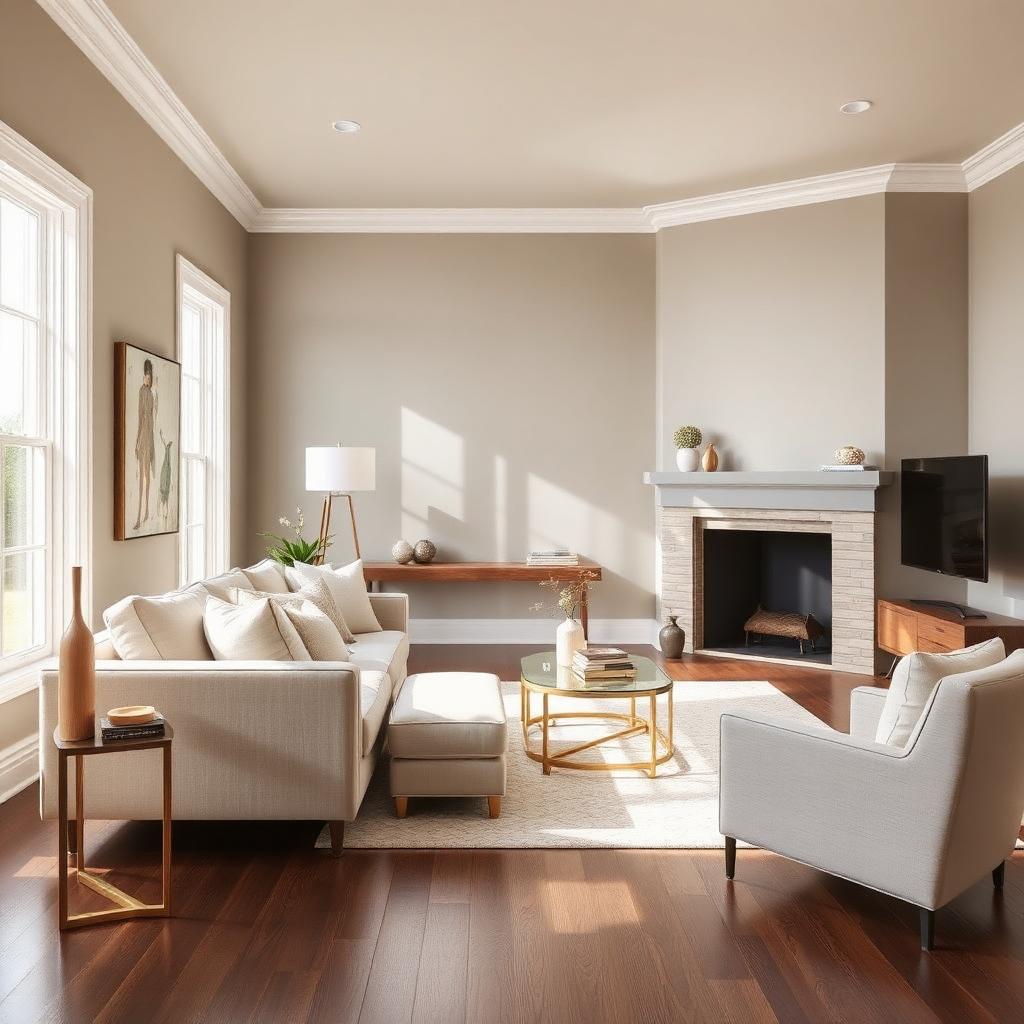
The Direct Answer: What Colors Go With Sherwin Williams Agreeable Gray
The best answer to what colors go with Sherwin Williams Agreeable Gray (SW 7029, #D1CBBD) is a mix of crisp warm whites (Alabaster #EDEAE0, Pure White #EDECE6), grounded neutrals (Accessible Beige #D3C6B4, Urbane Bronze #4E4B47), soft blues (Sea Salt #CDD2CA, Rainwashed #BFD3D0), and confident jewel-tone or earthy accents (Navy #2A3B4C, Sage #A5A58D, Terracotta #C97D5D, Black Fox #3E3936). Agreeable Gray is a warm greige with an LRV of 60 and a whisper of violet in the undertone — which is exactly why it plays nicely with almost any palette a designer or homeowner throws at it.
This guide breaks down the exact partners that flatter Agreeable Gray, the psychology behind why they work, and how to deploy them in real rooms without the color drifting purple, pink, or drab.
Meet the Color: Agreeable Gray SW 7029
Before pairing, understand what you are pairing with. Agreeable Gray is:
- HEX: #D1CBBD
- RGB: 209, 203, 189
- LRV (Light Reflectance Value): 60 — bright but not blinding.
- Undertone: warm greige with a subtle violet-taupe shift.
- Temperature: neutral-to-warm, leaning warm under incandescent light.
- Personality: the diplomat — quieter than Repose Gray, warmer than Requisite Gray, less yellow than Accessible Beige.
The reason what colors go with Sherwin Williams Agreeable Gray is one of the most searched paint questions on the internet is simple: it is Sherwin Williams' single most popular color and it behaves like a chameleon. Get its partners right and the room reads calm, expensive, and light-filled. Get them wrong and Agreeable Gray tips into muddy, dingy, or unexpectedly lavender.
Color Psychology: What Agreeable Gray Communicates
Color psychology is pattern recognition, and greige triggers a very specific set of associations:
- Calm and neutrality — the low chroma quiets the nervous system, ideal for open-plan spaces and bedrooms.
- Sophistication and restraint — greige is the interior-design equivalent of a well-cut linen suit.
- Warmth without commitment — it delivers the coziness of beige without the dated 2005 connotations.
- Flexibility and longevity — buyers and guests read it as move-in-ready, which is why it dominates real-estate staging and Airbnb interiors.
The takeaway: Agreeable Gray is a background color that flatters other colors. Treat it as the stage, not the star, and its partners will do the emotional work.
Palette 1 — Warm White & Crisp Trim: The Timeless Default
This is the safest, most universally flattering answer to what colors go with Sherwin Williams Agreeable Gray — the pairing designers reach for first.
- Walls: Agreeable Gray #D1CBBD
- Trim, ceiling, doors: Alabaster SW 7008 #EDEAE0 or Pure White SW 7005 #EDECE6
- Floor: warm white oak or walnut
- Accent metal: aged brass, satin bronze
Why it works. Alabaster shares Agreeable Gray's warm undertone, so trim reads as crisp without going icy blue-white. Pure White is a touch cleaner if your finishes lean modern. Both whites lift Agreeable Gray's LRV 60 into a bright, gallery-like envelope while keeping the temperature consistent.
Where to use it. Whole-house neutral schemes, real-estate listings, minimalist and Scandi-modern interiors. If your room struggles with dim northern exposure, cross-reference our guide to the best paint colors for a room with low natural light before committing.
Palette 2 — Tonal Greige: Depth Without Contrast
For monochrome-lovers and modern minimalists, layer Agreeable Gray with its own family in stepped values.
- Walls: Agreeable Gray #D1CBBD
- Cabinetry / built-ins: Accessible Beige SW 7036 #D3C6B4
- Anchor / island / trim accent: Urbane Bronze SW 7048 #4E4B47
- Softening white: Alabaster #EDEAE0
- Textiles: oatmeal linen, camel leather, unbleached cotton
Why it works. Accessible Beige is Agreeable Gray's slightly warmer cousin; used on cabinetry it reads as a natural gradient rather than a color change. Urbane Bronze — Sherwin Williams' 2021 Color of the Year — grounds the palette with a deep almost-black that shares the same warm undertone. The result is a room that feels tailored, expensive, and quietly modern.
Where to use it. Kitchens, home offices, primary bathrooms, boutique hospitality. This palette also makes rooms look bigger by minimizing contrast on architectural transitions — see our full breakdown of what color palette makes a room look bigger.
Palette 3 — Coastal Cool: Agreeable Gray + Soft Blue-Green
Agreeable Gray's neutrality is the perfect foil for the gentle blues and greens that dominate coastal, spa, and modern-farmhouse interiors.
- Walls: Agreeable Gray #D1CBBD
- Feature wall / vanity / accent: Sea Salt SW 6204 #CDD2CA or Rainwashed SW 6211 #BFD3D0
- Trim: Alabaster #EDEAE0
- Deep anchor: Naval SW 6244 #2A3B4C
- Warm relief: natural rope, rattan, brushed nickel
Why it works. Sea Salt and Rainwashed are green-blues with almost identical LRVs to Agreeable Gray, so they blend seamlessly across adjacent rooms — critical for open floor plans. Naval provides the depth these soft hues need to feel intentional rather than washed out. The palette reads calm and airy without going saccharine.
Where to use it. Bathrooms, bedrooms, coastal homes, open-plan main floors where you want each room to shift subtly without disrupting flow.
Palette 4 — Earthy & Warm: Terracotta, Sage, and Bronze
For the modern-organic, Japandi, and desert-modern moods that dominate 2026 interiors, lean into Agreeable Gray's warm undertone with clay and botanical accents.
- Walls: Agreeable Gray #D1CBBD
- Warm accent: Terracotta #C97D5D
- Botanical: Sage / Evergreen Fog SW 9130 #96A38A or Sage #A5A58D
- Deep anchor: Black Fox SW 7020 #3E3936
- Neutrals: Alabaster #EDEAE0, natural oak, jute
Why it works. Terracotta and Agreeable Gray share a warm base, so the accent reads as a natural clay glaze against the wall — no temperature clash. Sage adds botanical calm without cool undertones. Black Fox provides the graphic anchor these earth tones need to feel modern rather than rustic.
Where to use it. Living rooms, primary bedrooms, entry halls, boutique retail, brand identities for wellness, ceramics, and hospitality. If you're layering more color-driven decor onto this base, our guide on how to add color to your home walks through the accessory-first approach step by step.
Palette 5 — Bold & Confident: High-Contrast Accents
When Agreeable Gray is the envelope and you want the furniture to make the statement, pair it with saturated jewel tones.
- Walls: Agreeable Gray #D1CBBD
- Upholstery pop: Emerald #2F5D50 or Deep Mustard #C8A951
- Accent wall / door: Naval #2A3B4C
- Metals: aged brass and matte black
- Neutrals: Alabaster #EDEAE0, cream bouclé
Why it works. Agreeable Gray's LRV 60 gives saturated color plenty of light to bounce against, so emerald sofas and mustard velvets read rich instead of heavy. Naval anchors without competing with Agreeable Gray for wall attention. This is the palette to reach for when you want a room that photographs beautifully and still feels livable in five years.
Practical Designer & Homeowner Takeaways
Sample in Your Actual Light — Always
Agreeable Gray's violet undertone is dormant most of the time but wakes up under two conditions: cool 5000K LED bulbs and strong north-facing daylight. Sample 12×12 inch swatches at three times of day — morning, mid-afternoon, and lamp-lit evening — before committing. Specify 2700–3000K CRI 90+ bulbs to keep the warm undertone in charge.
Match Undertones, Not Values
The most expensive mistake with Agreeable Gray is pairing it with a cool blue-white trim (Extra White, Chantilly Lace). The temperature clash makes Agreeable Gray look muddy and the trim look sickly. Choose a warm white — Alabaster, Pure White, or Shoji White — so the two share the same warm base.
Use the 60-30-10 Rule
Even in a bold-accent room, restraint reads as luxury. Let Agreeable Gray occupy the 60% (walls, ceilings, large architectural surfaces), a mid-value partner (Accessible Beige, Sea Salt, or a wood tone) take 30%, and reserve 10% for a saturated accent. Break this rule and Agreeable Gray loses its diplomatic magic.
Materials That Flatter Agreeable Gray
- Warm woods — white oak, walnut, cerused oak. Cool-gray floors fight the wall undertone.
- Aged brass, satin bronze, matte black — the ideal metal trio. Avoid chrome, which reads cold against greige.
- Linen, wool bouclé, cotton, natural leather — soft matte textiles amplify the warmth. High-gloss vinyl flattens it.
- Cream marble, travertine, honed limestone — countertop and floor partners with matching warm undertones.
- Rattan, jute, sisal, hemp — the accessory family Agreeable Gray was engineered for.
Room-by-Room Application
- Living room: Agreeable Gray walls, Alabaster trim, camel leather sofa, terracotta throw, brass floor lamp, walnut coffee table.
- Kitchen: Agreeable Gray walls, Accessible Beige lower cabinets, Alabaster uppers, honed marble counters, aged brass hardware.
- Bedroom: Agreeable Gray walls, Sea Salt headboard wall, oatmeal linen bedding, Black Fox nightstands, natural oak floors.
- Bathroom: Agreeable Gray walls, Rainwashed vanity, Alabaster ceiling, brushed brass fixtures, warm marble hex floor.
- Home office: Urbane Bronze built-ins on an Agreeable Gray wall, cognac leather chair, brass task lamp, sisal rug.
- Exterior: Agreeable Gray body, Alabaster trim, Black Fox front door, aged copper light fixtures.
Avoid These Common Mistakes
- Painting the ceiling Agreeable Gray too — it drops the LRV of the room and makes the walls read darker than expected. Keep ceilings Alabaster or one shade lighter (SW's Agreeable Gray at 50%).
- Pairing with cool blue-gray floors — the temperature clash reveals the violet undertone. Choose warm oak or walnut.
- Cool 5000K LEDs — they push Agreeable Gray toward lavender. Specify 2700–3000K CRI 90+.
- Over-accessorizing with too many neutrals — Agreeable Gray is already the neutral. Add color and texture, not more beige.
- Skipping a warm accent — a room in pure Agreeable Gray with white and gray accessories reads cold and unfinished. Add at least one warm element: wood, leather, brass, or terracotta.
Complete Color Reference Table
| Item | Color | Hex | Color Name | Psychological Meaning |
|---|---|---|---|---|
| 1 | #D1CBBD | Agreeable Gray SW 7029 | Hero | Calm, neutral, sophisticated, welcoming |
| 2 | #EDEAE0 | Alabaster SW 7008 | Warm White | Softness, cleanliness, warmth, timelessness |
| 3 | #EDECE6 | Pure White SW 7005 | Crisp White | Freshness, clarity, modern restraint |
| 4 | #D3C6B4 | Accessible Beige SW 7036 | Tonal Neutral | Comfort, ease, honest warmth |
| 5 | #4E4B47 | Urbane Bronze SW 7048 | Deep Anchor | Weight, luxury, modern grounding |
| 6 | #CDD2CA | Sea Salt SW 6204 | Coastal Accent | Calm, spa-like restoration, coastal breath |
| 7 | #BFD3D0 | Rainwashed SW 6211 | Coastal Accent | Serenity, freshness, wellness |
| 8 | #2A3B4C | Naval SW 6244 | Jewel Tone | Authority, depth, trust, sophistication |
| 9 | #C97D5D | Terracotta | Earthy Accent | Warmth, hospitality, artisan craft |
| 10 | #A5A58D | Sage | Botanical Accent | Growth, calm, biophilic wellness |
| 11 | #3E3936 | Black Fox SW 7020 | Graphic Anchor | Drama, focus, modern contrast |
Agreeable Gray in 2026: Why It Still Wins
Trend forecasters keep predicting the death of greige and buyers keep painting more of it. The reason is architectural: Agreeable Gray is one of the few paint colors that photographs well in every light, on every phone camera, in every style of home. It has staying power because it behaves like a background rather than a statement — which is exactly what people want from wall paint. Expect it to remain the highest-selling Sherwin Williams color through the decade, especially as biophilic and warm-minimalist interiors continue their dominance.
Conclusion: Build Your Room Around Agreeable Gray
The best colors that go with Sherwin Williams Agreeable Gray depend on the mood: Alabaster and Pure White for timeless calm, Accessible Beige and Urbane Bronze for tonal depth, Sea Salt and Naval for coastal serenity, terracotta and sage for earthy warmth, or emerald and mustard for confident contrast. Use #D1CBBD as your anchor, respect warm undertones across trim and finishes, follow the 60-30-10 rule, and specify 2700K lighting to keep the violet undertone at bay.
When you're ready to build and export a full, designer-balanced palette around Agreeable Gray — or extract one from a room photo — try the Coloracci AI palette generator. It translates SW 7029 into ready-to-use combinations for walls, upholstery, and accents in seconds.