What Colors Go With Benjamin Moore Revere Pewter? (Complete Guide)
· Coloracci Team
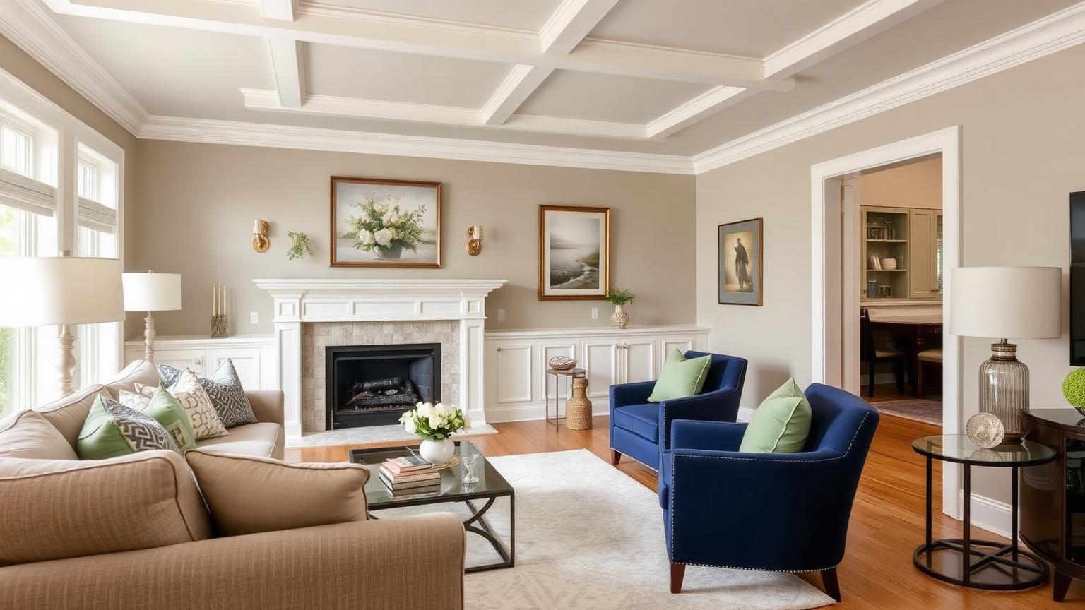
The Direct Answer: What Colors Go With Benjamin Moore Revere Pewter?
If you are asking what colors go with Benjamin Moore Revere Pewter, the short professional answer is this: Revere Pewter (HC-172, HEX #CCC7B9, RGB 204/199/185, LRV 55.51) is a warm greige, and it pairs most reliably with soft warm whites for trim (White Dove #F0EFEA), muted blues for cool contrast (Hale Navy #46515A, Wythe Blue #B9C4C1), silvery and historic greens for organic depth (October Mist #BEC4B6, Cushing Green #787D69), and deep charcoals or soft blacks for drama (Kendall Charcoal #656662, Wrought Iron #3D4045).
That is the executive summary. The rest of this guide explains why those pairings work — the undertone math, the light reflectance behaviour, the psychology — and gives you three complete, room-ready palettes you can specify tomorrow.
Revere Pewter Decoded: Warm or Cool?
One of the most-searched sub-questions around this color is simply is Revere Pewter warm or cool? The answer is: warm, but only just.
Break down the HEX #CCC7B9. Red sits at 204, green at 199, blue at 185. That 19-point gap between red and blue is the entire story. It is enough warmth to keep the color from reading as cold, institutional gray, but small enough that Revere Pewter never tips into obvious beige or tan. Designers call this narrow band "greige," and Revere Pewter is arguably its most famous member.
The second number that matters is LRV — Light Reflectance Value — at 55.51. LRV runs from 0 (absolute black) to 100 (pure white). Anything in the 50s is a genuine mid-tone: bright enough to keep a room feeling open, deep enough to have presence on the wall. That mid-range LRV is precisely why Revere Pewter behaves so differently room to room:
- North-facing rooms (cool, indirect light) pull the green undertone forward. Revere Pewter can look faintly sage-gray here.
- South-facing rooms (warm, abundant light) push the beige forward. It reads soft, sandy, and welcoming.
- Under warm LED lighting (2700K), it warms further and can approach a light taupe.
- Under cool LED lighting (4000K+), the green-gray dominates and it reads more contemporary.
If you want a deeper foundation on why the same paint chip shifts personality across rooms, our breakdown of warm versus cool color theory explains the perceptual mechanics in detail.
The Best White Trim for Revere Pewter
Trim is the single decision that makes or breaks this color. Because Revere Pewter carries warmth, a stark blue-white trim creates an unflattering contrast that makes the walls look dingy. The goal is a white with just enough warmth to feel related, but enough brightness to define architecture.
- Benjamin Moore White Dove (OC-17) —
#F0EFEA. The default answer, and for good reason. White Dove is a soft warm white with a touch of gray that echoes Revere Pewter's own composition. The contrast is gentle and sophisticated. Use it on baseboards, casings, crown molding, and interior doors. - Benjamin Moore Chantilly Lace (OC-65) —
#F0F1EC. A clean, crisp white with almost no undertone. Choose this when you want the trim to snap and the architecture to read graphically — modern farmhouse, transitional, or anywhere with strong millwork you want to showcase. - Benjamin Moore Simply White (OC-117) —
#F5F3E9. The warmest of the three, with a yellow lean. Excellent in older homes with wood floors and brass hardware, where a cooler white would feel out of period.
Designer rule of thumb: if your floors are red or orange-toned oak, choose White Dove. If your floors are pale white oak or engineered gray, Chantilly Lace gives you the cleaner read.
Blues That Go With Benjamin Moore Revere Pewter
Blue is the most requested accent family for this color, and the pairing works because Revere Pewter's green-gray undertone is already adjacent to blue on the wheel. You are creating a near-analogous relationship with a temperature twist.
- Benjamin Moore Hale Navy (HC-154) —
#46515A. The classic. Deep, slightly gray navy with none of the primary-blue harshness. Use it on kitchen islands, built-in bookcases, a front door, or an accent wall. The contrast ratio against Revere Pewter is high enough for real drama without being jarring. - Benjamin Moore Wythe Blue (HC-143) —
#B9C4C1. A muted blue-green that sits at almost the same value as Revere Pewter. Because the LRVs are close, this pairing is quiet and layered rather than contrasting — ideal for adjacent rooms, a powder room off a Revere Pewter hallway, or upholstery. - Benjamin Moore Boothbay Gray (HC-165) —
#A9B1B3. A sophisticated gray-blue that acts as a transitional bridge. Perfect for a bedroom that connects to Revere Pewter living space, or for cabinetry in a mudroom.
Greens That Go With Benjamin Moore Revere Pewter
Green is the sleeper pairing that professional designers reach for most often, because Revere Pewter's own green undertone makes the relationship feel inevitable rather than imposed.
- Benjamin Moore October Mist (1495) —
#BEC4B6. A gentle silvery sage. This was Benjamin Moore's Color of the Year for 2022 and it remains one of the most harmonious partners for Revere Pewter, because the two colors share nearly identical warmth and value. Use it in bedrooms, on a kitchen island, or on interior doors for a soft tonal effect. - Benjamin Moore Cushing Green (HC-125) —
#787D69. A rich, historic olive-green with real depth. This is your contrast green — use it on a library wall, a dining room, or exterior shutters. Against Revere Pewter it reads grounded and heritage-appropriate.
Pair either green with natural materials — jute, oak, unlacquered brass, linen — and the palette stops looking like paint choices and starts looking like a considered scheme.
Dark and Moody Contrast Colors
Every neutral scheme needs an anchor. Without a dark value somewhere in the room, Revere Pewter can float and feel unfinished.
- Benjamin Moore Kendall Charcoal (HC-166) —
#656662. A deep, warm-leaning charcoal that is the natural darker sibling of Revere Pewter. Use it on cabinetry, a fireplace surround, or window sashes. Because both colors share the greige DNA, this creates a monochromatic depth ladder. - Benjamin Moore Wrought Iron (2124-10) —
#3D4045. A soft, near-black with a blue-gray core. Use sparingly: an entry door, a metal-frame partition, a single accent piece. It provides the visual "period" at the end of the sentence.
Three Complete Revere Pewter Palettes
Palette 1 — Classic Transitional (Living Room)
- Walls: Revere Pewter
#CCC7B9 - Trim and ceiling: White Dove
#F0EFEA - Anchor: Hale Navy
#46515A(built-ins or a velvet sofa) - Accent: Unlacquered brass and warm oak
The most bulletproof combination in this guide. It reads timeless in almost any architecture.
Palette 2 — Organic Modern (Bedroom or Kitchen)
- Walls: Revere Pewter
#CCC7B9 - Trim: Chantilly Lace
#F0F1EC - Secondary: October Mist
#BEC4B6(cabinetry or headboard wall) - Anchor: Kendall Charcoal
#656662(hardware, lighting, a single door)
Calm, tonal, and deeply contemporary. This palette relies on texture — bouclé, linen, matte ceramic — to keep it from reading flat.
Palette 3 — Heritage Depth (Dining Room or Study)
- Walls: Revere Pewter
#CCC7B9 - Trim: Simply White
#F5F3E9 - Feature: Cushing Green
#787D69 - Anchor: Wrought Iron
#3D4045 - Accent: Wythe Blue
#B9C4C1in textiles
Rich, historic, and layered. Ideal for pre-war homes, craftsman interiors, and anywhere with substantial millwork.
Color Psychology: Why Revere Pewter Feels the Way It Does
Color psychology is applied pattern recognition, not mysticism — and Revere Pewter's effect is unusually consistent across occupants.
It reads as calm and balanced. Low-saturation mid-tones require less visual processing effort than either bright hues or high-contrast extremes. The eye settles rather than scans. This is why the color performs so well in spaces where people linger: living rooms, bedrooms, and long hallways.
It reads as warm without being sentimental. Pure grays signal neutrality but can also signal detachment — the palette of offices and airports. The 19-point red-over-blue lean in Revere Pewter is just enough to trigger a "hospitable" read. Occupants describe rooms in this color as welcoming rather than merely inoffensive.
It reads as grounded. Greige belongs to the family of earth tones — stone, weathered wood, linen, sand. These are colors we associate with stability and permanence, which is why the color is so heavily specified in real-estate staging: it makes a house feel settled.
It reads as timelessly elegant. Because it is not a trend color, it does not carry a date stamp. A room painted Revere Pewter a decade ago still looks deliberate today — a rare property in interior paint.
If you want to understand why gray-family colors carry these associations at a more fundamental level, our article on what makes a gray a gray unpacks the underlying color science.
Data Table: Revere Pewter Coordinating Colors
| Item | Color | Hex | Color Name | Psychological Meaning |
|---|---|---|---|---|
| Main wall | Warm greige | #CCC7B9 |
BM Revere Pewter (HC-172) | Calm, grounded, timeless hospitality |
| Trim / ceiling | Soft warm white | #F0EFEA |
BM White Dove (OC-17) | Clarity, gentle definition, comfort |
| Trim (crisp) | Clean white | #F0F1EC |
BM Chantilly Lace (OC-65) | Precision, freshness, modernity |
| Trim (warm) | Slightly warm white | #F5F3E9 |
BM Simply White (OC-117) | Softness, tradition, natural light |
| Anchor accent | Deep navy | #46515A |
BM Hale Navy (HC-154) | Authority, trust, classic confidence |
| Soft accent | Muted blue-green | #B9C4C1 |
BM Wythe Blue (HC-143) | Serenity, restraint, historic calm |
| Transitional | Gray-blue | #A9B1B3 |
BM Boothbay Gray (HC-165) | Sophistication, coastal composure |
| Feature color | Historic olive | #787D69 |
BM Cushing Green (HC-125) | Rootedness, heritage, natural depth |
| Soft green | Silvery sage | #BEC4B6 |
BM October Mist (1495) | Renewal, quiet optimism, balance |
| Dark anchor | Warm charcoal | #656662 |
BM Kendall Charcoal (HC-166) | Weight, structure, understated drama |
| Deepest anchor | Soft black | #3D4045 |
BM Wrought Iron (2124-10) | Definition, gravitas, finality |
Practical Takeaways for Designers and Homeowners
1. Sample on all four walls, not one. Because Revere Pewter's undertone shifts with light direction, a single sample board tells you almost nothing. Paint 2×2 ft patches on each wall of the room and look at them at 9am, 2pm, and 8pm.
2. Control your bulb temperature. A 2700K bulb and a 4000K bulb produce visibly different Revere Pewters. Choose your bulbs before you commit to accent colors, not after.
3. Respect proportion. The most common failure with this palette is over-accenting — navy island, navy chairs, navy rug, navy art. Keep the greige dominant. The 60-30-10 proportion rule is the fastest way to get this balance right: 60% Revere Pewter, 30% white trim and soft secondary, 10% Hale Navy or Cushing Green.
4. Match undertone to fixed elements first. Your countertops, tile, and flooring are not changing. If your granite has pink undertones, Revere Pewter's green lean will fight it. If your floors are warm oak, you are already halfway to a coherent scheme.
5. Use finish as a design tool. Matte or eggshell on walls, satin on trim, and semi-gloss on doors. The sheen difference alone creates definition even when the color contrast is subtle.
6. Do not skip the dark anchor. A room in Revere Pewter with White Dove trim and nothing darker than mid-tone will feel washed out in photographs and slightly unresolved in person. Even a black-framed mirror or matte black sconce is enough.
Conclusion
Revere Pewter earned its reputation the hard way: by working. Its warm greige composition (#CCC7B9, LRV 55.51) makes it flexible enough to sit under almost any lighting condition, and its restrained undertone means it collaborates rather than competes with whites, blues, greens, and charcoals alike. Whether you build the classic Hale Navy scheme, the tonal October Mist scheme, or the heritage Cushing Green scheme, the color does the same job every time — it makes the room feel settled.
Ready to build your own variation? Drop #CCC7B9 into the Coloracci palette generator and let the Fibonacci engine generate mathematically balanced coordinating colors, then export them straight to your design tools or paint spec sheet.