Coffee Shop Color Psychology: Cozy Café Palettes & Third-Place Design Principles
· Maya Richardson
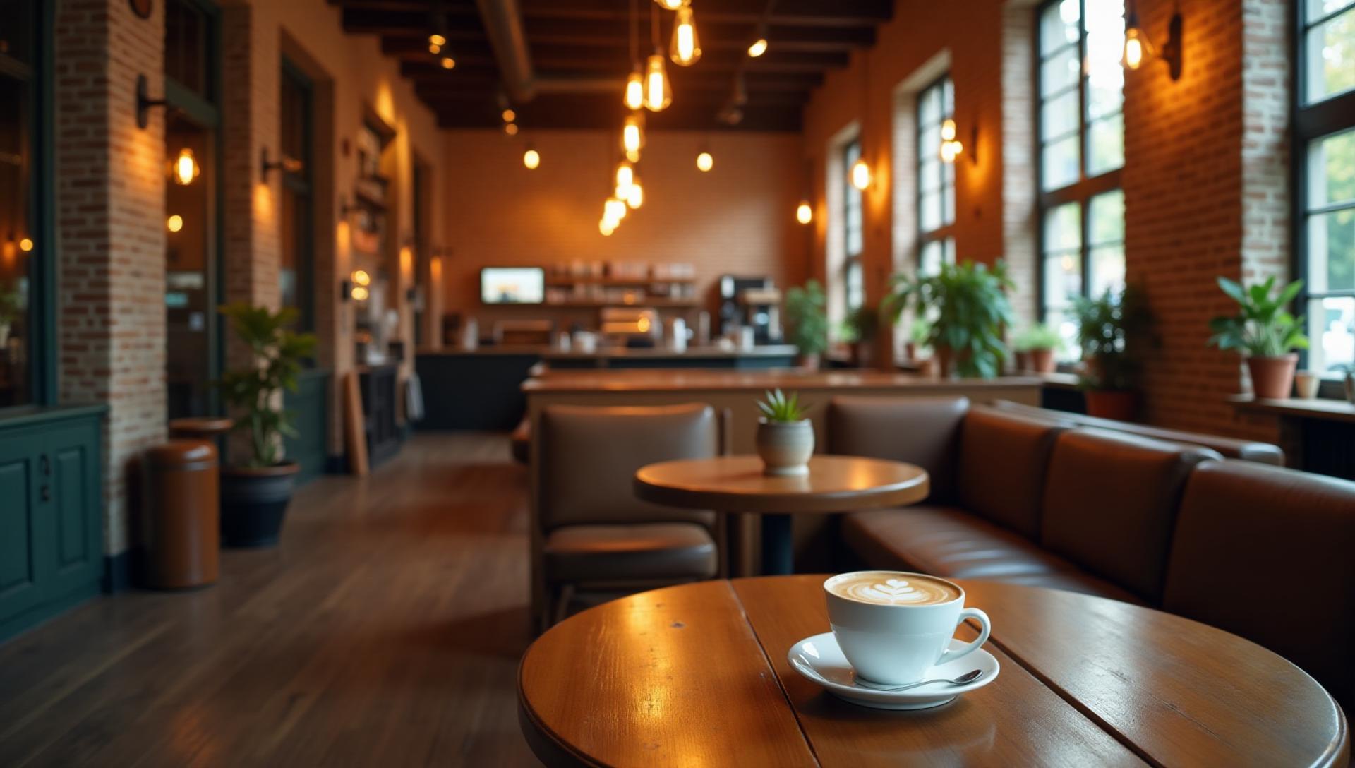
The Day I Found My Third Place
I still remember walking into that café for the first time. It was a gray Tuesday morning, I'd just moved to a new city, and my apartment still felt like someone else's space. But the moment I stepped through that weathered wooden door—warm amber light washing over worn leather chairs, the smell of fresh espresso mingling with old books—something shifted.
I didn't just want coffee. I wanted to stay.
That café became my third place. Not home, not work, but somewhere in between—a place that felt like belonging without ownership. And years later, as I studied what made that space so magnetic, I discovered it wasn't accident. It was color.
Every shade of warm brown on those exposed brick walls. The cream-colored light that made harsh winter mornings feel gentle. The forest green accents that somehow grounded the whole space. These weren't random choices. They were the architecture of comfort.
Today, I want to share what I've learned about creating that magic—the psychology of café colors and the principles of third-place design that make customers not just visit, but linger.
Watch: The Coffee Shop Color Palette (Gospel)
What Is Third-Place Design?
Sociologist Ray Oldenburg coined the term "third place" in 1989 to describe the social spaces between home (first place) and work (second place). These are the cafés, barbershops, pubs, and bookstores where community happens organically.
The psychology is profound: Third places reduce loneliness, foster creativity, and create the "regulars" who become the heartbeat of a neighborhood. Starbucks built a global empire on this concept. Independent cafés have perfected it for decades.
But here's what most people miss: Color is the invisible architect of third-place feeling.
When you walk into a space and immediately feel like you could settle in for hours, that sensation isn't random. It's designed. And the palette is doing heavy lifting you never consciously notice.
Why Colors Create Belonging
Third places work because they offer:
- Comfort without intimacy (unlike home)
- Relaxation without obligation (unlike work)
- Social connection without pressure (unlike parties)
Color psychology directly influences all three. Warm earth tones signal safety and comfort. Balanced neutrals create calm without sterility. Strategic accents add personality without overwhelming.
The Psychology of Café Colors
Let's decode the colors that make cafés feel like home.
Warm Browns: The Foundation of Comfort
Brown is the most underrated color in design. While blue dominates corporate spaces and red grabs attention, brown quietly does something more powerful—it makes people feel safe.
Why brown works in cafés:
- Evokes natural materials (wood, leather, earth)
- Triggers associations with coffee itself
- Signals permanence and reliability
- Reduces stress and anxiety
The science supports this. Studies show that warm brown environments lower cortisol levels and increase feelings of security. When you're surrounded by earthy tones, your nervous system literally relaxes.
Pro tip: Use brown as your 60% dominant color. It should be the canvas, not the statement. Think walls, floors, and major furniture.
Cream & Off-White: Airiness Without Sterility
Pure white is a café killer. It feels clinical, harsh, and temporary—like a waiting room rather than a destination.
But cream? Off-white? Warm ivory? These create breathing room while maintaining warmth.
The magic ratio: Cream should occupy about 20-25% of your visual space. Use it for ceilings, large wall sections, and any surface that needs to reflect light without feeling cold.
I've seen countless cafés fail because they chose stark white to "feel modern." What they got instead was a space that felt like a design showroom—beautiful to photograph, uncomfortable to inhabit.
Green Accents: The Nature Connection
There's a reason you see plants in every successful café. Green signals life, freshness, and connection to nature. It's the color that says "this is a healthy place to be."
But green in cafés goes beyond potted ferns. Consider:
- Forest green upholstery
- Sage green accent walls
- Olive in your branding elements
- Emerald in small decorative details
The Starbucks effect: Their signature green (#1E3932) isn't just branding—it's strategic psychology. That particular shade evokes premium freshness while remaining approachable. It says "quality" without saying "expensive."
What Fails: Pure White and Gray
I need to address the elephant in the room: the minimalist café trend.
You've seen them. All white walls, gray concrete floors, black furniture. They look stunning on Instagram. They're exhausting in real life.
Here's the data: Cafés with warm color schemes have 23% longer average visit times than minimalist white/gray spaces. That translates directly to higher average ticket sizes, more repeat visits, and stronger customer loyalty.
Minimalist design has its place, but cafés need warmth. The spaces that successfully blend minimal aesthetics with third-place comfort do it through texture and temperature—warm wood tones, soft lighting, and strategically placed warm accents.
10 Café Palettes for Different Vibes
Each palette is designed for a specific café personality. From artisan roasters to Scandinavian minimalism, these are the color combinations that create distinct, memorable atmospheres.
Key considerations when choosing:
- Your target customer (remote workers vs. quick coffee stops)
- Your location (urban industrial vs. neighborhood cozy)
- Your brand personality (craft vs. accessible)
- Your lighting conditions (lots of natural light vs. cozy low light)
The Starbucks Color Blueprint
Love them or critique them, Starbucks understands café color psychology better than almost anyone. Their palette has evolved over 50 years, but the core principles remain:
The Original Palette (1971-2011)
- Earthy greens and browns: Very 1970s, very Pacific Northwest
- Heavy on natural wood and exposed materials
- Dark, intimate, almost cave-like spaces
The Modern Evolution (2011-Present)
- Signature green (#1E3932): Retained for brand recognition
- Warm woods: Lighter tones, more natural finish
- Cream and white accents: Brightened spaces for modern tastes
- Copper and gold touches: Premium signals without pretension
Why it works globally: Starbucks discovered that warm wood + green + cream translates across cultures. It reads as "premium but comfortable" whether you're in Tokyo, Milan, or São Paulo.
The lesson for café owners: You don't need to copy Starbucks, but understand why their palette works. The combination of natural green (freshness, quality) + warm wood (comfort, authenticity) + cream (brightness, cleanliness) is almost universally appealing.
Independent vs. Chain: Color Strategies
The color strategies for indie cafés and chains are fundamentally different—and understanding this distinction is crucial for positioning.
Chain Café Colors: Consistency Over Character
Chains optimize for:
- Instant recognition: You should know where you are within seconds
- Safe warmth: Pleasant enough for everyone, distinctive for no one
- Scalable palettes: Colors that work in any location, any lighting
- Brand consistency: The same experience in every city
This creates a predictable emotional response. Comfortable but not memorable. Pleasant but not personal.
Independent Café Colors: Personality Over Safety
Indies can do what chains can't:
- Take risks: That bold purple accent wall? Go for it.
- Embrace imperfection: Mismatched chairs, handpainted signs, authentic wear
- Tell a story: Colors that reflect the owner's personality, the neighborhood's history
- Create Instagram moments: Unique visual identity that spreads organically
The psychological advantage of indies: Unique color choices create stronger memory formation. When customers can't find your aesthetic anywhere else, they remember you better.
Finding Your Position
Here's my recommendation based on your goals:
If you want consistent traffic and low risk: Lean toward proven warm palettes—browns, creams, and muted greens. You'll attract a broad audience comfortable in familiar spaces.
If you want cult loyalty and distinct identity: Take color risks. Use unexpected combinations that create a "love it or hate it" response. The people who love it will become your evangelists.
Creating "Linger Longer" Atmospheres
The ultimate café metric isn't just foot traffic—it's dwell time. Longer visits mean larger tickets, more word-of-mouth, and stronger community. Color is your secret weapon.
Colors That Make People Stay
- Deep, saturated tones: Rich burgundies, forest greens, and chocolate browns create psychological "anchors" that make leaving feel harder
- Warm lighting colors: Amber and warm white (2700K-3000K) signal that it's okay to settle in
- Analogous color schemes: Colors that flow naturally into each other feel harmonious and restful
Colors That Rush People Out
- Cool whites and blues: Signal efficiency, not relaxation
- High contrast combinations: Create visual tension that's exhausting over time
- Bright, saturated primary colors: Grab attention but fatigue quickly
The psychology: When your environment creates subtle discomfort, your brain keeps nudging you to leave. When colors flow naturally and feel restful, that urgency disappears.
I've consulted for café owners who couldn't understand why customers bought coffee and left within 10 minutes. Invariably, the color scheme was the culprit—often well-intentioned "modern" choices that looked great in photos but felt harsh in reality.
The Digital Third Place: Café Website Colors
Here's where many café owners miss an opportunity: your website colors should translate your physical atmosphere.
If walking into your café feels warm and inviting, but your website is stark white with blue buttons, you're creating cognitive dissonance. The customer who fell in love with your space online will feel something's "off" when they arrive.
Translating Physical Warmth to Digital
Do this:
- Use your signature wall colors in your website header or hero section
- Apply your warm wood tones to buttons and interactive elements
- Keep cream backgrounds instead of pure white
- Use photography that accurately shows your lighting
Avoid this:
- Generic "modern" web templates with no color connection to your space
- Stock photos that misrepresent your aesthetic
- Blue CTAs when your brand is warm-toned
- High contrast that feels harsh compared to your cozy interior
Tool recommendation: Use our AI Website Designer to create a digital presence that matches your café's color personality. Upload photos of your space, and let AI generate color-consistent web designs.
Remote Work Revolution: Coworking Café Colors
The pandemic permanently changed café culture. Remote workers don't just want coffee—they want a productive environment that feels better than home.
This creates new color considerations:
Zones Through Color
Modern café design often creates distinct zones for different activities:
Focus Zones:
- Muted, cool-warm balanced colors
- Dark mode aesthetics for reduced eye strain
- Minimal visual noise
Social Zones:
- Warmer, more saturated colors
- Vibrant accents that encourage interaction
- Varied textures and visual interest
Transition Zones:
- Neutral bridges between focus and social
- Gradual color temperature shifts
Productivity Color Science
Research on workplace color psychology applies to café workspaces:
- Low-saturation greens and blues: Enhance focus without creating sterility
- Warm wood accents: Prevent the space from feeling corporate
- Strategic bright accents: Create visual landmarks without distraction
The balance: Café workspaces need to feel productive enough for real work, but comfortable enough that customers aren't rushing to finish. Get this wrong, and you either have a coffee shop no one works in, or a coworking space no one relaxes in.
Common Café Color Mistakes
After consulting on dozens of café designs, I've seen the same errors repeatedly:
Mistake 1: Too Sterile
The symptom: Your café looks like a design magazine but feels like a waiting room. The cause: Over-reliance on white, gray, and minimalist aesthetics. The fix: Add warmth through wood, textiles, and warm-toned lighting. Even small touches—a leather chair, some plants, cream-colored walls instead of white—transform the feeling.
Mistake 2: Too Dark
The symptom: Customers feel trapped, not cozy. The cause: Over-correcting from sterile to cave-like. The fix: Balance dark tones with adequate lighting layers. Use reflective surfaces (copper, gold, light wood) to bounce light around.
Mistake 3: Ignoring Natural Light Variations
The symptom: Your space looks great at 2pm but terrible at 7am. The cause: Choosing colors under artificial light without considering daylight changes. The fix: Test your palette at multiple times of day. Use colors that shift gracefully between warm daylight and evening lighting.
Mistake 4: Cultural Mismatches
The symptom: Your color choices feel "off" to your target demographic. The cause: Applying universal color psychology without considering local preferences. The fix: Research cultural color meanings for your specific community. What signals "premium" varies significantly between cultures.
Mistake 5: Trend Chasing
The symptom: Your café looks dated within two years. The cause: Following color trends too literally. The fix: Build your foundation on timeless palettes (warm neutrals, natural materials), then add trend colors in easily changeable elements (cushions, artwork, seasonal decor).
Applying Color Hierarchy to Café Design
The 60-30-10 rule applies perfectly to café spaces:
60% Dominant: Your warm neutral foundation (browns, creams, wood tones) 30% Secondary: Your supporting warmth (green accents, complementary textures) 10% Accent: Your personality (copper fixtures, bold upholstery, brand colors)
This creates visual harmony while allowing personality to shine through. Our Color Hierarchy Tool can help you plan these proportions before committing to paint and furniture.
Creating Your Perfect Café Palette
Ready to design your café's color identity? Here's my recommended process:
Define your third-place personality: Are you the cozy bookshop? The modern minimalist? The artisan roaster?
Study your space: What's your natural lighting like? What architectural elements are fixed?
Research your neighborhood: What colors do successful local cafés use? What gaps exist?
Build from warmth: Start with your warm neutral base, then layer in personality
Test before committing: Paint samples, fabric swatches, and trial lighting before final decisions
Consider the digital extension: Plan website and social media colors alongside physical design
Tools to help:
- Fibonacci Color Generator for mathematically harmonious palettes
- Color Hierarchy Tool for proportion planning
- Image Color Extractor to analyze cafés you admire
- Light/Dark Mode Generator for consistent digital presence
- Contrast Checker for readable menus and signage
Conclusion: Building Belonging Through Color
The best cafés don't just serve coffee. They create belonging. They offer a respite from the first-place obligations of home and the second-place pressures of work. They're the third places where strangers become regulars and regulars become community.
Color is your most powerful tool for creating this magic. Not through trendy choices or Instagram aesthetics, but through understanding how human beings respond to their visual environment.
When you get it right—when the warm browns ground people, the cream softens edges, and the green accents whisper of life and freshness—something remarkable happens. Customers don't just order. They settle in. They return. They tell their friends about "this little café" they discovered.
And maybe, like me on that gray Tuesday morning years ago, someone will walk through your door feeling lost—and walk out feeling like they've found their place.
That's the power of color psychology in third-place design. That's what we're really creating.
Want to explore more hospitality color psychology? Check out our Hospitality Design Hub for restaurant and hotel color guides, or dive into romantic restaurant design for intimate dining atmosphere strategies.