Tropical Resort Color Psychology: Designing Paradise Escapes
· Coloracci Team
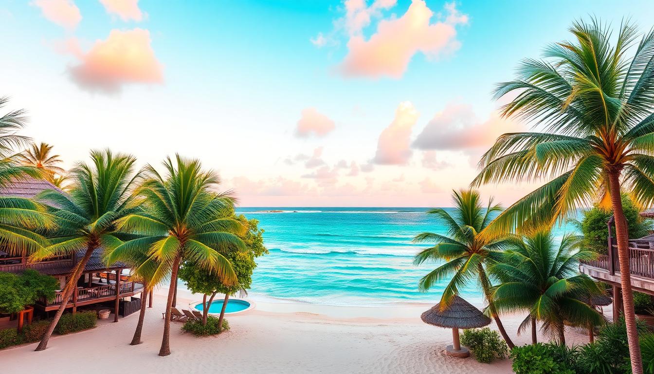
Tropical resorts face a unique design challenge: they must create environments that feel simultaneously exotic and accessible, luxurious and natural, stimulating and relaxing. Color psychology in resort design goes far beyond choosing "tropical" hues — it requires understanding how specific color combinations trigger vacation mindsets, influence perceived temperature, and create the Instagram-worthy moments that drive modern tourism.
The Ocean Palette: Blues and Aquas
The defining feature of tropical destinations is water, and resort color psychology inevitably centers on ocean-inspired palettes. But not all blues are equal in their psychological effects.
The Turquoise Effect
Turquoise (#40E0D0 through #48D1CC) — the color where blue meets green — has special status in tropical resort design:
- Temperature perception: Turquoise water appears cooler than it is, creating psychological relief from tropical heat
- Clarity signaling: Clear, turquoise water reads as clean and pristine
- Instagram optimization: This specific shade photographs exceptionally well, driving organic marketing
- Universal appeal: Cross-cultural positive associations with tropical paradise
The Maldives has built an entire tourism industry around the specific turquoise of its shallow lagoons — the color itself is the primary attraction.
Deep Blue for Luxury
Deeper blues (#006994 through #00416A) serve different resort functions:
- Infinity pools: Dark blue water creates the illusion of endless ocean connection
- Evening atmospheres: Deep blue twilight colors transition guests to dinner and entertainment
- Spa environments: Darker blues create contemplative, immersive relaxation spaces
- Fine dining: Navy and marine blue table settings signal seafood freshness and nautical elegance
Resorts must balance the bright, energetic turquoise of daytime activities with the sophisticated deep blues of evening experiences.
The Aqua Gradient Strategy
Sophisticated resort design uses the full spectrum of aqua colors to create visual interest and zone definition:
| Water Feature | Color Strategy | Psychological Effect |
|---|---|---|
| Main pool | Bright turquoise | Energy, activity, social hub |
| Infinity edge | Deep blue fade | Infinity illusion, luxury |
| Children's pool | Light aqua | Safety visibility, playful energy |
| Spa pools | Teal to deep blue | Tranquility, depth, mystery |
| Fountains | Spray-generated prisms | Dynamic movement, cooling |
Sand and Neutrals: The Canvas of Paradise
Tropical resorts require neutral foundations that complement rather than compete with natural beauty. The specific tone of these neutrals profoundly affects the guest experience.
The Warm Sand Spectrum
Beach sand colors vary dramatically by location and geology:
- White sand: #F5F5DC — Maldives, Caribbean, signals purity and luxury
- Pink sand: #E6C2C2 — Bermuda, Bahamas, creates distinctive romantic atmosphere
- Golden sand: #D4AF37 — Fiji, Thailand, warmth and natural richness
- Black sand: #2F4F4F — Hawaii, Iceland, dramatic volcanic exoticism
- Tan sand: #D2B48C — Most global beaches, accessible, familiar comfort
Resort design must harmonize with local sand colors — fighting against them creates visual discord.
Neutral Architecture
Tropical resort architecture typically employs:
- White: Maximum heat reflection, canvas for tropical color accents
- Beige and sand: Blending with beach environments, organic integration
- Natural wood: Teak, bamboo, thatch — tropical material authenticity
- Stone: Local materials connecting to specific place
These neutral backgrounds make tropical color — flowers, ocean, sky — the visual heroes.
The Green Factor: Tropical Vegetation
Lush tropical vegetation provides the color that distinguishes tropical resorts from beach destinations. The specific greens and their deployment create atmosphere.
Palm Green Psychology
Palm fronds and tropical foliage create distinctive color effects:
- Scale and drama: Oversized leaves create visual spectacle
- Movement in color: Swaying palms create living, changing color fields
- Pattern and shadow: Dappled light creates natural color variation
- Sound-color association: The rustle of palms adds sensory dimension
Specific tropical greens include:
- Coconut palm: Blue-green (#4A6741) with silver undersides
- Banana: Bright yellow-green (#9ACD32) creating energetic accent
- Monstera: Deep glossy green (#228B22) with dramatic pattern
- Bird of paradise: Orange and blue flowers against green — nature's tropical palette
The Jungle Immersion Effect
Resorts emphasizing nature connection use deeper greens:
- Forest immersion: Surrounding guests in verdant environment
- Mystery and discovery: Dense vegetation suggesting hidden experiences
- Biophilic benefits: Documented stress reduction from green exposure
- Privacy creation: Natural green screens between guest spaces
Bali's jungle resorts and Costa Rica's eco-lodges demonstrate this deep-green strategy.
Sunset Colors: Coral, Pink, and Gold
The tropical sunset provides the most dramatic color show of the day, and resort design must capitalize on this natural spectacle.
The Golden Hour Palette
Sunset creates a specific color progression:
- Pre-sunset (5:30pm): Warm gold and amber (#FFD700, #FFBF00)
- Peak sunset (6:00pm): Intense orange and coral (#FF7F50, #FF6B35)
- Post-sunset (6:30pm): Pink and lavender (#FFB6C1, #E6E6FA)
- Twilight (7:00pm): Deep blue and purple (#4A0080, #191970)
Resorts design specific viewing experiences around these transitions:
- Sunset bars: Positioned for optimal viewing, colors echoing sky
- Pool orientation: Positioning sunset reflection in water
- Dining timing: Meal service synchronized with color progression
- Photography moments: Staff trained to identify optimal sunset moments
Coral as Resort Signature
Living coral (#FF6B6B through #F4A460) has become the dominant accent color for contemporary tropical resorts:
- Living Coral (#FF6B6B): Pantone's 2019 Color of the Year, ocean-health awareness
- Beach coral: The pink-orange of actual coral colonies
- Sunset coral: Transitional sky colors
- Coral reef reference: Environmental consciousness in color choice
Coral works as resort color because it's simultaneously warm (welcoming) and fresh (modern), natural (authentic) and Instagram-optimized (marketable).
Warm Accent Colors: Balancing the Cool
Tropical palettes can become overwhelmingly cool (blues and greens). Strategic warm accents create balance and visual interest.
The Orange Energy Injection
Orange accents in tropical resorts:
- Pool umbrellas and loungers: Energy and visibility
- Towels and linens: Tropical freshness
- Cocktail colors: Food and beverage presentation
- Activity equipment: Kayaks, paddleboards, snorkel gear
The specific shade matters:
- Bright orange (#FF8C00): Maximum energy, youth-oriented
- Tangerine (#FF9500): Sophisticated, contemporary
- Coral-orange (#FF7F50): Natural, ocean-connected
- Burnt orange (#CC5500): Earthy, indigenous material reference
Pink: The Romantic Tropical
Pink in tropical resorts serves specific functions:
- Sunset echo: Connecting built environment to natural spectacle
- Gender-neutral romance: Contemporary pink transcends traditional associations
- Food and beverage: Rosé wine, tropical cocktails, fruit presentations
- Instagram moments: Pink walls and installations as photo backdrops
The "millennial pink" phenomenon (#F7CAC9) became particularly powerful in tropical destinations — Tulum, Bali, and the Maldives all feature prominently pink resort spaces.
Material Colors: Authentic Tropical Textures
Beyond painted colors, tropical resort design relies on the natural colors of materials.
Wood Tones: Teak to Bamboo
Tropical woods provide color warmth and authenticity:
- Teak: Honey-brown (#D2691E) with weathered silver-gray option
- Bamboo: Light tan to golden (#DEB887) with distinctive node pattern
- Mahogany: Deep red-brown (#C04000) for luxury applications
- Reclaimed fishing boat wood: Multicolored patina from ocean weathering
These wood colors provide the warmth that pure white tropical architecture often lacks.
Thatch and Natural Fibers
Rooftop thatch and woven materials add textural color:
- Palm thatch: Golden-brown to gray depending on age
- Rattan and wicker: Natural honey tones
- Seagrass and rope: Beige and tan variations
- Coco-coir: Dark brown fiber materials
These materials add color variation while maintaining organic, place-connected aesthetics.
Lighting: The Nighttime Color Transformation
Tropical resort color psychology transforms dramatically after sunset. Lighting design must create entirely new color experiences.
Pool Lighting Spectacles
Illuminated pools become nighttime focal points:
- Color-changing LED systems: Transforming pool color throughout evening
- Underwater lighting: Creating glowing water effects
- Fountain color: Dynamic water features with integrated lighting
- Reflection amplification: Using water surfaces to distribute colored light
Path and Landscape Lighting
Navigation and atmosphere through color:
- Warm path lighting: 2700K for comfort and romance
- Uplighting on palms: Creating dramatic shadow patterns
- Subtle color accents: Changing guest perception of daytime colors
- Starlight preservation: Minimizing light pollution for natural night sky viewing
Brand Identity Through Tropical Color
Major resort brands have developed recognizable tropical color identities.
Four Seasons: The Sophisticated Tropical
Four Seasons tropical properties use:
- Neutral architecture: White, beige, natural wood
- Landscape color: Mature tropical plantings as color source
- Accent restraint: Minimal, strategic color moments
- Service color: Staff uniforms providing controlled color presence
The palette communicates understated luxury — tropical without tackiness.
Banyan Tree: The Asian Tropical
Banyan Tree resorts emphasize:
- Dark wood: Asian tropical materiality
- Red accents: Asian hospitality and good fortune
- Natural greens: Emphasis on mature tropical vegetation
- Water features: Reflection and tranquility
The colors signal Asian tropical sophistication rather than generic beach resort.
Club Med: The Festive Tropical
Club Med's historical color identity:
- Bright primary colors: Red, blue, yellow — energetic and playful
- Trademark blue: The specific Club Med blue signaling all-inclusive ease
- Varied activities: Different colors for different activity areas
- Social atmosphere: Colors encouraging interaction and community
The palette prioritizes energy and fun over relaxation and luxury.
Regional Tropical Color Variations
Tropical destinations develop distinctive color identities based on local environments.
Caribbean: The Turquoise Standard
Caribbean resorts emphasize:
- Water clarity: Marketing the specific turquoise of shallow Caribbean waters
- Colonial color: Pastel architecture referencing heritage
- Jungle green: Lush interiors contrasting with beach exposure
- Sunset variations: Western-facing locations emphasizing evening color
Southeast Asian Tropical
Thailand, Bali, and Philippines offer:
- Deeper greens: Dense tropical vegetation
- Temple color integration: Gold, saffron, and maroon from religious architecture
- Rice terrace earth tones: Agricultural landscape colors
- Volcanic black sand: Dramatic contrast destinations
South Pacific: The Remote Paradise
Fiji, Tahiti, and similar destinations use:
- Extreme turquoise: Lagoon colors as primary attraction
- Flower color abundance: Hibiscus, frangipani, bougainvillea
- Coral reef colors: Snorkeling and diving as color experiences
- Polynesian heritage: Traditional tattoo patterns and tapa cloth colors
Measuring Resort Color Success
The effectiveness of tropical resort color choices can be evaluated through:
- Guest photography: What colors appear in social media posts?
- Booking conversion: Do property images with specific colors drive more reservations?
- Length of stay: Do colors contribute to extended visits?
- Guest satisfaction: Do color environments correlate with positive reviews?
- Return visits: Does the color experience create emotional attachment?
The ultimate test: do guests leave with color memories that drive return visits and recommendations?