Zodiac Signs Colors: The Complete 2025 Guide to Your Astrological Palette
· Lion Dada
I still remember the day my grandmother handed me a small velvet pouch on my 16th birthday. Inside was a deep red garnet ring—"For my little Aries warrior," she said with a knowing smile. "Red is your power color. It will protect you and give you courage."
I wore that ring through college applications, job interviews, and first dates. Did it actually bring me luck? Who knows. But there's something undeniably powerful about wearing a color that feels like you—like the universe wrapped it up just for your soul.
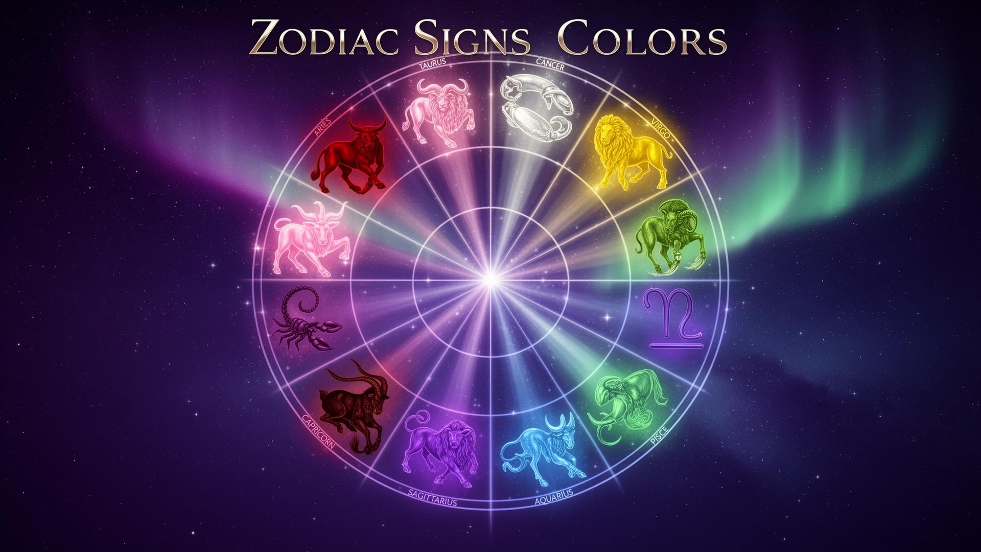
Whether you're a devoted astrology enthusiast or just color-curious, understanding the relationship between zodiac signs and their associated colors opens up a fascinating world where ancient wisdom meets modern design. In this comprehensive guide, we'll explore the signature color palette for each of the 12 zodiac signs, the psychology behind these associations, and practical ways to incorporate your astrological colors into your life.
The Ancient Connection Between Stars and Colors
Before we dive into specific signs, let's understand why certain colors became linked to zodiac signs in the first place.
The association between astrological signs and colors isn't arbitrary—it's rooted in centuries of observation, symbolism, and what we now understand as color psychology. Ancient astrologers noticed patterns: the passionate energy of Mars (ruling Aries) mirrored the stimulating effects of red. Venus's gentle beauty (ruling Taurus and Libra) echoed in soft pinks and harmonious greens.
Each zodiac sign is governed by:
- A ruling planet with its own color associations
- An element (Fire, Earth, Air, Water) that suggests a color family
- Personality traits that naturally align with certain hues
Understanding these connections helps explain why your zodiac colors feel so right when you encounter them.
The Four Elements and Their Color Families
Before exploring individual signs, let's look at the elemental foundation:
🔥 Fire Signs (Aries, Leo, Sagittarius)
Fire signs blaze with warm, energetic colors: reds, oranges, golds, and sunny yellows. These are the colors of passion, action, and vitality. Fire sign palettes are never shy—they demand attention and radiate confidence.
🌍 Earth Signs (Taurus, Virgo, Capricorn)
Earth signs ground themselves in natural, stable colors: rich browns, forest greens, beiges, and terracotta. These palettes feel organic and timeless, reflecting the earth signs' practical, reliable nature.
💨 Air Signs (Gemini, Libra, Aquarius)
Air signs float among light, ethereal colors: soft yellows, sky blues, lavenders, and silvery whites. These intellectual signs favor colors that feel open, fresh, and mentally stimulating.
💧 Water Signs (Cancer, Scorpio, Pisces)
Water signs flow through deep, intuitive colors: ocean blues, mysterious purples, sea greens, and pearlescent silvers. Their palettes have depth and emotional resonance.
The Complete Zodiac Color Guide
Now, let's explore each sign's unique color palette in detail.
♈ Aries (March 21 - April 19)
Primary Color: Deep Red (#DC143C)
Aries, the first sign of the zodiac, bursts onto the scene with the intensity of a flame. Ruled by Mars, the planet of war and passion, Aries naturally gravitates toward red—a color that matches their competitive spirit and boundless energy.
Why Red Works for Aries:
- Stimulates adrenaline and excitement (Aries thrives on action)
- Conveys leadership and courage (Aries pioneering nature)
- Demands attention (Aries hates being ignored)
Secondary Colors:
- Burnt Orange (#CC5500): Adds warmth while maintaining energy
- Bright Yellow (#FFD700): Reflects Aries' optimistic, sunny disposition
- Pure White (#FFFFFF): Represents Aries' desire for fresh starts
Colors to Avoid:
- Blue: Too calming for Aries' fiery nature; can feel restrictive
- Black: While sophisticated, it can dampen Aries' vibrant energy
Using Aries Colors in Design: For an Aries-inspired color palette, try combining deep red with warm gold accents on a white background. This creates a bold, energetic look perfect for sports brands, fitness apps, or action-oriented content.
♉ Taurus (April 20 - May 20)
Primary Color: Soft Pink (#FFC0CB)
Taurus, ruled by Venus (the planet of love and beauty), finds comfort in gentle, sensual colors. While many associate Taurus with green (for the Bull's earthy nature), pink better captures their romantic, pleasure-seeking soul.
Why Pink Works for Taurus:
- Evokes comfort and security (Taurus values stability)
- Represents sensual pleasures (ruled by Venus)
- Creates warm, inviting atmospheres (Taurus loves cozy spaces)
Secondary Colors:
- Forest Green (#228B22): Connects Taurus to their earth element
- Rose Gold (#B76E79): Combines Taurus' love of luxury with warmth
- Copper (#B87333): Reflects their appreciation for quality materials
Colors to Avoid:
- Bright Red: Too aggressive for peace-loving Taurus
- Harsh Yellow: Can feel jarring to Taurus' refined sensibilities
Using Taurus Colors in Design: Create a luxurious feel by pairing soft pink with rose gold metallics and forest green accents. This palette works beautifully for beauty brands, spa websites, or high-end product packaging.
♊ Gemini (May 21 - June 20)
Primary Color: Bright Yellow (#FFD700)
Gemini, the twins ruled by Mercury (planet of communication), naturally aligns with yellow—a color that stimulates mental activity and social connection. Just as Gemini's mind darts from topic to topic, yellow captures attention and sparks curiosity.
Why Yellow Works for Gemini:
- Stimulates mental alertness (Gemini is intellectually driven)
- Encourages communication (Mercury's influence)
- Radiates cheerfulness and sociability (Gemini's charm)
Secondary Colors:
- Light Green (#90EE90): Represents growth and adaptability
- Orange (#FFA500): Adds warmth and enthusiasm
- Silver (#C0C0C0): Reflects Gemini's quick, mercurial nature
Colors to Avoid:
- Dark Blue: Too heavy for Gemini's light energy
- Red: Can overwhelm Gemini's airy disposition
Using Gemini Colors in Design: For a Gemini-inspired palette, pair bright yellow with silver accents and touches of light green. Perfect for social media graphics, communication apps, or educational platforms.
♋ Cancer (June 21 - July 22)
Primary Color: Silver (#C0C0C0)
Cancer, ruled by the Moon, resonates with silver's reflective, mysterious quality. Like the moonlight that governs them, Cancers have a soft, nurturing glow that illuminates without overwhelming.
Why Silver Works for Cancer:
- Mirrors the Moon's gentle luminescence
- Represents intuition and emotional depth
- Creates protective, cocoon-like atmospheres
Secondary Colors:
- Pearl White (#FDEEF4): Reflects purity and maternal energy
- Sea Green (#2E8B57): Connects Cancer to their water element
- Cream (#FFFDD0): Evokes comfort and home
Colors to Avoid:
- Orange: Too aggressive for sensitive Cancer
- Bright Red: Can feel threatening to their protective nature
Using Cancer Colors in Design: Combine silver with pearl white and sea green for a soothing, nurturing palette. Ideal for home decor brands, family-oriented businesses, or wellness apps.
♌ Leo (July 23 - August 22)
Primary Color: Royal Gold (#FFD700)
Leo, ruled by the Sun itself, demands the most radiant color in the spectrum. Gold represents everything Leo embodies: royalty, warmth, generosity, and an undeniable presence that lights up any room.
Why Gold Works for Leo:
- Embodies solar energy and vitality (Sun-ruled)
- Represents royalty and luxury (Leo's regal nature)
- Attracts attention and admiration (Leo loves the spotlight)
Secondary Colors:
- Burnt Orange (#CC5500): Adds depth while maintaining warmth
- Regal Purple (#7851A9): Reinforces Leo's royal associations
- Deep Red (#DC143C): Captures Leo's passionate heart
Colors to Avoid:
- Pastel Pink: Too subtle for bold Leo
- Beige: Too boring for this vibrant sign
Using Leo Colors in Design: Create a show-stopping palette with gold, burnt orange, and regal purple. Perfect for entertainment brands, luxury products, or any design that needs to command attention. Check out our Fibonacci Generator for mathematically harmonious gold-based palettes.
♍ Virgo (August 23 - September 22)
Primary Color: Earth Green (#4E6E58)
Virgo, the sign of the harvest, finds harmony in colors that reflect their connection to nature and practicality. Earth green captures their grounded approach to life while suggesting growth and health.
Why Green Works for Virgo:
- Represents nature and health (Virgo's wellness focus)
- Creates balanced, harmonious spaces
- Suggests reliability and stability
Secondary Colors:
- Wheat Brown (#D2B48C): Connects to Virgo's harvest symbolism
- Beige (#F5F5DC): Clean and practical, like Virgo themselves
- Sage (#9DC183): Healing and calming
Colors to Avoid:
- Bright Red: Too chaotic for orderly Virgo
- Hot Pink: Too flashy for this understated sign
Using Virgo Colors in Design: Pair earth green with wheat and beige for a natural, organic aesthetic. Perfect for health brands, organic products, or minimalist designs that prioritize function.
♎ Libra (September 23 - October 22)
Primary Color: Blush Pink (#FFB6C1)
Libra, like Taurus, is ruled by Venus and gravitates toward beautiful, harmonious colors. Blush pink perfectly captures Libra's diplomatic nature, romantic soul, and commitment to balance and beauty.
Why Pink Works for Libra:
- Represents harmony and balance (Libra's core values)
- Evokes romance and partnership (Libra rules relationships)
- Creates aesthetically pleasing environments (Libra's design eye)
Secondary Colors:
- Light Blue (#ADD8E6): Adds calm and balance
- Lavender (#E6E6FA): Enhances Libra's refined elegance
- Ivory (#FFFFF0): Provides a sophisticated neutral base
Colors to Avoid:
- Bold Red: Too aggressive for diplomatic Libra
- Brown: Too heavy for this airy sign
Using Libra Colors in Design: Combine blush pink with lavender and light blue for a perfectly balanced palette. Ideal for wedding brands, fashion design, or any project requiring aesthetic harmony.
♏ Scorpio (October 23 - November 21)
Primary Color: Deep Black (#0D0D0D)
Scorpio, ruled by Pluto (planet of transformation) and traditionally by Mars, embraces the mysteries of black. This isn't emptiness—it's the depth of the ocean at midnight, holding secrets and power just beneath the surface.
Why Black Works for Scorpio:
- Represents mystery and hidden depths
- Conveys power and control
- Creates an aura of intensity and allure
Secondary Colors:
- Burgundy (#800020): Adds passionate undertones
- Crimson (#DC143C): Reflects Scorpio's Mars connection
- Dark Purple (#301934): Enhances mystical vibes
Colors to Avoid:
- Light Pink: Too innocent for intense Scorpio
- Pale Yellow: Feels superficial to deep Scorpio
Using Scorpio Colors in Design: Layer black with burgundy and dark purple for a powerful, mysterious palette. Perfect for thriller brands, gothic aesthetics, or designs that need to convey authority and depth. Explore dark mode design principles for implementation tips.
♐ Sagittarius (November 22 - December 21)
Primary Color: Rich Purple (#9400D3)
Sagittarius, ruled by Jupiter (planet of expansion and wisdom), resonates with purple—the color of royalty, spirituality, and boundless exploration. Purple matches their philosophical nature and adventurous spirit.
Why Purple Works for Sagittarius:
- Represents wisdom and higher learning (Jupiter's influence)
- Evokes adventure and exploration
- Combines fire sign passion with spiritual depth
Secondary Colors:
- Royal Blue (#4169E1): Adds trustworthiness and depth
- Plum (#8E4585): Sophisticated variation on their primary
- Turquoise (#40E0D0): Reflects their travel-loving nature
Colors to Avoid:
- Black: Too restrictive for freedom-loving Sagittarius
- Dark Brown: Feels too grounding for this nomadic sign
Using Sagittarius Colors in Design: Blend rich purple with royal blue and turquoise for an adventurous palette. Ideal for travel brands, educational platforms, or spiritual and philosophical content.
♑ Capricorn (December 22 - January 19)
Primary Color: Dark Brown (#5D4037)
Capricorn, ruled by Saturn (planet of structure and discipline), gravitates toward serious, professional colors. Dark brown represents their work ethic, reliability, and connection to traditional values.
Why Brown Works for Capricorn:
- Conveys professionalism and authority
- Represents stability and dependability
- Creates a grounding, serious atmosphere
Secondary Colors:
- Charcoal (#36454F): Adds sophistication
- Black (#000000): Reinforces authority
- Forest Green (#228B22): Connects to their earth element
Colors to Avoid:
- Bright Red: Too impulsive for methodical Capricorn
- Bright Yellow: Too frivolous for serious Capricorn
Using Capricorn Colors in Design: Combine dark brown with charcoal and forest green for a professional, trustworthy palette. Perfect for financial services, law firms, or corporate branding.
♒ Aquarius (January 20 - February 18)
Primary Color: Electric Blue (#00BFFF)
Aquarius, ruled by Uranus (planet of innovation and rebellion), vibrates with electric blue—a color that feels futuristic, unique, and slightly otherworldly. Just like Aquarius themselves.
Why Blue Works for Aquarius:
- Represents innovation and technology
- Evokes originality and unconventional thinking
- Creates an atmosphere of forward progress
Secondary Colors:
- Turquoise (#40E0D0): Adds warmth while maintaining uniqueness
- Violet (#EE82EE): Enhances their eccentric side
- Silver (#C0C0C0): Adds futuristic metallic touches
Colors to Avoid:
- Gold: Too traditional for revolutionary Aquarius
- Orange: Feels too earthy for this air sign
Using Aquarius Colors in Design: Mix electric blue with turquoise and silver for a cutting-edge palette. Ideal for tech startups, innovation hubs, or futuristic branding projects.
♓ Pisces (February 19 - March 20)
Primary Color: Sea Green (#20B2AA)
Pisces, the final sign of the zodiac, ruled by Neptune (planet of dreams and illusions), flows through life in colors of the ocean. Sea green captures their fluid nature, creativity, and connection to the spiritual realm.
Why Sea Green Works for Pisces:
- Represents water and emotional flow
- Evokes creativity and imagination
- Creates dreamy, escapist atmospheres
Secondary Colors:
- Lavender (#E6E6FA): Adds mystical, spiritual vibes
- Purple (#9370DB): Enhances their creative nature
- Aquamarine (#7FFFD4): Reflects their watery element
Colors to Avoid:
- Dark Gray: Too heavy for ethereal Pisces
- Black: Can feel oppressive to their sensitive nature
Using Pisces Colors in Design: Blend sea green with lavender and aquamarine for a dreamy palette. Perfect for creative agencies, artistic projects, or wellness brands.
Lucky vs. Unlucky Colors: A Quick Reference
While your primary colors bring strength and harmony, certain colors can work against your zodiac energy. Here's a quick reference:
| Sign | Lucky Colors | Unlucky Colors |
|---|---|---|
| Aries | Red, Orange, Yellow, White | Blue, Black |
| Taurus | Pink, Green, Rose Gold | Red, Yellow |
| Gemini | Yellow, Light Green, Orange | Dark Blue, Red |
| Cancer | Silver, White, Sea Green | Orange, Red |
| Leo | Gold, Orange, Purple, Red | Pink, Beige |
| Virgo | Green, Brown, Beige | Red, Pink |
| Libra | Pink, Light Blue, Lavender | Red, Brown |
| Scorpio | Black, Burgundy, Crimson | Pink, Yellow |
| Sagittarius | Purple, Blue, Turquoise | Black, Brown |
| Capricorn | Brown, Black, Green | Red, Yellow |
| Aquarius | Electric Blue, Turquoise, Violet | Gold, Orange |
| Pisces | Sea Green, Lavender, Purple | Gray, Black |
Using Zodiac Colors in Your Life
Understanding your zodiac colors is just the beginning. Here's how to practically apply this knowledge:
In Fashion & Personal Style
Your zodiac colors work beautifully as:
- Statement pieces: A red blazer for Aries, a gold accessory for Leo
- Subtle accents: A purple scarf for Sagittarius, pink nail polish for Libra
- Confidence boosters: Wear your power color to job interviews or important meetings
In Home Design
Incorporate your zodiac palette through:
- Accent walls in your primary color
- Throw pillows and blankets in secondary colors
- Artwork and accessories that feature your color family
In Digital Design
For designers working on personal brands:
- Use your zodiac palette in your portfolio
- Apply colors strategically based on your brand's "personality"
- Create cohesive social media aesthetics with your sign's colors
For Emotional Wellness
Colors affect mood and energy. Surround yourself with your zodiac colors when you need:
- Motivation: Fire signs' warm colors
- Calm: Water signs' cool tones
- Balance: Air signs' light hues
- Grounding: Earth signs' natural palette
The Science Behind Astrological Color Associations
While astrology is considered a belief system rather than a science, the color associations it suggests align surprisingly well with established color psychology principles:
- Red genuinely increases heart rate and energy (perfect for energetic Aries)
- Green actually promotes balance and reduces stress (ideal for health-conscious Virgo)
- Blue measurably calms the nervous system (suits peace-seeking Libra)
- Gold/Yellow stimulates mental activity (matches intellectual Gemini and Leo)
Whether you view zodiac colors as cosmic guidance or simply psychological tools, their effects on mood and perception are well-documented.
Creating Harmony Between Different Signs
What if you're designing for a couple with different zodiac signs? Or decorating a shared space? Here's how to blend zodiac palettes:
Compatible Elements:
- Fire + Air: Energetic, stimulating combinations
- Earth + Water: Grounding, nurturing harmonies
Challenging Combinations:
- Fire + Water: Use neutral bridges (white, gray)
- Earth + Air: Add metallic accents for connection
The key is finding common secondary colors or neutral grounds where different zodiac palettes can meet.
Conclusion: Your Colors, Your Power
Whether you're a skeptic or a true believer, there's undeniable magic in understanding how colors can represent and enhance your personality. Your zodiac colors aren't just random assignments—they're a reflection of the energy, traits, and potential that make you you.
That garnet ring my grandmother gave me? I still wear it. Not because I believe in literal cosmic protection, but because it reminds me of my own strength. It's a visual anchor to my identity—a way of saying, "This is who I am. This is the energy I bring."
Your zodiac colors can serve the same purpose. They're permission to embrace the hues that feel most authentic, most powerful, most you.
Ready to explore your astrological palette? Try our Fibonacci Color Generator with your zodiac's primary color as a starting point, and watch as mathematically harmonious companions emerge.
After all, the stars may guide us, but we choose how to shine.
What's your zodiac sign, and have you noticed an affinity for your astrological colors? Share your experiences in the comments below, or explore more color psychology insights on our blog.