Financial Website Color Psychology: From Bank Blues to Crypto Neons
· Coloracci Team
The Day I Realized Banks Are Manipulating Me With Blue
I was sitting in a Chase bank branch, waiting for a mortgage meeting, when it hit me. Everything was blue. The logo, the walls, the employee uniforms, even the pens. And I felt... calm. Trusting. Ready to hand over my financial future to complete strangers.
That's when I understood: every color choice in financial services is a psychological calculation.
Whether you're designing a banking app, launching a crypto exchange, or building the next Stripe, the colors you choose will make or break user trust. Today, I'm revealing the color strategies behind the world's most successful financial brands—and showing you exactly which hex codes they use.

Why Finance = Blue (The Trust Equation)
Let's start with the obvious: why is every bank blue?
It's not a coincidence, and it's not lack of creativity. It's pure psychology. Blue is the only color with no negative connotations in almost any culture. It's associated with:
- Sky and water → Stability, vastness, reliability
- Lower heart rate → Physical calming effect
- Authority without aggression → Unlike red's urgency or black's severity
Studies show blue literally lowers blood pressure and creates a sense of security. When you're asking people to trust you with their life savings, blue is your best friend.
| Bank | Primary Blue | Hex Code | Psychology |
|---|---|---|---|
| Chase | Chase Blue | #117ACA | Approachable trust |
| Bank of America | BoA Red + Blue | #012169 | Traditional authority |
| Barclays | Cyan Blue | #00AEEF | Modern reliability |
| Capital One | Deep Blue | #004977 | Serious finance |
| Citibank | Arc Blue | #056DAE | Global stability |
For more on the psychology of blue, check out my deep dive into Psychology of Blue in Design: Trust and Stability.
Traditional Banking: The Conservative Palette
Traditional banks have perfected a formula: Blue + Gold + White.
The Chase Formula
Chase's octagon logo in #117ACA is instantly recognizable. The shade is bright enough to feel modern but deep enough to convey stability. Their secondary palette includes:
- Navy (#0A3D62) for headers and serious content
- White (#FFFFFF) for clean backgrounds and transparency
- Charcoal (#333333) for readable body text
- Light Gray (#F5F5F5) for subtle card backgrounds
HSBC's Bold Red Exception
HSBC breaks the blue rule with #DB0011—but there's a reason. Red in Asian markets (their primary focus) symbolizes prosperity and good fortune. The hexagonal design adds structure and order to balance the energy of red.
Why Gold Appears Everywhere
Notice how many banks use gold accents? Gold = wealth, premium service, and legacy. It's not just decoration—it's a promise. Banks like JPMorgan and Goldman Sachs use subtle gold touches to signal "your money is in prestigious hands."
The ocean-like calmness of traditional banking colors connects directly to what I explored in Ocean Gradients: Serene Blue-Teal Transitions.

The Crypto Revolution: Breaking All The Rules
Then came crypto, and everything changed.
Cryptocurrency exchanges couldn't look like banks—they needed to feel different, innovative, and disruptive. The result? A complete color rebellion.
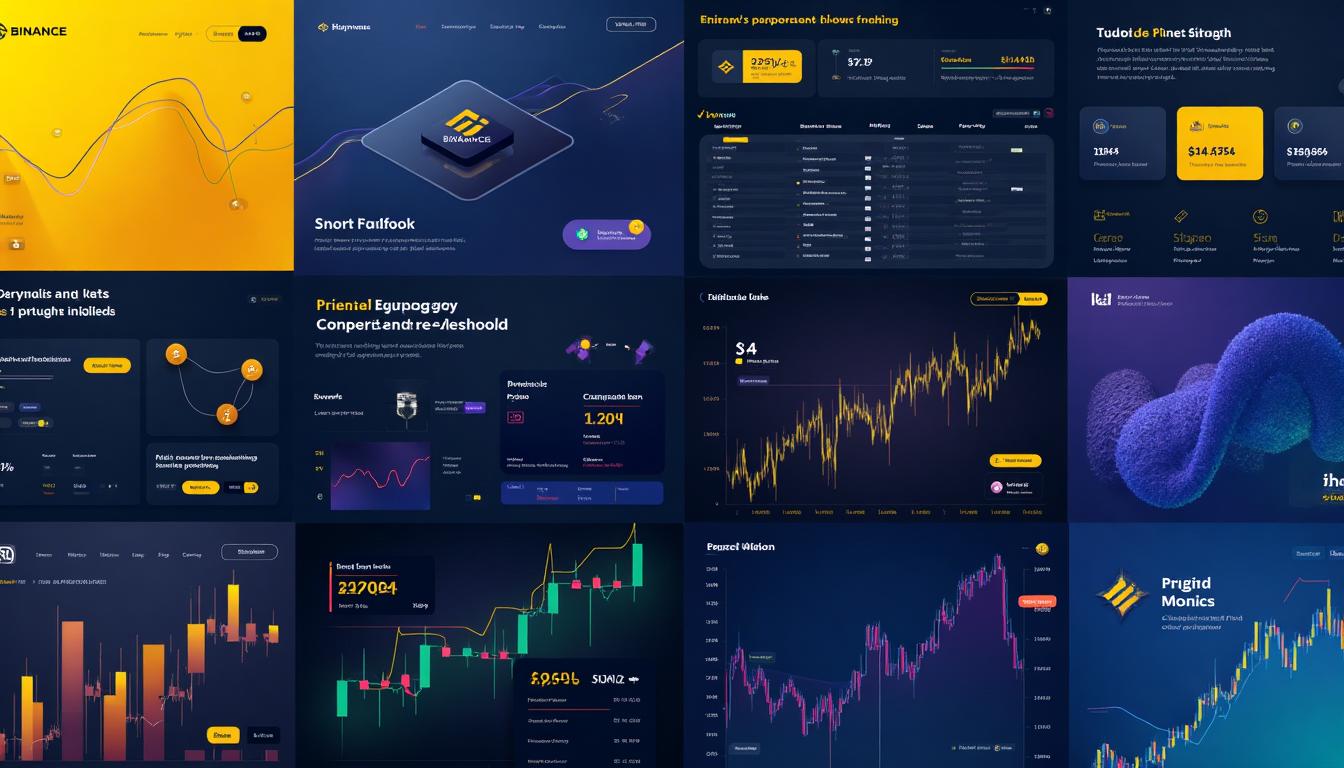
Binance: The Yellow Empire
Binance's #F0B90B yellow is one of the boldest choices in finance. Why yellow?
- Energy and optimism in a volatile market
- 24/7 trading energy (markets never sleep)
- Visibility in a dark-mode interface
- Chinese culture connection (yellow = royalty, prosperity)
On black backgrounds (#1E2329), that yellow pops like a beacon. It says: "We're not your grandfather's bank."
Their full palette includes:
- Binance Yellow (#F0B90B) → Primary brand, CTAs
- Dark Background (#1E2329) → Main UI
- Card Dark (#2B3139) → Component backgrounds
- Green (#0ECB81) → Profit, buy signals
- Red (#F6465D) → Loss, sell signals
Coinbase: Bridging Two Worlds
Coinbase chose #0052FF—a blue that bridges traditional finance trust with crypto innovation. It's bluer than most tech companies but more electric than banks. This strategic middle ground helped them become the first major crypto IPO.
Kraken: Purple Premium
Kraken's #5741D9 purple positions them as the premium crypto exchange. Purple has always signaled luxury and exclusivity (see my post on Purple Luxury Branding). Their sea creature branding adds memorable character in a sea of generic coin logos.
The FTX Lesson: Colors Can't Save You
FTX used a sophisticated palette with electric blue and sleek gradients. They looked trustworthy. They weren't. The lesson? Colors build trust, but they can't create it. Your design must be backed by substance.

Trading Platforms: The Red/Green Reality
Trading platforms live and die by data visualization. Their color choices are functional first, branded second.
Robinhood's Mint Revolution
Robinhood's #00C805 mint green was revolutionary. While competitors used serious dark interfaces, Robinhood said: "Trading should be accessible." Their bright green symbolizes:
- Growth (literally, money growing)
- Approachability (not intimidating)
- Freshness (new generation of investors)
But there's controversy here. Critics argued the gamified green made trading feel too casual, contributing to risky behavior. Design has consequences.
The Red/Green Dilemma
Every trading platform uses red for losses and green for gains—except in China. Chinese platforms often reverse this (red = prosperity, good fortune). If you're designing for global markets, consider:
- Making red/green configurable
- Using icons alongside color
- Providing colorblind-friendly alternatives (see Color Accessibility WCAG Guide)
eToro's Social Teal
eToro's #0BCCD4 teal combines trust (blue) with growth (green), reinforcing their "social trading" identity. Teal is unusual in finance—and that's the point. They want to stand apart from both traditional brokers and crypto exchanges.
Dark Mode Dominance
Notice how virtually every trading platform defaults to dark mode? There are real reasons:
- Reduced eye strain during long trading sessions
- Charts pop more on dark backgrounds
- Professional aesthetic that says "serious trader"
- Lower battery usage on OLED screens
For more on dark mode design, check out Dark Mode Design Colors: Beyond Simple Inversion.

Fintech Disruptors: Purple Is The New Blue
The newest wave of financial startups has discovered something: blue is boring.
Stripe's Purple Dominance
Stripe's #635BFF purple changed everything. When they launched, every payment company was blue. Stripe said: "We're different." Their purple signals:
- Premium technology (not just another payment processor)
- Innovation (moving beyond traditional colors)
- Developer focus (purple resonates with tech culture)
The gradient from purple to cyan (#00D4FF) creates visual movement, suggesting seamless payment flows.
Revolut's Electric Approach
Revolut's #0066FF is technically blue, but it's so electric it feels different. Combined with their dark-mode-first design, they appeal to digital natives who've never stepped in a physical bank.
Wise's Transparency Play
TransferWise (now Wise) chose #9FE870 bright green—the antithesis of bank blue. Why? Their entire brand is about transparency and "calling out" hidden bank fees. Green = honesty, freshness, nature. It says: "We have nothing to hide."
Their supporting palette is equally bold:
- Dark Green (#163300) for text
- Forest (#2E4A10) for headers
- Light Green (#E8F5E0) for containers
N26's Millennial Teal
N26's #48D2A0 teal targets millennials who want banking to feel like a lifestyle app, not a chore. The color is optimistic without being childish, tech-forward without being cold.

Trust Signals: Colors That Say "Your Money Is Safe"
Across all financial verticals, certain color combinations consistently build trust:
The Safe Trio: Blue + White + Gold
This combination appears everywhere because it works:
- Blue = Stability and reliability
- White = Transparency and honesty
- Gold = Value and premium service
Green = Security
Green in financial contexts almost always means security, not just profit:
- Security badges
- "Verified" indicators
- Safe payment confirmations
Avoiding Red (Mostly)
Red is dangerous in finance. It signals:
- Losses
- Warnings
- Errors
- Urgency (which can feel like pressure)
The exceptions are cultural (Asian markets) or intentional (urgent CTAs like "Limited Time Offer"). Even then, red should be used sparingly.
The New Trust Palette
Modern fintech has evolved the trust palette:
| Traditional Trust | Modern Trust |
|---|---|
| Deep navy | Electric blue |
| Gold | Teal accents |
| Serif typography | Clean sans-serif |
| Muted colors | Bold but sophisticated |
Dashboard & UI Colors: The Data Factor
Financial dashboards require functional color choices beyond branding:
Portfolio Visualization
- Positive performance: Green (#00C853 to #4CAF50)
- Negative performance: Red (#FF5252 to #F44336)
- Neutral/stable: Blue (#2196F3) or Gray (#9E9E9E)
- Categories: Distinct hues with similar saturation
Alert Colors
| Alert Type | Suggested Color | Example Hex |
|---|---|---|
| Error | Soft red | #FF6B6B |
| Warning | Warm amber | #FFB800 |
| Success | Fresh green | #00C853 |
| Info | Calm blue | #2196F3 |
Accessibility Requirements
Financial products must be accessible (it's often legally required):
- 4.5:1 contrast ratio for text
- Don't rely on color alone for information
- Colorblind-friendly palettes (avoid red-green only distinctions)
- Focus indicators for keyboard navigation
Regional Considerations: Global Finance Colors
Color meanings shift dramatically across cultures:
United States & Europe
- Blue = Trust, stability
- Green = Money, growth, go
- Red = Danger, loss, stop
China & East Asia
- Red = Prosperity, fortune, bullish
- Green = Can mean loss (opposite of Western markets)
- Gold = Wealth, success
Middle East
- Green = Islamic finance, positive
- Gold = Luxury, premium
- Blue = Universally safe
Designing for Global Markets
If your financial product serves multiple regions:
- Make critical colors configurable
- Use icons alongside colors
- Test with local users
- Consider cultural color associations in marketing (not just UI)
Design Your Financial Brand
Ready to create your own financial brand palette? Here are your next steps:
Start with Your Target Market
- Traditional finance → Deep blues, conservative palette
- Crypto/Web3 → Bold, dark mode, neon accents
- Millennial banking → Teals, purples, lifestyle aesthetic
- Enterprise B2B → Subdued blues, professional grays
Tools to Help You
Try Coloracci's tools to build your financial palette:
- AI Website Designer — Generate a complete financial website color scheme with AI
- Color Hierarchy Tool — Plan your brand color proportions (60-30-10 rule)
- Dark Mode Generator — Create matching light/dark palettes
- Color Contrast Checker — Ensure accessibility compliance
Key Takeaways
- Blue dominates traditional finance for good reason—it builds trust
- Crypto broke the rules with bold yellows, purples, and dark modes
- Fintech startups use purple to differentiate from boring bank blue
- Trading platforms prioritize function with universal red/green (but be careful globally)
- Trust = Blue + White + Gold (or modern equivalents)
- Always design for accessibility in financial products
- Cultural context matters when designing for global markets
The financial world is colorful in more ways than one. Whether you're building the next Binance or a simple budget app, the colors you choose will shape how users feel about trusting you with their money.
Choose wisely.
Want to analyze more brand color strategies? Explore how Tech Giants Choose Their Colors or dive into the Psychology of Red Logos for aggressive branding approaches.