What Colors Go With Wasabi Green? A Designer's Guide to Youthful Palettes
· Coloracci Team
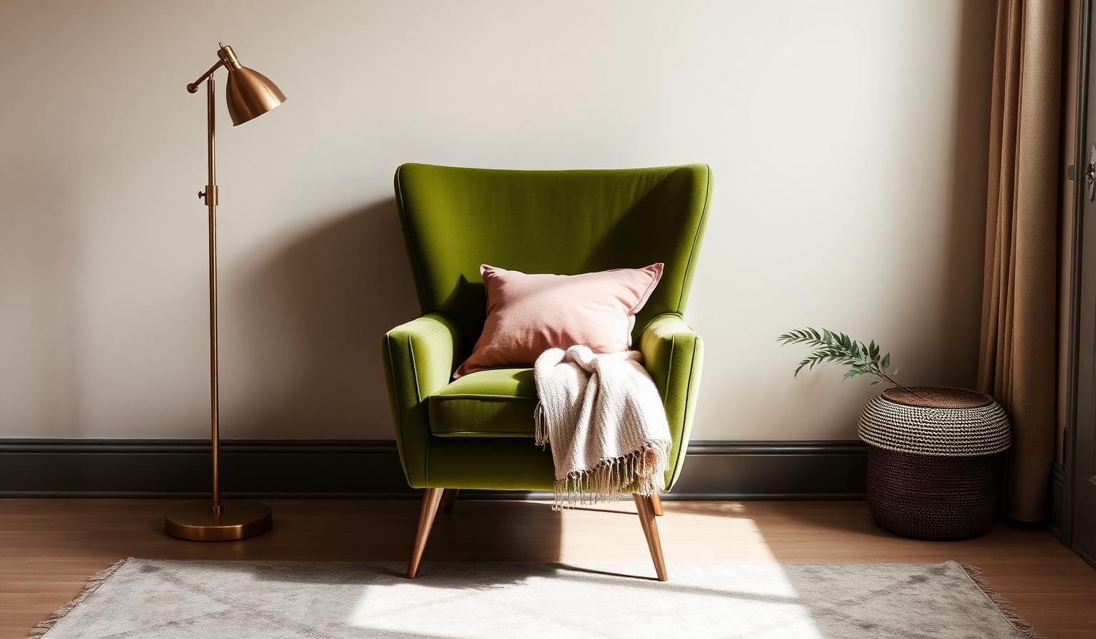
The Direct Answer: What Colors Go With Wasabi Green?
If you are asking what colors go with wasabi green, the short answer is that this vibrant, yellow-leaning green thrives in three very different company: warm earthy neutrals that ground it, saturated jewel and pop tones that let it electrify, and soft airy pastels that make it feel young and modern. The right partner depends entirely on the mood you want — sophisticated calm, creative energy, or fresh optimism.
Wasabi green is one of those in-between colors designers love and beginners fear. It reads as fashion-forward and slightly unexpected, sitting somewhere between olive, chartreuse, and moss. Pair it thoughtfully and it looks like a designer chose it. Pair it carelessly and it can feel dated or sickly. This guide gives you the exact HEX codes, three ready-to-use palettes, the psychology behind each pairing, and practical takeaways for interiors, branding, and digital design.
Understanding Wasabi Green: The Hero Shade
Wasabi green is not a single hex value — it is a family of yellow-greens that share the same aromatic, almost-electric character of the Japanese condiment it is named after. The three most useful reference values are:
- Wasabi Light #A9AD74 — softer, dustier, closer to sage. Best for large surfaces like walls and upholstery.
- Wasabi Classic #899566 — the balanced midpoint. Reads as a confident, grown-up olive-green.
- Wasabi Electric #7A933E — the saturated, high-energy version. Best as an accent or brand color.
All three sit in the yellow-green quadrant of the color wheel, which is exactly what gives wasabi green its energy. Unlike a pure forest green or a cool emerald, wasabi carries a warm yellow undertone that makes it feel fresh, modern, and slightly rebellious. It is a color of creativity, growth, and — critically for designers — of contrast: it flatters both warm and cool companions.
Color Psychology: What Wasabi Green Communicates
Color psychology is pattern recognition, not magic. Wasabi green triggers associations with young leaves, matcha, herbs, spring shoots, and — thanks to the condiment — a sharp, sensory jolt.
- Fresh and modern: Wasabi feels current. It is a favorite in wellness, food, tech, and lifestyle branding because it reads as clean without being sterile.
- Youthful and creative: The yellow undertone pushes it toward playfulness and originality, away from the corporate safety of navy or forest green.
- Connected to nature — but with a twist: It is a nature color that does not whisper. Where sage meditates, wasabi caffeinates.
- Adventurous: Because it sits outside the "safe" green zone, choosing wasabi signals confidence and taste.
The main psychological risk is over-saturation. Too much wasabi in a small space can feel acidic or unsettling. The palettes below solve this by surrounding it with restful companions.
Palette 1 — Neutral & Earthy: What Colors Go With Wasabi Green for a Calm, Grown-Up Space
This is the default answer for most interior applications. Earthy neutrals let wasabi carry the personality without shouting.
- Walls or large surface: Mushroom Gray #BDBAAD
- Accent color: Wasabi Classic #899566
- Anchor / contrast: Charcoal #36454F
- Softening neutral: Cream #FFFDD0
- Optional warmth: aged brass, walnut wood, natural linen
Why it works. Mushroom gray shares wasabi's dusty, organic quality — they belong to the same "found in nature" family. Charcoal provides the grounding weight that keeps the palette from floating, and cream introduces breathing room so the yellow-green never becomes overwhelming. This is the palette for a reading nook, a considered home office, or a boutique hospitality lobby.
Where to use it: living rooms, home offices, hotel suites, minimalist product packaging, wellness brands that want to feel premium rather than clinical.
Palette 2 — Bold & Vibrant: When You Want the Wasabi to Sing
If you are here for the electric answer to what colors go with wasabi green, this is your palette. It leans into the color's saturated, high-energy personality and pairs it with equally confident partners.
- Hero: Wasabi Electric #7A933E
- Warm complement: Electric Coral #FF5733
- Cool anchor: Deep Teal #008080
- High-drama accent: Magenta #FF00FF
- Neutral relief: warm white or off-black
Why it works. Electric coral sits nearly opposite wasabi on the color wheel, creating a classic split-complementary tension that feels intentional rather than random. Deep teal shares wasabi's earthy DNA but from the cool side, so it grounds the composition. Magenta is the surprise — used at 5–10% of the palette, it turns the whole scheme from "bold" into "unforgettable."
Where to use it: creative-industry branding, editorial design, cocktail bars, coworking spaces, packaging for wellness or beverage brands aimed at younger audiences, product pages that need to convert with confidence.
If you want to understand why complementary and split-complementary pairings feel so satisfying, our complementary colors examples guide walks through the color-wheel math with real designer combinations.
Palette 3 — Soft & Airy: What Colors Go With Wasabi Green for a Light, Optimistic Room
This palette softens wasabi's edge and turns it into something almost pastoral. It is the answer when you want wasabi green in a bedroom, nursery, spa, or airy retail environment.
- Hero: Wasabi Light #A9AD74
- Cool pastel: Lavender #E6E6FA
- Sky accent: Sky Blue #87CEEB
- Warm romantic accent: Blush Pink #F1D4D4
- Neutral base: warm white, natural oak
Why it works. Lavender and wasabi are analogous cousins in nature — think of a spring meadow with wildflowers. Sky blue introduces a cool, airy note that keeps the palette from feeling too sweet, and blush pink adds a whisper of warmth that flatters skin tones. This palette is inherently generous: it makes rooms feel larger, calmer, and more forgiving of imperfect natural light.
Where to use it: bedrooms, nurseries, spas, boutique retail, wellness product packaging, editorial fashion, wedding branding, feminine tech products that want to escape the pink-and-purple cliché.
Because wasabi and lavender live near each other on the color wheel, this palette is technically an extended analogous scheme. Our analogous colors examples guide breaks down why these near-neighbor combinations always feel harmonious.
Practical Designer & Homeowner Takeaways
Choosing Your Wasabi Value
The three HEX codes at the top of this article are not interchangeable. As a rule:
- Walls and large upholstery → use the lighter #A9AD74. Saturated wasabi on four walls can feel oppressive.
- Cabinets, accent chairs, doors → use the classic #899566. It reads as considered and premium.
- Logos, CTAs, small accents → use the electric #7A933E. Its saturation only works in small doses.
Lighting Considerations
Wasabi green is highly sensitive to light temperature. Under cool daylight (5000K+) it can lean cold and gray; under warm incandescent light (2700K) it warms into a friendly olive. Test paint samples at multiple times of day before committing to a wall color, and specify 2700–3000K bulbs in rooms where wasabi is the star.
Materials That Flatter Wasabi Green
- Natural wood — especially walnut, oak, and rattan — reinforces wasabi's organic character.
- Aged brass and unlacquered bronze create a warm metallic bridge that chrome and stainless steel cannot match.
- Linen, wool bouclé, and raw silk soften wasabi's edge; high-gloss synthetics can make it look plastic.
- Terracotta, unglazed ceramic, and travertine are ideal companion materials.
In Branding and Digital Design
- Use wasabi as a 60% brand accent, not a 100% brand color. It fatigues the eye at large scale on screen.
- Pair with charcoal or off-black type for readability. Wasabi on white is legible; wasabi on wasabi is not.
- For CTAs, prefer the electric #7A933E on a dark background — it out-performs safer green CTAs in click-through when the brand personality warrants it.
- Wasabi photographs beautifully in product shots but shifts on screen; always check your palette in the target medium.
Room-by-Room Cheat Sheet
- Kitchen: wasabi lower cabinets, cream uppers, brass hardware, walnut floors.
- Bathroom: wasabi zellige tile, warm white walls, unlacquered brass fixtures.
- Bedroom: wasabi light walls, lavender and blush textiles, natural oak bed.
- Home office: mushroom gray walls, wasabi accent chair, charcoal desk, brass task lamp.
- Nursery: soft wasabi walls, sky blue and blush accents, warm white ceiling.
Complete Color Reference Table
| Item | Color | Hex | Color Name | Psychological Meaning |
|---|---|---|---|---|
| 1 | #A9AD74 | Wasabi Light | Hero | Fresh, organic, calm, modern |
| 2 | #899566 | Wasabi Classic | Hero | Confident, grown-up, natural, considered |
| 3 | #7A933E | Wasabi Electric | Hero | Energetic, creative, adventurous, bold |
| 4 | #BDBAAD | Mushroom Gray | Neutral | Grounding, earthy, sophisticated, calm |
| 5 | #36454F | Charcoal | Neutral | Weight, focus, elegance, contrast |
| 6 | #FFFDD0 | Cream | Neutral | Softness, warmth, openness, ease |
| 7 | #FF5733 | Electric Coral | Bold Complement | Energy, appetite, creativity, warmth |
| 8 | #008080 | Deep Teal | Bold Complement | Depth, sophistication, coastal calm |
| 9 | #FF00FF | Magenta | Bold Accent | Drama, imagination, boldness, surprise |
| 10 | #E6E6FA | Lavender | Soft Pastel | Serenity, imagination, gentleness |
| 11 | #87CEEB | Sky Blue | Soft Pastel | Openness, optimism, clarity, calm |
| 12 | #F1D4D4 | Blush Pink | Soft Pastel | Warmth, tenderness, romance, welcome |
Common Mistakes When Using Wasabi Green
Painting the Whole Room Electric Wasabi
The saturated #7A933E is a fantastic accent and a punishing wall color. Reserve it for one door, one piece of cabinetry, or one wall — never four.
Pairing With Cool Grays
Cool blue-grays fight wasabi's yellow undertone and make the green look muddy. Choose warm mushroom or greige grays instead.
Ignoring the Ceiling
A wasabi-forward room needs a light, warm ceiling — cream or warm white — to avoid feeling closed in. Painting the ceiling wasabi too almost always backfires.
Using It Under Cool LED Bulbs
Cheap 5000K LEDs turn wasabi into a hospital green. Specify 2700–3000K bulbs with CRI 90+ for rooms where wasabi is featured.
Over-Combining Bold Colors
The Bold & Vibrant palette works because each color has a defined role. Add a fifth or sixth saturated hue and you lose the composition. Follow the 60-30-10 rule: 60% neutral, 30% wasabi, 10% bold accent.
Wasabi Green in 2026: Why It Is Trending
Wasabi green sits at the intersection of two dominant 2026 design currents: the biophilic move toward organic, plant-inspired palettes, and the fashion-led rejection of "safe" beige minimalism. It photographs well for social media, it flatters warm and cool skin tones equally in fashion, and it works across categories — from matcha branding and wellness apps to hospitality interiors and boutique retail.
Expect to see it continue in cabinetry, tile, upholstery, and premium packaging over the next several seasons. Unlike short-lived trend colors, wasabi has staying power because it is close enough to olive and sage — two evergreen designer favorites — to age gracefully.
Conclusion: Make Wasabi Green Work for You
So, what colors go with wasabi green? The best partners are mushroom gray, charcoal, and cream for a grounded, grown-up room; electric coral, deep teal, and magenta when you want the wasabi to sing; and lavender, sky blue, and blush pink when you want it to feel soft, young, and airy. The right choice depends on whether you want wasabi to whisper, sing, or dream.
Use the three HEX values and the palettes above as a starting point, then adjust for your light, materials, and personal taste. And when you are ready to build a complete, balanced palette around wasabi green — or extract one from an inspiration image — try the Coloracci AI palette generator. It translates your starting color into ready-to-use combinations for interiors, branding, and digital design. You can also learn the workflow in our guide to creating a color palette from an image with AI.