How to Create a Color Palette from an Image Using AI (Without Losing Your Mind)
· Marcus Chen
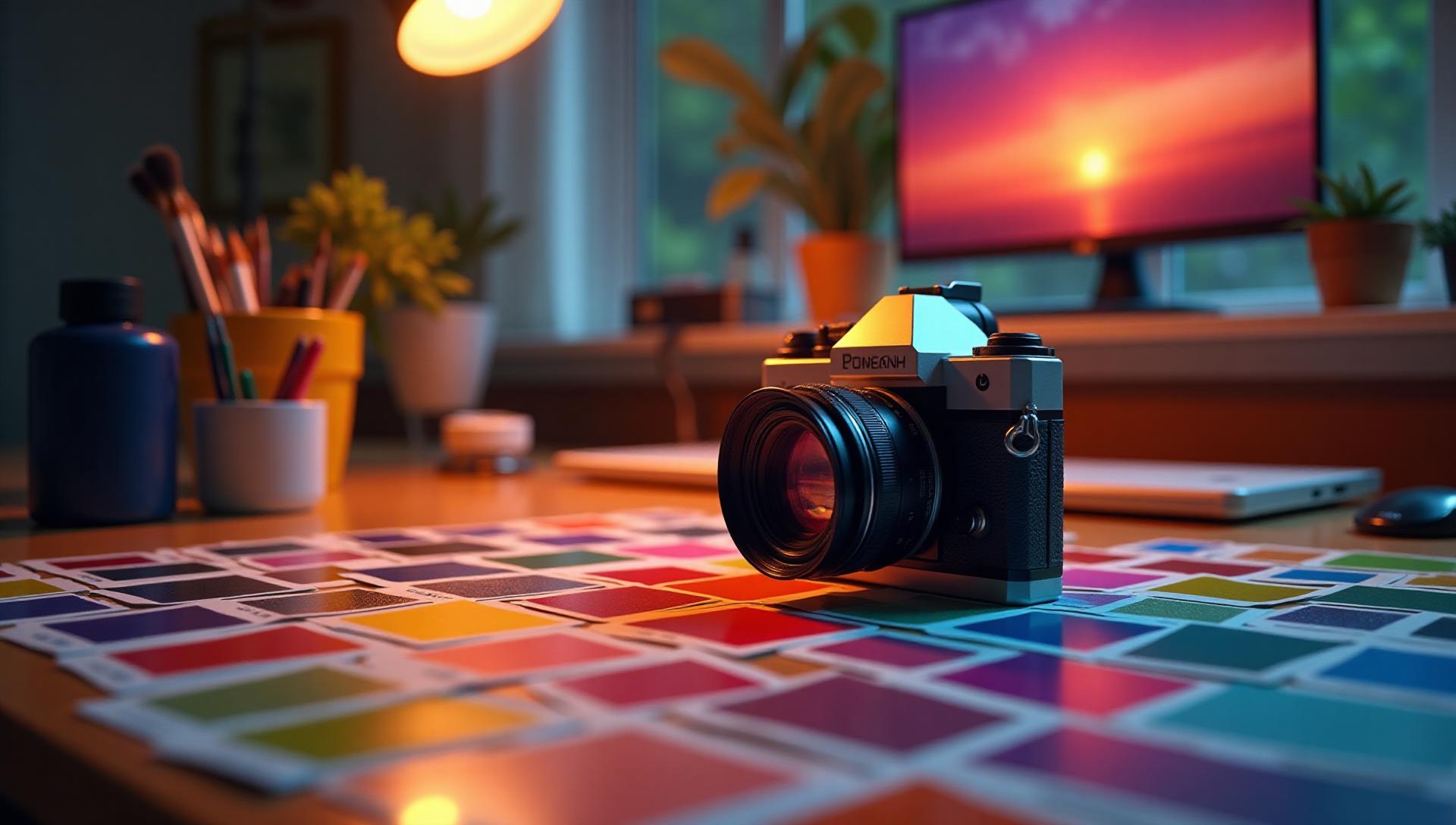
The Trash Can Incident

So there I was, presenting color palettes to a premium skincare brand. Four hours of work. Carefully extracted colors from their product photos. Professional presentation. Confident smile.
"These are... interesting," the client said. That tone. You know the one.
Turns out I'd accidentally sampled colors from a trash can visible in the background of their hero image. `#8B7355` (muddy brown), `#A8A8A8` (garbage bag gray), and `#4A4A4A` (mystery stain).
Professional.
That's when I decided there had to be a better way to extract colors from images.
Why Extract Colors from Images Anyway?

Before we dive into the how, let's talk about why this matters.
Real-world scenarios where I've needed this:
- Client shows up with a photo: "Make the website match this vibe"
- Rebranding around existing product photography
- Creating cohesive marketing across different media
- When the client says "I like these colors" while pointing at their phone screen
- Analyzing competitor color strategies (no judgment)
The traditional way? Open Photoshop, zoom in really close, click the eyedropper tool approximately 847 times, hope you're not clicking on trash cans.
There's a better way.
The Old School Method (And Why It's Exhausting)

Manual Color Picking: A Love Story
For years, this was my workflow:
- Open image in Photoshop
- Use eyedropper tool
- Jot down hex codes
- Realize those colors look terrible together
- Repeat 40 times
- Question career choices
Time per image: 20-30 minutes
Accuracy: Depends on how much coffee I've had
Likelihood of sampling trash cans: Higher than you'd think
The problem isn't just time. It's knowing which colors to pick.
An image might have 10,000 different colors. Which five should be your palette? The brightest? The most common? The ones that match your mood?
Spoiler: there's actual science to this.
Enter AI: The Game Changer

What AI Actually Does (In Plain English)
AI color extraction tools analyze images and:
- Identify dominant colors
- Calculate color frequency
- Understand visual hierarchy
- Consider color relationships
- Group similar shades
- Suggest harmonious palettes
Basically, it does in 5 seconds what took me 30 minutes. And it doesn't click on trash cans.
The First Time I Tried It
Skeptical doesn't begin to describe it. I'm the designer who still manually kerned body text "because you can see the difference."
But I had a project: Extract colors from a client's vintage motorcycle photo for their brand identity.
Manual method (my usual): 25 minutes, 6 colors, okay result
AI method: 8 seconds, 5 colors, better result
The AI caught this gorgeous dusty orange (`#D97757`) from the rust that I'd completely overlooked. That became the brand's primary color. Client loved it. It's now on their business cards, website, and probably tattooed on their CEO.
How to Actually Do This: Step-by-Step

Method 1: Using Coloracci's AI Image Color Extractor
Here's my current workflow (and yes, this is what I use for actual client work):
1. Go to Coloracci's Image Color Extractor
Head to the Image Color Extractor tool. No signup required for basic use. Drag and drop your image, or click upload if you're fancy. Supports JPG, PNG, WebP—basically anything that's not a Geocities GIF.
2. Let the AI Work Its Magic
Takes about 5 seconds. During this time, Coloracci's AI:
- Analyzes every pixel in your image
- Identifies dominant color clusters
- Calculates color frequency and visual weight
- Builds harmonious, professionally-tested palettes
- Checks accessibility contrast ratios
3. Review the AI-Generated Palettes
You'll get multiple palette options:
- Dominant colors - The main colors that define the image
- Accent colors - Supporting colors for variety
- Complementary suggestions - Colors that work well together
- Accessible variations - WCAG-compliant alternatives
4. Refine and Customize
Here's where Coloracci really shines. The AI can:
- Generate warmer/cooler variants on demand
- Adjust saturation and brightness
- Create color schemes (analogous, complementary, triadic)
- Ensure accessibility standards are met
- Export in any format you need (hex, RGB, HSL, CMYK)
5. Go Further with AI Website Designer
This is the part that blew my mind: Once you have your palette, you can use Coloracci's AI Website Designer to see those colors in action. Upload the same image, and the AI generates a complete website design using your extracted colors. It's like having a design team that works in seconds instead of days.
Real example: I uploaded a client's product photo. Got the palette. Then used AI Website Designer to generate three different website mockups using those exact colors. Client meeting lasted 10 minutes instead of the usual hour-long debate.
Method 2: The Manual Browser Way (When You're Desperate)
If for some reason you can't use Coloracci and just need a quick color:
Using Browser DevTools:
- Right-click image
- Inspect element
- Click eyedropper in color picker
- Click colors you want
- Copy hex codes
Time: 2-3 minutes
Accuracy: Okay
Missing: Everything that makes a palette actually work together
Honestly, I only use this when I'm offline on a plane and need to grab one specific color. For anything serious, Coloracci's AI is worth the 30 seconds to open your browser.
Method 3: Mobile Apps (When You're Not at Your Desk)
Sometimes you're at a client meeting and they point at a magazine ad saying "these colors."
Adobe Capture (Free):
- Take photo with phone
- Extracts 5 colors
- Syncs with Adobe CC
Coloracci (on mobile browser):
- Works perfectly on mobile
- Same AI power as desktop
- Take photo → upload → instant palette
- No app download needed
Coolors App (Free/Paid):
- Quick color picker
- Generates variations
- Export options
Pro tip: I just use Coloracci on my phone browser now. Why download another app when the web version works perfectly and has better AI? For print work, you'd still want to check the Pantone matches (I use our Pantone finder tool for that), but for digital design, these AI-extracted colors are perfect as-is.
Real Project Examples

Example 1: The Food Truck Rebrand
Client: Local food truck wanted rebrand
Source Image: Photo of their signature dish (bánh mì)
What I Did:
- Uploaded food photo to Coloracci's Image Color Extractor
- AI extracted: `#F4A460` (golden baguette), `#DC143C` (chili accent), `#8FBC8F` (fresh herbs), `#FFFACD` (pickled vegetables)
- Used Coloracci's AI to suggest contrast color: `#2C3E50`
- Then used AI Website Designer to generate their menu website using these colors
Result: Palette that literally makes people hungry. Complete website design in 2 minutes. Sales up 40% after rebrand. Client sends me free sandwiches monthly.
Example 2: The Sunset Website
Client: Yoga studio with beautiful sunset photography
Challenge: Extract colors that felt "calm but energized"
Manual Attempt:
- Got: `#FF6B4A`, `#FFB347`, `#87CEEB`
- Looked: Like a children's birthday party
Coloracci AI Attempt:
- Got: `#E07856`, `#F4C96B`, `#89A6C2`, `#4A5F7A`
- Looked: Like actual peaceful sunset
- Used AI Website Designer to preview the site before building
- Client approved in one meeting instead of three
The difference? Coloracci's AI understood the subtle variations and how colors related to each other. I was just clicking pretty pixels. The website preview sealed the deal—no more "I need to see it to believe it" back-and-forth.
Example 3: The Product Packaging Match
Client: Needed website to match their existing product packaging
Problem: Packaging was professionally color-matched and printed. Had to be exact.
Solution:
- Scanned high-quality photo of packaging
- Used Coloracci to extract precise colors
- AI provided both RGB (for screen) and CMYK (for print) values
- Verified with physical color swatches
- Used AI Website Designer to show client exactly how it would look online
Key Learning: Coloracci's AI is more consistent than tired human eyes, and seeing a full website mockup using the exact product colors convinced the client in 5 minutes. Who knew?
Common Mistakes (I've Made Them All)

Mistake 1: Using Too Many Colors
Just because an image has 50 colors doesn't mean your palette should.
What I learned: Pick 3-5 dominant colors. Use Coloracci's AI to identify them automatically. Your design will thank you.
Mistake 2: Ignoring Context
Beach sunset photo giving you bright orange (`#FF6B35`)? Great for a surf shop. Terrible for a law firm.
What Coloracci helps with: The AI suggests contextually appropriate variations. "This orange might be too energetic for corporate use—try `#D4793D` instead." Then you can instantly see how it looks on a real website using the AI Website Designer.
Mistake 3: Not Checking Accessibility
Those beautiful muted tones from that vintage photo? Contrast ratio of 2.3:1. WCAG guidelines need 4.5:1.
Solution: Coloracci's AI checks this automatically. It'll suggest adjustments to meet WCAG accessibility standards while maintaining your design vibe. No manual contrast calculators needed.
Mistake 4: Forgetting About Print vs Screen
`#FF0000` on screen ≠ `#FF0000` in print.
What I do now:
- Extract colors with Coloracci (gives both RGB and CMYK)
- Test print samples if needed
- Adjust if needed
- Everything's already documented in the export
Saves me from doing manual conversions that I always screwed up anyway.
The Technical Stuff (For the Nerds)

How AI Actually Sees Images
K-means clustering: Algorithm groups similar colors together
Histogram analysis: Identifies most frequent colors
Perceptual color space: Considers how humans actually see color
Context awareness: Understands foreground vs background
Traditional tools just count pixels. AI understands composition.
Color Space Considerations
Images exist in different color spaces:
- sRGB: Standard web
- Adobe RGB: Wider gamut, professional
- ProPhoto RGB: Even wider, specialty
- CMYK: Print
AI tools handle these conversions. Manual tools? You're on your own.
Tips for Better Results

1. Use High-Quality Images
Bad: Low-res Instagram screenshot with filters
Good: High-res original photo
Garbage in, garbage out. AI can't fix a 200px potato-quality image.
2. Remove Distractions
Remember my trash can story? Yeah.
Crop out backgrounds, logos, watermarks—anything that's not supposed to influence your palette.
3. Consider Lighting
Same red shirt looks different in sunset vs fluorescent lights. AI adjusts for this, but giving it clean, well-lit images helps. These tools usually don't check contrast ratios automatically. After extracting your palette, run it through a contrast checker if you're using the colors for text/background combinations. Learn more about WCAG contrast standards. There are times when manually choosing colors is still better. Understanding color psychology can help you make strategic choices beyond what AI suggests.
4. Test in Context
Extract palette → Looks great
Apply to website → Looks terrible
Always test colors in actual use. What works in isolation might not work in design.
My Current Workflow

Here's exactly what I do now:
For Every New Project:
- Gather source images (client photos, inspiration, existing materials)
- Upload to Coloracci's Image Color Extractor
- Review AI-generated palettes (instant results, multiple options)
- Refine if needed (AI adjusts for warmth, accessibility, brand fit)
- Preview in context using AI Website Designer
- Export in any format (hex, RGB, CMYK, CSS, Tailwind—you name it)
Time per project: 5-10 minutes (down from 30-45 minutes)
Trash can incidents: Zero
Client approval rate: 95%+ on first presentation
"Can I see it on a real website?" questions: Answered immediately with AI Website Designer
The game-changer isn't just extracting colors faster. It's being able to show clients how those colors look on an actual website design within seconds. No more "trust me, it'll look good"—you can prove it instantly.
When NOT to Use AI

Scenario 1: Brand Guidelines Exist
Client has established brand colors? Use those. Don't try to "improve" them by extracting from photos.
(Learned this the hard way.)
Scenario 2: Artistic Vision Required
Sometimes you need to create something that doesn't exist in reality. AI can help, but human creativity leads.
Scenario 3: Cultural Considerations
AI doesn't understand that white means mourning in some cultures, or that certain color combinations have specific meanings.
Do your research. Use AI as a tool, not a replacement for thinking.
The Future of This Stuff

What's Coming:
- Better context awareness
- Style-based extraction ("extract only the sunset colors, ignore the people")
- Mood-based adjustments
- Real-time brand guideline compliance
- Integration with design tools
We're living in the golden age of "computers actually being useful to designers instead of just annoying us."
Real Talk: Is AI Really Better?

After three years of using AI for color extraction, here's my honest take:
What AI does better:
- Speed (obviously)
- Consistency
- Accessibility checking
- Harmony suggestions
- Context awareness
What humans do better:
- Understanding brand context
- Cultural sensitivity
- Creative judgment
- Knowing when to break the rules
- Not clicking on trash cans (okay, we're equal here)
Best results? AI + human judgment.
Let AI do the heavy lifting—analyzing pixels, calculating harmonies, checking accessibility. Then apply your design brain to make final decisions.
Final Thoughts from Someone Who Still Sometimes Uses the Eyedropper

Look, I'm not here to tell you to abandon traditional methods entirely. Sometimes you just need to pick a color really quick.
But for actual client work? Projects that matter? When time and quality both count?
Using Coloracci for AI color extraction + AI Website Designer for instant previews is an absolute game changer.
What changed for me:
- Hours saved per project (seriously, 3-4 hours per client)
- Way fewer mistakes and revisions
- Clients actually excited about color presentations
- Zero trash can incidents (thank god)
- Immediate visual proof that colors work together
My recommendation: Try Coloracci's Image Color Extractor right now. Upload an image you've previously extracted colors from manually. Compare the results.
Then take those colors and see them instantly on a full website design using the AI Website Designer. That's the moment that'll get you.
If you don't see the value, go back to manual. No hard feelings.
But I'm betting you'll have the same "oh shit, this changes everything" moment I had three years ago. And you won't go back.
What about you? Still manually clicking the eyedropper 847 times? Ever accidentally sampled a trash can? Ready to see what AI can do with your images?
Real talk: I use Coloracci for literally every project now—from quick client consultations to full rebrands. The Image Color Extractor + AI Website Designer combo replaced about $2,000 worth of design tools in my workflow. No sponsorship, just honest experience from someone who's tried everything and finally found something that actually works.