What Color Palette Makes a Room Look Bigger? A Designer's Guide
· Coloracci Team
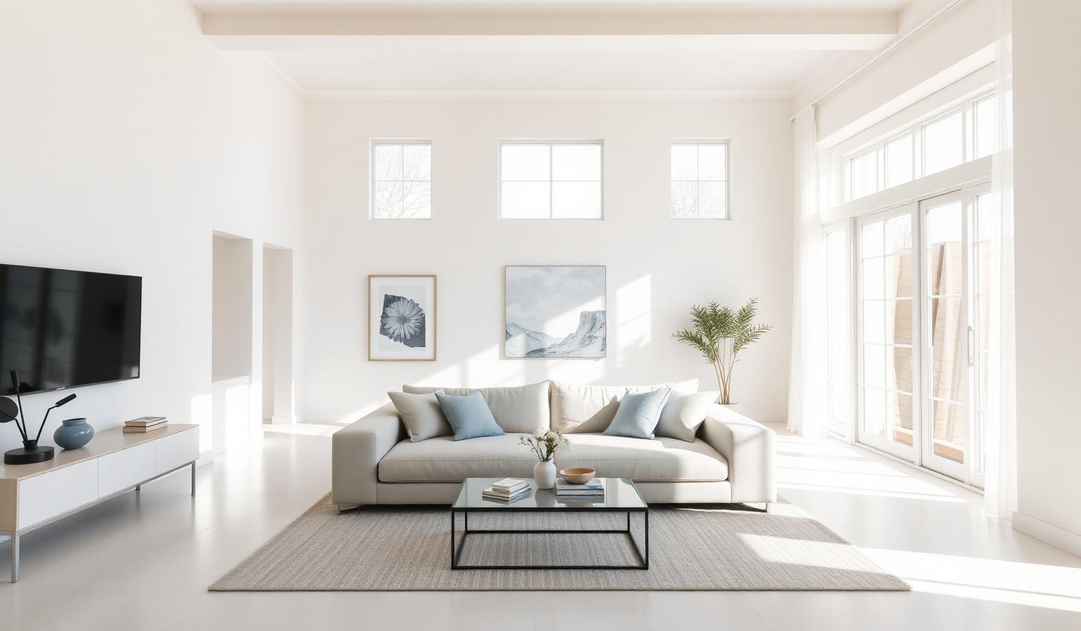
If you have ever stood in a cramped studio apartment or a low-ceilinged bedroom wondering what color palette makes a room look bigger, the answer is rooted in a single, unshakable principle of optical physics: lighter colors reflect more light, and reflected light is what visually expands a space. Off-whites, soft pales, airy blues, muted yellows, and pastel greens bounce wavelengths around the room rather than absorbing them, dissolving the sense of where one wall ends and the next begins. According to Benjamin Moore color and design experts, the most effective palettes combine warm off-whites (such as Swiss Coffee OC-45), recessive light blues (Smoke 2122-40, approximately #BAC8C9), reflective muted yellows (Cream Silk OC-115), and pale greens or peaches—often paired with a single bold accent wall to add depth.
In this designer's guide, we will break down exactly what color palette makes a room look bigger, give you the precise hex codes you can take straight to the paint store or palette generator, explore the psychology behind why these shades work, and translate Benjamin Moore's expert recommendations into a practical, room-by-room blueprint. Whether you are working with a sun-starved basement, a narrow hallway, or a small urban bedroom, the right palette can make square footage feel like it doubled overnight.
Why Lighter Color Palettes Make a Room Look Bigger
Before we look at specific paint chips, it helps to understand the science. Color perception is light perception. When a wavelength of light hits a surface, the surface absorbs some wavelengths and reflects others—the reflected ones are what your eye reads as "color." Dark surfaces absorb the majority of incoming light, which is why a charcoal-painted room can feel intimate and cocoon-like but also visibly smaller. Light surfaces, on the other hand, reflect 70–90% of the light that hits them, scattering it across the room and softening the visual edges of walls, ceilings, and corners.
Three optical effects are at play when you choose a light, room-expanding palette:
- Light Reflectance Value (LRV): Every paint color has an LRV between 0 (absolute black) and 100 (pure white). Designers recommend an LRV of 70 or higher for walls in small rooms. Most of the colors profiled below sit comfortably in the 75–90 LRV range.
- Color Recession: Cool colors—particularly soft blues and pale greens—appear to "recede" or move away from the viewer, while warm reds, oranges, and browns tend to "advance" toward the viewer. Recessive walls feel farther away than they actually are.
- Edge Dissolution: When wall and ceiling colors are similar in value, the boundary between them softens. The eye stops registering the ceiling as a hard "lid" and the room reads as taller and more continuous.
For a deeper foundation on how warm and cool colors behave in a space, our companion guide on warm vs. cool colors: theory and examples breaks down the temperature spectrum in detail. Pairing that knowledge with the LRV concept gives you everything you need to engineer a room-expanding palette from scratch.
What Color Palette Makes a Room Look Bigger? The Five Definitive Families
Benjamin Moore's color and design team has spent decades testing how individual hues perform in small or low-light rooms. Their recommendations cluster into five reliable color families. Below are the exact paint names, hex code approximations, and the design logic behind each.
1. Airy Blues and Crisp Whites
Blues are the original "receding" color. Because the human eye perceives short-wavelength blue light as visually distant—think of how mountains in the background of a landscape always appear bluish—painting a wall or ceiling in a pale, airy blue tricks the brain into reading the surface as farther away than it is.
- Smoke 2122-40 (approx. #BAC8C9): A whisper-soft, slightly grey-blue ideal for ceilings or rooms with low natural light. On a ceiling, #BAC8C9 mimics a clear morning sky, drawing the eye upward and dissolving the hard horizontal line where wall meets ceiling.
- Pure White OC-64 (approx. #EDEAE0): Benjamin Moore's crisp, clean white. Pairing #EDEAE0 walls with a Smoke 2122-40 ceiling produces a high-LRV envelope that maximally reflects daylight and lamp light.
2. Warm, Sunny Off-Whites
Cool pure whites can read clinical or even blue-tinged in rooms with limited natural light. For interior rooms, north-facing rooms, or any space that feels gloomy in the afternoon, designers reach for off-whites with subtle warm undertones. These shades reflect light just as effectively as cool whites but emit a softer, sun-kissed glow.
- Swiss Coffee OC-45 (approx. #EBE5D6): Arguably Benjamin Moore's most popular off-white, with a touch of warm cream that flatters every wood tone.
- Acadia White OC-38 (approx. #EBE3D1): A slightly creamier alternative with a hint of beige, perfect for traditional or transitional interiors.
- White Chocolate OC-127 (approx. #E8DDCB): A sumptuous, slightly deeper off-white that adds warmth without sacrificing reflectance.
3. Soft, Muted Yellows
Yellow is the most reflective color on the visible spectrum after white. A pale, muted yellow can do for a basement or laundry room what a skylight does for a kitchen—simulate sunlight even when none is available. The key is "muted." Saturated lemon or marigold yellows will overwhelm a small space; soft, milky yellows reflect light without screaming.
- Cream Silk OC-115 (approx. #F1E8C9): A gentle buttercream that reads as light, not yellow. Ideal for walls in windowless or basement rooms.
- Angel's Trumpet 278 (approx. #F4D981): A deeper, more saturated yellow reserved for accents—a single piece of furniture, trim, or a built-in—so the wall color continues to do the heavy reflective work.
4. Light Greens and Peaches
Pale greens and peaches sit at the analogous edges of the color wheel between the cool recession of blue and the warmth of yellow. They feel both organic and luminous, and they reflect natural light beautifully off surfaces like wood floors and linen upholstery.
- Silken Pine 2144-50 (approx. #C3D5B6): A pale, almost silvery green that brings the calm of nature indoors without dimming the room.
- Summer Shower 2135-60 (approx. #C8DCDE): A pale, cooled blue-green that performs especially well in bedrooms and bathrooms.
- Raleigh Peach CW-205 (approx. #F5D7C0): A soft, sun-warmed peach that adds a hint of warmth while preserving high reflectance.
5. Strategic Bold Accents for Depth
Counterintuitively, one of the fastest ways to make a small room feel bigger is to introduce a single bold accent wall against a backdrop of lighter hues. The bold wall creates a focal point that the eye lands on first, then "reads past" to the lighter walls, generating an illusion of depth and dimension—similar to how stage designers use a dark backdrop to make a foreground feel closer.
- Tomato Tango CSP-1145 (approx. #C0392B): A confident, slightly muted red. Used on a single wall behind a sofa or bed, it acts as a visual anchor and amplifies the perceived depth of the room.
Room-Expanding Color Palette: The Complete Data Table
The following table consolidates the recommended palette into a single reference. Use these exact specifications when entering colors into a digital palette tool or matching paint chips in-store.
| Item | Color | Hex | Color Name | Psychological Meaning |
|---|---|---|---|---|
| Ceiling / Low-Light Walls | Light Airy Blue | #BAC8C9 | Smoke 2122-40 | Calm, recession, openness, sky-like depth |
| Primary Walls (Bright Rooms) | Crisp White | #EDEAE0 | Pure White OC-64 | Clarity, freshness, neutral luminosity |
| Primary Walls (Low-Light) | Warm Off-White | #EBE5D6 | Swiss Coffee OC-45 | Comfort, warmth, gentle radiance |
| Primary Walls (Cozy Rooms) | Soft Off-White | #EBE3D1 | Acadia White OC-38 | Subtle warmth, classic refinement |
| Primary Walls (Warm Accent Rooms) | Creamy Off-White | #E8DDCB | White Chocolate OC-127 | Sophistication, soft luxury |
| Basement / Windowless Walls | Muted Pale Yellow | #F1E8C9 | Cream Silk OC-115 | Sunlight, optimism, energy |
| Accent Trim or Furniture | Deeper Muted Yellow | #F4D981 | Angel's Trumpet 278 | Confidence, warmth, focal energy |
| Bedroom / Living Walls | Pale Green | #C3D5B6 | Silken Pine 2144-50 | Calm, nature, restoration |
| Bathroom Walls | Pale Blue-Green | #C8DCDE | Summer Shower 2135-60 | Serenity, cleanliness, expansive air |
| Bedroom / Reading Nook | Pale Peach | #F5D7C0 | Raleigh Peach CW-205 | Warmth, comfort, gentle vitality |
| Accent Wall | Bold Red | #C0392B | Tomato Tango CSP-1145 | Depth, focal energy, dimension |
| Low Ceiling | Light Engaging Hue | #DCE6E2 | Crystalline AF-485 | Lift, openness, ceiling elevation |
How to Combine These Colors: Three Designer-Tested Palettes
Choosing a single beautiful color is easy. Combining several into a palette that visually expands a room requires balance. Use the classic 60-30-10 color proportions rule as your structural guide: 60% dominant wall color, 30% secondary (furniture, trim, large textiles), 10% accent (artwork, pillows, a single bold wall).
Palette A: "Coastal Air" — Best for Small Bedrooms and Living Rooms
- 60% Dominant Walls: Pure White OC-64 (#EDEAE0)
- 30% Ceiling and Trim: Smoke 2122-40 (#BAC8C9)
- 10% Accent: Raleigh Peach CW-205 (#F5D7C0) in throw pillows or art
Why it works: The crisp white walls reflect maximum light, the pale-blue ceiling visually lifts the roofline, and the peach accent introduces warmth without weighing the palette down.
Palette B: "Sunlit Cellar" — Best for Basements, Laundry Rooms, North-Facing Spaces
- 60% Dominant Walls: Cream Silk OC-115 (#F1E8C9)
- 30% Trim and Cabinetry: Swiss Coffee OC-45 (#EBE5D6)
- 10% Accent: Angel's Trumpet 278 (#F4D981) on a single piece of millwork
Why it works: The muted yellow walls simulate sunlight in spaces that receive none, the warm off-white trim softens the transition, and the deeper yellow accent injects energy without saturating the entire room.
Palette C: "Depth Illusion" — Best for Rectangular Rooms That Feel Boxy
- 60% Dominant Walls (three walls): Acadia White OC-38 (#EBE3D1)
- 30% Furniture and Textiles: Silken Pine 2144-50 (#C3D5B6)
- 10% Accent Wall (single far wall): Tomato Tango CSP-1145 (#C0392B)
Why it works: The bold red accent wall at the far end of the room becomes the focal vanishing point, exaggerating the perceived length of the space. The light off-white on the three remaining walls preserves overall openness.
The Color Psychology Behind a Room That Feels Bigger
Beyond optics, color shapes how we feel in a space, and a room that feels calm, breathable, and welcoming reads as bigger than its literal dimensions. Each family in our palette communicates a distinct psychological signal:
- Airy blues (#BAC8C9, #C8DCDE) lower the perceived temperature of a room and engage the parasympathetic nervous system. The result is a sense of stillness that invites the eye to wander freely, registering the room as more expansive.
- Warm off-whites (#EBE5D6, #EBE3D1) evoke safety, hospitality, and natural light. They reassure the brain, eliminating the "compressed" feeling that low-light rooms tend to trigger.
- Muted yellows (#F1E8C9) are tied to optimism and morning energy. They psychologically extend daylight hours, making spaces feel inhabited and alive.
- Pale greens (#C3D5B6) carry biophilic associations with foliage and growth, which research consistently links to perceived spaciousness and restoration.
- Strategic bold reds (#C0392B) generate focal tension. When used sparingly, they trick the brain into perceiving the room as deeper because foreground and background colors are differentiated.
For a richer exploration of how to layer color into a home with intention, our guide on how to add color to your home walks through fabric, art, and finish strategies that complement the palettes above.
Practical Designer Takeaways for Homeowners
Knowing the colors is half the battle. Applying them well is the other half. Use these professional rules when you actually pick up a paintbrush or order paint online.
1. Match Ceiling to Wall (or Go Lighter)
A low ceiling shrinks a room more than any wall color. Paint it the same shade as the walls—or one step lighter, such as Crystalline AF-485 (approx. #DCE6E2)—to eliminate the visual "lid." Avoid contrasting ceiling colors in small rooms; they hard-frame the ceiling line and reduce perceived height by inches.
2. Use Higher Sheen on Trim and Doors
Sheen is the unsung hero of room-expanding palettes. Matte and flat finishes absorb light. Semi-gloss and high-gloss finishes reflect it. Paint trim, doors, baseboards, and crown molding in a semi-gloss version of your wall color (or a lighter neutral) to bounce extra light around the room without changing the dominant hue.
3. Continue the Palette Across Adjoining Spaces
Boundaries kill flow. When a small living room opens into a hallway or dining nook, painting both spaces the same off-white (or close variations) erases the threshold and the eye perceives one continuous, larger area.
4. Avoid Strong Contrast at Eye Level
Save high-contrast moments for accents above 5'6" or below 3' (artwork, baseboards, ceiling beams). Strong contrast at eye level chops the room into segments and shrinks it.
5. Let Natural Light Steer the Hue
Test paint chips in the room at three times of day—morning, midday, and evening. North-facing rooms benefit from warm off-whites and creams (#EBE5D6, #F1E8C9). South-facing rooms can handle cooler blues and greens (#BAC8C9, #C3D5B6) without feeling chilly.
Conclusion: Build Your Room-Expanding Palette Today
So, what color palette makes a room look bigger? The verdict is unambiguous: lean into high-LRV off-whites and crisp whites for your dominant walls, layer in receding airy blues or pale greens on ceilings and secondary surfaces, introduce muted yellows in light-starved spaces, and reserve one bold color for a single focal accent. Anchor your selections around the exact hex codes in the data table above—#BAC8C9, #EDEAE0, #EBE5D6, #F1E8C9, #C3D5B6, #C8DCDE, #F5D7C0—and you have a designer-tested foundation that will visually open up almost any room.
When you are ready to translate these recommendations into a fully harmonized custom palette—complete with complementary accent shades, ready-to-export hex values, and Fibonacci-tuned color ratios—head to the Coloracci AI palette generator and build the exact room-expanding scheme that fits your home, your light, and your style. A bigger-feeling room is only one palette away.