The Best Paint Colors for a Room with Low Natural Light
· Coloracci Team
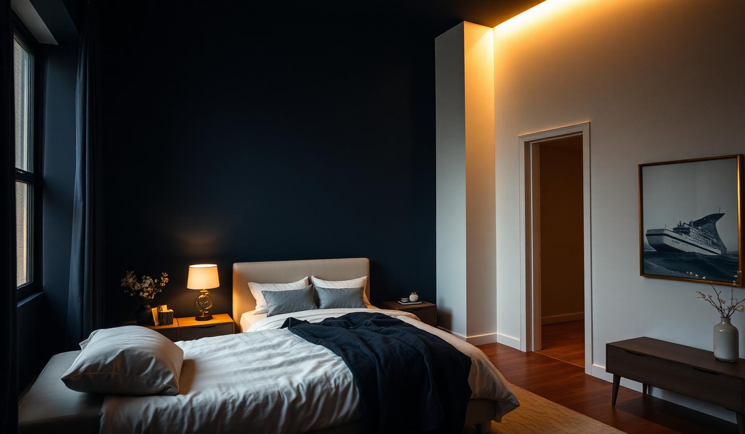
If you have ever stood in a north-facing bedroom at noon and wondered why every paint chip looks grey, muddy, or vaguely sad, you have discovered the central problem of low-light rooms. Choosing the best paint colors for a room with low natural light is not about hunting for "the brightest white" at the paint store—it is about making a deliberate strategic decision between two very different design philosophies. You can either fight the darkness by selecting highly reflective, warm-leaning shades that bounce every available lumen back into the room, or you can embrace it with deep, saturated hues that turn the space into an intentional, cocoon-like retreat. The one thing you must not do is settle for muddy mid-tone beiges or lifeless greys—these are the shades that make dim rooms feel unfinished, dreary, and smaller than they are.
In this guide, an expert breakdown of the best paint colors for a room with low natural light, we will translate advice from Benjamin Moore, Sherwin-Williams, and Farrow & Ball color consultants into a practical playbook: the exact hex codes, the LRV numbers that matter, the color psychology behind each pick, and the room-by-room combinations that professional designers actually specify. Whether you are painting a shaded living room, a basement office, or a north-facing bedroom, the palettes below will help you turn a low-light challenge into a design opportunity.
Why Low-Light Rooms Are Uniquely Difficult
Before we look at specific colors, it helps to understand what "low natural light" actually does to paint. A north-facing room in the northern hemisphere (or south-facing in the southern hemisphere) receives only diffuse, cool skylight—never direct sun. Rooms surrounded by tall buildings, dense trees, or deep overhangs get the same treatment. The available light is bluish, weak, and unchanging throughout the day, which means every warm undertone in your paint disappears and every cool undertone is amplified.
This creates three problems that shape the entire strategy for picking the best paint colors for a room with low natural light:
- Cool undertones read as grey or greenish. A "warm greige" that looks lovely in a sunny showroom can turn flat and institutional in a shaded room.
- Mid-tone LRVs (roughly 35–65) look muddy. Without directional sun to model shadows, mid-values lose their crispness and the room reads as tired.
- You have to commit. The most successful low-light rooms live at one of two ends of the Light Reflectance Value (LRV) spectrum: very high (LRV > 75, "make it glow") or genuinely deep (LRV < 25, "make it moody"). Anything in the middle fights the light and loses.
If you want a broader primer on how brightness and reflectance shape perceived room size, our companion piece on what color palette makes a room look bigger walks through LRV, color recession, and the optical tricks designers use to expand small spaces—all of which apply directly to low-light rooms.
Strategy 1: Light, Reflective Palettes (LRV > 75)
This is the classic move: choose warm, high-reflectance shades that gather every scrap of natural and artificial light and throw it back into the room. The critical word is warm. In a dim, cool-lit space, a pure cold white (LRV 90+ but with blue undertones) will read as clinical or grey. You want an off-white with a whisper of yellow, red, or peach—enough warmth to counteract the cool ambient light without tipping into obvious beige.
1. Benjamin Moore White Dove (OC-17) — #F1ECE2
LRV: 85. White Dove is arguably the single most-specified off-white in North American design because it hits the perfect balance: warm enough to feel like sunlight, restrained enough to still read as "white." In a low-light room, #F1ECE2 walls glow softly at every hour and take on the color temperature of your lamps at night, so a warm 2700K bulb makes the room feel golden and inviting rather than washed out.
Psychology: peace, cleanliness, and quiet spaciousness. White Dove reads as understated luxury—the color of linen sheets and unbleached paper—so a low-light room painted this shade feels intentional rather than dim.
2. Benjamin Moore Classic Gray (OC-23) — #E1DED8
LRV: 74. Classic Gray is a "warm grey" that behaves like an off-white in low light. The undertone is a barely-there beige, which prevents the cool ambient skylight from turning it steel-grey. #E1DED8 is the shade to reach for when you want the calm neutrality of grey without the moodiness that most true greys develop in shaded rooms.
Psychology: elegant, timeless, and calming. It is the color of morning mist and unbleached cashmere—soft on the eye, easy to layer with any accent color.
3. Sherwin-Williams Sleepy Blue (SW 6225) — #C3D1D9
LRV: 67. For rooms where you want the airy expansion of a pale color but with a hint of hue, Sleepy Blue is the designer's answer. Because blue is a "receding" wavelength, painting a low-light wall in #C3D1D9 makes the wall appear to sit farther away than it actually does—so the room reads as larger. The trick with any cool color in a dim room is to keep it very pale; go darker and the cool light will drag it into a heavy, aquarium-grey territory.
Psychology: tranquility, restfulness, and openness. Ideal for bedrooms, guest rooms, and shaded home offices where a calm mental state is the goal.
4. Benjamin Moore Dorset Gold (HC-8) — #D1B578
LRV: 51. Dorset Gold is the wildcard of the "light palette" list. It is not technically high-reflectance, but its warm, honey-gold pigment behaves like bottled sunlight in a low-light room. #D1B578 mimics late-afternoon sun even at 10 AM in a north-facing space, so it is unmatched for dining rooms, entryways, and libraries that lack a real window. Use it as an accent wall paired with White Dove, or commit to it on all four walls in a small snug.
Psychology: warmth, energy, and optimism. This is the shade that says "come sit down and stay a while."
Strategy 2: Moody, Saturated Palettes (LRV < 25)
The counter-intuitive move—and one that has driven the entire dark-paint movement of the last decade—is to stop fighting the darkness and instead lean all the way in. When a room will never be bright, painting it a deep, saturated color turns the low light from a liability into an atmosphere. The dim skylight now reads as intimacy rather than deficiency, and every table lamp becomes a dramatic pool of warm light against a rich backdrop.
This strategy works best in rooms with a defined purpose: bedrooms, dens, home libraries, powder rooms, and dining rooms are the classic candidates. Kitchens and workspaces that need task visibility usually do not.
5. Benjamin Moore Hale Navy (HC-154) — #4B5865
LRV: 6. Hale Navy is the most trusted deep navy in professional design because it never reads as pure blue—it always has a soft grey undertone that keeps it sophisticated rather than nautical. In a low-light bedroom, #4B5865 walls create the sensation of being wrapped in a wool blanket at dusk, with every warm-toned pillow and brass fixture jumping forward in contrast.
Psychology: drama, sophistication, and intimacy. It is the color of the deepest hour of blue in the evening sky—a shade the brain reads as "safe cocoon."
6. Sherwin-Williams Darkroom (SW 7083) — #433F42
LRV: 5. Darkroom is a dense, dark plum-brown with just enough warmth to feel enveloping rather than flat. In a low-light study or media room, #433F42 walls absorb every stray reflection and make the room feel purposeful and hushed. Pair it with brass hardware, a warm oak floor, and a single 2700K reading lamp for a room that feels like a chapter of a mystery novel.
Psychology: luxurious, mysterious, and grounding. Excellent for creating a den-like or library atmosphere.
7. Farrow & Ball Down Pipe (No. 26) — #525659
LRV: ~15. Down Pipe is the most photographed dark grey of the modern era for a reason: it is a charcoal with cool blue undertones that shifts throughout the day. In cool northern light it reads almost slate-blue; under warm lamps it drops into a soft graphite. Because low-light rooms have such a narrow lighting range, #525659 stays remarkably consistent—an architectural shade that flatters trim, panelling, and cabinetry.
Psychology: modern, bold, and intimate. Down Pipe creates a strong architectural statement that pairs beautifully with both crisp whites and warm woods.
The Complete Reference Table
Use this table as a quick-reference cheat sheet. Every color below is either LRV > 65 (light strategy) or LRV < 20 (moody strategy)—no muddy mid-tones.
| Item | Color | Hex | Color Name | Psychological Meaning |
|---|---|---|---|---|
| Light wall | Warm off-white | #F1ECE2 | Benjamin Moore White Dove OC-17 | Peace, cleanliness, spaciousness |
| Light wall | Warm pale grey | #E1DED8 | Benjamin Moore Classic Gray OC-23 | Elegance, calm, timelessness |
| Light wall | Airy pale blue | #C3D1D9 | Sherwin-Williams Sleepy Blue SW 6225 | Tranquility, restfulness, openness |
| Light accent | Honey gold | #D1B578 | Benjamin Moore Dorset Gold HC-8 | Warmth, energy, optimism |
| Moody wall | Deep navy | #4B5865 | Benjamin Moore Hale Navy HC-154 | Drama, sophistication, intimacy |
| Moody wall | Rich plum-brown | #433F42 | Sherwin-Williams Darkroom SW 7083 | Luxury, mystery, grounding |
| Moody wall | Charcoal blue-grey | #525659 | Farrow & Ball Down Pipe No. 26 | Modern, architectural, bold |
Designer-Approved Palette Combinations
Choosing a single color is easy. Building a palette that works across walls, trim, ceiling, and accents is where most low-light rooms succeed or fail. Below are three combinations professional designers actually specify for shaded spaces.
Palette A — "Quiet Glow" (Light Strategy, North-Facing Bedroom)
- Walls: White Dove #F1ECE2
- Ceiling: White Dove #F1ECE2 (same as walls—dissolves the visual edge)
- Trim: Chantilly Lace (a crisper white) for subtle definition
- Accent textile: Dorset Gold #D1B578
- Effect: The room glows uniformly under weak natural light; the gold textile becomes a "sun" that anchors the eye.
Palette B — "Sky and Sand" (Light Strategy, Shaded Living Room)
- Walls: Sleepy Blue #C3D1D9
- Trim: Classic Gray #E1DED8
- Accent wall (behind sofa): Dorset Gold #D1B578
- Effect: The blue recedes to enlarge the room; the gold accent wall throws warm reflected light onto the seating area.
Palette C — "Library at Dusk" (Moody Strategy, Low-Light Study)
- Walls: Hale Navy #4B5865
- Trim and built-ins: Hale Navy #4B5865 (color-drenched)
- Ceiling: Classic Gray #E1DED8 (slight lift)
- Accent metals: Brass and unlacquered bronze
- Effect: The navy envelops the room; the slightly lighter ceiling prevents claustrophobia; brass hardware catches every ray of lamplight.
For a deeper understanding of why cool colors like navy and Sleepy Blue behave the way they do in dim rooms, our guide to warm and cool colors—theory and examples explains the physics and psychology of color temperature in detail.
Color Psychology in Low-Light Spaces
Color psychology is amplified in low-light rooms because the color has your undivided attention—there is no bright view, no dappled sun, no changing light show to distract you. The paint on the walls becomes the entire visual experience of the room.
Light palettes (White Dove, Classic Gray, Sleepy Blue) trigger the same neurological response as being outdoors on an overcast day: mildly alert, calm, expansive. This is why they suit bedrooms, guest rooms, home offices, and small living rooms where you want the space to feel psychologically larger than it physically is.
Moody palettes (Hale Navy, Darkroom, Down Pipe) trigger the response humans have to twilight and firelight: a shift toward rest, focus, and social intimacy. Research on interior color perception consistently shows that deep, warm-cool blues and rich browns lower heart rate and encourage lingering conversation. This is why so many restaurants, cocktail bars, and boutique hotels choose dark palettes for shaded rooms—it is deliberate emotional design.
For a deeper look at how paint colors affect mood, sleep, and daily wellbeing at home, our guide on home interior color psychology and wellbeing unpacks the research and offers room-by-room recommendations.
Practical Takeaways for Designers and Homeowners
- Sample before you commit. Paint two-by-two-foot patches of every finalist on at least two walls (one near the window, one on the opposite wall). Live with them for 48 hours. Colors shift dramatically between the light of a paint store and the actual room.
- Never trust a swatch card. Swatches are printed under ideal light. In a dim room, the actual paint will look at least one step cooler and one step darker.
- Pick your strategy first, then your color. Decide whether you are going "light and reflective" or "deep and moody" before you visit the paint store. If you try to compromise in the middle, you will land in muddy mid-tone territory and hate the result.
- Match paint sheen to strategy. Light strategy benefits from a slight sheen (eggshell or satin) to add reflectivity. Moody strategy usually looks best in matte or dead-flat finishes that absorb light and read as velvety.
- Warm your artificial light. All of these recommendations assume 2700K–3000K bulbs. Cool 4000K–5000K bulbs will flatten warm off-whites and turn moody navies into muddy blues.
- Do not forget the ceiling. In light-strategy rooms, painting the ceiling the same shade as the walls (or one step lighter) dissolves the edge and makes the ceiling feel higher. In moody rooms, a very pale ceiling adds a "lift" that prevents the room from feeling oppressive.
- Choose LRV before you choose color. In a low-light room, LRV matters more than hue. If a color is not either LRV > 65 or LRV < 25, do not consider it.
Conclusion: The Best Paint Colors for a Room with Low Natural Light
The best paint colors for a room with low natural light are the ones that stop fighting the room's nature and start working with it. If your instinct is to lift the space, commit to a genuinely reflective, warm-leaning palette anchored by Benjamin Moore White Dove, Classic Gray, or Sherwin-Williams Sleepy Blue. If your instinct is to embrace the intimacy, go deep with Hale Navy, Darkroom, or Down Pipe and let the shadows become atmosphere. Either strategy will produce a room you love; the mid-tone compromise almost never will.
Ready to build a full palette around your favorite low-light shade? Head to the Coloracci palette generator to explore harmonies, contrast pairings, and accent-color suggestions that match any of the seven hex codes in this guide. Drop in #4B5865 or #F1ECE2 and let the AI build the coordinating textile, trim, and accent palette for you—so your low-light room ends up looking not just intentional, but unforgettable.