What Colors Go With Persimmon Orange Paint? A Designer's Guide
· Coloracci Team
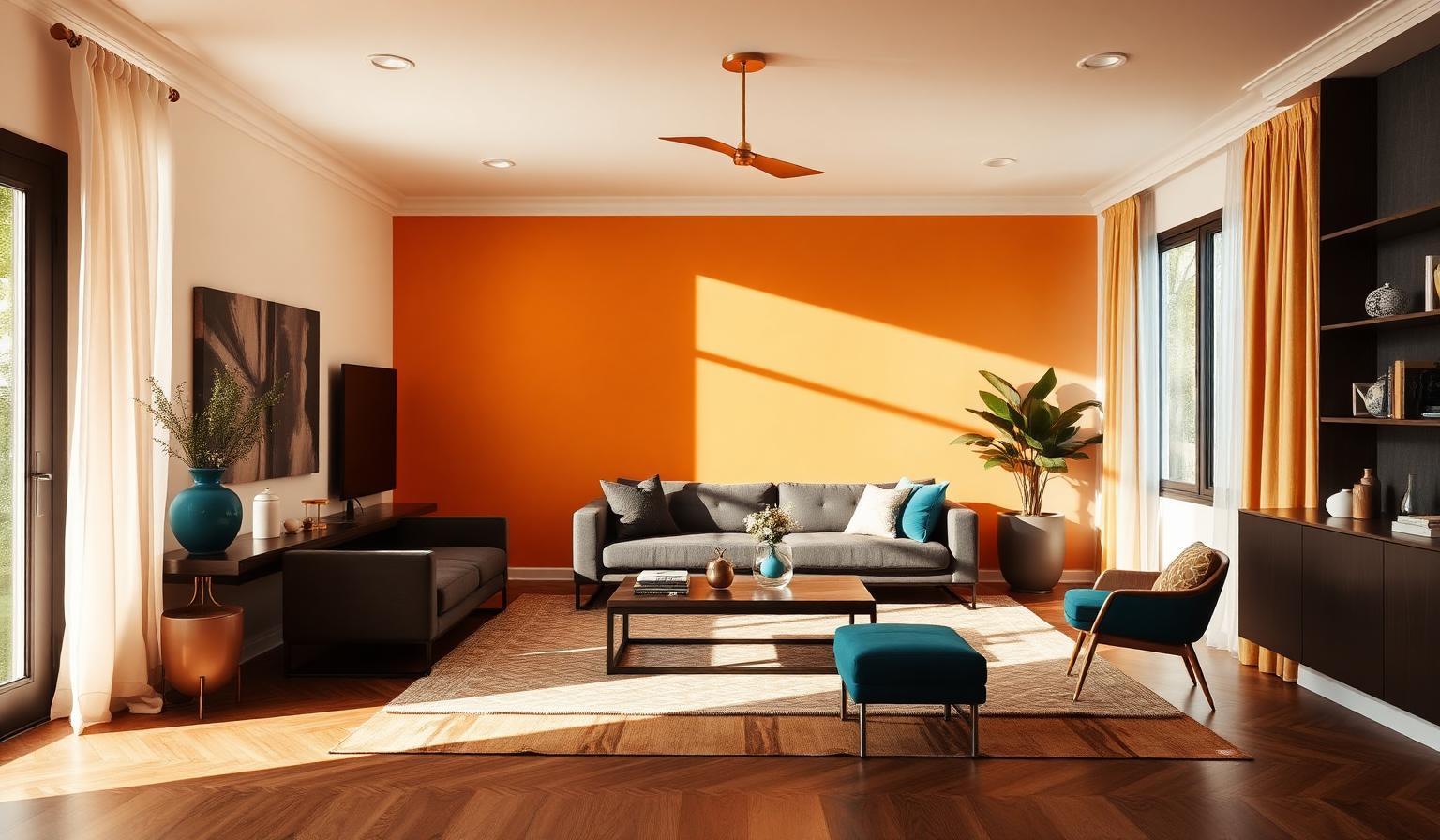
The Direct Answer: What Colors Go With Persimmon Orange Paint?
If you are wondering what colors go with persimmon orange paint, the short answer is that this warm, energetic hue partners beautifully with three distinct color families: soft neutrals that let it breathe, cool complements that sharpen its vibrancy, and analogous warm tones that amplify its autumnal personality.
Persimmon orange — a saturated orange-red somewhere between a ripe fruit and a glowing sunset — demands intentional pairing. Used without support, it can overwhelm a room or a brand. Used with the right companions, it becomes the confident focal point that makes a space feel welcoming, creative, and alive.
This guide gives you the exact HEX codes, four ready-to-use palettes, the psychology behind each pairing, and practical advice for using persimmon orange in interiors, branding, and digital design.
Understanding Persimmon Orange: The Hero Color
Persimmon orange sits at the intersection of red's passion and yellow's optimism. It is less aggressive than pure red, more sophisticated than tangerine, and more energetic than rust. Its HEX code #EC5800 places it in the orange-red quadrant of the color wheel, giving it a warm undertone that reads as friendly, enthusiastic, and slightly exotic.
In interior design, persimmon works best as an accent or feature color rather than a full-room wash. In branding, it signals creativity, appetite, and approachable energy — which is why it appears frequently in food, lifestyle, and children's product identities. For a deeper look at how orange functions commercially, see our guide to orange color in branding: from playful to professional.
Neutral & Earthy Pairings: Let Persimmon Take Center Stage
The safest and most versatile answer to what colors go with persimmon orange paint is a neutral palette. Neutrals provide visual rest, allowing persimmon to pop without competing for attention.
Creamy White (#F5F5DC)
Creamy white is the ideal wall color when persimmon orange appears on trim, furniture, or artwork. Unlike stark pure white, creamy white shares persimmon's warm undertone, so the transition between the two feels harmonious rather than jarring. Use it in living rooms, bedrooms, and kitchens where you want brightness without coldness.
Soft Beige (#F5DEB3)
Soft beige deepens the palette slightly and adds an organic, sandy quality. This pairing is excellent for relaxed, earthy interiors — think Mediterranean-inspired living rooms or California-casual bedrooms. Beige grounds persimmon and keeps it from feeling too electric.
Charcoal Gray (#36454F)
Charcoal gray is the sophisticated counterweight to persimmon's warmth. Use it for media consoles, office furniture, or exterior trim. The high contrast between warm orange and cool dark gray creates a modern, editorial look that feels intentional rather than accidental.
Earthy Brown (#8B4513)
Earthy brown reinforces persimmon's autumnal, harvest-time associations. Leather sofas, walnut floors, and terracotta accessories all lean into this relationship. For more on building warm, grounded palettes, explore our earth tone color palette guide.
Cool Complements: Sharpen the Contrast
On the color wheel, blue sits opposite orange, making blue-based hues the natural complement to persimmon. These cool pairings create visual tension and make persimmon appear even more vivid.
Dusty Blue (#6699CC)
Dusty blue softens the classic orange-blue contrast into something livable and refined. It is less severe than navy and less tropical than turquoise, making it ideal for bedrooms, nurseries, and lifestyle branding. Pair persimmon textiles with dusty blue walls for a balanced, approachable scheme.
Teal (#008080)
Teal is where green meets blue, and it is one of the most sophisticated partners for persimmon orange. A teal backsplash behind persimmon kitchen cabinets, or a teal velvet chair against a persimmon accent wall, creates a dynamic but grown-up energy. This combination feels both coastal and cosmopolitan.
Deep Navy (#000080)
Deep navy provides maximum contrast and maximum elegance. Use navy as the dominant color in a room — walls, large furniture, or brand backgrounds — and let persimmon serve as the accent in pillows, artwork, or CTAs. The result is confident, timeless, and visually arresting.
For the theory behind why these pairings work, read our designer's guide to complementary colors explained.
Analogous Pairings: Turn Up the Warmth
Analogous colors sit next to each other on the color wheel. For persimmon orange, that means golden yellows and burnt siennas. These combinations are warm, energetic, and unapologetically autumnal.
Golden Yellow (#FFD700)
Golden yellow amplifies persimmon's sunny side. Together they create a palette that feels like late afternoon light — warm, optimistic, and slightly nostalgic. Use this pairing sparingly; both colors are high energy, so let one dominate and the other accent.
Burnt Sienna (#E97451)
Burnt sienna is persimmon's quieter cousin. It deepens the palette and adds a weathered, artisanal quality. This is the perfect choice when you want warmth without the full brightness of persimmon — for example, on larger surfaces like rugs, upholstery, or background colors.
Four Designer Palettes for Persimmon Orange
Each palette below solves a different design problem. Choose the one that matches your space, light, and mood.
Palette 1 — The Modern Neutral Living Room
For a living room that feels current but cozy.
- Walls: Creamy White #F5F5DC
- Accent wall or built-in: Persimmon Orange #EC5800
- Sofa: Charcoal Gray #36454F
- Wood tones: Earthy Brown #8B4513
- Textiles: ivory, sand, and persimmon throw pillows
Why it works: the neutral envelope contains the energy of persimmon, while the gray sofa keeps the room from feeling too thematic.
Palette 2 — The Bold Kitchen
For homeowners who want personality without kitsch.
- Cabinets: Persimmon Orange #EC5800
- Backsplash: Teal #008080 in matte ceramic tile
- Countertops: warm white quartz with subtle gray veining
- Hardware: brushed brass
- Walls: Soft Beige #F5DEB3
Why it works: teal's coolness cuts through the warmth of persimmon and brass, creating a balanced triad that feels both retro and modern.
Palette 3 — The Autumn Bedroom
For a bedroom that wraps around you.
- Walls: Burnt Sienna #E97451 in matte finish
- Bedding: Persimmon Orange #EC5800 duvet with cream sheets
- Accent chair: Deep Navy #000080
- Floor: warm oak or walnut
- Lighting: brass or black metal
Why it works: burnt sienna handles the large surface area, while persimmon delivers the focal punch. Navy adds just enough contrast to keep the room from feeling monochromatic.
Palette 4 — The Creative Brand Identity
For food, lifestyle, or children's brands that want to feel approachable and energetic.
- Primary brand color: Persimmon Orange #EC5800
- Secondary color: Dusty Blue #6699CC
- Accent color: Golden Yellow #FFD700
- Neutral background: Creamy White #F5F5DC
- Text color: Charcoal Gray #36454F
Why it works: persimmon carries the brand's energy, dusty blue adds trust and calm, and golden yellow provides highlight moments without stealing focus.
Color Psychology: What Persimmon Orange Communicates
Color psychology is not magic — it is pattern recognition. Persimmon orange triggers associations with harvest, fire, sunsets, and citrus, which makes it feel warm, abundant, and stimulating.
- Energy and enthusiasm: Persimmon is more active than peach and more inviting than red. It encourages interaction.
- Creativity and playfulness: The hue sits outside the corporate safety zone of blue and gray, signaling originality.
- Appetite and conviviality: Like most warm oranges, persimmon stimulates appetite and social connection, which is why it works in kitchens and dining spaces.
- Autumn and transition: Its red-orange character evokes falling leaves and harvest seasons, making it ideal for seasonal campaigns and transitional spaces.
The key psychological risk is overuse. Too much persimmon can feel agitating or juvenile. The palettes above solve this by surrounding it with calmer companions.
Practical Designer & Homeowner Takeaways
In Interiors
- Use persimmon on one dominant surface. One accent wall, a painted door, or a piece of large furniture is usually enough.
- Keep ceilings and trim light. Creamy white or soft beige prevents the room from feeling closed in.
- Add natural materials. Wood, leather, linen, and jute all soften persimmon's intensity.
- Choose warm metal finishes. Brass, copper, and bronze feel more harmonious with persimmon than chrome or nickel.
- Test in your actual light. Persimmon shifts dramatically between morning and afternoon sun; paint a sample board and move it around the room.
In Branding and Digital Design
- Use persimmon for CTAs and highlights. It draws the eye without the urgency of red.
- Pair with navy or charcoal for readability. Persimmon text on dark backgrounds works; persimmon text on light backgrounds rarely does.
- Limit analogous warm accents. Golden yellow works best as a 5-10% accent, not a secondary color.
- Consider your audience. Persimmon skews friendly and creative — ideal for food, wellness, education, and lifestyle, less so for finance or law.
Complete Color Reference Table
| Item | Color | Hex | Color Name | Psychological Meaning |
|---|---|---|---|---|
| 1 | #EC5800 | Persimmon Orange | Hero | Energy, enthusiasm, creativity, warmth |
| 2 | #F5F5DC | Creamy White | Neutral | Calm, clarity, openness, softness |
| 3 | #F5DEB3 | Soft Beige | Neutral | Comfort, earthiness, warmth, relaxation |
| 4 | #36454F | Charcoal Gray | Neutral | Sophistication, grounding, modernity, balance |
| 5 | #8B4513 | Earthy Brown | Earth Tone | Stability, nature, reliability, harvest |
| 6 | #6699CC | Dusty Blue | Cool Complement | Trust, serenity, clarity, approachability |
| 7 | #008080 | Teal | Cool Complement | Depth, sophistication, coastal calm, balance |
| 8 | #000080 | Deep Navy | Cool Complement | Authority, elegance, stability, focus |
| 9 | #FFD700 | Golden Yellow | Analogous | Optimism, joy, abundance, illumination |
| 10 | #E97451 | Burnt Sienna | Analogous | Warmth, craftsmanship, earthiness, comfort |
Common Mistakes When Using Persimmon Orange
Pairing It With Too Many Warm Colors
Persimmon + golden yellow + burnt sienna + beige can quickly become a warmth overload. Always include at least one cool or neutral counterweight.
Using It in Low-Light Rooms Without Support
Persimmon can turn muddy in north-facing or dim rooms. If your light is cool or weak, pair it with creamy white and add warm artificial lighting.
Forgetting About Finish
A high-gloss persimmon door feels glamorous; a matte persimmon wall feels cozy. The same color behaves differently depending on sheen, so specify finish as carefully as hue.
Conclusion: Make Persimmon Orange Work for You
So, what colors go with persimmon orange paint? The best partners are creamy white and soft beige for calm, charcoal gray and earthy brown for grounding, dusty blue and teal for sophisticated contrast, and golden yellow and burnt sienna for warm harmony. The right choice depends on whether you want persimmon to whisper or shout.
Use the palettes and HEX codes in this guide as a starting point, then adjust for your light, materials, and personal taste. And when you are ready to build a complete, balanced palette around persimmon orange — or any other color — try the Coloracci AI palette generator. It translates your starting color into ready-to-use combinations for interiors, branding, and digital design.