What Colors Go With Chartreuse? A Designer's Guide to Mastering the Electric Hue
· Coloracci Team
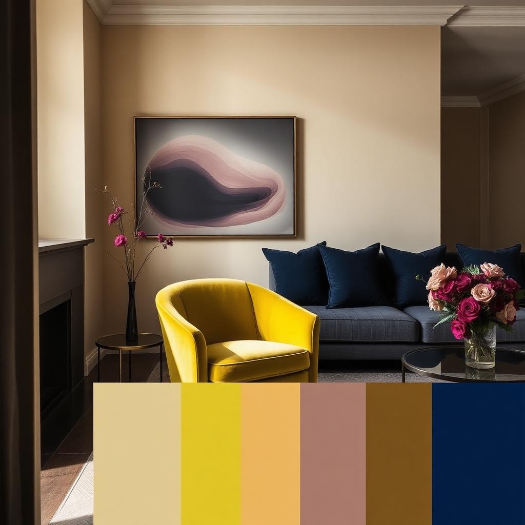
The Direct Answer: What Colors Go With Chartreuse?
If you are asking what colors go with chartreuse, the short answer is that this electric green-yellow works beautifully with three distinct families: clean neutrals that let it breathe, deep bold hues that ground its voltage, and analogous greens and yellows that amplify its energy. The exact HEX codes that matter most are Chartreuse #7FFF00, Crisp White #FFFFFF, Charcoal #36454F, Soft Beige #F5F5DC, Deep Magenta #8B008B, Navy #000080, Lime #32CD32, and Sunny Yellow #FFFF00.
Chartreuse is not a subtle color. It sits at the high-energy intersection of green and yellow, closer to neon than to sage. That makes it one of the most useful accent colors in a designer's toolkit and one of the easiest to misuse. Pair it well and it feels creative, optimistic, and unforgettable. Pair it carelessly and it can feel cheap or visually aggressive. This guide covers the exact HEX codes, the palettes that tame or amplify chartreuse, the psychology behind each pairing, and practical rules for using it in interiors, branding, and digital design.
Understanding Chartreuse: The Electric Hue
Chartreuse is named after the French liqueur produced by Carthusian monks since the 1740s, and like the drink, the color has a strong, distinctive personality. The most common reference value is #7FFF00, a vivid green-yellow that sits at roughly 90° on the HSL color wheel. More yellow-dominant versions such as #DFFF00 push the hue closer to pure yellow while keeping a sharp green edge.
Because chartreuse is a secondary mix, it inherits traits from both parents:
- From green: freshness, nature, renewal, and life.
- From yellow: optimism, energy, warmth, and attention.
The result is a color that reads as alert, modern, and slightly rebellious. It is not a background color. It is a foreground color, a statement color, a "look here" color. Understanding that is the first step to answering what colors go with chartreuse correctly.
Chartreuse Color Psychology: What It Communicates
Color psychology is not universal mysticism; it is pattern recognition built from nature, culture, and repeated exposure. Chartreuse triggers associations with spring buds, citrus peel, high-visibility safety gear, neon signage, and modern technology.
- Energetic and optimistic: The yellow component makes chartreuse feel sunny, confident, and forward-looking.
- Innovative and tech-forward: Chartreuse is common in gaming, esports, and startup branding because it reads as cutting-edge rather than traditional.
- Natural but vivid: It connects to plant life, but the saturated version is more "electric plant" than "forest calm."
- Youthful and playful: Brands targeting younger audiences often use chartreuse to signal creativity and irreverence.
The main psychological risk is overstimulation. Chartreuse at full saturation demands attention, and too much of it can create visual fatigue or anxiety. The palettes below are designed to channel that energy rather than let it run wild.
Palette 1 — Neutrals That Ground: What Colors Go With Chartreuse for a Clean, Modern Look
This is the safest and most versatile answer to what colors go with chartreuse. Clean neutrals give the eye a place to rest, allowing chartreuse to function as a precise accent without overwhelming the space.
- Hero accent: Chartreuse #7FFF00
- Primary background: Crisp White #FFFFFF
- Grounding neutral: Charcoal Gray #36454F
- Warm neutral: Soft Beige #F5F5DC
- Optional metallic: brushed nickel or matte black
Why it works. White maximizes the perceived brightness of chartreuse, making it feel crisp and intentional. Charcoal provides a sophisticated dark anchor that makes chartreuse pop without looking childish. Beige softens the contrast and introduces warmth, which is useful in residential or hospitality spaces where pure white can feel cold. This is the classic "white gallery wall with one chartreuse sculpture" palette — restrained, curated, and confident.
Where to use it: minimalist interiors, tech and SaaS landing pages, contemporary product packaging, fitness branding, modern kitchen accents, and clean editorial design.
If you want to explore how minimal palettes can be built around a single hero accent, our minimalist color palette guide walks through the exact principles designers use to keep a restrained scheme from feeling boring.
Palette 2 — Bold & Contrasting: Deep Magenta and Navy
For designers who want chartreuse to feel like a power move, the right bold partners create high-contrast, high-attention compositions. These are the colors that sit opposite or near-opposite chartreuse on the color wheel.
- Hero accent: Chartreuse #7FFF00
- Primary contrast: Deep Magenta #8B008B
- Deep anchor: Navy Blue #000080
- Soft relief: Warm White #FAF9F6
- Accent metal: brass or gold
Why it works. Deep magenta is the classic near-complement to chartreuse, sitting roughly opposite on the color wheel. That opposition creates maximum visual tension, which is exactly what makes the pair feel energetic and modern. Navy steps in as a calm, authoritative third color that prevents the pairing from feeling like a carnival. Warm white keeps the overall composition breathable. Use this palette when you want to signal innovation, confidence, and creative daring.
Where to use it: creative agency branding, editorial and fashion campaigns, event graphics, music and entertainment branding, packaging for premium lifestyle products, and statement walls in contemporary interiors.
The relationship between chartreuse and magenta is a textbook example of complementary color contrast. Our complementary colors examples guide explains the science behind why opposites on the color wheel create this kind of visual electricity.
Palette 3 — Analogous Energy: Lime and Sunny Yellow
When you want chartreuse to feel like a continuous wave of energy rather than a single accent, pair it with its closest neighbors on the color wheel. This is the analogous approach, and it is the most harmonious way to use chartreuse at larger scale.
- Hero accent: Chartreuse #7FFF00
- Cooler neighbor: Lime Green #32CD32
- Warmer neighbor: Sunny Yellow #FFFF00
- Grounding neutral: Stone Gray #928E85
- Relief color: Off-White #F8F8F0
Why it works. Lime green and sunny yellow share chartreuse's fundamental hue family, so they blend visually without competing. The palette reads as energetic, fresh, and organic — like a gradient of spring leaves and citrus. Stone gray is critical here: without it, the three yellow-greens can feel cloying or acidic. It provides the neutral weight that turns a bright color scheme into a usable design palette.
Where to use it: wellness and food branding, children's products, spring-themed campaigns, packaging for organic products, bright home offices, and casual hospitality interiors.
Because this palette relies on neighbors rather than opposites, it is an excellent example of analogous harmony. Our analogous colors examples guide breaks down why adjacent colors on the wheel feel naturally cohesive.
Practical Designer & Homeowner Takeaways
Choosing the Right Chartreuse Value
Not all chartreuse values are interchangeable. Use the value that matches the job:
- Full saturation #7FFF00 → logos, CTAs, small accents, sports graphics, packaging details. Never use this as a dominant wall color unless you are designing an immersive experience.
- Yellow-dominant #DFFF00 → when you want a warmer, more optimistic energy that leans closer to pure yellow.
- Desaturated or muted chartreuse → larger surfaces such as upholstery, accent walls, or branding backgrounds where the electric version would be too intense.
Using Chartreuse in Interiors
In a room, chartreuse is best treated as a 10% accent color. A single chartreuse chair, lamp, or artwork delivers more impact than four chartreuse walls. For paint, consider softer versions of the hue — approximately #A8C256 or #B5D048 — which keep the chartreuse character but do not vibrate on the walls. Pair chartreuse walls with crisp white trim and charcoal or navy furniture for a modern, gallery-like result.
Using Chartreuse in Branding and UI
- CTAs and buttons: Chartreuse on white or charcoal can outperform safer green buttons because the color is impossible to ignore. Test accessibility contrast carefully; the yellow-green can fail WCAG against light backgrounds.
- Data visualization: Chartreuse is excellent for highlighting one key data point, especially against navy or charcoal backgrounds.
- Brand personality: Use chartreuse when the brand wants to feel energetic, youthful, innovative, or slightly rebellious. Avoid it for luxury, medical, or corporate-conservative brands where it can feel out of place.
Materials and Finishes That Complement Chartreuse
- Matte black and charcoal make chartreuse feel sophisticated and urban.
- Warm wood tones such as oak, walnut, and ash soften chartreuse and keep it from feeling synthetic.
- Brass and gold bridge the warm yellow undertone and add a premium layer.
- Natural stone such as travertine, limestone, and concrete gray pair well because their neutral, earthy quality absorbs chartreuse's energy.
Complete Color Reference Table
| Item | Color | Hex | Color Name | Psychological Meaning |
|---|---|---|---|---|
| 1 | #7FFF00 | Chartreuse | Hero | Optimistic, electric, energetic, innovative |
| 2 | #DFFF00 | Yellow-Chartreuse | Hero Variant | Warm, sunny, bold, attention-grabbing |
| 3 | #FFFFFF | Crisp White | Neutral | Clean, breathable, modern, clarity |
| 4 | #36454F | Charcoal Gray | Neutral | Grounding, sophisticated, weight, contrast |
| 5 | #F5F5DC | Soft Beige | Neutral | Warmth, softness, organic, calm |
| 6 | #8B008B | Deep Magenta | Bold Complement | Drama, creativity, contrast, boldness |
| 7 | #000080 | Navy Blue | Bold Anchor | Authority, depth, calm, sophistication |
| 8 | #FAF9F6 | Warm White | Relief | Softness, openness, airiness, rest |
| 9 | #32CD32 | Lime Green | Analogous | Fresh, natural, vibrant, youthful |
| 10 | #FFFF00 | Sunny Yellow | Analogous | Joy, optimism, energy, warmth |
| 11 | #928E85 | Stone Gray | Analogous Ground | Stability, earthiness, balance, calm |
| 12 | #F8F8F0 | Off-White | Analogous Relief | Clean, gentle, space, neutrality |
Common Mistakes When Using Chartreuse
Overusing the Saturated Hue
The most common mistake is treating chartreuse like a neutral base. A room, website, or logo that is 50% pure #7FFF00 will feel exhausting. Use the full saturation color as a 10–20% accent and surround it with generous neutral space.
Pairing With Cool Grays
Cool blue-grays can make chartreuse look sickly or cheap. The green-yellow already has a cool edge, and a blue-gray background can push it toward an unpleasant neon-garbage tone. Choose warm grays, beiges, charcoals, or navy instead.
Ignoring Contrast in Digital Use
Chartreuse on white can be surprisingly low in contrast depending on the exact shade. Always check the WCAG contrast ratio before using chartreuse for body text or small UI elements. It is almost always better as an accent color behind dark text or as a large element on a dark background.
Mixing Too Many Bold Colors
The Bold & Contrasting palette works because it has a clear hierarchy: chartreuse, magenta, navy, and warm white. Add orange, red, and purple into the same composition and the palette collapses into visual noise. Limit the saturated palette to three main colors plus neutrals.
Forgetting the Light Source
Under warm incandescent light (2700K), chartreuse intensifies and can feel almost orange. Under cool daylight (5000K+), it leans greener and more acidic. Test paint swatches and fabric samples under the actual lighting of the space before committing.
Chartreuse in 2026: Why It Still Matters
Chartreuse has moved from trend color to recurring design staple because it satisfies two contradictory needs at once: it connects to nature and sustainability, and it signals technology and innovation. In 2026, it appears in eco-friendly product branding, esports identities, contemporary interiors, and bold fashion styling. It is particularly effective in hybrid spaces — such as biophilic offices and wellness tech products — where the brand wants to feel both natural and forward-thinking.
Unlike pure neon green, chartreuse has enough yellow warmth to feel approachable. Unlike pure yellow, it has enough green to feel grounded. That balance is what keeps it relevant across decades.
Conclusion: Master Chartreuse by Choosing the Right Partners
So, what colors go with chartreuse? The answer depends on the energy you want to create. For a clean, modern result, pair chartreuse with crisp white, charcoal, and soft beige. For high-drama contrast, use deep magenta and navy. For harmonious, continuous energy, blend it with lime green and sunny yellow. The common thread is restraint: chartreuse is the star, and the other colors are the stage.
Use the exact HEX codes and palettes above as your starting point, then adjust for your medium, lighting, and brand personality. And when you are ready to build a complete palette around chartreuse or any other starting color, try the Coloracci AI palette generator. It transforms a single color into fully balanced combinations for interiors, branding, and digital projects. For a deeper look at the theory behind these pairings, our guide to complementary colors examples is a natural next step.