What Colors Complement Persimmon? A Designer's Guide to Stunning Interiors
· Coloracci Team
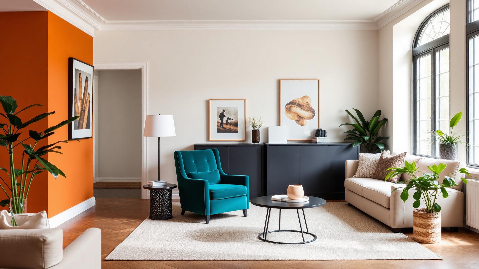
The Short Answer
If you are asking what colors complement persimmon for interior design, the direct answer is four families: deep teal (#008B8B) as the true optical opposite, cool gray (#A9A9A9) as the tension-breaker, creamy off-white (#F5F5DC) as the breathing room, and earthy greens like olive and sage (#808000, #9CAF88) as the natural partner. Persimmon itself sits at #EC5800 — a saturated orange-red with enough red in it to feel like a warm neutral's louder cousin, and enough orange to bounce light around a room.
Everything below is the reasoning, the exact HEX values, and the ratios that keep persimmon from taking over a space.
Understanding Persimmon Before You Pair It
Persimmon (#EC5800) is roughly 22° on the hue wheel — orange with a red bias. In HSL it reads about 216°... more usefully: hue 22, saturation 100%, lightness 46%. That combination of full saturation with mid lightness is what makes it difficult. It has the punch of a primary and the warmth of an earth tone at the same time.
Two consequences follow. First, persimmon advances visually — a persimmon wall looks closer than it is, which shrinks small rooms and focuses large ones. Second, it changes character dramatically with light temperature. Under 2700K incandescent light it deepens toward rust; under cool north daylight it flattens toward a brick red; under 4000K LEDs it can look aggressively synthetic. Always sample it on two walls of the actual room.
For the underlying temperature mechanics at work here, our guide to warm vs cool colors and how temperature shifts perception covers why advancing hues behave this way.
What Colors Complement Persimmon for Interior Design: The Core Palette
Deep Teal — #008B8B (Dark Cyan)
This is the textbook complement. Persimmon's complementary opposite lands in the cyan-teal band, and #008B8B is the version that works in real rooms rather than on a color wheel diagram. Because teal is a shaded complement rather than a bright one, it absorbs persimmon's energy instead of fighting it — you get vibration without visual noise.
Use it on upholstery, cabinetry, or a single ceramic-glazed surface. A teal velvet armchair against a persimmon wall is one of the most reliable moves in warm-palette interiors.
Cool Gray — #A9A9A9 (Dark Gray)
Neutral gray is the pressure-release valve. Persimmon is high-arousal; a mid-value cool gray is the only neutral that lowers the room's temperature without introducing a competing hue. It also makes persimmon read as intentional, which beige never quite manages.
Best applied to large soft surfaces: rugs, linen curtains, a sectional sofa. Keep it slightly cool (blue-leaning) — a warm greige will muddy against persimmon and make both look dirty.
Creamy Off-White — #F5F5DC (Beige / Cream)
Pure white is too clinical next to persimmon; the contrast is so hard that it turns the orange plasticky. A creamy off-white with a yellow bias shares persimmon's warmth while providing 80%+ light reflectance. This is your ceiling, trim, and majority wall color in almost every persimmon scheme.
Practical picks in the same family: Benjamin Moore White Dove OC-17, Farrow & Ball Wimborne White No. 239.
Olive Green — #808000
Olive is persimmon's analogous-adjacent partner via the natural world: think ripe fruit against foliage. It has enough yellow to harmonize and enough green-gray to stay quiet. Olive velvet, olive-painted joinery, or simply large plants will do the same work.
Sage Green — #9CAF88
The softer, more contemporary alternative to olive. Sage keeps the botanical logic but lowers the saturation, which suits smaller rooms and bedrooms where olive would feel heavy. If sage is doing most of the work in your scheme, our guide to what colors go with sage green walls maps the rest of that palette.
Charcoal — #36454F
Not a complement so much as a frame. Charcoal window frames, black-iron legs, and dark joinery give persimmon a boundary. Without a dark value somewhere in the room, a persimmon scheme floats.
Warm Brass — #B5A642
Metals matter here. Brass and aged gold sit inside persimmon's warm family and reinforce the autumn-harvest association. Chrome and cool nickel fight it. Choose brass, bronze, or blackened steel.
Terracotta — #C1613C
A deliberately lower-saturation sibling. Terracotta lets you extend persimmon across more surfaces without escalating the intensity — a persimmon accent wall with terracotta cushions reads as a considered gradient rather than a single loud gesture. This kind of layering is the backbone of a full earth tone color palette.
Five Persimmon Color Combinations That Work in Real Rooms
1. The Modern Complement — Persimmon + Deep Teal + Cream
- Persimmon #EC5800 (10% — accent wall or a single statement piece)
- Deep Teal #008B8B (20% — upholstery, cabinetry)
- Creamy Off-White #F5F5DC (60% — walls, ceiling, trim)
- Charcoal #36454F (10% — frames, lighting, hardware)
The highest-contrast option and the most photogenic. Ideal for living rooms with good natural light and mid-century furniture. The teal must be deep; a bright turquoise makes the pairing look like a sports team.
2. The Grounded Harvest — Persimmon + Olive + Cream
- Creamy Off-White #F5F5DC (55%)
- Olive Green #808000 (25%)
- Persimmon #EC5800 (12%)
- Warm Brass #B5A642 (8%)
The autumn palette done properly. Warm, edible, conversational — this is the scheme for dining rooms and kitchens, where persimmon's appetite-stimulating effect is a feature rather than a side effect.
3. The Quiet Modern — Persimmon + Cool Gray + White
- Cool Gray #A9A9A9 (45%)
- Soft White #FAFAF7 (35%)
- Persimmon #EC5800 (15%)
- Charcoal #36454F (5%)
For contemporary apartments and anyone nervous about color. Persimmon appears only in textiles and one artwork; the gray does the structural work. This is the lowest-risk entry point.
4. The Bohemian Layer — Persimmon + Sage + Terracotta + Cream
- Cream #F5F5DC (40%)
- Sage Green #9CAF88 (25%)
- Terracotta #C1613C (20%)
- Persimmon #EC5800 (15%)
An analogous-plus-green scheme with no hard contrast anywhere. Excellent for bedrooms, reading nooks, and rooms with a lot of natural texture — rattan, jute, unglazed ceramics.
5. The Dramatic Kitchen — Persimmon + Charcoal + Brass
- Charcoal #36454F (45% — lower cabinetry)
- Cream #F5F5DC (30% — walls, upper surfaces)
- Persimmon #EC5800 (17% — island or splashback)
- Warm Brass #B5A642 (8% — hardware, fixtures)
High drama, high resale risk, high reward. Works best where the persimmon surface is replaceable (a splashback, a painted island) rather than structural.
The Color Psychology of Persimmon
Persimmon inherits the orange family's psychological profile and intensifies it with red. The documented associations cluster around four effects:
Energy and stimulation. Long-wavelength colors raise physiological arousal slightly — measurable in heart rate and skin conductance. In interiors this translates to rooms that feel active rather than restful, which is exactly why persimmon belongs in living rooms, kitchens, entryways, and studios, and rarely in bedrooms above accent quantities.
Warmth and welcome. Orange is the most consistently rated "friendly" hue across cross-cultural studies. A persimmon entryway does real work on how a house feels within the first three seconds of walking in.
Appetite and conversation. The appetite association is well established in food and hospitality design; the conversational effect follows from arousal plus warmth. Persimmon dining rooms genuinely produce livelier tables.
Creativity and autumn. Persimmon reads as harvest, terracotta, ripe fruit, late light. It carries seasonal nostalgia, which is why it feels grounded even at full saturation — unlike, say, a saturated magenta.
The catch: arousal that is pleasant for two hours is exhausting for eight. Persimmon's psychological benefits are dose-dependent, which is the whole argument for the 10–20% ratios above.
Persimmon Color Reference Table
| Item | Color | Hex | Color Name | Psychological Meaning |
|---|---|---|---|---|
| Accent wall | Persimmon | #EC5800 | Persimmon Orange | Energy, warmth, appetite, creativity |
| Statement chair | Deep Teal | #008B8B | Dark Cyan | Calm, balance, sophistication |
| Sofa / rug | Cool Gray | #A9A9A9 | Dark Gray | Neutrality, restraint, modernity |
| Walls & trim | Creamy White | #F5F5DC | Beige / Cream | Openness, light, softness |
| Joinery / drapery | Olive Green | #808000 | Olive | Nature, stability, maturity |
| Bedroom walls | Sage Green | #9CAF88 | Sage | Restoration, quiet, growth |
| Frames & hardware | Charcoal | #36454F | Charcoal | Structure, weight, definition |
| Metals & lighting | Warm Brass | #B5A642 | Antique Brass | Luxury, heritage, warmth |
| Cushions & ceramics | Terracotta | #C1613C | Terracotta | Grounding, craft, earthiness |
Practical Takeaways for Designers and Homeowners
Cap persimmon at 10–20% of visible surface. The single most common failure with interior design with orange is over-application. One wall, or one large object, plus small echoes elsewhere.
Give it a cool counterweight. Every successful persimmon room contains something distinctly cool — teal, blue-gray, or a cool-leaning gray. Warm-on-warm-on-warm collapses into a sunset cliché.
Choose sheen carefully. Persimmon at full saturation in a satin or semi-gloss finish looks like signage. Matte or eggshell absorbs enough light to keep it architectural.
Watch your undertone neighbors. Persimmon's red bias clashes with pink-based beiges and cool lavender-grays. Test any existing flooring against a sample before committing — orange-toned oak amplifies persimmon; gray-washed floors calm it.
Use the ceiling. In rooms with generous height, painting the ceiling in the cream (#F5F5DC) rather than a stark white keeps persimmon from looking stranded.
Think in seasons. Persimmon-heavy textiles are easy to rotate. If you want the color without the commitment, buy the throw, the cushions, and the art rather than the paint.
Conclusion
The question of what colors complement persimmon for interior design has a stable answer: deep teal for contrast, cool gray for restraint, creamy off-white for space, and earthy greens for harmony — with charcoal and brass as the structural frame. Persimmon (#EC5800) is a generous color when it is given a supporting cast and a strict ratio, and an overwhelming one when it is not.
Start with one surface, add the cool counterweight, and let the cream carry the room.
Ready to build your own version? Use the Coloracci AI palette generator to generate a full persimmon-based interior scheme with exact HEX codes, harmony variants, and contrast checks — or explore related pairings in our guide to what colors go with persimmon orange paint.