What Colors Go With Sage Green Walls? A Designer's Guide
· Coloracci Team
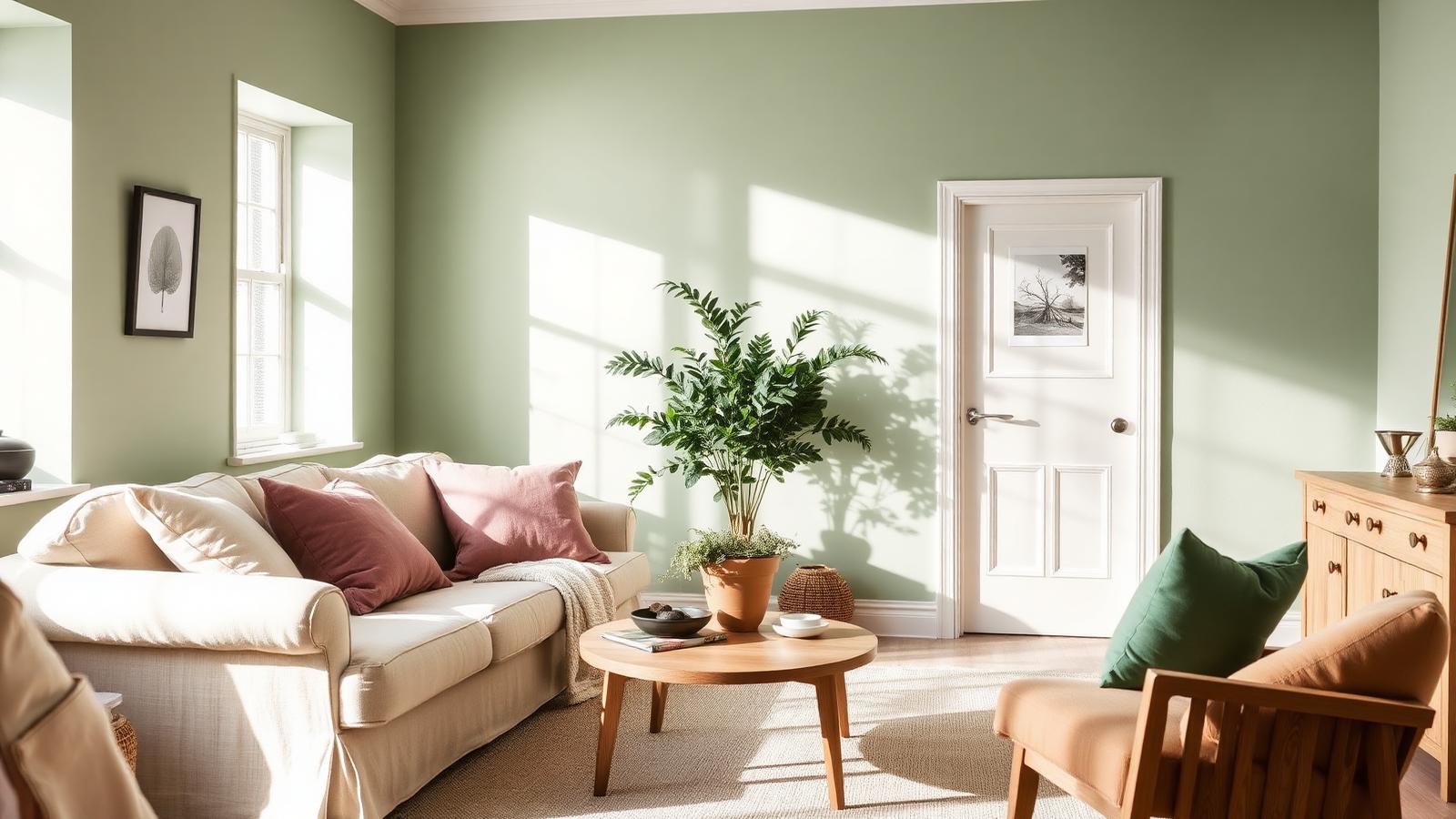
The Short Answer: What Colors Go With Sage Green Walls?
If you are wondering what colors go with sage green walls, the designer's answer is this: sage is a muted, gray-tinted green, so it behaves like a soft neutral rather than a loud color. That means it pairs beautifully with warm off-whites, blush and dusty rose, terracotta and clay, maroon, lavender, mustard yellow, soft blues, and grounding charcoal. The HEX codes that matter most are Sage #B2AC88, #9CAF88, and #8A9A5B, alongside Dusty Rose #D9AAB7, Cream #F2E8CF, Terracotta #A05E49, Beige #DDCDBE, Creamy White #F5F5DC, Charcoal Gray #36454F, Light Gray #D3D3D3, and Mustard Yellow #FFDB58.
Sage green walls have become one of the most requested paint choices of the decade, and for good reason. Sage sits at the intersection of green and gray, which strips out the brightness of a true green and leaves behind something calm, organic, and sophisticated. But that gray undertone is exactly what makes pairing tricky: choose a partner color that is too saturated and the sage goes dull; choose one that is too cool and the whole room reads slightly gray-green and lifeless. This guide breaks down the exact combinations that work, why they work, and how to apply them room by room.
Understanding Sage Green: The Three HEX Codes You Need
"Sage" is not a single color. It is a family of muted greens, all sharing a desaturated, dusty character borrowed from the herb's silvery leaves. Three values cover most of what you will encounter on a paint chip:
- Sage #B2AC88 — the warmest and most neutral of the three, leaning slightly toward khaki and beige. Reads almost like a warm greige in low light. The safest choice for whole-room walls.
- Sage #9CAF88 — the classic mid-tone sage, a clear but muted green with balanced warmth. This is the "sage green wall" most people picture.
- Sage #8A9A5B — a deeper, more olive-leaning sage with visible yellow in its base. Best for feature walls, cabinetry, and rooms with generous natural light.
- Sage #A9B6A9 — a cooler, grayer variant that behaves almost like a green-tinted gray, ideal for minimalist and Scandinavian interiors.
Before you commit to a partner color, identify which sage you actually have. Hold a pure white card against the wall: if the green looks yellow-toned next to the white, you have a warm sage (#B2AC88 or #8A9A5B) and should lean into warm partners like terracotta and cream. If it looks gray or slightly blue, you have a cool sage (#A9B6A9) and cooler partners like soft blue and light gray will look more intentional.
Sage Green Color Psychology: Why the Color Feels So Calm
Sage green is one of the most psychologically restorative colors available to an interior designer. Green sits at the center of the visible spectrum, requiring the least adjustment from the human eye, which is part of why green rooms are consistently rated as the most relaxing in perceptual studies. Sage takes that baseline calm and lowers the volume further by muting saturation with gray.
The associations are consistent across cultures and contexts:
- Nature and renewal. Sage recalls foliage, herb gardens, olive groves, and moss — living things without the intensity of tropical greens.
- Wisdom and maturity. The name itself carries the meaning. Muted greens have long been read as considered, grown-up, and unhurried.
- Tranquility and balance. Low saturation reduces visual stimulation, which is why sage performs so well in bedrooms, bathrooms, and reading rooms.
- Eco-credibility and reliability. In branding, sage signals sustainability, wellness, and honesty without the clichéd brightness of "eco green."
That psychological profile also explains sage's weakness: used alone, across every surface, it can tip from serene into flat or institutional. Every palette below includes at least one element with contrast or warmth specifically to prevent that.
Palette 1 — Soft & Romantic: What Colors Go With Sage Green Walls in a Bedroom
This is the pairing that has driven most of sage's recent popularity, and it is the strongest answer to what colors go with sage green walls in bedrooms, nurseries, and dressing rooms.
- Walls: Sage Green #B2AC88
- Textiles and accents: Dusty Rose #D9AAB7
- Bedding, trim, ceiling: Cream #F2E8CF
- Optional metal: aged brass or antique gold
The logic is complementary. Green and red sit opposite each other on the color wheel, but a saturated red against sage would be jarring. Dusty rose is red that has been muted and lightened to the same degree that sage has been muted — the two colors share an equal level of grayness, which is why they feel like they belong to the same family rather than fighting each other. Cream then softens the meeting point, adding warmth that keeps the pair from feeling chalky.
How to apply it: paint all four walls in sage, keep trim and ceiling in cream, and introduce dusty rose in exactly two or three places — a headboard, a throw, a pair of lampshades. Resist adding rose to the walls; the palette works because rose stays an accent.
Palette 2 — Earthy & Grounded: Sage With Terracotta and Beige
For living rooms, kitchens, and open-plan spaces, an earthy palette gives sage the warmth and weight it needs to carry a larger area.
- Walls: Sage Green #9CAF88
- Statement accent: Terracotta #A05E49
- Supporting neutral: Beige #DDCDBE
- Materials: oak, rattan, jute, unglazed clay, travertine
Terracotta is the single most reliable partner for sage because both colors come from the same source: earth pigments. Terracotta is iron-rich clay; sage is dried foliage. They co-occur constantly in nature — a potted plant on a clay pot is this exact palette — and the eye reads naturally co-occurring colors as harmonious. Beige bridges the two, sharing warmth with terracotta and desaturation with sage. If you want to go deeper into this family, our guide to the earth tone color palette maps out the full range of clay, ochre, and umber values that extend this scheme.
Ratio guidance: roughly 60% sage (walls), 30% beige (large upholstery, rugs, curtains), 10% terracotta (cushions, ceramics, one accent chair). Pushing terracotta past 15% tips the room from calm into rustic.
Palette 3 — Modern & Architectural: Sage, Creamy White, and Charcoal
When sage needs to look contemporary rather than cottage-like, contrast is the answer.
- Walls: Sage Green #8A9A5B
- Trim, ceiling, cabinetry: Creamy White #F5F5DC
- Contrast accent: Charcoal Gray #36454F
Charcoal does something no warm neutral can: it provides a true dark anchor. Without a dark value in the room, sage and cream both sit in the mid-to-light range, and the space reads soft but slightly unresolved. Adding charcoal in window frames, a light fixture, hardware, or a single piece of furniture creates the value contrast that makes every other color look more deliberate.
Because #8A9A5B is the deepest sage of the three, this palette suits rooms with strong natural light. In a north-facing or low-light room, drop back to #9CAF88 and keep charcoal to small metal details only.
Palette 4 — Fresh & Optimistic: Sage, Light Gray, and Mustard Yellow
For home offices, kitchens, and kids' spaces, a pop of yellow injects energy without breaking sage's calm.
- Walls: Sage #A9B6A9
- Neutral field: Light Gray #D3D3D3
- Energy accent: Mustard Yellow #FFDB58
Yellow and green are neighbors on the color wheel, which makes this an analogous scheme — the gentlest form of harmony available, because the eye moves between the colors without a jump. Mustard is yellow with the brightness pulled back, so it matches sage's muted register. Light gray keeps the palette crisp and prevents the yellow from reading as retro. If you want to build more schemes on this principle, our breakdown of analogous color examples shows how neighboring hues create instant cohesion across interiors and branding alike.
Practical note: mustard should stay under 10% of visible surface area. A single armchair, a set of open-shelf ceramics, or a framed print is enough.
Palette 5 — Tonal & Serene: Sage on Sage
If you want maximum calm, build the room entirely from sage's own value range: #8A9A5B on lower walls or cabinetry, #9CAF88 on upper walls, #A9B6A9 in textiles, and #F2E8CF on ceiling and trim. This is a monochromatic scheme, and it depends entirely on varying texture — linen, boucle, matte plaster, natural wood — to create the interest that color contrast usually provides. Our guide to monochromatic color schemes covers the value-stepping rules that keep this approach from flattening out.
Two More Pairings Worth Knowing: Maroon and Lavender
Beyond the five core palettes, two less obvious partners deserve mention.
Maroon (#800020) is the sophisticated evening version of the sage-and-rose pairing. Where dusty rose is soft and diffuse, maroon is deep and formal. Used on a velvet sofa or a set of dining chairs against sage walls, it produces a dining room that feels genuinely luxurious. It requires warm lighting — under cool LEDs, maroon and sage both go muddy.
Lavender (#C9B6D6) works because purple sits near green's complement while sharing sage's gray base. The combination is unexpected, slightly romantic, and excellent in bathrooms and creative studios. Keep lavender pale; at full saturation it competes with sage rather than complementing it.
The Complete Sage Green Reference Table
| Item | Color | Hex | Color Name | Psychological Meaning |
|---|---|---|---|---|
| Wall base (warm) | #B2AC88 | Warm Sage | Grounded calm, quiet maturity | |
| Wall base (classic) | #9CAF88 | Classic Sage | Nature, renewal, balance | |
| Wall base (deep) | #8A9A5B | Olive Sage | Wisdom, permanence, depth | |
| Wall base (cool) | #A9B6A9 | Gray Sage | Stillness, restraint, clarity | |
| Soft accent | #D9AAB7 | Dusty Rose | Tenderness, warmth, nostalgia | |
| Neutral field | #F2E8CF | Cream | Comfort, softness, openness | |
| Earth accent | #A05E49 | Terracotta | Craft, warmth, human touch | |
| Support neutral | #DDCDBE | Beige | Stability, ease, neutrality | |
| Trim / ceiling | #F5F5DC | Creamy White | Cleanliness with warmth | |
| Contrast anchor | #36454F | Charcoal Gray | Authority, structure, focus | |
| Cool neutral | #D3D3D3 | Light Gray | Modern restraint, quiet | |
| Energy accent | #FFDB58 | Mustard Yellow | Optimism, creativity, warmth | |
| Formal accent | #800020 | Maroon | Richness, tradition, gravity | |
| Unexpected accent | #C9B6D6 | Soft Lavender | Imagination, gentleness |
Practical Takeaways for Designers and Homeowners
1. Test sage in the actual room, at three times of day. Sage's gray component makes it more light-sensitive than almost any other paint family. Under warm evening bulbs it goes yellow-olive; under cool north light it can slide toward gray-blue. Paint a large sample board — at least 60 x 60 cm — and move it around the room before committing.
2. Never pair sage with a stark, blue-based white. Pure white (#FFFFFF) or a cool white trim makes sage look dirty by contrast. Use cream (#F2E8CF) or creamy white (#F5F5DC) for trim and ceilings; the shared warmth keeps the sage looking intentional.
3. Let natural materials do half the work. Sage's strongest visual relationships are with wood, stone, rattan, linen, and unglazed clay. A sage room with oak floors and a jute rug needs almost no additional color to feel complete.
4. Use the 60-30-10 rule strictly. Sage 60% (walls), a warm neutral 30% (large soft furnishings), an accent 10% (rose, terracotta, mustard, or maroon). Sage is forgiving on the walls but unforgiving when a saturated accent gets too much airtime.
5. Add one dark value to every sage room. Charcoal hardware, a black-framed mirror, a dark timber side table — a single dark anchor gives the eye a reference point and stops the palette from floating.
6. In north-facing rooms, choose the warmest sage available. #B2AC88 holds its character in cool light far better than #A9B6A9, which can turn genuinely gray.
7. For branding, sage plus cream reads eco; sage plus charcoal reads premium. If you are applying this palette to a logo or website rather than a wall, that single swap changes the entire market positioning.
Sage Green Beyond the Wall: Branding and Digital Use
The same rules translate to screens with one caveat: contrast ratios. Sage greens fall in the mid-luminance range, which means sage text on cream backgrounds will usually fail WCAG AA. Use sage as a background or large-surface color, and pair it with charcoal #36454F for body text — that combination clears AA comfortably at normal text sizes. For calls to action, terracotta #A05E49 provides enough hue separation from sage to draw the eye without breaking the palette's calm.
In brand identity work, sage carries an unusually consistent set of signals: sustainability, wellness, honesty, and unhurried quality. That is why it dominates skincare, herbal products, slow fashion, and boutique wellness studios. The risk is category sameness — if everyone in your sector uses sage, differentiate through the accent, not the base. A sage-and-maroon identity looks nothing like a sage-and-mustard identity, even though both start from the same green.
Conclusion: Sage Is a Neutral, So Treat It Like One
The most useful mental reframe when deciding what colors go with sage green walls is to stop treating sage as a green and start treating it as a warm neutral that happens to have a green cast. Once you do, the choices become obvious: pair it the way you would pair greige — with warm whites, one earthy accent, one dark anchor, and natural texture throughout. Dusty rose for softness, terracotta for warmth, mustard for energy, charcoal for structure, maroon for formality. Each one is a different room, and all five start from the same wall.
Ready to build your own version? Drop your sage HEX — #B2AC88, #9CAF88, or #8A9A5B — into the Coloracci palette generator and let it produce complementary, analogous, and monochromatic variations with exact HEX, RGB, and HSL values you can take straight to the paint counter or into your design file.