Warm Color Palettes That Will Transform Your North-Facing Living Room
· Coloracci Team
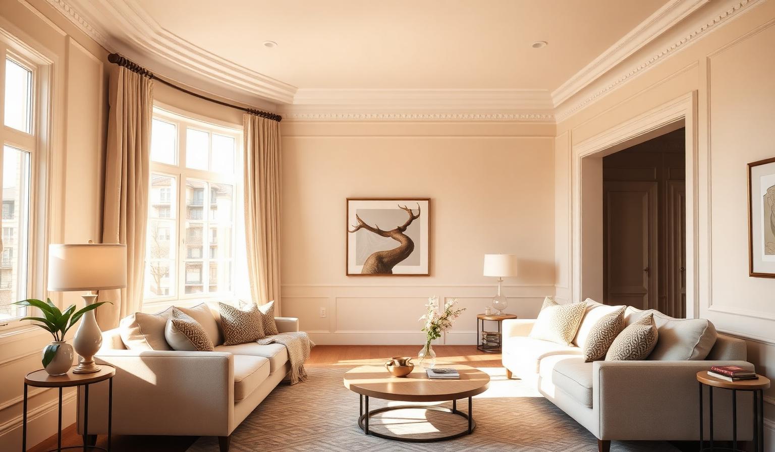
If you have ever wondered why your living room feels flat, gray, or subtly depressing no matter how much you love the sofa, the answer is almost never the furniture — it is the direction the room faces. Warm color palettes for north-facing living rooms are the single most effective design intervention you can make, because north-facing rooms receive cool, indirect light that drains the warmth out of every finish, fabric, and paint chip in the space. The fix is not more lamps or brighter bulbs. It is choosing wall colors that were engineered — at the pigment level — to absorb cool blue-gray light and reflect back a softer, warmer glow.
This guide walks through exactly why north-facing light behaves the way it does, and then breaks down six professional warm neutrals — Benjamin Moore Navajo White, Gentle Cream, Ballet White, and Muslin, plus Sherwin Williams Natural Linen and Aesthetic White — with exact HEX values, undertone analysis, psychological meaning, and the specific palette combinations that make a north-facing living room finally feel warm, expensive, and inviting.
Why North-Facing Light Ruins Cool Paint Colors
A north-facing room, in the northern hemisphere, never receives direct sunlight. Instead, it receives ambient light reflected off the northern sky — which is measurably cooler and bluer than direct sun. Photographers know this as "open shade" light: color temperature around 7,000–10,000K, versus roughly 5,500K for direct midday sun. That extra blue is invisible to the naked eye but devastating to paint.
Cool light interacts with pigment through subtractive color mixing. When blue-heavy light hits a color that already contains gray or blue undertones — the entire family of "designer greiges," most cool whites, and virtually every trendy "griege" from the 2010s — the blue in the light amplifies the blue in the paint. The wall reads as dull, chalky, and slightly institutional. The same paint chip that looked crisp and modern in the store lighting looks like a hospital corridor at 3 p.m. in a north-facing living room.
The solution is deceptively simple: choose paint colors whose undertones actively push back against the cool light. You want yellow, orange, and warm-beige undertones — pigments that absorb the incoming blue wavelengths and reflect the warmer end of the spectrum back into the room. This is why the color analysts at Benjamin Moore and Sherwin Williams specifically flag their "warm neutral" family as north-facing solutions. These colors are not just off-white; they are calibrated correctors.
For a deeper technical breakdown of temperature theory, see our guide to warm vs cool colors and how they behave in real environments. For rooms that are both north-facing and short on windows, our companion piece on the best paint colors for a room with low natural light is required reading.
The Six Warm Neutrals Every North-Facing Living Room Needs
Below are the six best-in-class warm neutrals for north-facing living rooms, ordered from the palest to the most saturated. Each includes the exact HEX value, its dominant undertone, and the psychological effect it creates.
1. Benjamin Moore Navajo White — #EEE7D5
Navajo White is the timeless cream that architects and interior designers reach for when a room needs to feel warm without committing to a color. It carries a soft yellow-cream undertone with just enough weight to prevent it from reading as flat white. On north-facing walls it produces a subtle candlelight effect — the room feels calm, historical, and slightly sun-touched even on the grayest afternoon.
Psychological meaning: Comfort, timelessness, quiet luxury. Navajo White signals a homeowner who values longevity over trends.
2. Benjamin Moore Ballet White — #E8E2D5
Ballet White is Navajo White's more restrained cousin — a muted cream with a hint of green-gray sophistication mixed into the yellow base. This tiny green note is what keeps it from ever feeling saccharine, and it is why designers use it in formal living rooms where warmth needs to coexist with elegance. Under cool north light, Ballet White reads as a soft, powdery neutral that flatters both warm woods and cool metals.
Psychological meaning: Refinement, calm, understated confidence.
3. Sherwin Williams Aesthetic White — #E3DDD3
Aesthetic White is an off-white beige with a whisper of warm gray. It is the most versatile color on this list because it is warm enough to fix a cool room but neutral enough to work in mixed-light spaces. Homeowners who fear commitment to "yellow" paint love Aesthetic White — it reads as a sophisticated pale putty, not a cream.
Psychological meaning: Balance, openness, contemporary calm.
4. Sherwin Williams Natural Linen — #DFD3C3
Natural Linen steps firmly into beige territory with a soft orange undertone that is almost imperceptible on the chip but powerful on the wall. In a north-facing living room this orange base actively neutralizes blue ambient light and produces the closest thing paint can offer to golden-hour glow. It pairs exceptionally well with black-framed windows, brass fixtures, and warm oak floors.
Psychological meaning: Grounded warmth, hospitality, natural comfort.
5. Benjamin Moore Muslin — #E1D6C1
Muslin is a classic light beige with balanced yellow-tan undertones — the kind of color that photographs beautifully in every light. It has slightly more chroma than Natural Linen, so the walls feel present without being loud. In a north-facing living room with tall ceilings, Muslin is the color that makes visitors ask "who did your interiors?"
Psychological meaning: Warmth, tradition, quiet elegance.
6. Benjamin Moore Gentle Cream — #E9DDC5
Gentle Cream is the boldest choice on this list — a heavy cream with an unmistakable yellow-orange base. Use it when your north-facing living room is genuinely dim and needs the maximum warmth boost paint can deliver. Gentle Cream turns even overcast afternoons into something that feels like late-summer light indoors. It works best in traditional and transitional interiors; in ultra-modern rooms it can read too honeyed.
Psychological meaning: Comfort, generosity, homely richness.
Three Complete Palettes for a North-Facing Living Room
Individual paint chips are only half the answer. The other half is the full palette — what goes on the trim, the ceiling, the sofa, and the accent wall. Below are three professional combinations built around the warm neutrals above.
Palette A — "Quiet Luxury" (Timeless & Refined)
- Walls: Benjamin Moore Ballet White
#E8E2D5 - Trim & ceiling: Benjamin Moore White Dove
#F2EFE6 - Anchor accent: Deep bronze
#5A4632 - Metal: Antique brass
#B08D57
This palette gives you a soft warm envelope that flatters everything from linen slipcovers to walnut furniture. The bronze anchor grounds the space without introducing any cool tones that would fight the walls.
Palette B — "Golden Hour" (Cozy & Traditional)
- Walls: Benjamin Moore Gentle Cream
#E9DDC5 - Trim: Warm ivory
#F5EDDD - Anchor accent: Deep terracotta
#B4553A - Metal: Aged brass
#9C7B3C
Gentle Cream plus terracotta is the closest thing to sunset-in-a-room. This is the palette for a north-facing living room that needs to feel like a Mediterranean villa in February.
Palette C — "Modern Warm Neutral" (Contemporary & Calm)
- Walls: Sherwin Williams Aesthetic White
#E3DDD3 - Trim: Crisp warm white
#F4EFE6 - Anchor accent: Espresso brown
#3E2C22 - Metal: Matte black
#1A1A1A
Aesthetic White with black accents is the palette for homeowners who want warmth without any hint of "traditional." The warm putty walls prevent the black from feeling stark, and the black stops the walls from ever feeling twee.
Psychology: Why Warm Neutrals Change How a Room Feels
Color psychology in residential interiors is not folklore — it is measurable. Studies on perceived room temperature consistently show that occupants rate warm-neutral rooms as 2–3°F warmer than identical rooms painted in cool neutrals, at the same actual thermostat setting. That perception drives everything: how long guests stay, how relaxed you feel after work, whether the room reads as "welcoming" or "sterile" in the first three seconds.
Warm creams and beiges also raise perceived brightness. Because they reflect back a higher percentage of the warm end of the spectrum, north-facing rooms painted in warm neutrals literally look brighter than the same rooms painted in cool whites — even though a light meter would register the same lumens. The eye interprets warm-shifted light as sunlight, and sunlight, biologically, means "safe, bright, daytime."
Finally, warm neutrals are the most flattering backdrop for skin tones. In a north-facing living room where you host friends and family, this matters more than most homeowners realize. Cool walls turn faces gray. Warm walls turn faces alive.
Practical Takeaways for Homeowners and Designers
1. Test paint samples on the north wall, not the south wall. A sample on your brightest wall will lie to you. Paint a 2×2 ft square on the wall that receives the least light, and observe it at 10 a.m., 2 p.m., and 6 p.m. before deciding.
2. Prefer LRV between 65 and 82. Light Reflectance Value (LRV) is the percentage of light a color reflects. In a north-facing living room you want a warm color with LRV in the mid-to-high range — bright enough to lift the room, warm enough to correct the light. All six colors in this guide fall in that band.
3. Never pair warm walls with cool white trim. The most common mistake is painting Navajo White walls with a stark cool white like Chantilly Lace on the trim. The contrast reads as dirty. Use a warm white — Benjamin Moore White Dove, Simply White, or Sherwin Williams Alabaster — on trim and ceilings.
4. Use 2700K bulbs, not 3000K or 4000K. Warm-neutral walls need warm-neutral light to complete the effect. A single cool bulb can undo the entire palette.
5. Introduce warm textiles. Wool, linen, jute, and warm-oak wood amplify the paint. Cool materials — chrome, glass, gray velvet — fight it.
6. Consider room proportions. If your north-facing living room is also small, our guide to color palettes that make a room look bigger pairs perfectly with the warm neutrals above.
Data Table: The Six Warm Neutrals at a Glance
| Item | Color | Hex | Color Name | Psychological Meaning |
|---|---|---|---|---|
| Wall paint | ⬜ | #EEE7D5 |
Benjamin Moore Navajo White | Comfort, timelessness, quiet luxury |
| Wall paint | ⬜ | #E8E2D5 |
Benjamin Moore Ballet White | Refinement, calm, understated confidence |
| Wall paint | ⬜ | #E3DDD3 |
Sherwin Williams Aesthetic White | Balance, openness, contemporary calm |
| Wall paint | ⬜ | #DFD3C3 |
Sherwin Williams Natural Linen | Grounded warmth, hospitality, comfort |
| Wall paint | ⬜ | #E1D6C1 |
Benjamin Moore Muslin | Warmth, tradition, quiet elegance |
| Wall paint | ⬜ | #E9DDC5 |
Benjamin Moore Gentle Cream | Generosity, homely richness, sun-touched |
Conclusion: Build Your Own Warm North-Facing Palette
North-facing living rooms are not a design problem — they are a design opportunity. Once you understand that cool ambient light needs a warm-undertone correction, choosing paint becomes precise instead of guesswork. The six colors in this guide are the professional short list, refined over decades by Benjamin Moore and Sherwin Williams color labs specifically because they fix the north-facing problem instead of fighting it.
Ready to build a complete palette around your chosen wall color — including accent walls, sofa fabric, artwork, and metals? Feed any of the HEX codes above into the Coloracci AI palette generator and get a full, harmonized five-color palette in seconds. You'll see instant combinations of trim whites, anchor accents, and complementary tones that are already balanced for warmth and light — the fastest way to move from "I like this cream" to a living room that finally feels the way you always wanted it to.