Superhero Color Psychology: Why Superman Wears Blue and Batman Wears Black
· Coloracci Team
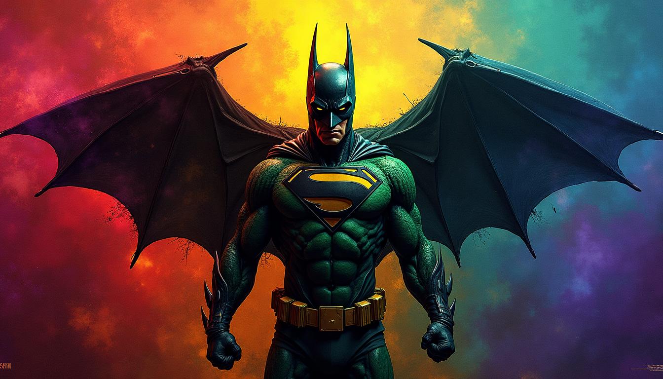
The Moment I Realized Superhero Colors Aren't Random
I was eight years old, sitting cross-legged on my bedroom floor, surrounded by comic books. My mom walked in and asked a simple question: "Why does Superman wear blue?"
I had no answer.
Twenty years later, as a designer obsessed with color psychology, I finally understand: every superhero color choice is a calculated brand decision. And the lessons apply far beyond the comic book page.
Whether you're designing a brand identity, choosing colors for your website redesign, or just curious about pop culture, the psychology behind superhero costumes offers masterclass insights.

Why Superheroes Need Signature Colors
The Comic Book Printing Constraint
Here's something most people don't know: early superhero colors were dictated by printing technology.
In the 1930s and 40s, comic books used a limited four-color printing process (CMYK). Artists could only use combinations of cyan, magenta, yellow, and black at specific percentages. That's why so many classic heroes wear:
- Primary colors (Superman, Wonder Woman)
- High-contrast combinations (Batman's black and yellow)
- Bold, saturated hues that wouldn't muddy in printing
This constraint became a feature. Bold colors made heroes instantly recognizable on crowded newsstand shelves—the same principle that drives logo color psychology today.
Instant Recognition in a Crowded Panel
A comic book page might have 6-9 panels with multiple characters. Readers need to identify heroes in a fraction of a second. The solution? Distinctive color signatures.
This is why:
- Superman is always blue and red
- The Hulk is always green
- Spider-Man's red and blue remain consistent across decades
The same principle applies to modern brand design—your brand colors should be instantly recognizable even at a glance.
The Big Three: Red, Blue, and Yellow
The most iconic superheroes overwhelmingly use primary colors. There's profound psychology behind this choice.
Superman: Universal Trust Through Primary Colors
Superman's palette—deep blue, vibrant red, and golden yellow—isn't accidental.
Blue (primary suit): Projects trust, stability, and calm authority. Blue is the most universally liked color across cultures, making Superman immediately trustworthy.
Red (cape and boots): Adds energy, courage, and action. The red prevents Superman from feeling passive—he's not just trustworthy, he's heroic.
Yellow (S-shield and belt): Introduces optimism and hope. Yellow is the color of sunshine, aligning with Superman's role as a beacon of hope.
Together, these primary colors create universal appeal. There's nothing ambiguous about Superman—he's clearly the good guy.
Design Lesson: When you want to project trustworthiness and universal appeal, stick to primary colors. They work across cultures and demographics.

Captain Marvel & Supergirl: Same Formula, Same Power
Notice how Captain Marvel (Carol Danvers) and Supergirl share Superman's primary palette?
This isn't laziness—it's intentional brand consistency. When you want a character to read as a classic hero, you reach for red, blue, and gold. The triadic color harmony projects balanced power.
Wonder Woman: Warrior Meets Patriotism
Wonder Woman's red, gold, and blue serve double duty:
- Warrior colors: Gold armor, red for battle, blue for righteousness
- Patriotic symbolism: The American flag palette (she debuted during WWII)
Her specific shade of red is deeper than Superman's—more wine than cherry—projecting maturity and ancient power. The gold isn't yellow; it's metallic, suggesting luxury and royalty.
Dark Heroes, Dark Palettes
Not all heroes wear bright primaries. The rise of anti-heroes introduced darker, more complex color palettes.
Batman: Black for Fear, Yellow for Visibility
Batman's palette is genius in its contradiction:
Black and gray (suit and cape): Creates fear through association with shadows, night, and death. Black is the color of the unknown and dangerous.
Yellow (belt and bat signal): The only bright element serves a specific purpose—visibility. Batman wants criminals to see the bat symbol coming. Yellow is a warning color.
This combination creates psychological tension: you can't quite see him (black), but you know he's there (yellow). It's complementary color theory weaponized for intimidation.

Wolverine: Aggression Meets Heroism
Wolverine's yellow and blue is fascinating because it clashes intentionally.
Yellow: Aggressive, attention-grabbing, almost warning-like (think hazard signs) Blue: Attempts to signal heroism and team unity (X-Men colors)
The result? A hero who doesn't quite fit—he's always slightly at odds with his team. His colors telegraph his personality: heroic but volatile.
Black Widow: Deadly Elegance
Natasha Romanoff's black and red palette communicates:
Black: Stealth, secrecy, spy craft—she operates in shadows Red accents: Danger, her violent past, the "widow" in her name
The minimal red (just her hair and occasional details) suggests controlled danger—she's lethal but precise.
The Green Problem: Why Green Heroes Are Outsiders
Have you noticed that green heroes are almost always outsiders or monsters?
- Hulk: Green represents his monstrous transformation
- Green Lantern: Powered by alien technology, not of Earth
- Martian Manhunter: Literally an alien
- Poison Ivy: A villain turned anti-hero with plant powers
Green in superhero context signals the other—something not quite human or not quite of our world. This aligns with green's broader psychology as a color of nature, growth, but also envy and sickness.
The Hulk's specific shade—gamma green—is deliberately toxic-looking. It's not the calming green of nature; it's radioactive, dangerous, otherworldly.
Team Color Coordination
When superheroes form teams, their color coordination tells a story about group dynamics.

X-Men: Unity Through Uniform
The X-Men's classic yellow and blue uniforms serve a crucial narrative purpose:
Yellow and blue: Creates visual unity among diverse characters Matching costumes: Emphasizes they're a team first, individuals second
This color choice reinforces the X-Men's theme: outcasts finding family. Their matching colors say, "We belong together."
Avengers: Diversity Through Individuality
Compare this to the Avengers, where every member has a distinct palette:
- Iron Man: Red and gold
- Captain America: Red, white, and blue
- Thor: Blue and red with silver
- Hulk: Green
- Black Widow: Black
The Avengers' color diversity communicates independence within collaboration. They're individuals who choose to work together, not a family unit. Their clashing colors reflect their clashing personalities.
Design Lesson: Team branding choices matter. Matching colors suggest unity and shared identity. Diverse colors suggest a coalition of individuals.
Villains vs. Heroes: Color as Moral Compass
Comic book colorists use predictable patterns to telegraph morality.
The Joker: Inverted Heroism
The Joker's green hair, purple suit, and white skin directly invert heroic colors:
- Purple: Opposite of yellow on the color wheel—chaos vs. hope
- Green: The "sick" version of heroic blue—madness vs. stability
- White skin: Death, emptiness, the opposite of healthy human tones
His palette is a split-complementary scheme designed to look unsettling. Nothing about the Joker's colors feels safe.
Thanos: Cosmic Villainy in Purple
Why is Marvel's ultimate villain purple?
Purple traditionally signifies royalty, power, and ambition. Thanos believes he's a righteous king making hard choices. His purple skin makes him look alien but also regal—he sees himself as heroic.
Modern Superhero Color Evolution
Superhero colors have evolved dramatically from comics to cinema.

The MCU's Muted Realism
The Marvel Cinematic Universe deliberately muted traditional comic book colors:
- Spider-Man's blue is darker, almost navy
- Iron Man's red is burgundy rather than cherry
- Captain America's blue is desaturated, almost military
This shift serves several purposes:
- Realism: Muted colors feel more "real-world"
- Cinematography: Saturated colors can look cheap on screen
- Adult audience: Muted palettes signal "this isn't kid stuff"
DC's Dark Palette
DC took muting even further with films like Batman v Superman and Justice League:
- Superman's blue became almost gray
- Batman's black absorbed almost all light
- The overall palette was desaturated and cool-toned
This reflected DC's storytelling approach: grittier, more serious, less "comic book-y."
Spider-Verse: The Neon Revival
Then Into the Spider-Verse (2018) blew everything up:
- Saturated primaries returned
- Neon accents and halftone patterns
- Unapologetic comic book aesthetics
The film's success proved audiences don't need muted colors to take superheroes seriously. You can create bold, vibrant gradient transitions while telling mature stories.
Designing Your Own Superhero Brand
What can designers learn from superhero color psychology?
1. Primary Colors for Universal Appeal
If you need to appeal to everyone, primary colors remain unbeatable. They're clear, trustworthy, and culturally universal.
Try our AI Website Designer to generate palettes with primary color harmony.
2. Dark Palettes for Sophistication
Anti-hero colors (black, dark red, muted gold) work for brands targeting:
- Premium audiences
- Mature demographics
- Luxury positioning
Explore dark mode design psychology for modern applications.
3. Team Colors Tell Stories
How you coordinate colors across a brand family communicates relationships:
- Matching: Unified identity, shared values
- Varied: Independent entities, coalition
Use our Color Hierarchy tool to plan multi-color brand systems.
4. Evolution Signals Maturity
Just as Superman's colors have subtly shifted over decades, your brand colors can evolve. A website redesign might mute or shift your palette while maintaining recognition.
The Psychology Behind Your Favorite Hero
Next time you see a superhero costume, you'll understand the calculated psychology behind every color choice:
- Blue: Trust, stability, heroism
- Red: Action, courage, passion
- Yellow/Gold: Hope, optimism, visibility
- Black: Mystery, fear, sophistication
- Green: Otherness, nature, transformation
- Purple: Royalty, villainy, cosmic power
These same principles apply to your brand's color strategy. Every color choice tells a story—make sure it's the story you want to tell.
Ready to Design Your Heroic Palette?
Whether you're building a brand, redesigning a website, or just exploring color theory, Coloracci's tools can help:
- AI Website Designer: Generate complete color palettes with AI
- Color Hierarchy Tool: Plan your brand color proportions
- Image Color Extractor: Extract palettes from superhero artwork
Your brand deserves colors as iconic as Superman's cape.
Related reading: