When Movies Wear Colors: The Hidden Psychology Behind Film Titles
· Lion Dada
I was halfway through watching 50 Shades of Grey when something clicked in my mind—not about the plot (let's be honest, we all know what that movie was about), but about the title itself. Why "grey"? Why not "50 Shades of Mystery" or "50 Shades of Complexity"? The answer hit me like a perfectly edited jump scare: the color is the story.
Think about it. When you hear "Blue Velvet," you don't just think of fabric—you feel something unsettling, something that looks innocent on the surface but hides darkness underneath. When someone mentions "Black Swan," you immediately sense duality, transformation, danger. Color names in movie titles aren't accidents or marketing gimmicks. They're psychological triggers, emotional shorthand that directors use to communicate the soul of their film before a single frame rolls.
Over the past few months, I've fallen down a rabbit hole of cinema, color theory, and psychology. I've watched (and rewatched) dozens of films with colors in their titles, and I've discovered patterns that would make any designer's heart race. So grab your favorite beverage, get comfortable, and let me take you on a journey through the chromatic world of cinema.
The Trilogy That Started It All: Krzysztof Kieślowski's Three Colors
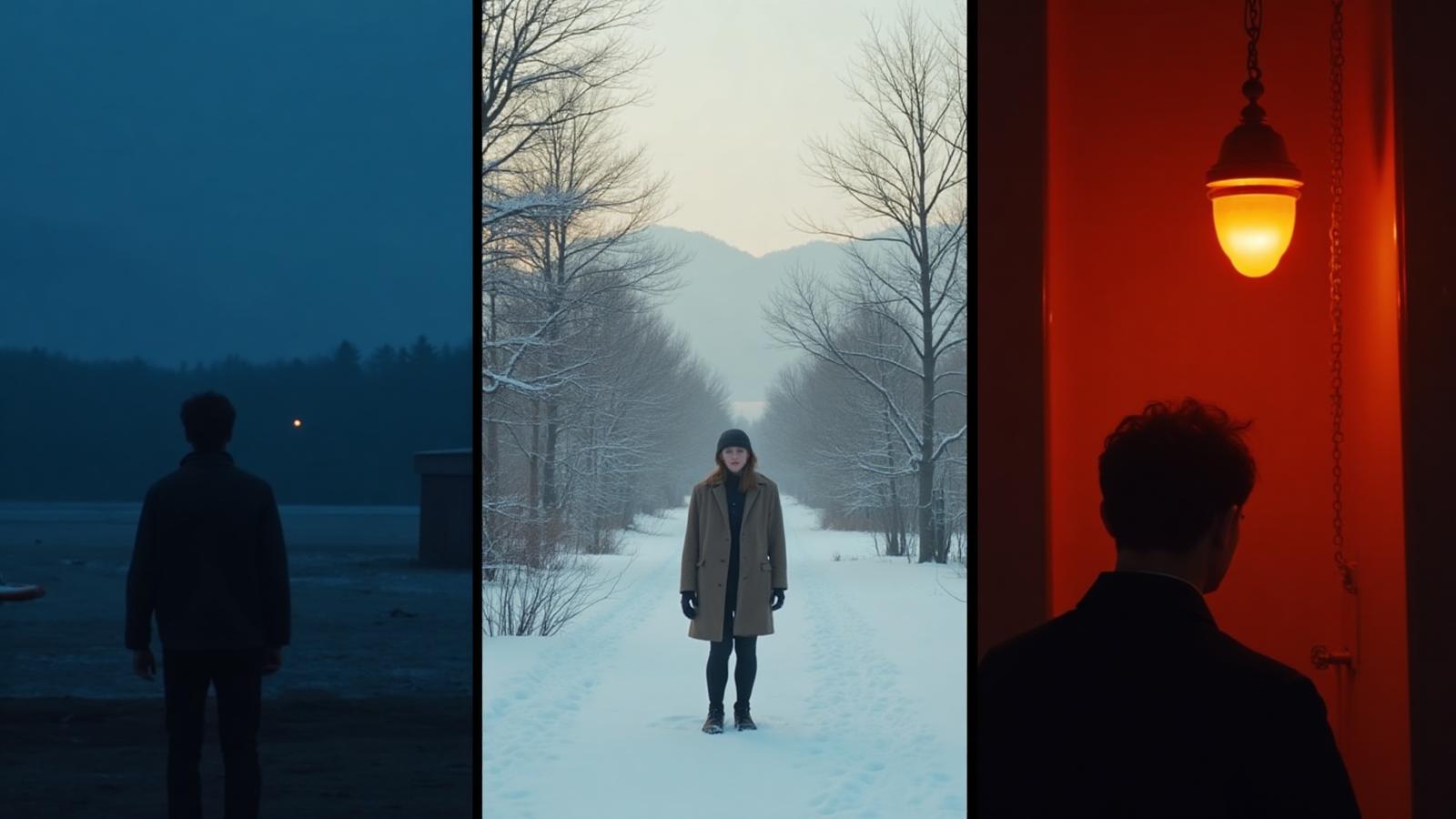
If we're talking about movies with colors in their titles, we need to start with the master himself: Krzysztof Kieślowski. His Three Colors trilogy (1993-1994) didn't just use colors as titles—he made them characters, emotional guides, visual poetry.
Blue (1993): Freedom Through Grief
Blue tells the story of Julie, a woman who loses her husband and daughter in a car accident. The film is drenched in blue—blue light filters through windows, blue hangs in the air like grief itself. But Kieślowski's genius was making blue represent both the crushing weight of sorrow and the possibility of emotional freedom.
Watch how the color appears: blue swimming pool water when Julie tries to escape reality, blue glass ornaments that reflect light, blue sugar cubes dissolving in coffee. Every blue object is a reminder of what she's lost and a pathway to what she might become. The film asks: can you be truly free when you've lost everything that mattered?
The psychological impact is profound. Blue is simultaneously cold (isolation) and deep (emotional depth). It's the color of both distance and introspection. Kieślowski used it to show that freedom isn't about escaping pain—it's about diving into it until you come out the other side.
White (1994): Equality in Revenge
White is the middle child of the trilogy, and it's brilliant in its subversion. White traditionally means purity, innocence, cleanliness. But Kieślowski twists this. His protagonist Karol returns to Poland covered in literal white snow, plotting an elaborate revenge against his ex-wife.
The white is everywhere—winter landscapes, white weddings, white lies. The color becomes ironic, mocking. Equality (the French Revolutionary ideal the film explores) isn't about fairness or purity—it's about evening the score, balancing the scales through deception.
Notice how Kieślowski shoots white on white: pale faces against snow, white rooms that feel empty rather than clean. The absence of color becomes its own statement. This is probably the most underrated film in the trilogy, but for designers, it's a masterclass in how neutral tones can carry enormous emotional weight.
Red (1994): Fraternity Through Connection
Red is the culmination, the most visually stunning of the three. Red explodes across the screen—red billboards, red cars, Valentine's red jacket, red theater curtains. But this isn't aggressive red or romantic red. This is the red of human connection, of lives intersecting, of fate bringing people together.
The film follows Valentine, a model who accidentally hits a dog and meets a retired judge who eavesdrops on his neighbors. Their unlikely friendship becomes a meditation on how we're all connected, how our lives touch in ways we never see. The red is warm, enveloping, inevitable.
Kieślowski used red to show fraternity—not in the revolutionary sense, but in the deeply human sense of recognizing yourself in another person. Every red object in the frame is a thread connecting characters, moments, destinies. It's breathtaking.
Black vs. White: The Classic Duality
Black Swan (2010): The Transformation
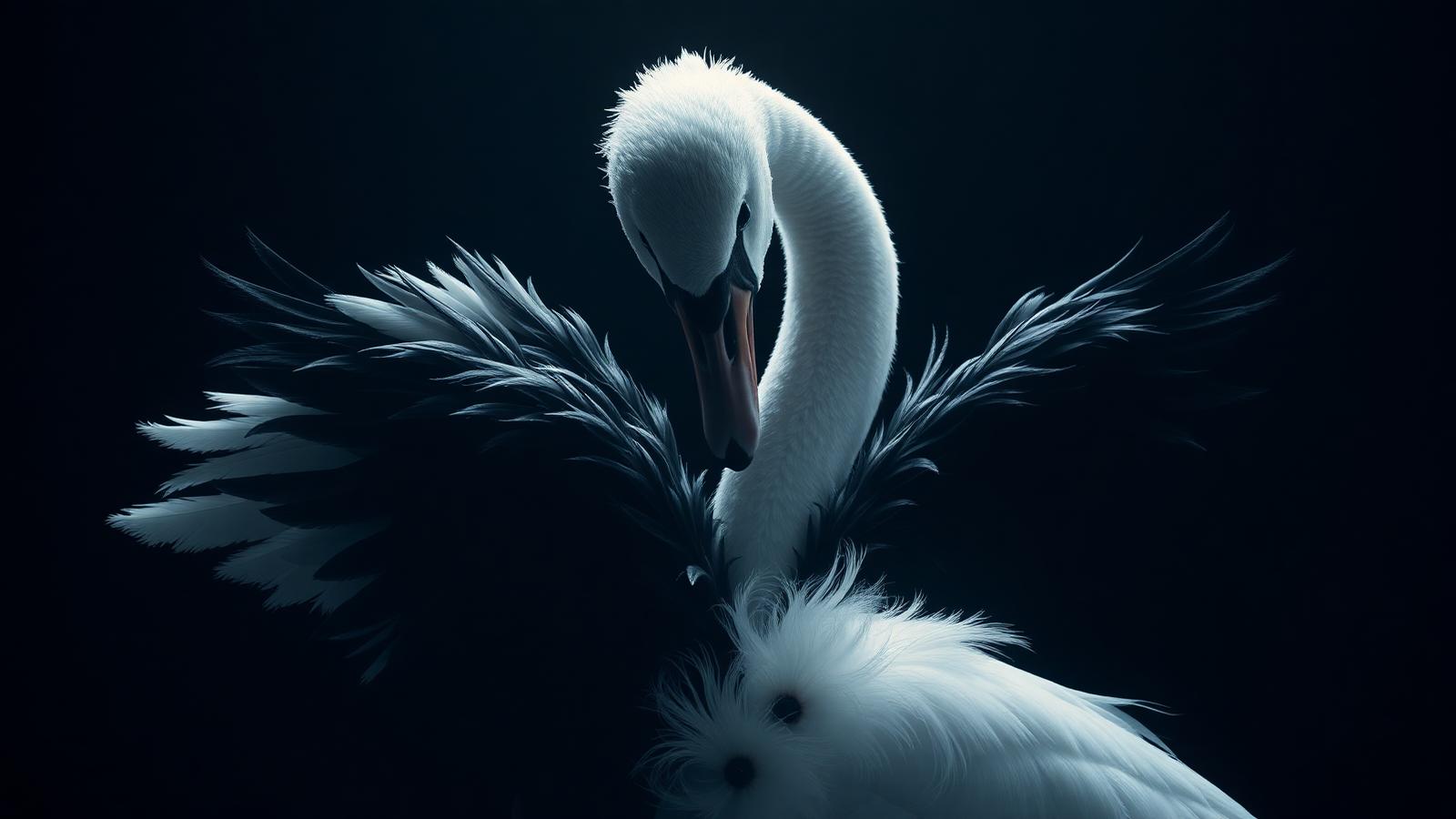
Darren Aronofsky's Black Swan is perhaps the most perfectly titled film of the 21st century. The entire movie is built on the duality of Tchaikovsky's ballet: Nina must dance both the White Swan (innocence, purity, technical perfection) and the Black Swan (seduction, passion, raw emotion).
Watch Nina's wardrobe transformation throughout the film. She starts in white, pink, pale colors—childlike, controlled by her mother, fragile. As she descends into her Black Swan persona, the colors shift: grays, then darks, then finally black. The famous scene where she transforms on stage isn't just about makeup and costume—it's about her internal color palette literally changing.
The psychology here is fascinating. Black represents everything Nina has repressed: her sexuality, her anger, her authentic self. White represents what she's been forced to be: perfect, controlled, technically flawless but emotionally dead. The tragedy is that to access black (her truth), she has to destroy herself.
For designers, Black Swan teaches us that black isn't just elegant or sophisticated—it's the color of hidden truth, of what we bury, of the shadow self. And white isn't innocence—it's often a mask we wear.
White Noise (2022): The Sound of Nothing
Noah Baumbach's adaptation of Don DeLillo's novel uses "white noise" as both title and concept. White noise is every frequency playing at once—it should be cacophony, but instead it becomes a neutral hum, a background to life, an absence of meaning.
The film's use of color is deliberately muted, washed out, almost overexposed—like life viewed through a filter of consumer culture and death anxiety. The "white" isn't purity; it's the static of modern existence, the noise that drowns out authentic experience.
This is white as emptiness, as the opposite of signal. In a world of constant stimulation, white noise is what's left when nothing means anything anymore. Heavy stuff for a movie title, but brilliant in its precision.
Men in Black (1997): Authority in the Shadows
On the lighter side, Men in Black uses its color choice to signal exactly what these characters are: agents of secret authority, people who operate outside normal rules, individuals who've erased their own identities to protect humanity from things it can't know about.
Black suits, black sunglasses, black cars—this is the uniform of power, mystery, and emotional detachment. The agents wear black because they're supposed to be invisible, authoritative, and slightly intimidating. They're not police (who wear blue), not military (who wear green or camo)—they're something else entirely, and black communicates that otherness.
The franchise proves that color psychology works even in comedy. We accept the premise partly because the color choice feels right. Black is the color of secrets.
Red: The Color That Demands Your Attention
The Hunt for Red October (1990): Danger in the Deep
Tom Clancy's submarine thriller uses red brilliantly on multiple levels. Obviously, there's the Soviet connection—the Red menace, communism, the USSR. But the submarine itself, the Red October, becomes a symbol of something larger: innovation that could shift the balance of power, technology that's both amazing and terrifying.
Red in this context is about high stakes. The entire plot revolves around whether a Soviet captain is defecting or launching an attack. Red is the color of alarm bells, of nuclear war, of blood in the water. It's appropriate that the submarine is red—it's a moving target of maximum danger.
Red Sparrow (2018): Seduction as Weapon
Jennifer Lawrence's spy thriller takes red in a completely different direction. Here, red represents seduction, manipulation, the weaponization of sexuality and attraction. The "Sparrow School" trains spies to use their bodies and emotional intelligence as tools.
The costume design is key: Lawrence wears red at crucial moments of power and sexuality. Red dress at the theater, red lipstick during interrogations, red ambient lighting during training scenes. This is red as power move, red as danger wrapped in attraction.
The film asks: what happens when red (passion, desire) becomes calculated rather than spontaneous? The answer is complicated and often disturbing, but the color choice is perfect. You can't look away from red, which is exactly the point.
Lady in Red (1979): Visibility as Tragedy
The lesser-known but historically important Lady in Red tells the story of John Dillinger's girlfriend, whose red dress made her visible to FBI agents, leading to Dillinger's death. The title is both literal (she wore red) and metaphorical (she stood out when she should have blended in).
Red here is about being seen, being marked, being unable to hide. It's a reminder that sometimes the wrong color choice can be fatal. In a crowd, red makes you the target.
If you're fascinated by the psychology of red and want to explore its use in branding, check out our deep dive into why 75% of food brands choose red logos.
Blue: The Ambivalent Color
Blue Velvet (1986): Innocence Corrupted
David Lynch's masterpiece uses blue as a symbol of American suburban innocence—and what festers underneath. The blue velvet robe at the film's center is simultaneously beautiful (velvet, luxurious fabric) and horrifying (witness to abuse, symbol of corruption).
Lynch shoots blue everywhere: blue skies that feel too perfect, blue shadows that hide violence, blue fabric that's both soft and suffocating. The color becomes duplicitous, trustworthy and threatening at once.
This is the dark side of blue—the color that seems calm but hides depths you don't want to explore. The film changed how I see blue in design. Now when I see too-perfect blue, I wonder what it's hiding.
Blue Is the Warmest Color (2013): Longing and Loss
The French film La Vie d'Adèle was released internationally as Blue Is the Warmest Color, and that title change is genius. The story follows Adèle's intense love affair with Emma, a woman with blue hair, blue being her signature color.
Blue here represents longing, the ache of passionate love, the coldness of loss when that love ends. The "warmest color" title is ironic—blue is traditionally cool, but in the context of lost love, the memory of someone becomes the warmest thing you have left.
The film uses blue sparingly but powerfully: Emma's hair, blue clothing, blue light in intimate scenes. It's about how a color can become so associated with a person that you can't see it without feeling them.
Want to understand more about how blue works in design? Our article on the psychology of blue explores its complex emotional range.
Purple: Royalty and Rebellion
The Color Purple (1985): Resilience in Bloom
Steven Spielberg's adaptation of Alice Walker's novel uses purple as a symbol of beauty, divinity, and black women's strength in the face of overwhelming oppression. The famous line—"I think it pisses God off if you walk by the color purple in a field somewhere and don't notice it"—encapsulates the entire theme.
Purple appears in flowers, in clothing that characters save for special occasions, in moments of joy and connection. It's the color of Celie finding her voice, of Shug teaching her to love herself, of women creating beauty in harsh circumstances.
Spielberg uses purple sparingly, which makes every appearance meaningful. When you see purple in this film, you're seeing hope, resilience, and the divine feminine reclaiming power.

Purple Rain (1984): The Artist's Identity
Prince's Purple Rain made purple inseparable from his identity. The color represents his unique blend of sexuality, spirituality, funk, and rock—something that couldn't be captured by red (too aggressive), blue (too cool), or pink (too soft).
Purple is the color of artistic vision that doesn't fit categories. Prince wore purple, lit stages in purple, made purple his color in a way few artists ever achieve. The rain imagery adds another layer: purple rain is beautiful, unusual, slightly surreal—exactly like Prince's music.
For our deep dive into luxury branding with purple, check out this article on purple in high-end design.
Orange: The Mechanical Violence
A Clockwork Orange (1971): Unnatural Acts
Stanley Kubrick's dystopian masterpiece has the most puzzling color title—why orange? The answer is layered. In Anthony Burgess's original novel, "clockwork orange" is Nadsat slang (Russian-influenced teen speak) for something that appears natural but is mechanical, that looks organic but is artificial.
Orange becomes the color of this theme: it's warm (organic) but also artificial (neon signs, stage lighting). The film's production design uses orange in unsettling ways—orange drinks, orange jumpsuits, orange-lit interiors. It's never quite right, never natural.
Kubrick understood that orange is an uncomfortable color. It's between warm and aggressive, friendly and alarming. A clockwork orange is humanity's nature being mechanically programmed, and the color captures that disturbing in-between state perfectly.
The visual palette of the film influenced generations of designers. Orange became the color of dystopia, of futures that went wrong, of technology that dehumanizes.

Gray: The Complicated Middle
50 Shades of Grey (2015): Moral Complexity
Love it or hate it, 50 Shades of Grey has a brilliant title. Christian Grey isn't a villain (black) or a hero (white)—he's gray, morally complicated, neither entirely predatory nor entirely romantic. The "50 shades" concept suggests infinite variation between extremes.
Gray represents ambiguity, complexity, the refusal of simple answers. The film's aesthetic is cool grays, steel, concrete, expensive neutrals—the color palette of wealth without warmth, control without comfort.
E.L. James chose the name Christian Grey deliberately. Gray is the color of moral ambiguity, of BDSM relationships that exist outside traditional romance narratives, of consent that's negotiated rather than assumed. It's the perfect color for a story that asks readers to find romance in power exchange.
The Grey (2011): Survival in Neutral
Liam Neeson's survival thriller uses gray as the color of the Alaskan wilderness: neutral, deadly, indifferent to human survival. The gray wolves are predators, but they're not evil—they're just following their nature. The gray weather is harsh, but it's not malicious—it's just what Alaska is.
Gray here is about the universe's indifference. There's no good or evil in nature, no black or white—just the gray reality of survival. The men aren't heroes or villains; they're just trying to not die. The wolves aren't monsters; they're just hungry.
This is gray as existential reality: the world doesn't care about your story, your morality, your meaning. It's gray—and you have to survive it anyway.
We recently wrote an in-depth article about what makes gray and its psychology—it's a more complex color than most people realize.
Green: Hope or Envy?
The Green Mile (1999): Death Row's Paradox
Frank Darabont's adaptation of Stephen King's novel uses green in a fascinating way. The Green Mile is death row at Cold Mountain Penitentiary—the hallway prisoners walk to their execution. But green? Green is traditionally the color of life, growth, renewal.
That's the point. The film uses green to highlight the paradox of executing someone who can heal, someone who's innocent, someone who represents divine goodness. The green mile is where life goes to die, and that contradiction is heartbreaking.
Watch how the film shoots green: the linoleum floor is green, the walls are institutional green, even the light has a green tinge in certain scenes. It's the color of false hope—you're walking toward death on a path that looks alive.

Green Book (2018): Safe Travel
Green Book references the historical Negro Motorist Green Book, a guide published from 1936-1966 that listed safe establishments for black travelers in a segregated America. Green here is safety, navigation, survival.
The film follows a white driver and black pianist traveling through the South, relying on the Green Book to find places where they'll both be accepted. Green becomes the color of practical hope—not idealistic change, but realistic survival strategies in an unjust system.
It's a reminder that colors carry historical weight. Green wasn't chosen randomly for that guidebook; it meant "go," safe passage, permission to proceed. The film honors that meaning.
Pink: Beyond Stereotypes
Pretty in Pink (1986): Class and Identity
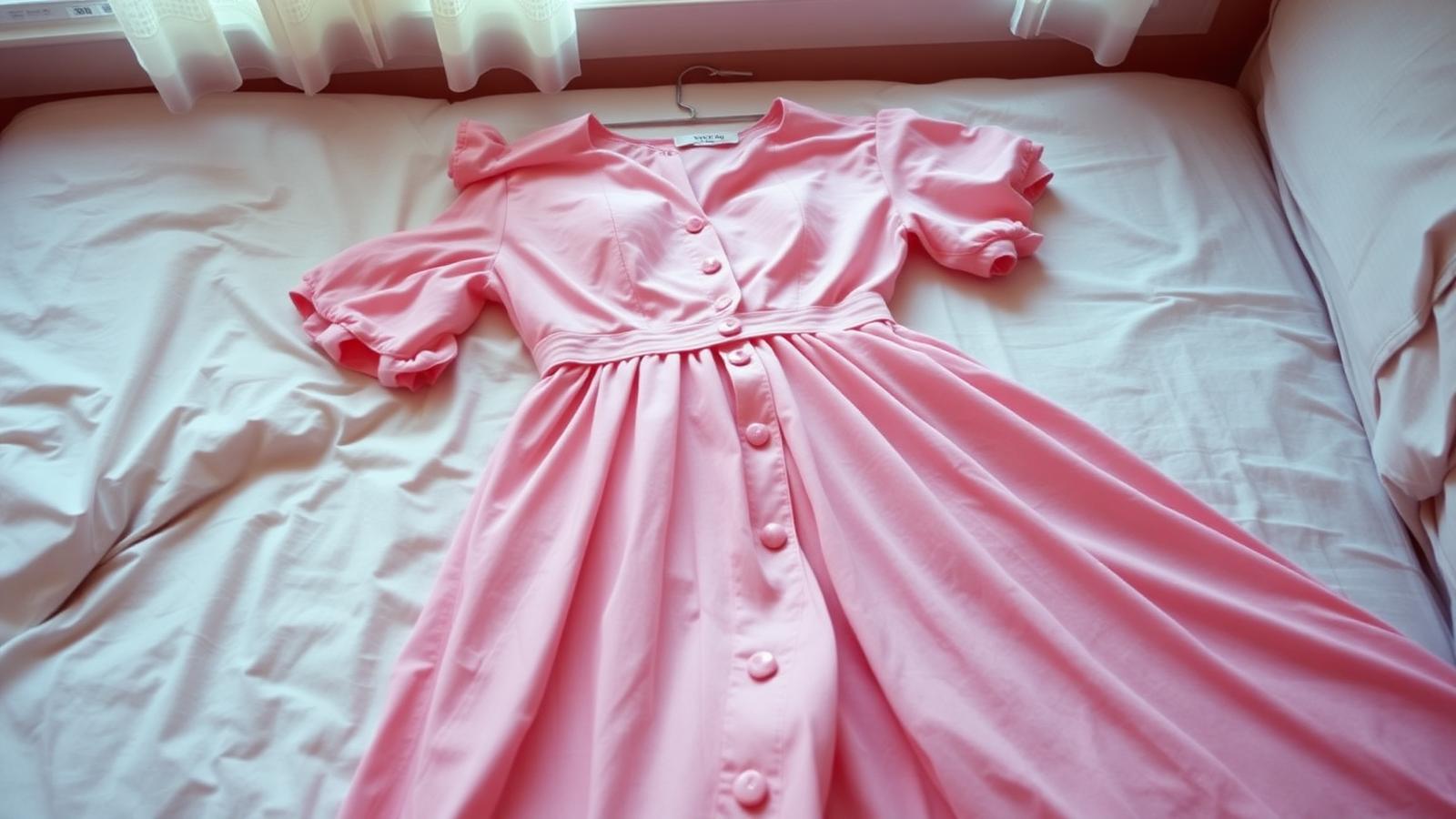
John Hughes's Pretty in Pink uses its title color to explore class difference and personal identity. Andie works in a record store, sews her own clothes, and doesn't fit in with the wealthy kids at her school. When she makes a pink dress for prom from two vintage dresses, she's making a statement: I'm not like you, and I'm pretty in my own way.
Pink here is working-class femininity, DIY aesthetic, refusal to conform to upper-class standards of beauty. It's not soft or delicate—it's punk, thrift-store chic, rebellion disguised as romance.
The film reclaims pink from its "girly" associations and makes it a color of authenticity. Andie is pretty in pink because she's true to herself, not because pink is traditionally feminine.
The Pink Panther (1963): Playful Mystery
Blake Edwards's classic uses pink for pure whimsy. The Pink Panther is a diamond with a pink flaw that looks like a panther—absurd, valuable, comic. The animated Pink Panther that became the franchise's icon is playful, mischievous, impossible to take seriously.
Pink here is the color of not taking yourself seriously, of camp, of comedy that's aware of its own ridiculousness. Inspector Clouseau chasing the Pink Panther is funny partly because the color choice is so un-serious for a heist film.
It's a good reminder: pink can be hilarious if you let it be.
What Can Designers Learn From All This?
After analyzing dozens of color-titled films, certain patterns emerge that apply directly to branding, web design, and creative work:
1. Color Creates Expectations
When you name something with a color, you're making a promise. Blue Velvet promises something unsettling beneath a beautiful surface. Black Swan promises duality and transformation. The Green Mile promises something paradoxical about life and death.
In branding, this means: choose your signature color carefully. It's not just aesthetic—it's communicating your story before customers experience your product.
2. Colors Have Cultural Memory
Red means communism in The Hunt for Red October, but seduction in Red Sparrow. Purple means spirituality in The Color Purple, but rock and roll in Purple Rain. Context matters, but so does accumulated cultural meaning.
When designing, consider what baggage your color choice carries. What memories, associations, and feelings does it trigger in your audience?
3. The Best Color Choices Are Slightly Unexpected
A Clockwork Orange works partly because orange is such a weird choice for dystopia. Blue Is the Warmest Color works because calling blue warm is contradictory. Pretty in Pink works because pink as rebellion surprises us.
Don't just reach for the obvious color. If everyone in your industry uses blue (banks, I'm looking at you), what happens if you use orange instead?
4. Colors Tell Stories Without Words
Kieślowski's Three Colors trilogy proves that color can be narrative structure. Each film tells its story partly through its chosen color's emotional range and symbolic weight.
Your brand's color palette is telling a story about who you are. What story are your colors telling?
Try It Yourself: Extract Color Palettes From Movies
Want to explore the actual color palettes of famous films? Upload a movie poster or screenshot to our Image Color Extractor and see what colors the designers chose. You might be surprised by what you find.
Or better yet, use our AI Website Designer to create a color scheme inspired by your favorite film. Describe the mood of Blue Velvet or The Color Purple, and watch as AI generates a palette that captures that cinematic feeling.
For deeper color analysis and brand identity work, try our Mood Board Generator—perfect for when you want to capture a film's emotional palette in your own project.
The Chromatic Cinema Continues
Every year, new films with color titles emerge: Red Notice (2021), Black Widow (2021), The Green Knight (2021). The pattern continues because it works. Colors are psychological shortcuts, emotional primers, storytelling devices.
The next time you see a movie with a color in the title, pause before you watch it. What does that color make you feel? What does it promise? What story is it telling before the film even begins?
Because the truth is, we all respond to color on a level deeper than conscious thought. Filmmakers know this. Great designers know this. And now, you know this too.
So go forth and create your own colorful stories. Just remember: choose your colors like filmmakers choose their titles—with intention, with psychology, with an understanding that the right color can make everything click into place.
What's your favorite movie with a color in its title? And more importantly—what color would your life's movie be called?