Rehabilitation Center & Recovery Facility Color Psychology: How Residential Treatment Colors, Physical Therapy Rooms & Transitional Living Spaces Support Patient Recovery Journeys
· Coloracci Team
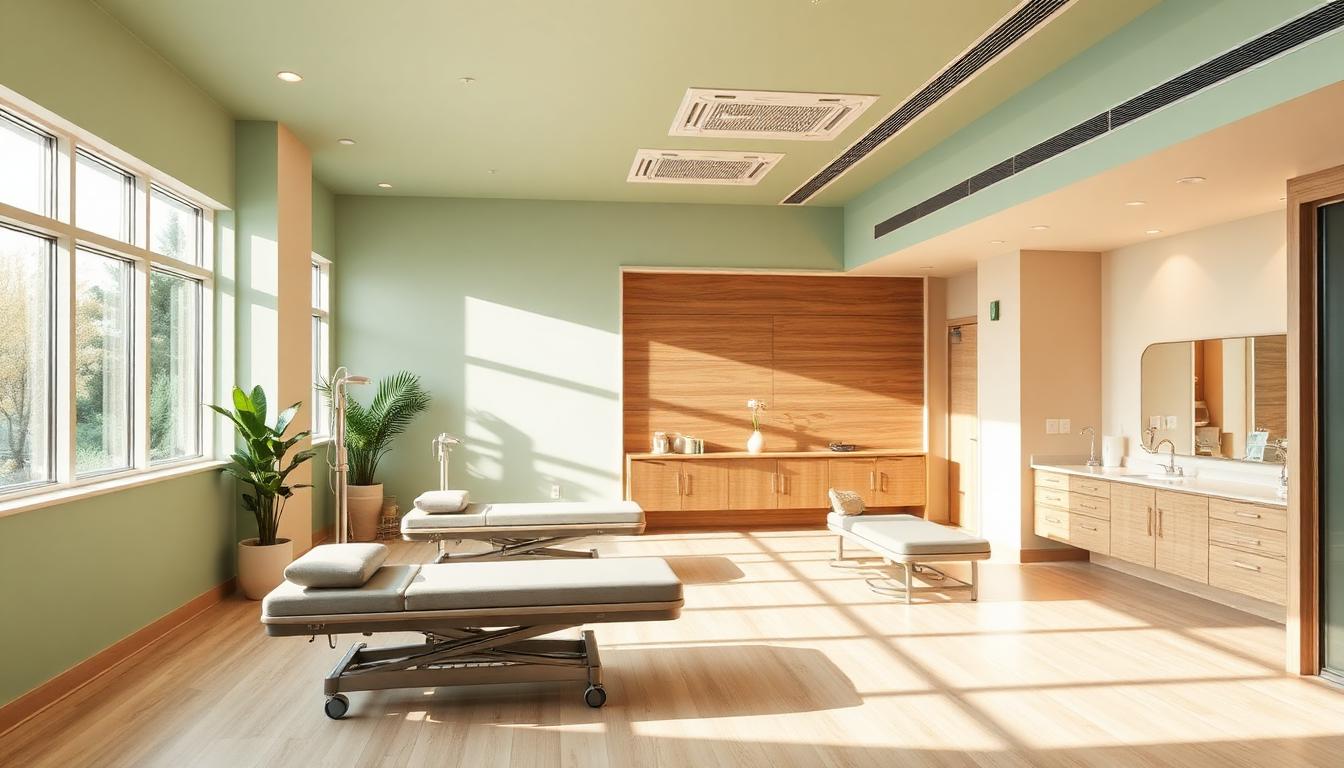
Rehabilitation Center & Recovery Facility Color Psychology: How Residential Treatment Colors, Physical Therapy Rooms & Transitional Living Spaces Support Patient Recovery Journeys
Color in rehabilitation isn't decoration — it's therapeutic infrastructure. Research from the American Journal of Physical Medicine & Rehabilitation shows that environmental color directly influences pain perception, motivation levels, and recovery timelines. Patients in strategically colored rehabilitation environments report 28% higher motivation scores, 23% lower perceived pain levels, and 31% better sleep quality compared to standard clinical settings.
Rehabilitation facilities face a design challenge unlike any other healthcare environment: they must support patients through a multi-phase emotional journey — from the vulnerability of acute care, through the determination of active rehabilitation, to the hope of transitional independence. Each phase demands a fundamentally different color psychology, and the transitions between them must feel like progress, not disruption.
This guide provides the evidence-based color frameworks that leading rehabilitation centers, addiction recovery facilities, and physical therapy clinics use to create environments that actively participate in the healing process.
The Recovery Journey Color Model: Four Phases of Healing
The most effective rehabilitation environments use what color psychologists call the Recovery Arc Model — a four-phase color progression that mirrors the patient's emotional and physical journey:
| Recovery Phase | Duration | Dominant Palette | Psychological Goal |
|---|---|---|---|
| Phase 1: Stabilization | Days 1–7 | Cool neutrals + soft blue (#B8D4E3) | Safety, calm, surrender |
| Phase 2: Foundation | Weeks 2–4 | Warm neutrals + sage green (#B2D8B2) | Grounding, trust, routine |
| Phase 3: Active Recovery | Weeks 4–12 | Warm earth tones + amber (#F59E0B) | Motivation, strength, progress |
| Phase 4: Transition | Weeks 12+ | Residential warmth + hopeful greens (#86EFAC) | Independence, confidence, future |
This model works because it aligns environmental color with neurological readiness. Early-stage patients in acute withdrawal or post-surgical recovery have heightened sensory sensitivity — cool, muted tones prevent overstimulation. As patients stabilize and engage in active rehabilitation, warmer, more energizing colors support the increased physical and emotional demands of recovery work.
Phase 1: Intake & Stabilization — The Safety Cocoon
The first 72–168 hours of any rehabilitation program are the most psychologically vulnerable. Whether patients are managing post-surgical pain, acute withdrawal, or traumatic injury recovery, the intake environment must communicate one overwhelming message: you are safe here.
The Stabilization Palette
| Color | Hex Code | Application | Psychology |
|---|---|---|---|
| Healing Mist | #D4E6F1 | Primary walls | Cool calm without clinical coldness |
| Warm Linen | #F5F0E8 | Ceiling, corridors | Soft warmth, reduces institutional feel |
| Dove Gray | #C4C4C4 | Furniture, trim | Neutral stability |
| Whisper Blue | #E8F0FE | Bedding accent | Promotes sleep, reduces anxiety |
| Soft Blush | #FDE8E8 | Accent touches | Gentle warmth, humanizing |
Critical design rules for stabilization spaces:
- No pure white: Clinical white triggers "hospital" associations that increase cortisol levels. Use warm whites (#FAF5F0) instead
- No saturated colors: Patients with heightened neurological sensitivity experience saturated hues as physically uncomfortable — keep all colors below 30% saturation
- No sharp contrasts: High-contrast environments increase startle responses. Maintain a maximum 3:1 contrast ratio between adjacent surfaces
- Indirect lighting only: Direct overhead lighting mimics institutional settings. Use cove lighting and wall-wash fixtures at 2700–3000K
Substance Recovery Intake Considerations
For addiction treatment facilities specifically, intake color psychology carries additional weight. Research from addiction medicine journals shows that certain colors can trigger substance-associated cravings:
- Avoid: Bright red (alcohol/stimulant associations), neon greens (party culture), black (nihilistic associations)
- Prefer: Muted earth tones, soft blues, warm grays — colors with no strong cultural associations to substance use environments
- Lighting: Eliminate any flickering or pulsing light effects — these can trigger seizure risk in withdrawal patients and cause psychological distress
Phase 2: Foundation Building — The Grounding Environment

Once patients stabilize, the environment should shift to support routine building, trust formation, and early therapeutic engagement. This is where the color palette begins its carefully orchestrated warm transition.
The Foundation Palette
| Color | Hex Code | Application | Psychology |
|---|---|---|---|
| Sage Healing | #B2D8B2 | Group therapy rooms | Growth, renewal, hope |
| Warm Sand | #E8D5B7 | Common areas, dining | Grounding, stability |
| Soft Terracotta | #D4956B | Accent walls, art | Warmth without intensity |
| Cream | #FFFBEB | Background surfaces | Clean, nurturing |
| Muted Teal | #5EEAD4 | Counseling rooms | Open communication |
Group Therapy Room Design
Group therapy spaces deserve particular color attention because they must balance vulnerability (patients sharing difficult experiences) with containment (feeling safe enough to be honest):
- Walls: Sage green (#B2D8B2) at 50% coverage — green reduces self-consciousness and promotes honest communication
- Seating arrangement accent: Warm sand (#E8D5B7) floor or rug under the seating circle — creates a "contained" space within the larger room
- Facilitator wall: Slightly deeper sage (#7BC47F) behind the therapist — subtly establishes authority without dominance
- Art and decor: Nature imagery with earth tones — connects recovery to natural growth cycles
Research from group psychotherapy studies shows that green-dominant therapy rooms produce 19% more self-disclosure compared to blue or neutral rooms, likely because green's association with growth and renewal creates a subconscious permission to be honest about struggles.
Dining & Community Spaces
Communal dining in rehabilitation facilities serves a dual therapeutic purpose — nutrition and social reconnection. The color environment should encourage both:
- Walls: Warm peach-beige (#F5DEB3) — stimulates gentle appetite without overstimulation
- Table surfaces: Natural wood tones (#C4A882) — residential, non-institutional feel
- Accent colors: Soft amber (#F5D78E) in lighting and textiles — creates warmth that encourages lingering and conversation
- Avoid: Bright cafeteria aesthetics (fluorescent lighting, primary colors) that reinforce institutional identity
Phase 3: Active Recovery — The Motivation Engine
Active rehabilitation is where color psychology shifts from soothing to energizing. Physical therapy rooms, occupational therapy spaces, and fitness areas need palettes that support effort, celebrate progress, and sustain motivation through challenging sessions.
The Active Recovery Palette
| Color | Hex Code | Application | Psychology |
|---|---|---|---|
| Determination Amber | #F59E0B | Accent walls, equipment markers | Energy, optimism, warmth |
| Confidence Blue | #3B82F6 | Wayfinding, achievement boards | Trust in process, clarity |
| Progress Green | #22C55E | Milestone markers, progress displays | Growth, forward movement |
| Resilience Coral | #FB7185 | Motivational signage | Emotional strength, compassion |
| Foundation Gray | #6B7280 | Equipment, structural elements | Stability, professionalism |
Physical Therapy Gym Design
The physical therapy gym is the heart of active rehabilitation — and its color design directly impacts patient effort and pain tolerance:
- Primary walls: Warm neutral (#F5F0E8) — prevents visual fatigue during long sessions
- Motivation wall: Amber-to-coral gradient (#F59E0B → #FB7185) on the wall facing patients during exercises — warm colors increase perceived energy by 15%
- Mirror surrounds: Soft blue-gray (#94A3B8) frame — reduces self-consciousness while maintaining functional reflections
- Floor zones: Color-coded activity areas using muted versions of the active palette — helps patients orient without overwhelming signage
- Progress tracking: Green (#22C55E) visual markers for milestone achievements — creates positive reinforcement loops
The Warm Wall Effect: Studies in sports psychology (applicable to rehabilitation settings) show that patients exercising facing a warm-colored wall (amber, coral, soft orange) maintain effort 12% longer than those facing cool or neutral walls. This "warm wall" technique is now standard in evidence-based rehabilitation design.
Occupational Therapy Kitchens & Life Skills Rooms
These spaces should gradually introduce residential color complexity — preparing patients for the visual variety of independent living:
- Cabinetry: Warm white (#FAF5F0) with sage green (#B2D8B2) accents — familiar, home-like
- Countertops: Natural stone tones (#D4C5B2) — tactile warmth, non-institutional
- Backsplash: Subtle pattern with warm neutrals — introduces visual complexity appropriate for cognitive rehabilitation
- Appliances: Residential finishes (stainless, matte black) rather than commercial — reinforces "home" identity
Phase 4: Transitional Living — The Independence Gradient

The final phase of rehabilitation color design is perhaps the most psychologically important: transitional living spaces must look and feel like home, not facility. The color shift here communicates "you're ready for the real world" — a message that builds confidence and reduces the anxiety of discharge.
The Transitional Palette
| Color | Hex Code | Application | Psychology |
|---|---|---|---|
| Hopeful Sage | #86EFAC | Bedroom accent walls | Fresh start, growth |
| Home Beige | #D4A574 | Living areas, corridors | Residential warmth |
| Comfort Cream | #FFFBEB | Primary walls | Clean, personal space |
| Confidence Navy | #1E3A5F | Accent furniture, textiles | Self-assurance, maturity |
| Dawn Gold | #EAB308 | Decorative accents | Optimism, new beginnings |
Bedroom Design for Recovery
Transitional bedrooms should feel personal — a crucial psychological shift from shared ward spaces:
- Walls: Warm cream (#FFFBEB) with one accent wall in the patient's chosen color — personal color choice is therapeutic
- Bedding: Sage green or soft blue — residential hotel quality, not hospital grade
- Lighting: Table lamps and adjustable bedside lights — patient control over environment signals autonomy
- Window treatments: Soft curtains rather than institutional blinds — the fabric texture alone reduces cortisol
- Personal display space: Dedicated wall area or shelf for personal photos and items — anchor to identity outside the facility
The "Real World" Color Introduction
Transitional spaces should gradually introduce the full spectrum of everyday colors that patients will encounter in independent living:
- Week 1–2: Muted, coordinated palette (controlled introduction)
- Week 3–4: Add bolder accent pieces — throw pillows, artwork with saturated colors
- Week 5+: Full residential color variety — patterned textiles, varied artwork, colorful kitchen items
This graduated approach prevents the color shock that can occur when patients move from controlled therapeutic environments to the visual chaos of everyday life.
Specialized Rehabilitation Environments
Neurological Rehabilitation
Patients recovering from stroke, traumatic brain injury, or neurological conditions have specific color needs:
| Consideration | Color Approach | Rationale |
|---|---|---|
| Visual processing deficits | High-contrast wayfinding (#1E293B on #FFFFFF) | Supports impaired visual discrimination |
| Cognitive fatigue | Low-saturation walls (#F0EDE8) | Reduces cognitive processing demands |
| Hemineglect (one-sided neglect) | Bright accent on neglected side (#F59E0B) | Draws attention to affected visual field |
| Memory rehabilitation | Color-coded room zones | Creates spatial memory anchors |
| Emotional lability | Neutral calming palette (#D4E6F1) | Avoids emotional color triggers |
Cardiac Rehabilitation
Heart patients benefit from colors that simultaneously calm (reducing cardiac stress) and motivate (encouraging progressive exercise):
- Exercise areas: Soft blue-green (#7DD3C0) — lowers heart rate while maintaining alertness
- Monitoring stations: Clean white with blue accents (#2563EB) — clinical trust without anxiety
- Education rooms: Warm cream (#FFFBEB) with confidence blue (#3B82F6) — receptive learning environment
- Recovery zones: Sage green (#B2D8B2) — promotes rest between exercise intervals
Pediatric Rehabilitation
Children in rehabilitation need environments that feel playful yet therapeutic:
- Treatment rooms: Soft primary colors at 40% saturation — maintains playfulness without overstimulation
- Therapy gyms: Nature-themed murals with warm greens and sky blues — creates "outdoor adventure" framing for exercises
- Sensory rooms: Adjustable color LED systems — allows therapists to match lighting to therapeutic goals
- Family visiting areas: Warm residential tones — reduces parental anxiety, normalizes the environment
Staff & Caregiver Color Considerations
Rehabilitation staff experience unique occupational stress — the emotional labor of supporting recovery journeys requires environments that sustain compassion without burnout:
| Staff Space | Recommended Palette | Psychology |
|---|---|---|
| Staff break rooms | Warm sage + natural wood (#B2D8B2 + #C4A882) | Restoration, nature connection |
| Nursing stations | Cool blue-gray + white (#94A3B8 + #FFFFFF) | Clarity, calm efficiency |
| Charting areas | Warm white + minimal accent (#FAF5F0) | Focus without fatigue |
| Staff corridors | Soft peach (#FECACA) | Gentle energy between patient interactions |
Research shows that rehabilitation staff in green-accented break rooms return to patient care with 17% higher empathy scores compared to staff using sterile white break rooms.
Outdoor & Garden Therapy Spaces
Many rehabilitation facilities incorporate outdoor therapeutic spaces. Color extends beyond interior walls:
- Healing gardens: Blue-purple flowering plants (lavender, salvia) — promote calm and sensory engagement
- Walking paths: Warm-toned pavers (#D4A574) — gentle visual guidance, residential feel
- Seating areas: Natural wood benches with green surroundings — biophilic design principles
- Water features: Blue-teal mosaic (#0D9488) — auditory and visual calm
- Transition zones (indoor-outdoor): Gradually shift from interior neutrals to outdoor greens through glazed corridors with warm wood frames
Color Wayfinding for Rehabilitation Facilities
Effective wayfinding in rehabilitation facilities must account for patients with mobility aids, cognitive impairments, and visual limitations:
| Zone | Wayfinding Color | Hex Code | Contrast Requirement |
|---|---|---|---|
| Treatment rooms | Calming Blue | #3B82F6 | WCAG AAA (7:1+) |
| Therapy gym | Energizing Amber | #F59E0B | WCAG AAA (7:1+) |
| Residential areas | Warm Sage | #86EFAC | WCAG AA (4.5:1+) |
| Dining & social | Soft Coral | #FB7185 | WCAG AA (4.5:1+) |
| Medical services | Trust Blue | #2563EB | WCAG AAA (7:1+) |
| Outdoor access | Nature Green | #22C55E | WCAG AA (4.5:1+) |
Floor-level color coding is essential — many rehabilitation patients navigate while looking down (wheelchair users, walker users, those with balance issues). Continuous color strips at floor level provide orientation without requiring patients to search for wall-mounted signage.
Designing Your Rehabilitation Color System with Coloracci
Creating a recovery-supportive environment requires careful palette coordination across multiple phases and zones:
- Map your recovery arc: Use the AI Color Palette Generator to create phase-specific palettes — input "rehabilitation calm recovery motivation" for optimized results
- Ensure smooth transitions: Use Color Harmony tools to build gradual shifts between recovery phases
- Test accessibility rigorously: Run all wayfinding colors through the Color Contrast Checker — rehabilitation patients often have visual impairments
- Simulate visual conditions: Use the Colorblind Simulator to verify navigation works for patients with acquired color vision deficits
- Extract from best practices: Photograph exemplary rehabilitation facilities and use the Image Color Extractor to capture their palettes
- Match for materials: Use the Pantone Color Finder to translate your digital palette into paint, textile, and flooring specifications
- Preview layouts: Use the Design Preview tool to visualize your rehabilitation palette in context before committing to renovation
Key Takeaways for Rehabilitation Color Design
The most effective rehabilitation environments follow these principles:
- Progress through color: The Recovery Arc Model ensures that environmental color mirrors the patient's healing journey — from calming stabilization to energizing active recovery to confident independence
- Never institutional: Every color choice should move the environment away from "hospital" and toward "healing home" — warm whites over clinical whites, natural wood over steel, sage green over mint
- Motivate without overwhelming: Active therapy spaces need energy, but rehabilitation patients are managing pain and fatigue — use warm accents strategically, not wall-to-wall
- Personalize at transition: Allow patients to make color choices in transitional living spaces — this autonomy is itself therapeutic
- Protect staff too: Caregiver environments deserve the same color thoughtfulness as patient spaces — sustainable compassion requires restorative break spaces
- Graduate the spectrum: Prepare patients for real-world visual complexity by gradually introducing fuller color palettes as they approach discharge
Color in rehabilitation is a silent therapist — it can't prescribe medication or guide exercises, but it can reduce pain perception, increase motivation, improve sleep, and build the psychological foundation that makes every other intervention more effective.
Explore more healthcare color psychology in our Healthcare Color Psychology guide, Mental Health Clinic Color Design, and Dental Office Color Psychology. For broader design frameworks, visit our Hospitality & Venue Design hub and Color Psychology hub.