Pantone vs. HEX: When to Use Which Color System — Pantone vs HEX what designers need to know
· Coloracci Team
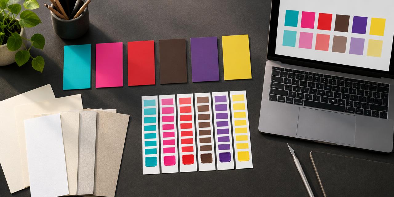
The Tiffany Blue Box has carried a color story since the nineteenth century, but its most useful lesson for a designer is surprisingly modern: you cannot order its proprietary blue by copying a turquoise square from a website. Pantone vs HEX what designers need to know begins with that gap between a recognizable appearance and an authorized production specification. The familiar online reference #0ABAB5 is an approximation, not a purchase order for Tiffany's physical color.
Imagine the same identity moving from a product page to a coated carton, an uncoated thank-you card, and an embroidered uniform. Four suppliers can receive the same picture and deliver four plausible, visibly different colors. The problem is not necessarily poor workmanship. The brief may have confused screen instructions with a material standard.
This guide focuses on that professional decision: which specification controls each deliverable, how to evaluate famous-brand codes, and what to approve before production. For a broader introduction, read our general Pantone versus HEX guide. Here, the goal is a defensible brand handoff rather than another list of attractive swatches.
Pantone vs HEX what designers need to know: Choose the authority first
Pantone is a family of physical color-standard systems, not a universal ink that behaves identically everywhere. The Pantone Matching System, or PMS, supports graphic-production specifications such as PMS 185 C. Its reference and ink formulation give printers a common target; the C suffix identifies coated-paper appearance. Other libraries address different materials and applications.
HEX is a notation for RGB channel values. In a six-digit code, the first pair describes red, the second green, and the third blue. Each hexadecimal pair runs from 00 to FF, equivalent to decimal values from zero to 255. In standard CSS usage, #FF0000 means maximum sRGB red with no green or blue contribution.
The distinction is therefore not “professional versus amateur.” Pantone defines a physical reference; HEX communicates a digital color instruction. Both can be used professionally, and both can be used badly. A printer cannot derive a complete manufacturing specification from a HEX value, while a developer cannot implement an unspecified physical chip consistently across an interface.
Before choosing either, ask who has final authority. Does the client approve a measured production sample, a current physical guide, or a digital master in sRGB? A cross-media identity may deliberately maintain separate approved targets. Those targets are related expressions of one identity, not interchangeable numbers.
Print and manufacturing: Standardization is not a guarantee
Use a Pantone reference when a defined physical target matters: brand stationery, solid-color packaging, merchandise, environmental graphics, and supplier coordination. A dedicated spot ink can deliver a clean logo field without building that color from four overlapping process inks. It can also reach colors that ordinary CMYK printing cannot reproduce convincingly.
However, a Pantone number alone does not guarantee that a can in Brazil matches a billboard in France. Those objects may use different coatings, processes, substrates, and lighting conditions. Pantone is not the only route to reliable color either: measured standards, custom formulations, ICC-managed workflows, and production tolerances also contribute.
A coated carton reflects light differently from absorbent stationery. A translucent plastic part changes with thickness and its background. Embroidery thread catches directional highlights that flat ink lacks. Matching these outputs requires material-specific sampling, not merely repeating the same code in a spreadsheet.
For a brochure containing photography, controlled CMYK may be more sensible than adding multiple spot inks. For a signature packaging field, a spot color may earn its extra cost. For textiles, a relevant textile reference or approved fabric sample is usually more actionable than a coated-paper chip. Consult the supplier before locking the file.
Practical rule: specify the reference, library, substrate, finish, process, and approval sample together. Pantone narrows ambiguity; proofing and process control manage the remaining variation.
Digital design: HEX controls instructions, not every display
Use HEX for websites, apps, digital advertising, email graphics, and screen-first assets. It is compact, inspectable, and convenient for design tokens. A team can define an approved brand turquoise once and reuse it consistently in navigation, illustrations, and campaign templates.
In ordinary web use, six-digit HEX values describe sRGB colors. A wide-gamut screen does not automatically turn that code into a wider-gamut specification. If a project needs Display P3, document an explicit P3 value and an sRGB fallback rather than silently interpreting HEX differently. Our color-profile guide explains that distinction.
Identical instructions still do not guarantee identical perception. Display calibration, panel technology, brightness, ambient light, and accessibility settings affect appearance. Your responsibility is to establish a controlled digital master and test representative devices, not promise that every phone will resemble your studio monitor.
Brand colors also need functional companions. A vivid turquoise might work beautifully in a large logo yet fail as small text on white. Keep the identity color intact where appropriate, then define darker text, focus, and selected-state variants with explicit roles. Test combinations using the color contrast checker, and never make color the sole carrier of important information.
Pantone vs HEX what designers need to know: Conversion is a shortlist
There is no universal one-to-one Pantone-to-HEX conversion. A physical specimen reflects a spectral distribution of light; an RGB display produces color through three primary channels. Some reproducible physical colors fall outside sRGB. Fluorescent inks add light-dependent behavior, while metallic finishes change with illumination and viewing angle. One flat screen patch cannot reproduce those effects.
The reverse direction is also constrained. A bright screen color may not be achievable on a selected paper using a particular printing process. A conversion engine can identify nearby reference colors, but its ranking depends on the dataset, source profile, measurement assumptions, and color-difference method.
Try the HEX to Pantone converter as a discovery step, then check which library its results actually represent. Coloracci's current matching dataset is TCX, a textile-oriented library. A TCX result is not automatically a PMS coated-ink formula. For graphic printing, use it as a perceptual clue and request an appropriate C or U reference from the print supplier.
Delta E helps quantify a difference under defined conditions. It does not certify a brand match across all materials. The formula, measurement setup, viewing conditions, and acceptance threshold matter. Establish an agreed tolerance with the supplier rather than treating one low score as unconditional approval.
An official brand guide may publish a Pantone reference and a separate HEX value that are not the mathematically nearest pair. That can be intentional: the digital value may preserve recognition, contrast, or historical continuity better than a mechanical conversion. Follow the approved specification before replacing it with a tool's suggestion.
Six famous colors: Read the provenance before the code
The following table is an educational comparison, not a set of authorized brand standards. Its HEX values are exact digital inputs but only approximate references to physical objects. “Exact code” does not mean “exact material match,” and a circulating Pantone association does not establish permission to use a brand identity.
| Item | Color | Hex | Name | Meaning |
|---|---|---|---|---|
| Tiffany & Co. box | Turquoise | #0ABAB5 |
Common Tiffany Blue screen approximation | A distinctive luxury cue; the custom physical standard is proprietary |
| Coca-Cola packaging | Red | #F40009 |
Common Coca-Cola Red screen reference | Immediate recognition and energetic contrast; not an official Pantone equation |
| Barbie identity study | Pink | #DA1884 |
Common 219 C-associated digital reference | High visibility and playful confidence; verify the applicable brand guide |
| UPS identity study | Brown | #351C15 |
Common UPS Brown screen reference | Familiarity and continuity; confirm production specifications with the brand |
| Cadbury packaging study | Purple | #330066 |
Common Cadbury Purple screen reference | Distinctive confectionery recognition; not a universal conversion of 2685 C |
| Minions character study | Yellow | #FCE300 |
Illustrative bright-yellow digital reference | Optimism and comic energy; not proof of an official Minion Yellow match |
Tiffany: Custom does not mean publicly purchasable
Tiffany's relationship with Pantone produced a custom color associated with its founding year, 1837. Tiffany's own history describes its 2001 standardization as a custom color exclusively for Tiffany and not publicly available. Treating “1837 C” as an ordinary public swatch is misleading. Nor does protection make it impossible for people to publish approximate HEX references. A legal identity and a screen simulation are different things.
For practical comparison, our closest Pantone to Tiffany Blue guide separates the proprietary standard from publicly accessible candidates. Use the same discipline when a client presents a famous box and says, “Make ours exactly this color.”
Coca-Cola: Do not promote 484 C into an official formula
The frequently repeated claim that Coca-Cola Red equals PMS 484 C is not a reliable production instruction. Coca-Cola's account of its red explicitly says there is no Pantone color for Coca-Cola red. Keep #F40009 labeled as a commonly cited digital reference unless the relevant, current brand documentation authorizes it.
This matters commercially: a converter's closest candidate can help a designer study a hue, but it cannot turn that candidate into the brand owner's master specification.
Barbie, UPS, and Cadbury: An association needs context
PMS 219 C is often associated with Barbie Pink, while PMS 476 C is associated with UPS Brown. Cadbury's relationship with 2685 C is especially well documented in discussions of its packaging identity and trademark disputes. Nevertheless, every association needs the applicable product, guide version, medium, and permission context.
Do not assume that #DA1884, #351C15, or #330066 is a universal official screen conversion for those physical references. A Pantone swatch visualization, a brand website, and a production standard can each contain different numbers for legitimate reasons.
Minion Yellow: A named launch is not PMS 013 C
Pantone introduced Minion Yellow as a named collaboration in 2015. That does not establish the supplied “013 C” attribution, nor does it validate #FCE300 as the official digital equivalent. Use this row to demonstrate a bright yellow, not to certify licensed character artwork. For authorized work, request the actual licensor specification.
A production test that reveals the real trade-offs
Build a small cross-media test sheet before the full campaign. Include the primary brand field, reversed white lettering, fine dark text, a tint, and adjacent neutrals. These elements expose more than an isolated color chip: ink spread affects lettering, paper color alters tints, and neighboring colors change perceived saturation.
For a turquoise identity, compare the approved screen #0ABAB5 against two physically shortlisted references on the intended coated and uncoated papers. Label every sample by reference and process. Do not label them “correct” until the client and supplier approve the result under agreed lighting.
Then check the digital version in its real composition. A turquoise button beside a saturated blue illustration can appear greener than the same button beside white. Compare a second blue identity through our Facebook Blue Pantone guide, which distinguishes current Facebook, Meta, and legacy references rather than pretending one famous blue covers every era.
Record the accepted difference and the reason for the decision. A slightly less saturated physical target may preserve legibility or reproduce more reliably across suppliers. That is an informed design compromise, not necessarily a failure.
Pantone vs HEX what designers need to know: Write the handoff contract
A useful handoff describes authority, not just appearance. Replace a two-column “Pantone = HEX” chart with separate entries for physical and digital masters. Identify the person who can approve substitutions and the circumstances that require another proof.
Before release, confirm these seven items:
- Source: Record whether each value comes from an official guide, a measured sample, or an editorial approximation.
- Physical target: Include the complete library and suffix, material, finish, process, and approved specimen.
- Digital target: State HEX, RGB, profile, semantic role, and permitted functional variants.
- Process fallback: Tie CMYK builds to the printer's output condition rather than a generic conversion website.
- Acceptance: Agree on visual review, measurement method, tolerance, and responsible approver.
- Version: Date the guide and prevent old files from remaining in supplier circulation.
- Exceptions: Name outputs that require separate recipes, such as thread, plastic, metal, or illuminated signage.
Keep approximate study values away from production-ready files unless they are clearly labeled. This simple separation prevents a research swatch from becoming a manufacturing instruction by accident. It also makes future redesigns auditable: the next designer can see what was chosen, by whom, and why.
Conclusion: Specify the medium, then approve the result
Pantone is the stronger reference language for many physical color targets; HEX is the appropriate instruction format for conventional sRGB screen design. Neither eliminates viewing conditions, material limitations, or the need for evidence. The professional advantage comes from assigning each specification a clear job.
For cross-media branding, maintain parallel approved targets, distinguish official codes from approximations, and proof the actual outputs. Famous colors are useful lessons precisely because their recognition can tempt teams into oversimplifying the production details.
Start with a shortlist, finish with a proof: enter your digital master in the Coloracci HEX to Pantone converter, inspect the returned library, and take appropriate physical candidates to your supplier before approving the final run.