What is the Closest Pantone to Tiffany Blue? (#0ABAB5)
· Coloracci Team
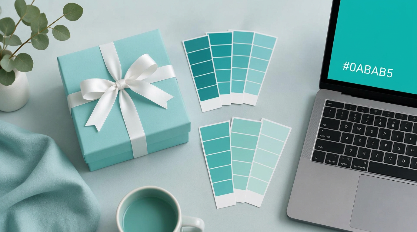
Open any Pantone Formula Guide, flip through every turquoise and aqua page, and you will not find the one blue the whole world recognizes from across a department store: the color of the Tiffany box. That absence is deliberate. Tiffany Blue, digitally expressed as #0ABAB5, is a private color, and that is exactly why designers keep asking the same question — what is the closest Pantone to Tiffany Blue that anyone can actually buy, print and specify? The answer is more nuanced than the single swatch number repeated across the internet, and getting it right is the difference between a package that whispers luxury and one that looks like a pool-supply catalog.
This guide breaks down the official digital values, the custom Pantone that you cannot license, the public swatches most often cited as substitutes, and a practical workflow for matching the color across print and screen. If you just need the math, run #0ABAB5 through our HEX to Pantone converter and compare the Delta E values yourself — then come back for the context the numbers cannot give you.
Tiffany Blue by the Numbers
Before hunting for a match, lock down what you are matching. Tiffany Blue is a light robin egg blue — a green-leaning cyan that sits right on the border between turquoise and aqua. Its commonly published specifications are:
- HEX:
#0ABAB5 - RGB: approximately R 10, G 186, B 181
- CMYK: approximately C 94, M 0, Y 2.8, K 27.1
- HSL: roughly 178°, 90% saturation, 38% lightness
Two things stand out to a trained eye. First, the red channel is almost empty (10 out of 255), which is why the color reads so clean and cool. Second, the green and blue channels are nearly equal, with green just slightly ahead. That tiny green lead is the whole personality of the color: remove it and you drift toward plain cyan; exaggerate it and you land in mint or jade.
The CMYK values deserve a warning. A straight mathematical conversion produces that heavy 27% black, but no competent print house would build Tiffany Blue that way. Black muddies cyan quickly, and the resulting process build looks dull next to the real box. This is the first clue that the color was never meant to live in CMYK at all.
The Tiffany Blue family at a glance: #0ABAB5 (Tiffany Blue) · #81D8D0 (classic box tone) · #71DBD4 · #64CCC9 · #00BFB3 · #00A499
Why You Won't Find 1837 Blue in a Swatch Book
The history explains the gap. Tiffany & Co. was founded in 1837, and the robin egg blue appeared on the cover of its Blue Book catalog in the nineteenth century. In 1998 the color was trademarked by Tiffany & Co. for its packaging and related uses. Then, in 2001, Tiffany partnered with Pantone to standardize a custom color named 1837 Blue — a direct nod to the founding year.
Custom Pantone colors work very differently from the public Pantone Matching System (PMS). A custom color is formulated for one client, documented privately, and distributed only to that client's approved suppliers. It is not printed in public Formula Guides, it does not appear in design software libraries, and a commercial printer cannot simply mix it from a published recipe. That is why searches for "Pantone 1837" end in frustration.
There is also a legal layer that designers often forget. A trademarked color is protected in a specific commercial context. Using a similar turquoise for a hospital wayfinding system is ordinary design; using a near-identical robin egg blue for jewelry gift boxes invites trouble. For the full story of how the brand defends the shade, read our analysis of Tiffany Blue as the most protected color in fashion. The practical takeaway here: find the closest Pantone for reference, inspiration or a legitimately different context — not to counterfeit a brand asset.
The Closest Pantone to Tiffany Blue: Candidates Compared
Most online sources name PANTONE 3242 C as the closest public match, with PANTONE 325 C and the textile standard PANTONE 18-5641 TCX as alternatives. Those citations are a reasonable starting point, but they are not interchangeable, and one of them is not the best choice for every job. Here is how the main candidates compare, using Pantone's published sRGB approximations for the coated inks.
| Item | Color | Hex | Name | Meaning |
|---|---|---|---|---|
| Reference | Robin egg blue | #0ABAB5 | Tiffany Blue (digital) | The benchmark screen value; luxury, calm, anticipation |
| Pastel reference | Soft aqua | #81D8D0 | Light Tiffany interpretation | The paler version often seen on printed boxes and photos |
| Most cited match | Light turquoise | #71DBD4 | PANTONE 3242 C | Matches the airy, pastel feel; lighter than #0ABAB5 |
| Classic alternative | Muted aqua | #64CCC9 | PANTONE 325 C | Slightly greyer and softer; forgiving on uncoated stock |
| Saturation match | Vivid teal-cyan | #00BFB3 | PANTONE 3262 C | Closest chroma and lightness to the digital hex |
| Deep companion | Dark teal | #00A499 | PANTONE 3272 C | Adds depth for type, borders and shadows |
| Contrast neutral | Crisp white | #FFFFFF | Ribbon White | The white ribbon that makes the blue feel precious |
Look carefully at that table and a pattern emerges. There are really two Tiffany Blues in circulation. The first is the saturated screen value #0ABAB5. The second is the softer, lighter blue people remember from the physical box and from product photography, closer to #81D8D0. PANTONE 3242 C earns its reputation because it sits near that second, remembered version: light, fresh and pastel. If your reference is a photograph of the box, 3242 C will feel right.
If your reference is the hex code itself, 3242 C is noticeably too light. In that case PANTONE 3262 C (#00BFB3) lands much closer in both lightness and saturation, and is the swatch we would test first on a press proof. PANTONE 325 C (#64CCC9) is a gentler, slightly desaturated option; it tends to behave well on uncoated paper, where every ink loses some brightness anyway.
PANTONE 18-5641 TCX belongs to a different system entirely. TCX references are cotton textile standards used by fashion and home-goods manufacturers, not ink for paper. Use it when you are dyeing fabric, ribbon or upholstery — never hand it to an offset printer. Our Pantone Finder covers these textile references if you need neighbors in the same family.
How to Find the Closest Pantone to Tiffany Blue Yourself
Swatch lists age, and the "closest" match depends on the substrate, the lighting and the version of the color you are chasing. A repeatable method beats a memorized number.
1. Decide which Tiffany Blue you mean. Screen value (#0ABAB5) or physical memory (#81D8D0)? Write it down in the brief. Most mismatches start with two stakeholders picturing different blues.
2. Measure distance, not vibes. Paste the hex into the HEX to Pantone converter. It converts the color to the Lab color space and ranks Pantone references by Delta E — a number describing how different two colors look to the human eye. Under 2 is near-identical to most viewers; under 5 is a close match; above 10 is clearly a different color.
3. Shortlist three swatches. For this color, a sensible shortlist is 3262 C, 3242 C and 325 C. Include one deeper swatch such as 3272 C if the design needs a supporting tone.
4. Check the physical guide under D50 light. Screen approximations of Pantone inks are only approximations. Hold the actual coated and uncoated chips under a standard viewing booth, or at least consistent daylight, next to your printed reference.
5. Proof on the real material. A turquoise on bright coated board and the same ink on kraft or recycled stock can look like two different colors. The substrate is part of the color.
This workflow mirrors the principle we lay out in The Designer's Guide to Pantone vs. HEX: HEX defines a color on screens, Pantone defines a color in ink, and any conversion between them is an informed approximation rather than an exact translation.
Why This Blue Works So Well
A match only matters if you understand what the color is doing. Robin egg blue carries a cluster of associations that luxury brands prize: elegance, sophistication, calm confidence and a faint sense of nature and renewal. It is cool enough to signal trust and restraint, yet the green undertone keeps it lively rather than clinical.
Just as important is scarcity. Retail environments are dominated by red, black, white and navy. A light, clean turquoise is rare, so it stands out without shouting. Paired with generous white space and a single white ribbon, it signals that the object inside has been chosen with care. That is the same restraint we see in minimalist technology branding — compare how Apple builds premium perception with neutrals and silence in our Apple brand colors analysis. Tiffany simply chose one unforgettable hue instead of none.
The lesson for designers: the color's power comes as much from discipline as from the swatch. The blue is almost never mixed with competing accents. It is framed by white, supported by quiet typography, and repeated consistently for generations.
Practical Takeaways for Designers
- Name the version. Specify "screen: #0ABAB5" and "print: PMS 3262 C (proof against 3242 C)" in the same brand document. Never leave the print color implied.
- Start with 3262 C for saturated work, 3242 C for pastel work. Test both on your stock; let the proof decide.
- Avoid a straight CMYK build. The mathematical conversion adds heavy black. If you must print in process, work with your printer on a cyan-heavy build with little or no black, and accept that it will not be as vivid as a spot ink.
- Use TCX only for textiles. PANTONE 18-5641 TCX is for fabric and ribbon, not paper.
- Pair with pure white and a deep teal.
#FFFFFFfor breathing room and#00A499or darker for text keeps the blue feeling premium and gives you accessible contrast — the light blue alone fails as a text color on white. - Check contrast before using it in UI.
#0ABAB5on white is too low-contrast for body text. Reserve it for large surfaces, buttons with dark labels or illustrations. - Respect the trademark. Borrow the lessons — restraint, consistency, a single signature hue — not the exact color in a jewelry or gift-packaging context.
- Build your own signature. The real opportunity is to find your equivalent: a specific, ownable shade, documented in HEX and Pantone from day one.
Common Mistakes When Matching Tiffany Blue
The most frequent error is trusting a single online swatch number without proofing. The second is matching to a photograph taken under warm indoor light, which pushes the blue toward green. The third is specifying the digital hex to a printer and letting prepress guess. And the fourth is overusing the color: flood an entire layout in robin egg blue and it stops feeling precious. The box works because the blue is a moment, not wallpaper.
Conclusion: The Closest Pantone to Tiffany Blue Depends on Your Target
There is no public swatch labeled Tiffany Blue, because the true 1837 Blue is a private, custom Pantone formulated for one company. The closest Pantone to Tiffany Blue that you can actually specify depends on which version you are chasing: PANTONE 3242 C for the airy, pastel blue people remember from the box, PANTONE 3262 C for the saturated #0ABAB5 screen value, PANTONE 325 C for a softer option on uncoated stock, and PANTONE 18-5641 TCX for textiles. Measure, shortlist, proof on the real material and document both HEX and Pantone together.
Most of all, remember why the color works: it is a single, confident hue used with extraordinary consistency. That is a strategy any brand can adopt with a color of its own.
Find Your Own Signature Blue
Convert any HEX code to its nearest Pantone matches with Delta E scores, then build a full palette around it. Try the HEX to Pantone Converter →