What Pantone is Facebook Blue? A Designer's Guide
· Coloracci Team
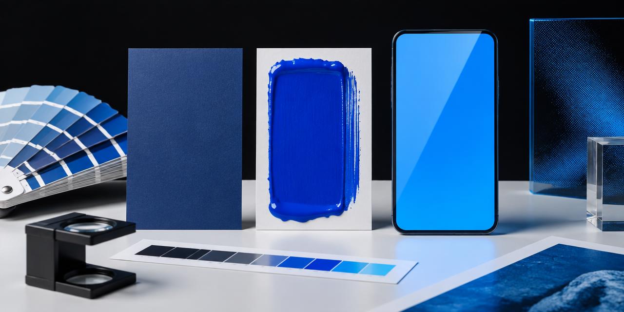
On April 30, 2019, the familiar lowercase Facebook wordmark changed from a restrained navy to a blue so bright it seemed lit from inside the screen. That single update explains why the question what Pantone is Facebook Blue no longer has one neat answer. A designer matching a current Facebook interface, Meta's corporate identity, or a decade-old social campaign is looking at three different blues: #1877F2, #0081FB, and #3B5998. They share a family resemblance, but their hue, saturation, lightness, and production behavior are not interchangeable.
The short answer is that PANTONE 2727 C is a useful physical starting point for current Facebook Blue #1877F2, PANTONE 2925 C is commonly proposed for the more cyan Meta Blue #0081FB, and PANTONE 7684 C is a sensible candidate for legacy Facebook Blue #3B5998. None should be described as an official one-to-one equivalent. Meta's public brand resources identify branded blues but do not publish a universal Pantone spot specification for these three HEX values. The Pantone numbers in this guide are practical comparison candidates, not corporate production standards.
What Pantone Is Facebook Blue #1877F2?
The value most designers mean by “Facebook Blue” is #1877F2: RGB 24, 119, 242. It arrived with Facebook's 2019 visual identity refresh and became strongly associated with the circular app icon and the brighter, more contemporary product system. Compared with the older #3B5998, it contains far more blue-channel energy, greater saturation, and considerably more perceived luminosity.
Among commonly cited print references, PANTONE 2727 C is the most defensible first swatch to inspect. Its published screen approximation is often shown near #307FE2. Place that beside #1877F2 and the difference becomes clear: 2727 C is slightly more violet and subdued, while Facebook Blue feels cleaner, brighter, and more electrically saturated on an RGB display. A coated spot ink can approach the visual character, but it cannot reproduce the emitted-light intensity of a phone at full brightness.
Some color directories instead suggest PANTONE 7684 C or another neighboring blue. That disagreement is not evidence that one directory is careless; it exposes the limits of conversion. Results change with the Pantone library, RGB profile, color-difference formula, and source data used for each swatch. If a job requires a physical match, enter the source value in the Coloracci HEX to Pantone converter, shortlist several candidates, then compare current physical chips under controlled light.
Why 2727 C Is a Starting Point, Not an Answer
HEX is an instruction for red, green, and blue light. Pantone Formula Guide colors are mixed inks viewed by reflected light on a specific paper. Even a low numerical color difference cannot make these media identical. Coated stock preserves saturation and surface brightness better than uncoated stock, so 2727 C on gloss board may feel convincingly close while the corresponding uncoated result looks softer, greyer, and more absorbent.
Surrounding color matters too. Facebook Blue beside white #FFFFFF feels open and energetic. The same blue beside the near-black #1C1E21 gains intensity through contrast. A match approved as an isolated chip may shift perceptually once it sits inside a navigation bar, on a fabric booth wall, or under a matte laminate.
Facebook Blue, Meta Blue, and Legacy Blue Compared
The three blues tell a compact history of social-interface design. Legacy Facebook Blue #3B5998 belonged to the era of desktop chrome, compact navigation bars, and low-resolution displays. Its lower saturation and darker value gave white type a stable ground and helped the site feel institutional rather than playful. It was recognizable precisely because it was controlled: a quiet, slightly violet navy repeated across years of product use.
The 2019 Facebook Blue #1877F2 reflects a mobile-first environment. Brighter OLED and LCD screens could carry a more luminous accent, while a simplified icon needed enough chroma to remain distinctive at small sizes. The red channel dropped relative to the legacy blue, and the blue channel moved close to its maximum. The result feels faster, friendlier, and more like an action color than a structural corporate navy.
Meta Blue #0081FB entered the conversation with the Meta corporate identity announced in 2021. It pushes farther toward cyan: its red channel is zero, while green rises to 129 and blue reaches 251. That channel structure makes it feel cooler, more spatial, and more synthetic than #1877F2. Meta's wider visual system also uses neighboring blues, including deeper #0064E0, so designers may encounter a range rather than one flat corporate swatch.
| Item | Color | Hex | Name | Meaning |
|---|---|---|---|---|
| Current Facebook | Electric royal blue | #1877F2 |
Facebook Blue | Social connection, immediacy, trust, mobile-era energy |
| Current print candidate | Clear medium blue | #307FE2 |
PANTONE 2727 C approximation | A coated-ink starting point; slightly more violet and muted |
| Meta Platforms | Bright cyan-blue | #0081FB |
Meta Blue | Openness, technology, dimensional digital space |
| Meta print candidate | Process-like cyan blue | #009CDE |
PANTONE 2925 C approximation | More cyan and lighter than Meta Blue; proof before use |
| Legacy Facebook | Muted violet-blue | #3B5998 |
Classic Facebook Blue | Stability, familiarity, desktop-era authority |
| Legacy print candidate | Deep muted blue | #385E9D |
PANTONE 7684 C approximation | Similar restraint and depth; less luminous than screen color |
| Meta supporting dark | Deep interface blue | #0064E0 |
Meta dark blue | Depth, hierarchy, dimensional contrast |
| Interface neutral | Near-black charcoal | #1C1E21 |
UI Charcoal | Grounds bright blue and supports readable typography |
The table deliberately uses the word “approximation.” A Pantone swatch's published HEX is itself a simulation of physical ink, not a replacement for the chip. Treating #307FE2 as proof that 2727 C equals #1877F2 would reverse the logic: it compares one screen simulation with another screen target while bypassing the printed material that Pantone exists to control.
The Perceptual Difference in Plain Language
Imagine the three values as voices. #3B5998 speaks at a measured volume. It has enough violet and grey influence to feel established. #1877F2 raises the volume and sharpens the consonants; it is an unmistakable call to tap, share, or continue. #0081FB moves the voice into a cooler room, removing red and leaning toward cyan so it feels less social-network-specific and more like a broad technology platform.
This distinction affects palette building. Warm coral #FA3E3E creates a direct notification contrast against current Facebook Blue. Pale grey #F0F2F5 lets it dominate without the visual vibration of pure white across a large interface. The legacy blue works naturally with quieter cool greys, while Meta Blue benefits from deep navy and black anchors that prevent its cyan energy from feeling lightweight.
What Pantone Is Meta Facebook Blue for Print?
For current Facebook Blue, begin a coated-paper proof with PANTONE 2727 C and at least one neighboring saturated blue. For Meta Blue, include PANTONE 2925 C, but expect it to print lighter and more cyan than the digital target. For legacy Facebook Blue, inspect PANTONE 7684 C because its muted depth is closer in spirit and screen approximation to #3B5998. These are separate shortlists, not three labels for one brand color.
The choice may change on uncoated paper. Ink sinks into open fibers, reducing apparent saturation and edge crispness. A printer may recommend a darker or cleaner neighboring formula to preserve the intended appearance after absorption. On fabric, powder-coated metal, plastic, vinyl, or backlit signage, a Formula Guide reference may be useful only as a communication anchor; the manufacturer still needs a material-specific sample and tolerance.
This is why a cross-media brand guide should never place “PMS = HEX” in one undifferentiated row. As explained in The Designer's Guide to Pantone vs. HEX, each system controls a different output. Write parallel targets instead:
- Digital master: HEX
#1877F2in sRGB for screen interfaces. - Spot-color candidate: PANTONE 2727 C on coated paper, subject to physical approval.
- Process fallback: a press-tested CMYK build tied to a named profile and stock.
- Large-format or material target: an approved production sample with an agreed tolerance.
That language gives vendors authority to solve for the intended appearance without pretending every process shares the same gamut.
A Reliable Matching Workflow for Designers
1. Identify the era before matching. Ask whether the reference is a current Facebook asset, Meta corporate material, or historical Facebook artwork. Eyedropping a compressed screenshot may return a fourth blue created by image compression or display capture.
2. Preserve the digital source. Record the full six-digit HEX value and sRGB profile. Do not build from a JPEG of a logo when an approved vector or brand resource is available.
3. Generate a shortlist. Use the HEX to Pantone converter to compare candidates. Do not stop at the first result; inspect nearby swatches with slightly different hue and lightness.
4. Choose the correct library. Formula Guide C and U references concern printing ink on coated and uncoated paper. Fashion, Home + Interiors TCX references are textile standards. A numerically close TCX color is not an offset-ink instruction.
5. Compare physical chips. Use a current guide under D50 viewing light. Pantone books fade and soil with age, while office lighting can add green or yellow casts that distort blue comparisons.
6. Proof on the final substrate. Approve the color inside the real composition, at production scale, with coatings and finishing applied. A matte varnish can lower apparent depth; a gloss laminate can increase saturation and reflections.
7. Document the decision. Record the library, suffix, paper, process, profile, date, and approved proof. The specification should say who has authority if the measured result and visual judgment disagree.
Common Mistakes When Matching Facebook Blue
The most common mistake is combining the Facebook and Meta identities. #1877F2 and #0081FB look related in isolation, yet the second has no red component and reads more cyan. Swapping them can make a familiar asset feel subtly counterfeit even when viewers cannot explain why.
Another mistake is assuming a conversion directory publishes an official brand standard. If two credible tools propose different Pantone numbers, neither result should be silently promoted to “the official PMS.” Label the match as calculated or approximate, and preserve a link to the authoritative digital source.
Designers also forget the suffix. “2727” without C or U is incomplete for print production because coating changes the appearance. They approve color on a laptop rather than a physical proof, ignore the substrate, or use the bright blue for small text on white without checking contrast. Brand recognition does not override accessibility requirements.
Finally, do not infer legal permission from color data. Studying or matching a blue for analysis is different from reproducing brand assets in a way that implies affiliation. The same caution applies to protected signature colors; our guide to the closest Pantone to Tiffany Blue explains why a useful color match is not automatically a license to imitate a brand presentation.
Practical Takeaways
- Use
#1877F2for the widely recognized 2019-era Facebook Blue, not the older#3B5998. - Treat PANTONE 2727 C as a strong coated-paper candidate for
#1877F2, then compare neighboring chips and proof physically. - Keep Meta Blue
#0081FBseparate. PANTONE 2925 C is a useful cyan-leaning candidate, not an exact or officially confirmed equivalent. - For historical work using
#3B5998, inspect PANTONE 7684 C and other muted violet-blues rather than forcing a match chosen for the current identity. - Preserve both digital and physical specifications in the handoff. One value cannot govern screens, coated stock, uncoated paper, textiles, plastics, and illuminated signs.
- Use
#FFFFFF,#F0F2F5, and#1C1E21as contextual checks; a blue's apparent brightness changes dramatically against each neutral. - Date the specification. Brand colors evolve, and “Facebook Blue” without an era or code is an invitation to use the wrong file.
Conclusion: There Is More Than One Facebook Blue
So, what Pantone is Facebook Blue? For #1877F2, PANTONE 2727 C is the best practical first comparison. For Meta's cooler #0081FB, begin with PANTONE 2925 C. For the historic, less saturated #3B5998, PANTONE 7684 C provides a more plausible tonal direction. None is a guaranteed official equivalent, and every choice must be judged in the correct Pantone library on the actual production material.
The evolution from muted institutional blue to luminous action blue and then cyan-leaning platform blue mirrors a larger shift in digital branding: identities are now designed first as emitted light, motion, and interface behavior. Print matching remains possible, but it requires translation rather than transcription.
Ready to build a production shortlist? Enter Facebook Blue, Meta Blue, or any HEX value in the Coloracci HEX to Pantone converter →, compare the nearest references, and take the strongest candidates to a physical proof.