Nail Salon Color Design: Elegant Palettes for Beauty Spaces
· Coloracci Team
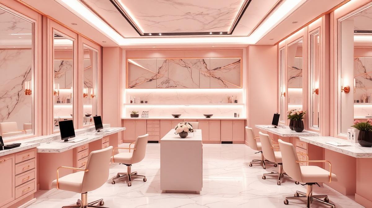
Nail Salon Color Design: Elegant Palettes for Beauty Spaces
The nail salon industry has undergone a dramatic transformation—from utilitarian service spaces to Instagram-worthy beauty destinations where the interior design is as important as the nail art itself. Modern nail salons compete not just on service quality but on ambiance, and color is the primary tool for creating an environment that feels simultaneously luxurious, hygienic, and relaxing. The right color palette can justify premium pricing, encourage social media sharing, and build a loyal clientele.
The Psychology of Nail Salon Colors
What Clients Subconsciously Evaluate
When a client enters a nail salon, color communicates three critical messages within seconds:
| Message | Color Signal | Client Thought |
|---|---|---|
| Hygiene | White, light gray, clean pastels | "This place is clean and safe" |
| Luxury | Rose gold, marble, deep tones | "I'm treating myself to something premium" |
| Relaxation | Soft pink, lavender, sage | "I can relax and enjoy this experience" |
| Skill/Artistry | Bold accent colors, creative displays | "These artists are talented and trendy" |
The Clean-Luxury Balance
The fundamental tension in nail salon design:
- Too clinical (all white + bright lights) = Feels like a medical office
- Too dark/moody = Clients can't see nail colors accurately
- Too colorful = Overwhelming, unprofessional, hard to photograph
- Sweet spot = Soft, warm neutrals with strategic luxury accents
Nail Salon Design Tiers
Ultra-Premium/Luxury Nail Bars
| Element | Color | Hex Code | Material |
|---|---|---|---|
| Walls | Soft blush or warm gray | #F5E6E0 / #D4C5C7 | Velvet panels, textured wallpaper |
| Floors | White marble with gray veining | #F0EDE8 | Polished marble or luxury vinyl |
| Stations | Rose gold + white | #B76E79 + #FFFFFF | Marble top, metal accents |
| Seating | Blush pink or champagne | #F4C2C2 / #F7E7CE | Premium leather or velvet |
| Lighting | Warm white | 3000-3500K | Chandelier + ring lights |
| Accent wall | Deep emerald or navy | #0B6623 / #1B2838 | Feature wall for photos |
| Shelving | Gold or rose gold metal | #FFD700 / #B76E79 | Floating, backlit |
Modern Minimalist
| Element | Color | Hex Code | Material |
|---|---|---|---|
| Walls | Pure white or off-white | #FFFFFF / #FAF9F6 | Smooth plaster |
| Floors | Light gray concrete | #C0C0C0 | Polished concrete |
| Stations | White + light wood | #FFFFFF + #D4B896 | Clean laminate + natural wood |
| Seating | White or light gray | #F5F5F5 / #E0E0E0 | Modern molded chairs |
| Lighting | Cool-neutral | 4000K | Track lighting, clean fixtures |
| Accent | Single bold color | Brand-specific | Feature wall or neon sign |
| Plants | Living green | #4CAF50 | Natural biophilic elements |
Trendy/Instagram-Focused
| Element | Color | Hex Code | Strategy |
|---|---|---|---|
| Feature wall | Bold pink or arch shape | #FF69B4 / #FFB6C1 | Photo backdrop |
| Neon sign | Custom quote in brand color | Custom | Social media content driver |
| Ceiling | Painted bold or with florals | Custom | Overhead content shots |
| Displays | Rainbow-arranged polish wall | Gradient | Visual attraction + convenience |
| Furniture | Mix of textures/colors | Custom | Eclectic, curated aesthetic |
| Mirror frames | Statement gold or arched | #B8860B | Premium feel, selfie-friendly |
Color Accuracy for Nail Services
Lighting for True Color Rendering
The most critical technical consideration—clients must see nail colors accurately:
| Light Source | CRI (Color Rendering Index) | Suitability |
|---|---|---|
| Natural daylight | 100 | Perfect—ideal but variable |
| High-CRI LED (95+) | 95-98 | Excellent—consistent and recommended |
| Standard LED | 80-85 | Adequate—some color distortion |
| Fluorescent | 62-75 | Poor—makes colors look greenish/flat |
| Warm incandescent | 100 | Perfect CRI but too yellow for color matching |
Recommendation: Use 95+ CRI LED lighting at 4000-4500K for nail stations. This provides accurate color rendering without the harshness of cool white.
Wall Color Impact on Nail Color Perception
Wall colors reflect onto hands and nails, affecting how polish colors appear:
- White walls: Neutral—most accurate color perception
- Pink walls: Add warmth to all nail colors—flattering but can make cool tones look off
- Gray walls: Neutral but can make colors appear slightly muted
- Dark walls: Can make it harder to see subtle nail color differences
- Best practice: Soft warm white (#FFF8F0) for station areas—neutral enough for accuracy, warm enough for flattering skin tones
The Polish Display Strategy
Color Organization Methods
| Method | Description | Best For |
|---|---|---|
| Rainbow gradient | Arranged by color spectrum | Visual impact, easy browsing |
| By brand | Grouped by manufacturer | Brand-loyal clients |
| By finish | Matte, shimmer, glitter, chrome | Finish-focused shoppers |
| By season/trend | Current trending collections forward | Fashion-forward salons |
| By service | Gel vs. regular vs. dip | Service-differentiated salons |
Display Wall Design
The polish wall is both functional and decorative:
- Backlit shelving: LED strips behind frosted shelves create a glowing, gallery-like effect
- Mirror backing: Doubles the visual density and adds sparkle
- White or light gray (#F5F5F5) shelving: Doesn't compete with polish colors
- Spacing: Adequate spacing between bottles prevents visual overwhelm
Branding and Color Identity
Building a Nail Salon Brand Palette
| Brand Archetype | Primary | Secondary | Accent | Vibe |
|---|---|---|---|---|
| Classic Luxury | Champagne #F7E7CE | White #FFFFFF | Gold #B8860B | Timeless elegance |
| Modern Chic | Blush #F4C2C2 | Gray #808080 | Rose gold #B76E79 | Contemporary polish |
| Edgy/Artistic | Black #1A1A1A | White #FFFFFF | Neon pink #FF1493 | Bold creativity |
| Natural/Organic | Sage #8F9779 | Cream #FFFDD0 | Terracotta #CC7722 | Earth-conscious |
| K-Beauty Inspired | Soft pink #FFD1DC | Lavender #E6E6FA | Lilac #C8A2C8 | Gentle, youthful |
Seasonal Color Theming
Refreshing the salon's accent colors seasonally keeps the experience fresh:
| Season | Accent Colors | Hex Codes | Theme |
|---|---|---|---|
| Spring | Pastel rainbow | #FFB6C1, #87CEEB, #98FB98, #FADADD | Bloom, fresh starts |
| Summer | Coral + turquoise | #FF7F50 + #40E0D0 | Vacation, vibrant |
| Autumn | Burgundy + gold | #800020 + #B8860B | Warmth, richness |
| Winter | Navy + silver | #1B2838 + #C0C0C0 | Elegance, sparkle |
| Holiday | Red + gold + emerald | #CC0000 + #FFD700 + #50C878 | Celebration, glamour |
Digital Presence
Website and Social Media Colors
Your online presence should mirror your salon's physical palette:
- Website background: Match your salon's wall color for visual consistency
- Booking buttons: Bold accent color—easy to find and click
- Portfolio gallery: Clean grid on white or light background—let the nail art speak
- Instagram grid: Consistent filter/color treatment creates a cohesive feed that attracts followers
Use Coloracci's AI palette generator to design a cohesive nail salon brand palette that works across physical and digital touchpoints.
Explore more beauty industry colors: Beauty Salon & Spa Colors, Barbershop Colors, Yoga Studio Colors, or Wedding Venue Colors.